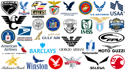
The eagle is one of the most common animal figures in heraldry, which has long been present on the emblems of not only companies or brands but also cities and states. The explanation is simple: the head of the feathered world is considered a great character. After all, he personifies royalty, height, freedom, strength, power, majesty, pride, victory, courage and vigilance, courage. In general, the king of birds is the master of the sky.
Strenuousness, power, courage, boldness, confidence, and strength – these are the qualities that most organizations and businesses strive for, so they approach them with the eagle. Some use a heraldic image, some use a real one, some use something in between, some use an anthropomorphic one, and some use an abstract one. In general, these birds represent an incredible diversity in visual appearance and their species. Indeed, depending on the species, they are divided into eagles, condors, falcons, and golden eagles.
We tried to unite the most famous eagle logos and characterize them to understand the essence of the choice. I came to the conclusion that in most cases, they should be considered an expression of high professionalism of companies, or at least as an aspiration to it. The formidable bird does not so much inspire fear as it expresses confidence in superiority, i.e., brands are convinced that they have the power, thanks to which they can reach unprecedented heights. The signs are presented in random order.
American Airlines
American Airlines, an American airline carrier, uses an allegorical logo. It lacks concreteness. An abstract bird glides in the height, reminiscent of an airplane wing. This is facilitated by the chosen geometry and color differentiation into three zones: blue, white-silver, and red. Thanks to the correct distribution of shadows, the central element looks like the neck and head of a huge bird with a hook-shaped beak. The sign is complemented by a calm inscription divided into two lines and aligned to the right. The letters are tall, lowercase (except for the first), grotesque, and dark gray in color. There is also a line at the bottom with the inscription “A Comcast Company.” It is black in color, with wide character spacing and uppercase lettering.
Winston
For Winston cigarettes, the emblem consists of two parts: graphic and text. The style of the emblem is minimalistic, as there are no other elements. The image shows an eagle flying to the right. He is large, with widely spaced wings, a spread tail, and a white head. The drawing is made in an abstract style, without specifics, so it conveys the general atmosphere of the free-floating bird rather than its details. The lettering font is thin, tall, and elegant. The eagle gives the cigarette label sophistication and freedom of action.
Gulf Air
Gulf Air has been using the Eagle logo since its inception as an airline striving for royal service, luxury amenities, and high standards. This is also the trend in Bahrain, where it operates. The bird has been present on the emblem of this nation’s largest aviation service practically since the 1950s. The visual style of the brand has always been focused on noble perfection, so it features gold and dark blue palettes. The key element is the soaring eagle. It has very large wings, which speaks about the reliability of the air carrier. To the right of the bird is the name divided into two lines: the upper inscription is in Arabic, and the lower one is in English.
Wilson Combat
The Wilson Combat gun manufacturer has chosen a logo in an appropriate design – strict, businesslike, with an improvised sight on the barrel. Under it is an eagle, combined with the first letter of the word “Combat.” Its body is replaced by a large letter “C,” above which are raised-up wings consisting of five-pointed feathers. The head of the bird is white, with black eyes, a beak, and a thin outline. The entire composition is positioned below a two-line inscription, including the name of the company. The words are aligned on both sides and circled in gray like the rest of the elements.
American Eagle
The emblem of this casual fashion brand also features an eagle. I chose the emblem with the American eagle because of the freedom, royalty, pride, and majesty that this bird possesses. Not in the last place is the territorial reference because the bald eagle is one of the important symbols of the USA. With its help, the company seeks to show that its products are made in the United States. Both the badge and the inscription are solid dark blue in color. The flying eagle is drawn without details. Its dark silhouette is above the inscription, located in two lines. In the upper line is the name, and in the lower line is the word “Outfitters.”
Vauxhall
Vauxhall designed the heraldic eagle emblem to demonstrate an unbreakable link to history, to show reliability and experience, and to emphasize market dominance and premium products. The bird on the emblem resembles a mythological creature: it has a specific head contour like a griffin – something between an eagle and a lion. This is indicated by the protruding upward ear, sloping forehead, and extended to the left paw. In addition, the plumage in the neck area resembles a shaggy mane. This symbiosis was necessary to emphasize the exclusivity and elitism of the brand and everything connected with it. The bird is painted in a rich red color and is surrounded by a wide ring of the same color. Next to it, there is a trapezoidal flag with the first letter of the company name.
USPS
The USPS logo is not an abbreviation but the full name of the company – United States Postal Service. It is grouped into two lines and divided by a horizontal red line. The font is italicized, grotesque, and smooth, with a non-standard letter “A”: the glyph has been replaced by an open triangle resembling the Phoenician letter delt (or Greek delta). Earlier, it designated a door or entrance to a tent, which very well corresponds with the postal service, which representatives enter each door at delivery of mail. As for the eagle, it is schematic and depicted with a few strokes. The bird consists of blue and white stripes forming the beak, eye, and head.
Anheuser Busch
Anheuser-Busch has a legendary logo: the company has been using it for decades, keeping the concept intact. Only the details change, which does not affect the theme or the style. The basis of the emblem is a blocky Old English letter “A” with semicircular protrusions and shaped feet. Instead of the crossbar, a bald eagle is drawn: he flies through the letter, wide spread wings. Both elements are painted in golden color with white flecks. The bird is massive and confident, with detailed feathers. Above the glyph is a five-pointed star; below it is the name of the brewing giant. The inscription is in italics, mimicking calligraphic handwriting. It is black, thin, and elegant.
USMC
The USMC logo used is symbolic, colorful, and filled with multiple meanings. Each detail has a specific legend and purpose. In the center of everything is the planet. It depicts two continents: North America and South America. They are painted in gold color, so they clearly stand out on the white background. At the top of the globe is an eagle with wings spread wide and a fluttering ribbon. It bears the inscription “Semper Fidelis,” the motto of the Marine Corps. Behind the globe is a sea anchor horizontally intertwined with a rope. The center is painted in red. Then, there are several stripes of different widths. The largest is black, serving as a background for the full name of the organization, the United States Marine Corps. As a frame is used a thick rope, coiled in a ring. In general, the emblem is similar to the official seal.
USAA
USAA presented the emblem in two colors: blue and white. They match well with the futuristic emblem of the striped eagle. The abstract bird consists of diagonal lines with a curve at the ends: on the left, they are bent downwards, and on the right – upwards. This creates the illusion of spread wings. At the top of the peak is ahead. It is located in profile and is complemented by a powerful beak. The icon is minimalistic: the body of the eagle resembles the letter “A,” and there is nothing superfluous in it. Below is the abbreviated name of the American organization United Services Automobile Association because otherwise, it would not fit in the length of the format of the top element. The font is smooth, even uppercase, with only the “A” having serifs.
Barclays
The visual identity of one of the largest banks in the world is very authoritative and serious. The developers proposed for Barclays a logo with an eagle in the style of the national emblem. The two-dimensional bird occupies the entire space of the improvised shield as its wings are spread. The head is turned to the left so that the blue beak is visible against the white background. The wings are curled at the top and divided into several segments at the bottom. The name is italicized, capitalized, and decorated with miniature serifs.
U.S. Air Force
Designers made the emblem for the US Air Force geometric in the style of cubism. Therefore, the eagle is not realistic, but conventional, consisting of rectangles, trapezoids and triangles. In the center is a small circle with a solid blue fill, and around it, in the negative space, white rays are visible, forming a five-pointed star. The wings of the bird are raised upwards, and the tail is spread as if flying over the name of the military organization. The inscription is in squat, bold, and capitalized letters.
TicketCity Bowl
The TicketCity Bowl logo features an aggressive eagle holding a rugby ball in its talons. This element is in the foreground at the bottom. At the top are the wings and head of the bird with an open beak, as if it is letting out a menacing cry. The center part is occupied by a blue banner with a white and yellow header. High-rise black buildings can be seen in the background – as if it were a nighttime cityscape. From the bald eagle, in different directions, diverges triangular rays. The whole logo is surrounded by a gray-blue outline.
Benfica
The emblem of Benfica is a golden eagle standing on a bicycle wheel, as a symbol of the sport with which this Portuguese team started, since it took up soccer later. At the bird’s feet is a ribbon with a motto written in red and green. In the center is a triangular shield with a stylized ball, which is diagonally closed by a blue stripe with the inscription “S. L.B.” The eagle has horizontally flat wings, fluffy feathers, and an open beak as if it were protecting the sports club’s paraphernalia.
The Independent
The Independent’s visual style is based on a logo depicting an eagle flying with a newspaper in its paws. It has been used for decades, as printed publications are the specialty of the British media, although today they exist in the Internet format. The eagle, in this case, symbolizes confidence, the protection of free speech, and the availability of truthful facts. It is a reliable and authoritative source of news. On the background of a red circle is drawn a white bird with spread wings. Such a sign reflects a turbulent and full of passion world, over which soars a confident and calm eagle, which has collected the most interesting information.
Smirnoff
The Smirnoff vodka brand chose a logo with a double-headed eagle, a classic example of Russian heraldry. By doing so, it emphasized its roots, although it works abroad. In earlier versions, the bird was close to realism, but now it looks allegorical, resembling a mirror image. Instead of wings, it has two stripes on each side, tails forked, heads turned in different directions, with one common crown painted above them. The eagle is colored silver with cold reflections, resembling a piece of ice. Across it runs a red ribbon framed by the name of the company. It is typed in white capital letters with minimal rounding: only “S,” “R,” and “O” have it.
CIA
The sign of the Central Intelligence Agency also contains the main American symbol – a bald eagle. Thus, the emblem of the CIA denotes high status, authority, compliance with government requirements, defense of the country, power, and confidence. All this is embedded in the bird, looking out from behind a pentagonal shield with the image of azimuth. The central part is surrounded by two inscriptions: at the top – the expanded name of the organization, and at the bottom – an indication of the country it represents. None of the fonts contain serifs. All elements are placed in a blue circle and form a seal with a thin yellow border.
Salewa
The fashion brand Salewa has an impromptu logo. It looks more like a label than a full-fledged emblem, which, however, does not prevent it from being widely recognized. The bird consists of just two simple shapes, which look like long trapezoids. They are painted in black and are located above the inscription of the same color. The font is stylized, geometric, uppercase, and divided into pairs of letters.
Colorado Eagles
The designers proposed a logo in color format with an eagle head for the Colorado Eagles hockey team. The bird is positioned to the left of three stripes (red, yellow, and blue) resembling feathers. It looks menacing, displaying a pointed beak. Below it is a two-level inscription, in which the first part of the name is placed between the letters of the second row – “E” and “S.” In both cases, the font is uppercase, white, with serifs and a yellow border. The background is black, forming deep shadows.
Ramones
The band Ramones has a logo that looks like a classic round seal. In the center is drawn an eagle, which symbolizes strength, rebellion, superiority, and rebellion. It has a bat in one paw, a laurel branch in the other, a motto ribbon in its beak, a square with a white ornament on its chest, and seven arrows above its head. The bird is surrounded by a ring of five-pointed stars, followed by a wide band with the names of the members of the musical group. The name is located at the top: it is typed in bold grotesque. The color palette of the emblem is monochrome.
New York
The emblem of the state of New York designers is made in heraldic style and bright colors. The eagle denotes benevolence, reliability, pride, courage, and high authority. He stands on a globe, which is located above a shield with a landscape of American nature. To the right and left are depicted two women, Liberty and Justice. Under their feet is a ribbon with a Latin saying. The composition is surrounded by the state motto. The frame of the emblem is made in the form of a braided rope. The palette is rich and consists of blue, red, gold, green, gray, and white colors.
Crystal Palace
The English soccer team Crystal Palace uses an emblem with a blue eagle and a red ball. These are the most colorful elements in it. Both colors are combined in the name ribbon at the bottom. It is wavy, blue, with a red border and white lettering in bold sans-serif font. The background is a composition of architectural structures painted in gray.
Nationwide
This building society from the UK has chosen to have an outline eagle flying to the right side on the background of block “N.” This is the first letter of the organization’s name. Nationwide chose a minimalistic logo to emphasize the simplicity of the process that professionals take on. The contoured bird looks calm and confident, so it symbolizes reliability. Its wings are raised upwards, and its head, back, and tail are stretched horizontally in a straight line. The main colors of the emblem are blue and white. In the lower part, there is a black inscription in sans-serif font.
Moto Guzzi
For Moto Guzzi, the emblem is not just a way of identification but a visualization of a concept. With its help, the two-wheeler manufacturer demonstrates its capabilities: reliability, speed, superiority on the road, confidence, and impeccability. The main element of the emblem is a golden eagle with spread wings and detailed elements. However, this does not mean that the image is made in a realistic style. No, it is a stylized image with detailed feathers. The bird’s paws are folded, and the neck is stretched out as if pointing forward. The wings are perfectly aligned horizontally. At the bottom, there is the brand name written in black paint.
Eagle
The Eagle automobile brand had a logo that predictably contained an eagle. It was its only graphic element and was located in a triangular shield with convex sides. It featured a head with a sharp, hooked beak. The bird was pointing to the right and staring intently ahead. The image was made with white lines on a black background. At the top was the name written in rounded capital letters.
Lazio
Lazio” has an emblem with the image of an eagle sitting on a shield. The bird spreads its wings wide and looks attentively to the right side – that is where its head is turned. The upper line of the wings is flat, horizontal. The palette of the visual identity of the Italian soccer club is light: it is white, bicolor blue, and gold. The coat of arms has wide vertical stripes. The name of the team is typed in italic capital letters with serifs.
FPV
The FPV logo is used with an abbreviated version of the name because its acronym stands for First-Person View. The drone manufacturer identifies its products as a powerful surveillance tool that has the keen eye of an eagle, able to discern every detail from a height. The company’s emblem is designed in a minimalist style and is an oval with a black stroke in the negative space of which the head of the bird looms. In the lower right corner is the name, typed in rounded and italicized letters.
IMSS
Protection and security are what the eagle stands for in the symbolism of the Mexican State Department of Public Welfare. For IMSS, the logo was designed to reflect the direction of its work, so the bird covers the chick with its wings, protecting it and creating favorable conditions for life. It is placed in a green square with rounded corners and is visible in negative space. The inscription consists of narrowed letters elongated vertically. The glyphs are on a white background below the badge and have small extensions at the ends.
Hogwarts
The mythical educational institution Hogwarts has a logo divided into four parts, one of which features an eagle on a shield. It is located in the lower right corner and symbolizes the Ravenclaw faculty. The remaining sides are occupied by a badger, a snake, and a lion. Between them (in the center) is a capital letter “H” – the first letter of the name. In general, the emblem looks like a coat of arms of a complex configuration, supplemented by upper and lower ribbons.
Giorgio Armani
Giorgio Armani has the most stylish and iconic logo. The Italian fashion house placed an abstract eagle on the emblem consisting of alternating black and white stripes. The dark lines are wide and expressive, with rounded ends. In the middle, they are divided into three parts, forming a body and wings raised upwards. Such geometricity is associated with the specificity of the company engaged in clothing patterning. The bird is located above the inscription, typed in a thin uppercase font with short and narrow serifs. At the bottom of the eagle, there is a white mark – an elegant monogram of “GA.”
