


The image of an owl is the best choice for brand visual identity across any field of activity, as it symbolizes wisdom and other positive qualities. This nocturnal bird stands for knowledge, erudition, and insight. It can be seen in pitch darkness, bringing good luck even in difficult circumstances.
In addition, its destiny is prosperity and wealth. Not without reason, it is believed that where the owl is, there is bound to be a financial upswing because it protects money, keeps treasures, and guards them. Feathered predators are always near such places. Therefore, its presence on the emblems can activate profits. This nocturnal inhabitant promotes the rational use of money and helps to develop intuition.
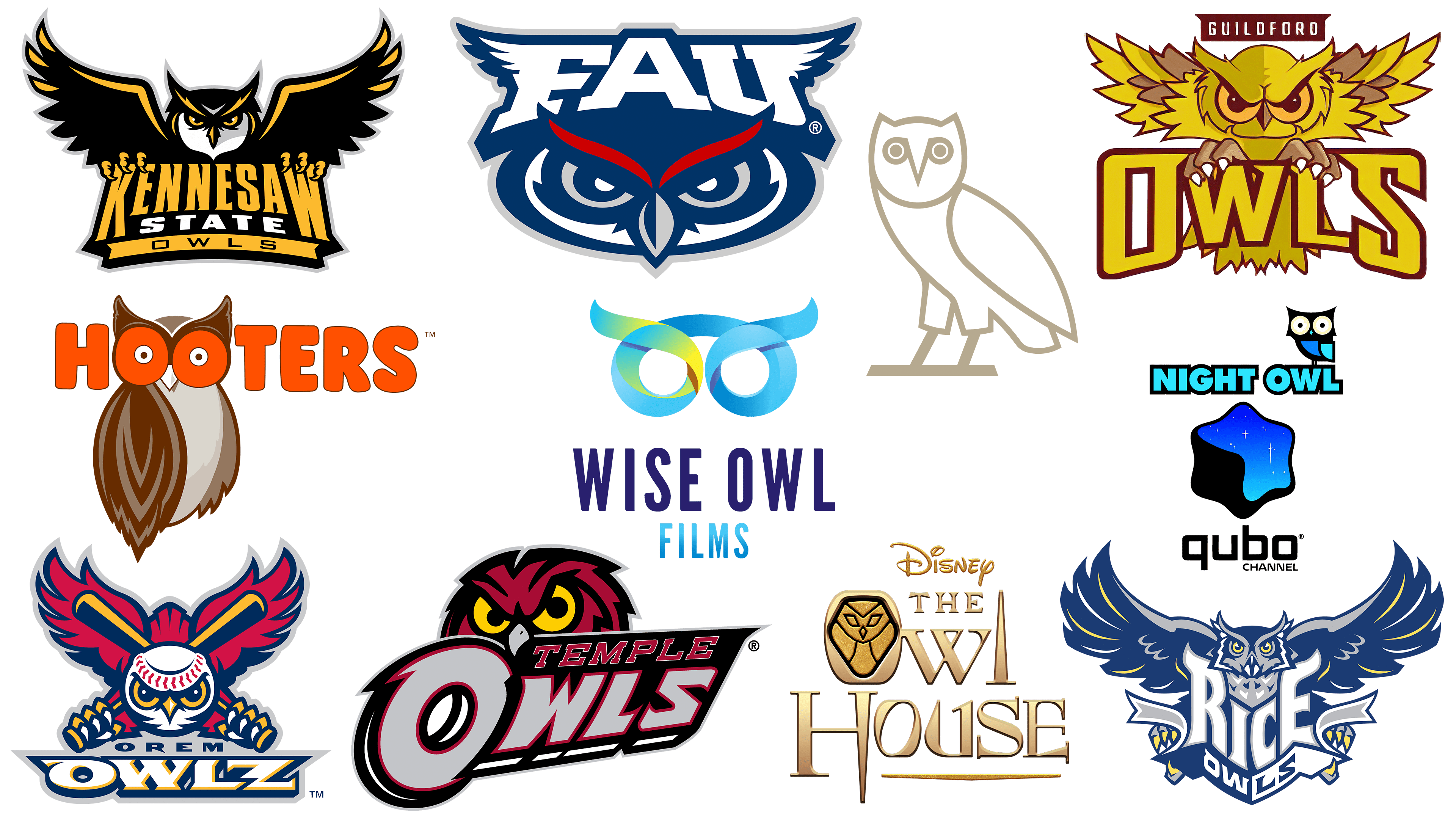
Industrial companies, financial institutions, sports clubs, TV channels, restaurant chains, and everyone can use such a talisman to strengthen their image and gain business understanding and confidence. Let’s look at some logo options with owls to see which one best contributes to the prosperity of your business. We have listed them in descending order of complexity.
The Owl House
![]()
The most multi-structured visual identity sign featuring an owl is the logo of the Disney television series. The Owl House logo consists of several elements: two names (the TV project and its creator), a pictogram, and a dividing line. They are combined in a complex composition, which looks very original, resembling a copper plate. This is facilitated by the proper selection of shades within the same color palette, ranging from coffee to golden brown. The feathered raptor adds fantasy. The forest dweller is drawn schematically and composed of rhombuses, triangles, and curvilinear trapezoids. The owl is in a vertical oval, replacing the letter “O,” and looks mysterious, as if hiding in a hollow tree. The series’ name is set in a unique font with no analogs. The letters are metallic and shiny, with serifs and shadows along the voluminous edges. Instead of the letter “l,” the image of a high stele is used. The letter “H” has an elongated right foot, from which a small stripe extends to the right, emphasizing the rest of the word. At the top is the standard Disney badge in a handwritten style.
Rice Owls
![]()
Designed for the Rice Owls Club, the logo depicts a flying owl. This image is dynamic and used appropriately, adorning the athletic department of Rice University in Texas. All 14 teams (women’s and men’s) compete under this mark. The nocturnal predator instills fear, seeking to psychologically influence the opponents. Its widespread wings make the bird large and massive, and the sharp nails on its paws make it deadly. It has large eyes, a penetrating gaze, and a sharp beak. The word “Rhys” is harmoniously placed in front: the side letters are taller than the middle letters, so they fit together perfectly. The designers added elongated elements with pointed ends to resemble plumage. This is such an interpretation of serifs. The owl holds a ribbon in its paws with the second part of the name “Owls.” This inscription is two-colored and written in wide, squat letters. The logo’s color palette consists of white, yellow, and two shades of blue.
Qubo Night Owl
![]()
The Qubo Night Owl logo debuted in 2007, when the channel launched. As of 2021, it is no longer broadcast on television due to its closure. The emblem was a multi-part composition with five elements. At the top was a miniature owl, as the program was broadcast at night, which best conveys the darkness of the time of day and those who are awake at night. The bird sat at the end of the Night Owl row and stared ahead with wide-open eyes. The inscription was in turquoise capital letters with a black border. In the center was a figurative element – the TV station’s signature emblem. There were small, pointed stars in a blue gradient denoting the sky. Below was the word “Qubo” typed in a thin geometric font with rounded corners. All the glyphs in it were almost identical: the “q” and “b” repeated each other particularly well. The owl looked like a collage assembled from several figures.
Guildford Owls
![]()
The designers created an aggressive logo for the Guildford Owls because they are a rugby team, and Australian athletes need a visual element of intimidation. It was first used in the mid-50s of the last century. The emblem turned out to be bright and powerful. The main emphasis is on the eye-catching color (yellow-burgundy), the bird’s predatory nature, its cunning, and its high attack capabilities (sharp claws and a powerful beak). The feathers are ruffled, indicating readiness for fierce defense. They look like knife blades. The tail is also fluffed and pointed downward. The owl stares menacingly forward. It clutches the letters “W” and “L” in its paws. The letters “O” and “S” are connected with them by sharp serifs in the upper part. Above the raptor’s head is a dark red rectangle with the word “Guildford” written in white uppercase glyphs.
Kennesaw State Owls
![]()
Another owl with outstretched wings took an honorable place in the symbolism of the athletic department of Kennesaw State University from the state of Georgia (USA). Moreover, the Kennesaw State Owls also have an aggressive logo. This is emphasized not only by the menacing appearance of the feathered raptor but also by the dark color of the emblem. Knife-like feathers, black and gray colors, an intimidating appearance, and realistic claws create an oppressive atmosphere. On the white face, a diamond-shaped beak stands out brightly. In its paws, the bird holds the first word from the name of sports teams – “Kennesaw.” It is typed in capital letters with enlarged “K” and “W”. The middle line is a white sans-serif label reading “State.” On the bottom line is the last part of the name, “Owls.” It is rendered with thin glyphs and has wide inter-character spacing.
Temple Owls
![]()
The designers created the Temple Owls logo, depicting the owl in a reduced form, with only the top part of the head visible. The nocturnal raptor peeks out from behind the athletic department’s name, which is owned by Temple University in Pennsylvania and includes 19 teams. The bird has ruffled feathers with dots on the tips, round yellow eyes, a large hooked beak, and black-and-gray trim. As designed by the developers, the lower torso is obscured by a two-tiered inscription on a dark background. In the upper part is the word “Temple.” It is ash-colored, cursive, printed, with serifs. The second line is occupied by the word “Owl” with a huge letter “O.” Because of the parallel lines, it appears three-dimensional, resembling an owl’s eye with a black-and-white pupil. It also has a sharp protrusion resembling a feather tip. The glyphs, like the owl, are red. They are circled along the edge with a thin white stripe for clarity. The text is arranged diagonally.
Orem Owlz
![]()
A minor league baseball team, the Orem Owlz, used an owl logo from 2001 to 2020. This team was located in the city of the same name in the American state of Utah. It chose a rich color scheme: dark blue, red, and yellow. They were well balanced by the white color. The bird of prey had a belligerent look as it held two bats in its clawed paws. They were crossed behind its back and were in line with its wings. The head of the fearsome predator resembled a baseball with huge eyes and a massive beak painted on it. Below was the name of the sports club. The first word was typed in a small sans-serif font, the second in large claw serifs. The bottom lettering was shaped like a trapezoid.
Florida Atlantic Owls
![]()
Florida Atlantic University’s athletic department, the Florida Atlantic Owls, has an abbreviated logo. Designers cropped an owl image, leaving only the head, and incorporated the abbreviation “FAU” into it. The resulting emblem is a focused bird whose gaze radiates sternness, anger, and malice. All 18 university teams use it. The eyes are made in half-discs, inverted arcs with the tips of feathers. The massive beak is a rhombus with rounded corners on the right and left. It is divided into light and dark sides, which makes it voluminous. The head of the nocturnal raptor is oval, formed of white, blue, and gray stripes of different widths. The upper part has the abbreviated name of a higher educational institution. The developers harmoniously integrated it into the owl’s forehead and ears, supplementing the letters with serifs and miniature feathers (wings). On the restrained background, two red eyebrow lines stand out brightly.
Hooters
![]()
Designers proposed an owl logo for the Hooters fast-food chain because its name and concept align. Such a play of symbolic meaning between the word and the image supports the idea of outstanding forms of the female body, as this brand emphasizes. The fact is that all waitresses working for the company are required to have a lush bust. This idea is emphasized in the visual identity through the double letter “OO,” which replaces the bird’s-eye view. Moreover, she is depicted in her entirety and sits with her full face turned towards the audience. The plumage color palette is restrained (brown, beige, gray), and the lettering is bright orange. The letters are bubbly, rounded, uppercase, and typed in a sans-serif font. The title is at the level of the owl’s head. The icon’s background is a flat white space.
Wise Owl Films
![]()
The owl logo was adopted when British Lime Pictures created a subsidiary, Wise Owl Films, and has since served as a memorable mark of individuality. The emblem is a curly ribbon stylized to resemble the eyes of a bird of prey with highly recognizable brow arches. It consists of two yellow and blue circles. At the bottom, the company name is divided into two lines. The upper phrase is dark blue; the lower lettering is blue. The letters are tall, bold, and grotesque.
OVO
![]()
This is the simplest owl style. The fashion brand OVO has chosen a minimalistic logo. It shows only a full-length bird. There are no other elements in the contour drawing. The feathered raptor stands with its head turned towards the audience. The paws are connected in one continuous line. The bird does not look aggressive.
On the contrary, its eyes read concentration, attentiveness, and interest. The eyes and beak are stylized as “OVO” from October’s Very Own. The eyes are the letter “O,” and the beak is a “V.” The main colors of the logo are gold and white.