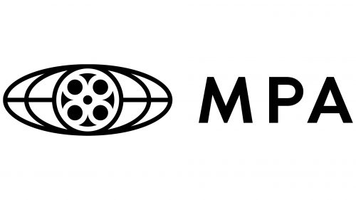
 Motion Picture Association Logo PNG
Motion Picture Association’s logo is intrinsically linked with the main attribute of film shooting – the film reel. The emblem demonstrates the growing importance and dominance of cinema worldwide. It hints at the reach of the film industry’s products across all continents.
Motion Picture Association: Brand overview
| Founded: | 1922 |
| Headquarters: | Washington, D.C., U.S. |
| Website: | motionpictures.org |
Meaning and History
The MPA’s branding can be divided into two significant periods, each with a distinct logo appearances. Initially, for 45 years, the logo was an oval, reminiscent of a medallion. The second period introduced a reel in the center of the image. This symbol has remained with the company to this day. Both the oval and circular elements emphasized the film production process. The images evoked associations with film and movie cameras. The main reason for rebranding was the organization’s name change, which occurred with each new director.
What is the Motion Picture Association?
It’s an association of major American film studios founded in 1922. Its primary mission is to protect filmmakers’ creative freedom and intellectual property, expand the film market, and introduce shooting innovations. The organization’s headquarters is located in Washington, D.C.
1922 – 1957
The first logo was a slender, upward-stretched oval, inside which the initials of the name Motion Picture Producers and Distributors of America were arranged in two tiers.
The letters M and P were written in lowercase cursive in the top row. Emphasis was placed on the term “Motion Picture” since the entire organization revolves around cinema. The lowercase and cursive highlighted the dynamic action, the process of producing and selling films, as the main business of the Association.
The leg of the “P” extends diagonally across the entire oval. It separates the uppercase letters “PD” on one side and “A” on the other.
Elegant elements hinted at the company’s youth and indicated proper manners and moral purity. During this period, Hollywood had specific behavior requirements for actors and actresses and produced films full of purity and decency.
The closed space of the oval indicated three things:
- The unification of filmmakers for mutual support and the development of common standards.
- The pursuit of monopoly and the marginalization of independent studios.
- The organization of independent film editing, as opposed to censorship committees that often cut out undesirable scenes, disrupt the film’s continuity.
Overall, the emblem appears very cluttered and tight. The letters seem intertwined and illegible. The lack of a tagline makes understanding the organization’s work direction challenging.
1945 – 1967
In 1945, a new director, Eric Johnston, joined the project. He renamed MPPDA, proposing a more compact and elegant name – Motion Picture Association of America. Consequently, the emblem changed.
The rebranding was just a slight transformation of the already existing logo. The upper M and P remained unchanged. The leg of the P divided the oval diagonally. On one side was the A from Association, and on the other part, the A from America.
The lines of the inscription became thicker to demonstrate the increasing influence and stature of the Association.
1967 – today
In 1966, Jack Valenti became the president of the association. Under his leadership in 1967, the renowned symbol of the film reel was developed, representing the organization in the subsequent years.
At the center of the new logo was a reel with film. Such spools stored the filmed materials in studios. From the reel, two ovals of unwound film extended. A horizontal line and oval shapes created a schematic representation of the globe with the equator and meridians. This imagery symbolizes the global reach of the film industry’s productions.
The reel in the logo represents movie producers, while the globe signifies distributors. The ovals indicated dual protection: a rating system and laws against piracy. Under Valenti’s presidency, instead of censorship, a rating system was implemented, helping to determine if a movie was suitable for children. The Association also actively combated piracy and illegal copying.
Below the image, a straight line of film on which the organization’s full name, Motion Picture Association of America, was written in capital letters. This caption significantly facilitated understanding of the company’s essence.
1967 – 2019
The reel and globe image has been the association’s symbol for almost 50 years. Since 1967, the image has been displayed without a caption.
2019 – today
On the contemporary logo, the emblem with the reel is complemented by the capital letters MPA, as since 1919, the organization changed its name to Motion Picture Association. The reel appears smaller and is positioned to the left, while the abbreviation is on the right, emphasizing the evolution and changes in the Association and the world of cinema. American cinema has gained substantial weight on the international stage. A merger of movies, television, and digital streaming services emerged as channels to distribute films globally. Hence, film cassettes are becoming a thing of the past.
Font and Colors
Black is the only color in the emblem. It’s associated with film reels, indicating the global reach and power of the organization’s members, active worldwide. Movies from member studios are the most sought-after in cinemas and virtually have no competitors in the US.
The logo’s inscription consists of three capital letters, rendered in a simple, straight font without serifs. This choice hints at the Association’s mission to facilitate movie production and sales.


