


The motorcycle industry is one of the leading industries in the United States. In the twentieth century, America formed a cult fascination with iron “horses” that replaced cowboys’ usual means of transportation. Despite some lag in the development of this type of production, it “started” in the first decade of the last century in the United States. American motorcycles became trendsetters, which continues today. In the United States, models adopted a modern look, which was then emulated across Europe and, today, even by leading Japanese brands. An interesting assessment can be made by studying the design of Chinese motorcycles, which largely copy the best American models from past years.
What are the US motorcycle brands?
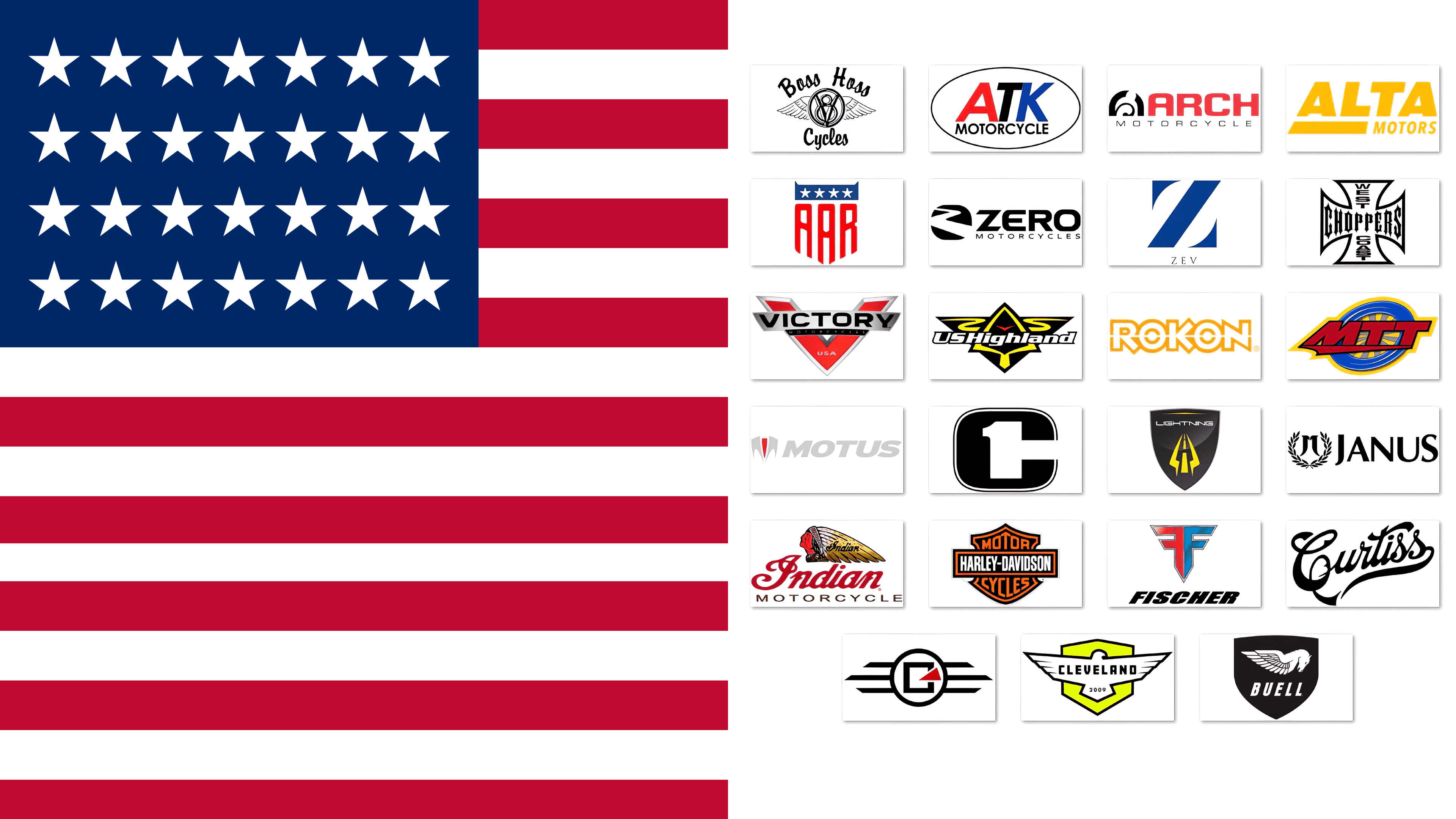
There are many motorcycle manufacturers in the USA, including Indian, Harley-Davidson, Buell, Victory, Zero, West Coast Choppers, Motus, Lightning, Alta, Rokon, Confederate, Alligator, Arch, ATK, Boss Hoss, Cleveland CycleWerks, Curtiss, Fischer, Janus, MotoCzysz, MTT, US Highland, and Z Electric Vehicles.
The peculiarity of the development of the motorcycle industry in the United States was the country’s vast territory and the massive population migration in the early XX century. Initially, this was facilitated by two leading American brands, Indian and Harley-Davidson. The first brand was founded in 1897 by former racer George Hendy. Serial production of Indians began in 1901, using an automatic intake valve, with models. Harley, the 1903 model, won the hearts of almost all car enthusiasts of different generations. However, modern production has increasingly been criticized for poor reliability, vibrations, overheating, and high prices.
Indian
![]()
One of the earliest American motorcycle brands was Indian, founded by riders George Hendy and Oscar Hedstrom in Medina, Minnesota, USA, in 1897. Like the rest of the world, its first products were bicycles. The company began mass production in 1901, when George Hendy assembled his first motorcycle. Applying ideas that had long plagued George Hendy ensured his victory in 1903. The company’s subsequent development ensured a new model was produced yearly until 1953. The company underwent years of transitions from one owner to another, culminating in its sale to Harley-Davidson, which led to its closure. But at the beginning of the XXI century, British motorcycle enthusiasts revived the brand, reselling it in 2011 to the famous Polaris Group.
Motorcycles of this brand have preserved the traditions in its emblem for a long time. It reflected the spirit and style of the brand, confirming the name itself. The silhouette of a proud and courageous Indian head in a national headdress, with the name inscription and an explanation beneath it, became the brand’s visual identity. Its image fully and accurately characterized the motorcycles as proud, masculine, and beautiful in their performance. But in light of modern trends, the only text in the logo is Indian, set in a handmade font, under which small lowercase letters are inscribed MOTORCYCLE.
Harley-Davidson
![]()
1903 was the year of William S. Harley, Arthur Davidson, Walter Davidson, and William A. Davidson’s motorcycle brand, Harley-Davidson. The company is headquartered in Milwaukee, USA. Having won the battle for the consumer in India thanks to a substantial injection of funds into the advertising campaign, the brand still holds the palm of superiority not only in the United States. Its heavy cruiser models have earned it continued fame. Today, the brand successfully sells its equipment worldwide and has opened additional production facilities in Brazil and India.
A key factor in the brand identity’s impressive strength is its name. The first emblem appeared in 1909. It has undergone many changes. Today, the brand uses several variations of the Harley-Davidson emblem across different lines of new models, including just the lettering of the main logo, the 1922 Bar and Shield. After being black-and-white, it has now adopted an orange color scheme, making those colors integral to the image elements. At the top is the inscription MOTOR, and at the bottom is CYCLES. The title is in lowercase on the center plate. The outlines of the figures and the inscription on the shield are orange, while the name is white. The color scheme reflects the spirit and essence of the brand. The orange symbolizes energy, black – elegance, and white creates contrast, making the graphics easier to perceive and remember.
Buell
![]()
The American motorcycle brand Buell Motorcycle was a fairly young company. Founded in 1983 in East Troy, Wisconsin, USA, by former Harley-Davidson engineer Eric Buell, it became the bearer of his name. The brand held its first AMA Formula 1 championship on motorcycles of its own assembly, the RW750. Then, the production of sport street motorcycles based on Harley-Davidson’s powertrain was established. In 1993, the latter bought 49% of the brand’s shares. But by 1998, Harley had become a full owner. In 2009, the Buell lineup ceased to exist.
The logo, adopted in 2009, featured the traditional silhouette of a Pegasus’s head and wings. Together with the brand name, written in lowercase letters with a rightward slant beneath the image of a horse, this graphic composition was placed on a black shield. Its rim, text, and horse were all silver-gray. The main task of the emblem was to effectively convey an important feature of the brand: movement and speed, which are characteristic of all Buell Motorcycle Company sports models. This is symbolized by the pegasus with spread wings and the name’s rightward slant. Moreover, the pegasus is a reinforcing symbol of this perception, creating the idea of double speed and acceleration.
Victory
![]()
In 1987, in Spirit Lake, Iowa, USA, the world-renowned American Polaris founded a motorcycle manufacturing company, Victory. Having extensive practical experience producing ATVs and snowmobiles, Polaris decided to turn its attention to motorcycles. To make the new direction of production recognizable, the brand received a loud name, Victory, the first example of which was the line V92C, presented to the public by Al Unser Jr., two-time champion of Indianapolis. The brand’s main focus was on touring and cruising models. On January 9, 2017, the brand was closed by an official statement from a Polaris spokesperson.
The last emblem of Victory Motorcycles was an accented letter “V”, the first word of the brand name. Executed in red, it was the center of attention. The full name was printed on the letter’s plate, in black lowercase letters, crossing the “legs” on a silver-gray background. Below, on a black stripe, the word MOTORCYCLES was written in small gray lettering. The main mark had a three-dimensional shape. Its edges were also silver-gray. At the V-shaped point, the word “USA” was written in small font. This variant was the most successful, memorable, and concise of all versions.
Zero
![]()
Neil Saiki, a NASA engineer, founded the American motorcycle brand Zero. Founded in 2006 in Santa Cruz, California, the company aimed to develop a new type of motorcycle technology: electric motorcycles powered by proprietary lithium-ion batteries. Striving to fully meet the requirements of modernity and the definition of uniqueness, the company’s developers and designers pay special attention to the originality of their products’ construction, suspension, and appearance. For their owners, they provide maximum comfort and convenience while driving. The models are designed for both driving on bad roads and high-speed driving.
The brand logo reflects the essence of the name. The logo is represented by a sign combining two symbols: Z and 0. The latter is the numerical value of the name. The original compound is inscribed in the number Z, where the upper and lower endings of the letter are the corresponding elements of the numerical value. The diagonal of the letter crosses the free space of the “zero,” simultaneously symbolizing the zigzags of the road or the image of an electric discharge. To the right of the sign is the name inscription in black lowercase large font, below which the word MOTORCYCLES is typed in smaller font. The text is aligned with the sign’s height.
West Coast Choppers
![]()
Jesse James founded West Coast Choppers (WCC) in Paramount, California, USA, in 1992-93. Daytec and Belt Drive LTD manufactured all important motorcycle components. The main “dignity” of the products was the original biker-style design and the emblem, which, in its visualization, goes back to the totems known as the Iron or Maltese Crosses. The unique, exclusive choppers and iconic emblem apparel formed the basis of a small-scale production run that today numbers only about 200 custom bikes owned by many celebrities.
Its logo reflects its spiritual commitment to the “crusading history” of orders and awards, embodying the strength and courage of its holders. The brand has made individual improvements by fully repeating the silhouette of the Iron Cross in its logo, a characteristic of the Knights of Malta’s emblem. The inscription- WEST COAST- is from top to bottom, across the entire interior of the cross. The third word of the brand name, CHOPPER, is in Gothic script from left to right. The outline of the cross and the text are black.
Motus
![]()
Innovation Depot programs launched Motus Motorcycles to build motorcycles. Founders Lee Connom and Confederate Motorcycles designer Brian Case unveiled their first sport touring motorcycle in March 2012. In 2013, the MST-R was named the best dream motorcycle in Motorcyclist magazine’s 2012 Motorcycle of the Year issue. However, after five years, the sponsors funding the production deemed it unprofitable and stopped funding it. In 2018, the brand ceased to exist.
The Motus Motorcycles emblem was a modern version of the design, including a badge that echoed the contours of the sportbike’s front fairing. The left and right fenders, and the name text to the right of the Motus badge, are light gray, symbolically related to the metallic color on the original motorcycles. The accent was red on the central part of the fairing. The right slant of the lowercase font of the name created a visual sense of speed.
Lightning
![]()
Lightning Motorcycle Corp.’s lithium battery electric technology is gaining more fans worldwide. The company was founded in 2006 by former Porsche racer Richard Hatfield in San Carlos, California. Two years later, an electric model was developed for public services, police, rescue workers, border guards, and armed forces.
The brand’s emblem is a figure resembling the shape of a modern motorcycle’s shield or fairing. Executed in a gray-black gradient with a gray border, the emblem features a central accent group depicting road markings receding into the distance, framed on both sides by symbolic lightning images. Executed in yellow, they effectively attract attention. Above the composition is a white-and-gray inscription of the brand name. Above them, creating visual completeness for the whole composition, there is a stylized yellow turn indicator that repeats the shape of the shield’s upper contour.
Alta
![]()
Alta Motors, an idea from Silicon Valley, became the basis of a small business producing electric motorcycles. In the two years since its founding, the brand has attracted the attention of even Tesla’s co-founders, raising $17 million from various investors. Mark Feinstein created it. The main production know-how was the batteries used in its design. All electronic components for cars and battery cases were produced at the plant in Brisbane, and the rest of the company’s products were purchased from other manufacturers. However, the end of 2018 proved difficult, and the brand announced the suspension of production.
Two models of the brand, Redshift SM and Redshift MX, featured a bright, memorable yellow emblem that was laconic and simple. It was the text of the company’s name, a graphic design that ensured the product’s recognizability. All the letters of the name are lowercase with a slant to the right, symbolizing movement and speed. Below the first two letters, Alta was a wide strip with a beveled left edge that continued the letter “A.” Along the right edge of the band, a second word, Motors, was written in smaller type, ending on the right border of the first word.
Rokon
![]()
Rokon is an American motorcycle manufacturer based in Rochester, New Hampshire, United States, with a history dating back to 1958. Its founder, Orla Larsen of Vermont, organized a business to manufacture and sell two-wheeled motorcycles, the brainchild of Charlie Phenom. In 1964, he moved to New Hampshire to expand production of the then-acquired Trail-Breaker motorcycle. Today, the brand is known for manufacturing four-wheel-drive two-wheel ATVs.
The latest evolution of the company’s visual style has provided a new logo that is simple and concise in keeping with current trends. The brand name was chosen as the logo, and the font was designed as the main element in visualizing the brand’s features. First, this was facilitated by the symmetry of the letters, which is favorably emphasized by the white stripe running right in the center of the text. To ensure visual memorability, all letters were highlighted in orange. However, symmetry was the most important element in the formation of an individual style. Two letters, “O,” like two wheels, carry the main visual load, “dragging” the whole composition behind them.
Confederate
![]()
Being a lawyer, Matthew Chambers had a passionate love for motorcycles. The passion overcame a private practice, which he sold to pursue his dream, and he founded Confederate in 1991 in Baton Rouge, Louisiana. In 1993, the company moved to New Orleans, Louisiana, and the manufacturing facility was in Birmingham. Production was based on customizing unique designs and delivering outstanding examples directly to the customer. Today, such exclusive cars are owned by Tom Cruise, David Beckham, Brad Pitt, John Travolta, Nicolas Cage, and King Abdullah II of Jordan. In 2007, the company was rebranded as Curtiss Motorcycles. On March 29, 2018, Combat Motors LLC acquired the rights to the brand and design.
The company designed a corresponding logo that aligned with the task and used a modern, techno style. The modern and original logo design effectively reflects the characteristics of the brand’s products. The logo is a text graphic composed of the company name. The word “Confederate,” in capital letters in a techno style, conveys visual information about the design features of the brand’s motorcycles. Its slant to the right is a common way to visually convey motion and speed. The connection of the letters symbolizes the close relationship between the manufacturer and the customer from the moment the order is placed to its delivery to the owner. The underline emphasizes the first word, and the straight lowercase lettering of the word MOTORCYCLES below the line makes the essence of the logo easier to understand, thereby creating the necessary visual impression.
Alligator
![]()
Dan Gurney, the only rider to win multiple racing championships, created a unique vehicle, the Gurney Alligator. What set it apart from all motorcycles past and present was its unique design and fit. Created in a Santa Ana, California workshop, the unique exterior design was reminiscent of Gottlieb Daimler’s 1886 prototype. During development, the 1976 base model underwent a design evolution, being named the A-1 model, which Gurney completed in 1980 and called the “Grandpa Alligator.” The motorcycle’s elongated body, low, squat stance, and desire to pay homage to North American nature contributed to this evolution. In 2002, the brand announced plans for a new model called Instigator, whose production had not yet begun.
In addition to its unique appearance, the Alligator was distinguished by its emblem: a shield with black inside. In the upper part of the shield, there was a blue stripe, the color of the U.S. flag, with five white stars. Under it, repeating the contours of the shield, imitating the red stripes of the national flag, there are three letters – AAR. Modern copies of the Alligator use an updated text emblem on the fuel tanks, in the form of an inscription at the top: “Dan Gurney” (the developer’s name). Below is the company inscription in handwritten script and a copy of the manufacturer’s inscription. Thus, the new emblem was a tribute to the brand’s engineering genius and history.
Arch
![]()
Arch Motorcycle Company, LLC is one of the unique American motorcycle companies in the United States (Hawthorne, California). Its founders are Gard Hollinger, an auto-motorcycle shop owner, and Hollywood star Keanu Reeves. The meeting of two geniuses in different fields took place in 2007. It wasn’t until 2011 that the idea of creating its motorcycle brand, Arch Motorcycle Company, LLC, bore fruit. Infecting Hollinger with the idea of creating his vision of a two-wheeled Porsche 911, Reeves offered funding. The Arch actor was inspired by his own Harley to create a prototype, which led to the release of the first KRGT-1 in 2014. In 2017, 3 more models were added.
Today, this new “techno-film” brand is easily recognizable by its emblem, represented by the brand name and a graphic icon. The latter is represented as a silhouette of a racer leaning to the side while turning, against a gray arch and a highlighted stylized Kickstarter image. To the right of the sign, the brand name Arch is printed in white lowercase letters on a wide red plate, the left edge of which mirrors the sign’s curves. The plate’s height matches the sign’s height. Along its full length, underneath, is the phrase “Motorcycle Company,” the second part of the company name.
ATK
![]()
In 1980, ATK began operations in the United States. It was founded by Grand Prix gold medalist Horst Leitner, who moved from Austria to the U.S. that year. After receiving his first order and funding from the Austrian company Puch in 1985, Leitner named the company after the device he patented that year, the ATK, and began production of his first motorcycle. After he left, the dealer network bought back 1987 Can-Am models, which provided ATK with direct orders and financing throughout North America. In the early 2000s, the company added ATK production and expanded by buying smaller bankrupt companies and merging with a Korean manufacturer.
After its first release, ATK motorcycles, characterized by high reliability, safety, and distinctive design, became known for an emblem recognizable to all. Simple and concise, meeting modern requirements, the emblem was an oval in the free space in which the brand’s name was inscribed in lowercase letters with the traditional right slope. To increase recognition and ease of recall, each letter was assigned a color: red, white, or dark purple. At the same time, across different logo variants, both the white letter T and its black analog appear.
Boss Hoss
![]()
Among American motorcycle manufacturers, Boss Hoss from Dyersburg, Tennessee (USA), was distinguished by models with multi-cylinder and multi-diesel engines. The motorcycles were characterized by their large size and visual sense of power and strength. The creator of Monte Varna created his first model in 1990 by installing a Muscle car’s engine into the frame of a motorcycle. After the appropriate treatment, the technique was recognized by motorcycle enthusiasts; currently, thanks to Boss Hoss, there are 20 model lines of such monsters and tricycles. The brand’s products are exclusive.
The brand’s recognizability is not only due to the unique shape of its motorcycles. Thanks to the brevity and simplicity of execution, the modern emblem makes it easy to remember and recognize any manufacturer series. The small rectangular nameplate, mounted on the motorcycle’s body, bears only the company’s name in a traditional lowercase, gradient-steel-gray font. The letters rest on a stylized plinth bearing the inscription “Motorcycles” in small font. The emblem creates an impression of massiveness and reliability, which are characteristic of all motorcycle brand products.
Cleveland CycleWerks
![]()
Cleveland CycleWerks is a privately owned small motorcycle company that designs and manufactures motorcycles in Cleveland, Ohio. Its production collection features café racers, bobbers, and retro-style motorcycles. Founded by Scott Colosimo, Jarrod Strang, and Curtis Ray in 2009, the company faced the challenge of finding local manufacturers of needed parts at affordable prices only after contracting with manufacturers in China. Inexpensive, easy to repair, customize, and maintain, the stylish motorcycles of this brand have become a favorite among non-professionals.
The company’s logo is a certain adherence to the emblems of classic European brands. This is confirmed by the image of a shield in the background with a black-and-white outline and “lemon” filling the interior space, and a stylized image of the silhouette of an eagle with outstretched wings in front of the shield. Such elements symbolize the assurance of equipment protection and safety, as well as the opportunity to experience a sense of flight with quality equipment from a proud brand. The inside of the eagle is in white or black and filled with the brand name. The date of the brand’s foundation, 2009, is placed in the tail area. The name is in lowercase letters, such as Amboy Black by Parkinson.
Curtiss
![]()
Curtiss Motorcycles is the new name of the established luxury motorcycle brand Confederate. A shift in focus to producing exotic electric street bikes was the reason for the brand’s renaming, which Matt Chambers, founder, announced in 2017. Together with Zero Motorcycles, the revitalized Curtiss Motorcycles, now under a new name, planned to start production of the Hercules model at the company’s production facilities. The new name is a tribute to pilot and motorcyclist Glenn Curtiss.
The company’s new logo consists only of the graphically rendered text of the company name. Font Diner’s Automatic lowercase font was chosen as the basis. Its graphics best reflect the spirit and principles of the company’s new strategy and corporate style. All letters have acquired the smooth, round, wheel-like characteristics. The last two rounded letters, “CC,” harmonized with the first “C,” creating visual unity in the composition. Their diagonals recall the original design of the brand’s motorcycle wheels, adding a modern “techno” effect.
Fischer
![]()
The most significant new American motorcycle of 2006, the MRX 650, named by Motorcyclist magazine, was produced by Fischer Motor Company. The sportbike company was the basis for his designs, founded in Maryland by Daniel Fischer, a famous motorcycle racer of the 1990s. He created a subsidiary design company, EADS (Airbus), and invited Harley-Davidson and Michael Jordan Motorsports to be contractors. Components were ordered from American factories. Fisher’s working concept was to adjust and refine existing designs. In 2012, the strategy was revised, and production was halted.
The brand designed its logo to reflect the company’s and its founder’s names. The mark in the form of two letters, “F,” facing “back” to each other, created a visual perception of the shape of the motorcycle fairing. Executed in two corporate colors, blue and red, they have evenly executed bevels on their edges to the center, forming a sharp lower corner and providing the necessary perception of the composition as a fairing. Depending on its placement, the emblem could have a yellow line in the background and the brand name in black, slanted lowercase, underneath.
Janus
![]()
In 2012, a new motorcycle manufacturer debuted in Indiana, United States, combining modern technology with the style of the 1920s. The Janus Motorcycles brand introduced the Halcyon 50 moped, with serial production beginning in 2013. The founders of the company, Devin Biek and Richard Worsham, who are fans of vintage motorcycles, decided to create a unique symbiosis of the past and present. Devin Biek owns a tuning company, which allowed him to apply his expertise in a new direction. The neoclassical variant proved promising. It interested not only collectors but also retro lovers.
The company’s emblem is a sign in the form of two letters, “J,” the first letter of the name, facing each other. They create a visual shape in the form of the letter “M” – a symbol of the type of equipment produced. This group is framed by a laurel wreath, symbolizing the strategy’s greatness and the realized idea’s victoriousness. To the right of the sign, the text of the name is made in a large font, under which the inscription of the word Motorcycles of smaller size, located above the line separating it from the even smaller inscription GOSHEN INDIANA. The entire symbolism is in a single monochrome color scheme. Depending on the logo’s placement, its composition can be black or white.
MotoCzysz
![]()
In 2009, professional American motorcycle racer and engineer Michael Czysz founded a zero-emission racing car company based in Portland, Oregon, which took the founder’s name, MotoCzysz. That same year, it teamed up with Bajaj Auto to create eco-friendly motorcycles, presumably hybrids. Joining Remy Electric Motors LLC allowed it to design and build electric drives for ATVs. In 2013, an electric TT Zero Race motorcycle driven by Michael Rutter won the TT race.
Like the machinery, its emblem is characterized by originality and impeccable design. The rounded rectangle in black and white has a black finish. In its inner part, the number 1 is painted in white, a tribute to the C1 engine prototype and the first electric motorcycle, the E1pc. At the same time, the figure signifies both the leaders who developed this technology and the demonstration of continued success. From the figure to the right, breaking the rectangle stretches a white stripe. This is a symbol of the removal of restrictions and the existence of a direct path to achieving the goal, bypassing the dead end of using harmful environmental technologies.
MTT
![]()
Marine Turbine Technologies (MTT) is an American company that made history in the domestic bridge-building industry by developing a unique motorcycle model, the Y2K Turbine Superbike. The Franklin, LA-based company develops turbines for marine and river vessels and fire suppression systems. The brand created a motorcycle equipped with a gas turbine engine based on their developments. The technique has not been put into serial production and is assembled to order by hand for a specific application. Models with turbojet and turboshaft engines are presented. An important feature of such engines is their ability to operate on different fuel types, including aviation, kerosene, gasoline, diesel, and biofuel.
The brand has chosen a combined variant for its emblem, a partial embodiment of both the main production and the new branch. The emblem is an abbreviation of the name MTT, typed in lowercase letters with a slight rightward slant, in bright scarlet. It is made on the background of a wheel, the core of which can be perceived in the form of spokes and turbine blades. The entire badge is bright yellow, while the wheel cover is gradient blue. The wheel’s shape demonstrates the momentum of traveling at high speed, as evidenced by the change in its circumference into a right-sloping oval.
US Highland
![]()
Oklahoma is the birthplace of US Highland, an American motorcycle brand. Its founder, Mats Malmberg, died in 2010 in a plane crash along with two other executives. After that, the company was reorganized into a holding company under UHLN (OTCBB) (US Highlands Inc). The brand’s main products were motorcycles built to individual customer specifications. The products were prefabricated modular units. It was planned to create a dealer network and produce electric motorcycles, with the engine to be installed in the front wheel’s hub.
For its emblem, the brand chose an original design of the sign as an inverted shield inscribed within an inverted equilateral triangle. For the basis, only the contours of the figures connected at the intersection were used, and they were rendered in white. The inner space of the resulting single figure is made in black. In the central part, repeating the shield shape, yellow contours were created, creating a visual impression of a motorcycle fairing, with a stylized red arrow at its center. To the right and left of the sign, a yellow ribbon symbolizing the road’s zigzag was symmetrically depicted. The brand name, US Highland, is almost centered in the white foreground.
Z Electric Vehicles
![]()
One of the leading manufacturers of “green” vehicles is Z Electric Vehicle Corporation (ZEV) from Morgantown, West Virginia. Its electric scooters are assembled in the United States and China. Production facilities are located in the United States, Australia, and Vietnam. Today, ZEV scooters stand out as the fastest and most powerful among commercially produced small-class electric vehicles. A large range of travel distinguishes them. Founded in 2006 by Darus Zerbach Jr., the brand has 19 model lines of electric scooters and has prepared a line of sporty electric motorcycles MS.
The company logo demonstrates the effective application of modern technologies, creativity, and a deep understanding of current features. The logo is simple and laconic. Its accent element is the abbreviation ZEV, set in lowercase with strict spacing between letters, which enhances visual perception, readability, and memorability. The clarity of each letter, executed in the same color, allows for a good perception of the motorcycle’s surface on printed materials or digital media. To the right of the header, the text emphasizes an important feature of scooters: ELECTRIC. The small font, aligned at a lower level with the main font, does not interfere with the perception of the logo as a single, harmoniously created composition.
FAQ
What is the largest motorcycle company in the US?
Harley-Davidson, Inc., is the largest motorcycle manufacturer in the United States. Founded in 1903 and headquartered in Milwaukee, Wisconsin, the brand offers a diverse line of motorcycles, including sports cruisers and bikes. The company posted revenue of $5.76 billion in 2022, demonstrating its important role in the American motorcycle market. Harley-Davidson, known by its stock symbol NYSE: HOG, has a long-standing reputation for producing high-quality, well-engineered motorcycles that appeal to riders in the United States and worldwide.
What motorbikes are made in the USA?
Many motorcycle brands manufacture their motorcycles in the United States. Among the most famous are Harley-Davidson and Indian Motorcycles. Harley-Davidson has a long history and broad appeal, while India combines traditional design with modern technology.
Other well-known manufacturers include Kawasaki and Yamaha. Although these brands originated in Japan, they assemble some models in the United States to better serve the American market.
The US is home to several innovative companies specializing in advanced technologies. Arcimoto and ARCH Motorcycles, co-founded by actor Keanu Reeves, are making waves in the industry. Boss Hoss impresses with its powerful V8 engines, while Curtiss Motorcycles, Lightning Motorcycles, and Zero Motorcycles lead the way in the electric bike segment.
What is the most popular motorcycle brand in America?
In 2021, Harley-Davidson was the most popular motorcycle brand in the United States, with the largest market share. The brand is a staple of American motorcycle culture, known for its unique designs and rich history.
Honda, a respected Japanese brand, is the second most popular in the United States and is famous for its reliable motorcycles and diverse models. Yamaha, also from Japan, is third and renowned for its high-performance and innovative motorcycles. Kawasaki takes fourth place with its sports bikes and reliable engines.
Which bikes are mostly used in the USA?
In the United States, Harley-Davidson is the favorite motorcycle brand among riders. Based in Milwaukee, this iconic brand is known for its unique style and deep heritage, making it an icon of American motorcycle culture. The motorcycles are popular for their classic designs and powerful performance, appealing to the adventurous spirit of American riders.
How many motorcycle manufacturers are in the US?
The United States has dozens of motorcycle manufacturers, from large companies to small custom shops. Brands like Harley-Davidson and Indian Motorcycles are well known for their high-quality, popular motorcycles that have received international recognition. In addition to these big players, many smaller shops specialize in custom motorcycles. These workshops cater to customers by creating unique bikes tailored to individual styles and preferences.