The Mutual of Omaha logo epitomizes a strong and energetic company. The emblem demonstrates the ability to survive and lead in its industry. The logo promises protection and sound investments for its clients.
Mutual of Omaha: Brand overview
Mutual of Omaha is an insurance company with a net income of $277 million. It provides life insurance, Medicare, and long-term care annuities throughout the United States.
Meaning and History
The company was founded in 1909, but it adopted the name Mutual of Omaha in 1950. Since then, the company’s name and logo design have remained the same, with minor changes to the color and details of the logo. The visual identity is deeply tied to the history of the region. Because the contributors established the company as a mutual ownership enterprise, the emblem symbolizes the mutual support of the residents. It reflects a love for their homeland and a desire for its prosperity and wealth.
What is Mutual of Omaha?
It is an American personal and corporate insurance company that has been in business for over 115 years. It is ranked fifth in the United States in its field. According to Standard & Poor’s credit ratings, the company is rated AA-, which emphasizes its stability and ability to meet its obligations. The organization has more than 6,000 employees.
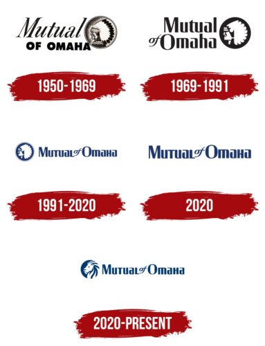
1950 – 1969
In 1948, the Mutual Benefit Health and Accident Association was licensed to sell insurance policies in 48 states. They then changed their name and emblem, switching to life insurance.
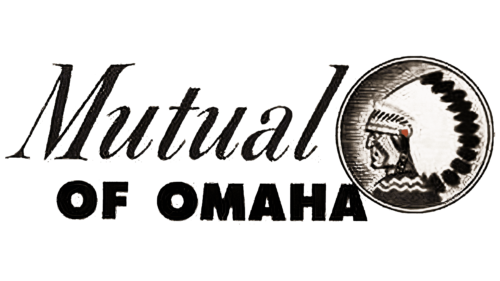
On the new emblem, the name was typed in a two-tiered font. The word “Mutual” is written in cursive, leaning forward, signifying the bond between depositors and the idea of mutual support, growth, and development. It represents the pooling of financial resources to create a collective firm.
The inscription “of Omaha” is written in bold, printed formal type highlighting the geographic name. It symbolizes the unification of the people of Omaha, which has spread across the country.
Behind the text, a Native American chief’s head is depicted in a coin-like circle, emphasizing the company’s roots. In this way, the company expressed its love for its homeland, its adherence to local laws, and its concern for the prosperity of its people.
The portrait is meticulously detailed, depicting the face, feather headdress, and clothing of a Native American. This image echoes the seal of the city of Omaha, which depicts an agreement between pioneers and Native people.
1969 – 1991
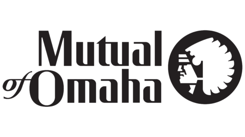
For the company’s 60th anniversary, its visual symbol underwent a revision. A single typeface was adopted for the name, consisting of smooth and perfectly formed letters with some refined elements. The text represents the thoughtfulness of insurance plans, confidence in the future, and the flexibility of the client to comfortably accumulate savings.
The Native American head is positioned on a black circular background, becoming more schematic. The design emphasizes that the company operates in America and for America and its people.
1991 – 2020
The 1991 update embodied the idea of progress and change over time. The image of a native was placed on the right side of the logo to emphasize Mutual of Omaha’s origins. The name of the company was written on the right side, with both words in a row, giving the impression of a composition looking toward the future.
The black hue of the logo was replaced with blue. This color evokes trust and emphasizes professionalism. It echoes the color of the flag of the city of Omaha, where the headquarters of the insurer is located. Blue is also associated with the fact that the company sponsors a swim team.
2020
In 2020, the company announced that it would no longer use Native American imagery in its visual identity. This decision was made as part of a nationwide movement for racial justice.
Companies, sports teams, and other national organizations were asked to stop using Native American symbols. Such imagery is inconsistent with the history of the extermination of Native American peoples. Some mascots are offensive to indigenous people. Their replication by organizations created by or working with non-indigenous people makes no sense.
Shortly after the announcement, the emblem was changed: the round coin was removed, and only the name was left.
2020 – today
A few months after the announcement, the company unveiled a new logo. Based on the previous design, instead of an indigenous figure, a lion’s head was placed in a circle.
This animal, with its majestic mane, represents courage, strength, and confidence. This king of beasts emphasizes active resistance to market challenges and promises victory over competitors.
The choice of animal was meant to emphasize the long-standing sponsorship of Mutual of Omaha’s Wild Kingdom wildlife show.
Saying goodbye to images of the past and introducing strong and vibrant symbols emphasizes that being a client of the company is prestigious and modern.
Font and Colors
The blue color of the emblem symbolizes the professional qualities of the employees and the reliability of the company. This shade is associated with calmness, poise, compliance with the law, and years of experience.
Smooth, confident font lines with open glyphs in the letter “A” depict the company as reliable but ready for change. The italicized word “OF” emphasizes flexibility, the ability to assess market conditions, and evolve to maintain a leadership position.
Mutual of Omaha color codes
| Dark Midnight Blue | Hex color: | #003970 |
|---|---|---|
| RGB: | 0 57 112 | |
| CMYK: | 100 49 0 56 | |
| Pantone: | PMS 654 C |
