


![]() Nando’s Logo PNG
Nando’s Logo PNG
The designers made the rooster logo for Nando’s because it forms the basis of the restaurant’s menu. The symbol, called Barcelos, has been part of the South African fast-food chain’s identity since the beginning. A large heart is drawn at the bird’s center, symbolizing great love for delicious chicken dishes. The emblem’s color palette is radical yet classic: red and black on a white background.
Nando’s is an international restaurant chain based in South Africa. It appeared in Johannesburg in 1987. Its creators are Fernando Duarte and Robert Brozin. The restaurant’s signature dish is grilled chicken seasoned with malagueta pepper. The symbol of fast food is the Barcelos rooster, a common mascot from Portugal. It is directly related to this restaurant because it serves Portuguese-Mozambican cuisine. Today, the total number of outlets exceeds 1200 across 30 countries worldwide.
The successful career of Nando’s Restaurant naturally began with a love of good food. One day, Mozambican Fernando Duarte and South African Robert Brozin visited Chickenland, where they tried chicken with a special variety of hot peppers. They liked the dish so much that they chipped in and bought the establishment together, turning it into a local restaurant. Beginning business people quickly found a name for it: they named it after their son, Fernando. Two years later, they already had a real network: three outlets in South Africa and one in Portugal.
Nando’s, a fast-food chain known for its spicy grilled chicken, has become a favorite worldwide thanks to its Peri-Peri flavor. This journey started with a simple idea in Johannesburg, South Africa, in 1987. Robert Brozin and Fernando Duarte found something special in the Peri-Peri sauce and opened the first Nando’s restaurant, named after Fernando. They wanted to share their love for this spicy chicken with everyone.
From 1988 to 1992, Nando’s quickly became popular in South Africa because of its unique Peri-Peri sauce. This sauce, made from African Bird’s Eye chili, was a hit, and Nando’s started to grow.
In the early 1990s, Nando’s expanded beyond South Africa, opening restaurants in Botswana, Swaziland, Namibia, Zimbabwe, and Mozambique. By 1994, it had reached the UK and spread to Europe, Asia, Australia, and North America. Nando’s was no longer just a restaurant; it became a place where people, especially young ones, enjoyed gathering. Its marketing was funny and clever, making the brand even more likable.
Nando’s has focused on sustainability and responsibility. They use free-range chicken and support the communities where they operate, which shows they care about making good food.
Today, Nando’s has over 1,200 restaurants in 35 countries. It’s known for its entrepreneurial spirit, cultural impact, and adaptability to local markets. The Peri-Peri sauce is still a big reason for Nando’s success, along with its fun marketing and friendly restaurant atmosphere.
Meaning and History
![]()
In 1992, they sold the business to Capricorn Ventures International. She seriously adopted the fast-food restaurant emblem and began to develop her identity. Until then, friends paid little attention to her, so there were almost no traces of her presence. The new owner kept the old name and used it on corporate signs. By 2022, three variants of the same logo appeared.
What is Nando’s?
Nando’s is a world-famous African chain restaurant specializing in grilled chicken with hot-pepper seasoning. It has existed since 1987 and operates in 30 countries with over 1,200 catering outlets. Its founders are two friends, Fernando Duarte and Robert Brozin. In 1992, the fledgling chain was taken over by Capricorn Ventures International.
1987 – 1991
The diner did not yet have a permanent logo at the beginning of the work. The sign was finally decided upon when the already established company was passed to another owner. And until then, Nando’s logo was not widely known because the founders paid more attention to the menu than the identity.
1991 – 1998
![]()
After the sale of the restaurant chain, the marketing strategy and advertising intensified. The logo became permanent and adorned all of Nando’s establishments. It was a Portuguese symbol, the Barcelos rooster, depicted in red and black colors. The bird was drawn in a cartoon style with a comb-like tail (they were identical). In the center of the body was a small heart. The feet were black and massive, divided in two by a thin red stripe. The title was at the bottom and in italics, imitating rounded handwriting. But the letters in the inscription were not connected.
1998 – 2016
![]()
Designers diversified the rooster. They gave the body the shape of a heart, reduced the white elements on the head, widened and rounded the beak, removed the vertical line from the legs, and painted white dots on the tail. The artists left the black outline. In addition, the name was extended to include green leaves on the sides.
2016 – today
![]()
Now, Nando’s logo is similar to the previous one but has a fresh aesthetic. Compared to the previous version, it is more accurate: clear lines, precise shapes, and no unnecessary details. For example, the green-branched elements of the wreath have disappeared, as has the black border around the white dots on the bird’s tail. But the name now plays a paramount role: it is enlarged to the maximum so that its proportions are no inferior to those of the stylized rooster.
Font and Colors
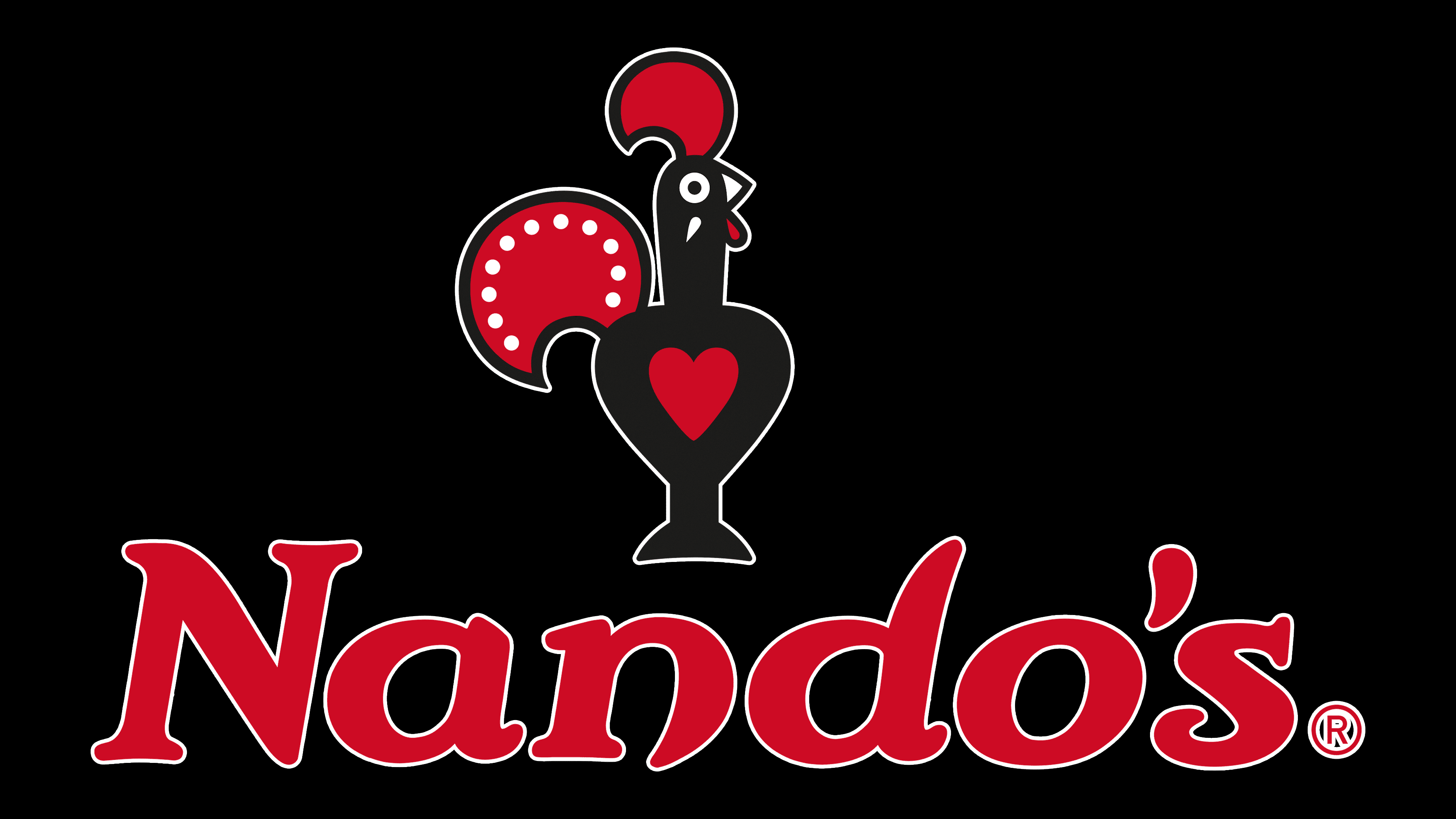
Nando’s visual identity is based on the Portuguese cockerel mascot. His nickname is Barcelos. It looks like a folk ceramic toy and is perfect for a South African chain restaurant’s concept. The bird’s central part is a red heart, symbolizing a love of food. The red color also represents the hot malagueta pepper used to cook grilled chicken. It is perfectly conveyed in the drop-shaped apostrophe from the brand name.

The designers opted for an italic style, using a typeface that mimics individual handwriting while keeping letters separate. This font resembles traditional South African signs and is called Nando’s Hand. It was sourced from DIN Next and designed with artist Mark Salimu. The logo’s corporate color is red, called PERi Red Pantone.
FAQ
What does the Nandos logo mean?
The Nando’s logo, featuring the Rooster of Barcelos, is a simple emblem; it’s a nod to Portuguese culture and a tale of hope and redemption. This story starts with a Galician pilgrim in Barcelos, Portugal, who was falsely accused of theft and sentenced to death. He claimed a roasted rooster would crow at his hanging to prove his innocence. Astonishingly, the rooster did crow, saving his life and becoming a symbol of faith, justice, and good fortune.
For Nando’s, this rooster connects the brand to its Portuguese-inspired Peri-Peri flavors and stands for the company’s values of authenticity, joy, and spreading flavor worldwide. Adopting this symbol, Nando’s weaves a narrative of hope and resilience into its identity, mirroring its growth from a small restaurant in South Africa to a global name.
What bird is on the Nandos logo?
The Nando’s logo features a cockerel named Barci, a key part of the brand’s image and deeply connected to Portuguese culture. The logo’s cockerel comes from the story of the Rooster of Barcelos, a Portuguese symbol of faith, justice, and good fortune.
Barci has been with Nando’s from the start, changing looks over time but keeping its important meaning. This shows how Nando’s has grown and updated its image while staying true to its heritage. Choosing a cockerel for the logo highlights Nando’s Portuguese roots and famous Peri-Peri flavors. Barci reminds us of Nando’s growth from a small company to an internationally known name, proving that adapting to change and aging is part of staying strong and true to core values.
What font is the Nandos logo?
The Nando’s logo stands out for its distinctive font, “Nando’s Hand.” This font is key to the restaurant’s look and feel, giving off warm, authentic, and friendly vibes. By choosing a handwritten-style font, Nando’s shows its dedication to creating a cozy, personal dining experience, setting it apart from other places that use more common fonts.
Seeing this font on posters, menus, or any Nando’s material instantly tells you it’s about the famous Peri-Peri chicken with its unique flavors from Portugal and Africa. This font is a big part of why people recognize and remember Nando’s. It quietly shares Nando’s values and stories, helping customers feel a deeper connection to what the brand stands for.
What does Nandos logo represent?
Nando’s logo represents the brand’s heart and soul, mixing its cooking style with a strong emotional bond to its origins. The logo has two main parts: a flame and a heart. The flame stands for Nando’s expertise in flame-grilling, which is key to making its famous Peri-Peri chicken. It shows its commitment to serving fresh, high-quality food cooked perfectly over a flame, emphasizing the skill and passion behind each dish.
The heart pays homage to Barci, the name affectionately given to the cockerel that symbolizes Nando’s. This heart shows the love and passion at the core of Nando’s, highlighting their dedication to customers, community, and cultural roots. The flame and heart tell the story of a brand committed to excellence in cooking and creating meaningful connections.