 National Breast Cancer Foundation PNG
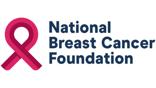
The National Breast Cancer Foundation logo represents two opposite positions on the same scale. They are pain and compassion. The comprehensive support, the heartfelt sincerity, and the practical benefit are what the logo says, and it knows everywhere in the world.
National Breast Cancer Foundation: Brand overview
| Founded: | 1991 |
| Founder: | Janelle Hail |
| Headquarters: | United States |
| Website: | nationalbreastcancer.org |
Meaning and History
The visual recognition of the organization’s logo is at a high level among scientists and people who have encountered this disease. For all the time, two versions of the logo were presented, which differed minimally from each other. Now they are actively used in attracting investors and stimulating further research in this area.
What is National Breast Cancer Foundation?
This is one of the most famous charitable organizations that has been engaged in research aimed at combating cancer for almost 30 years.
1994 – 2018
The first version of the logo was presented immediately after founding the fund. It consisted of a three-level word inscription, as well as an emblem, which was located on the left.
A pink ribbon is used as an emblem. She is considered a symbol of women’s health, and therefore, just looking at her, many people associate her with breast diseases.
If we talk about the word inscription, then on the first line is the word “National.” It is somewhat smaller than the rest of the words. On the second line, it says “Breast Cancer,” and on the third, “Foundation.” All words are in the same font. This is a classic bold sans-serif typeface. The style of writing letters is traditional, and therefore we can say that minimalistic and concise details are noticeable at the heart of the logo.
The dark gray color of the name of the organization and the bright pink color of the emblem successfully contrast with each other, making the logo more visible.
2018 – today
The only redesign made the foundation’s logo more modern and progressive. The word inscription was also made in three lines, but the font was changed to a more elegant one using serifs. Moreover, all lines were now the same size, which directly indicated that they were all elements of a common name. Now only the initial letters were capitalized, and all the rest were made in lower case.
The emblem also became more prominent. It uses a pink gradient. Moreover, it has now become more voluminous and noticeable. In general, the emblem is associated with feminine nature. It is welcoming and friendly and, therefore, should evoke positive emotions in the target audience, even though the organization is directly related to the fight against cancer. After all, it is through the use of bright colors that the organization indicates that everything is possible if you engage in full-fledged research.
Font and Color
Both versions of the word inscription had different fonts of the word inscription, although it was located in three lines. The first version used a classic bold sans-serif typeface, which was subsequently replaced with a modern and elegant serif typeface.
The color palette consists of pink, dark gray, and white. It is pink in women that should be associated with their health, as well as with the fact that everything can be solved if you take the issue seriously.
National Breast Cancer Foundation color codes
| Ruby | Hex color: | #db2562 |
|---|---|---|
| RGB: | 219 37 98 | |
| CMYK: | 0 83 55 14 | |
| Pantone: | PMS 1925 C |
| Big Dip O’Ruby | Hex color: | #a20d47 |
|---|---|---|
| RGB: | 162 13 71 | |
| CMYK: | 0 92 56 36 | |
| Pantone: | PMS 7636 C |
| Prussian Blue | Hex color: | #193656 |
|---|---|---|
| RGB: | 25 54 86 | |
| CMYK: | 71 37 0 66 | |
| Pantone: | PMS 540 C |
