![]() National Park Service Logo PNG
National Park Service Logo PNG
The National Park logo reflects the importance of preserving the unique natural and cultural objects that make up the United States’ heritage. Also, the emblem symbolizes travel, adventure, and new experiences, as many picturesque and historical places are open to visitors.
The National Park Service traces its roots to the 19th century, when the United States began protecting major natural areas. In 1864, Abraham Lincoln signed the Yosemite Grant, giving Yosemite Valley and the giant sequoia grove to California for public use. In 1872, Ulysses S. Grant created Yellowstone National Park, the first national park under federal control.
For decades, parks were managed by different agencies, often with weak funding and poor oversight. Theodore Roosevelt expanded protected lands during his presidency from 1901 to 1909, and the Antiquities Act of 1906 gave presidents the power to create national monuments. Still, no single federal body managed the growing park system.
The decisive figure was Stephen Mather, a businessman who became frustrated after visiting poorly managed parks in 1914. Interior Secretary Franklin Lane invited him to help fix the problem, and in 1915 Mather became assistant secretary for national parks. With journalist Robert Sterling Yard, he promoted parks in national magazines and pushed Congress to create a dedicated agency.
On August 25, 1916, Woodrow Wilson signed the Organic Act, establishing the National Park Service under the Department of the Interior. Mather became its first director and served until 1929. In 1933, Franklin Roosevelt transferred battlefields, memorials, forts, and other historic sites to NPS control. During the Great Depression, the CCC built roads, campgrounds, overlooks, and park buildings. In 1956, Mission 66 began a ten-year program of visitor centers, roads, and facilities for the agency’s 50th anniversary.
Meaning and History
![]()
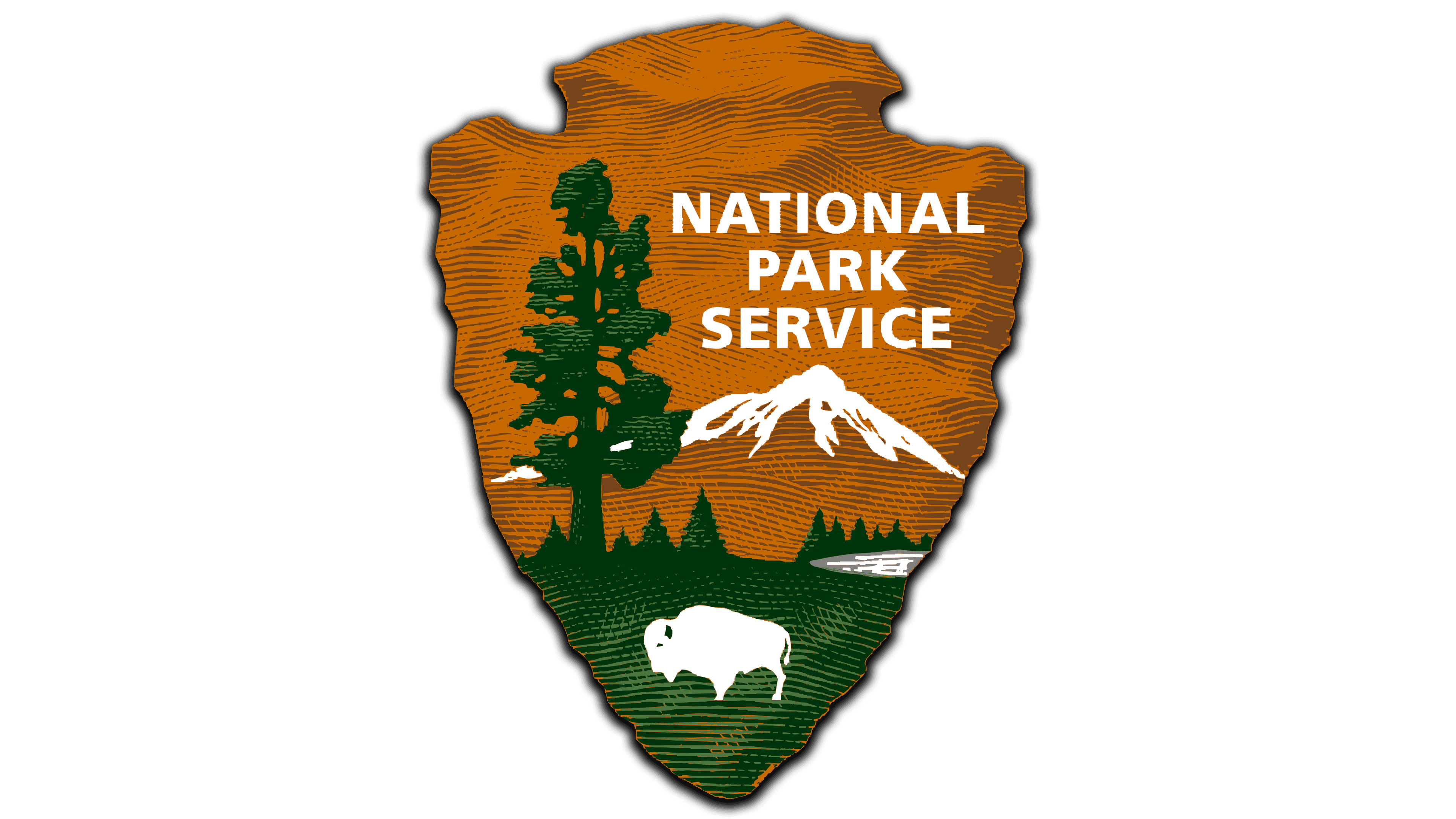
The current NPS logo is called Arrowhead, as it has the corresponding shape. But it wasn’t always used. It is known that from 1916 until mid-century, the agency used a round emblem featuring two branches and a sequoia cone. In 1949, Dudley Bayliss created an emblem for the National Park Service from the letters “N,” “P,” and “S” in the form of a mountain peak. But this icon, which won the contest and brought its author $50, never became official. Historian Aubrey Neasham decided that the NPS needed a graphic symbol, such as a buffalo, a tree, or an arrowhead. This idea was voiced to the architect Herbert Maier, who took on its implementation and secured his team’s support.
In 1951, the new logo was approved by the United States Department of the Interior and began appearing in brochures a year later. In 1954, minor adjustments were made, making the drawing more detailed and adding a serrated edge. In 1955, this version first appeared on uniforms, and ten years later, the Arrowhead symbol became a patented trademark.
The agency attempted a large-scale rebranding in the late 1960s. The firm Chermayeff & Geismar Associates created an emblem for it consisting of three triangles outlined by three circles. They were meant to represent the protection of trees and mountains. But the NPS staff rejected the new design and returned to the 1951 Arrowhead. In 2014, the logo was revised: it got a relief of wavy stripes, and some details were changed.
What is National Park?
The National Park Service, also known as NPS, is a federal agency within the United States Department of the Interior and is directly responsible to the Assistant Secretary for Fish and Wildlife and Parks. Its task is to protect protected territories in the United States, such as recreational areas, historical sites, and natural and cultural monuments. It not only protects these resources but also provides access to them.
1951
![]()
1952 – 1968
![]()
1968 – 2000
![]()
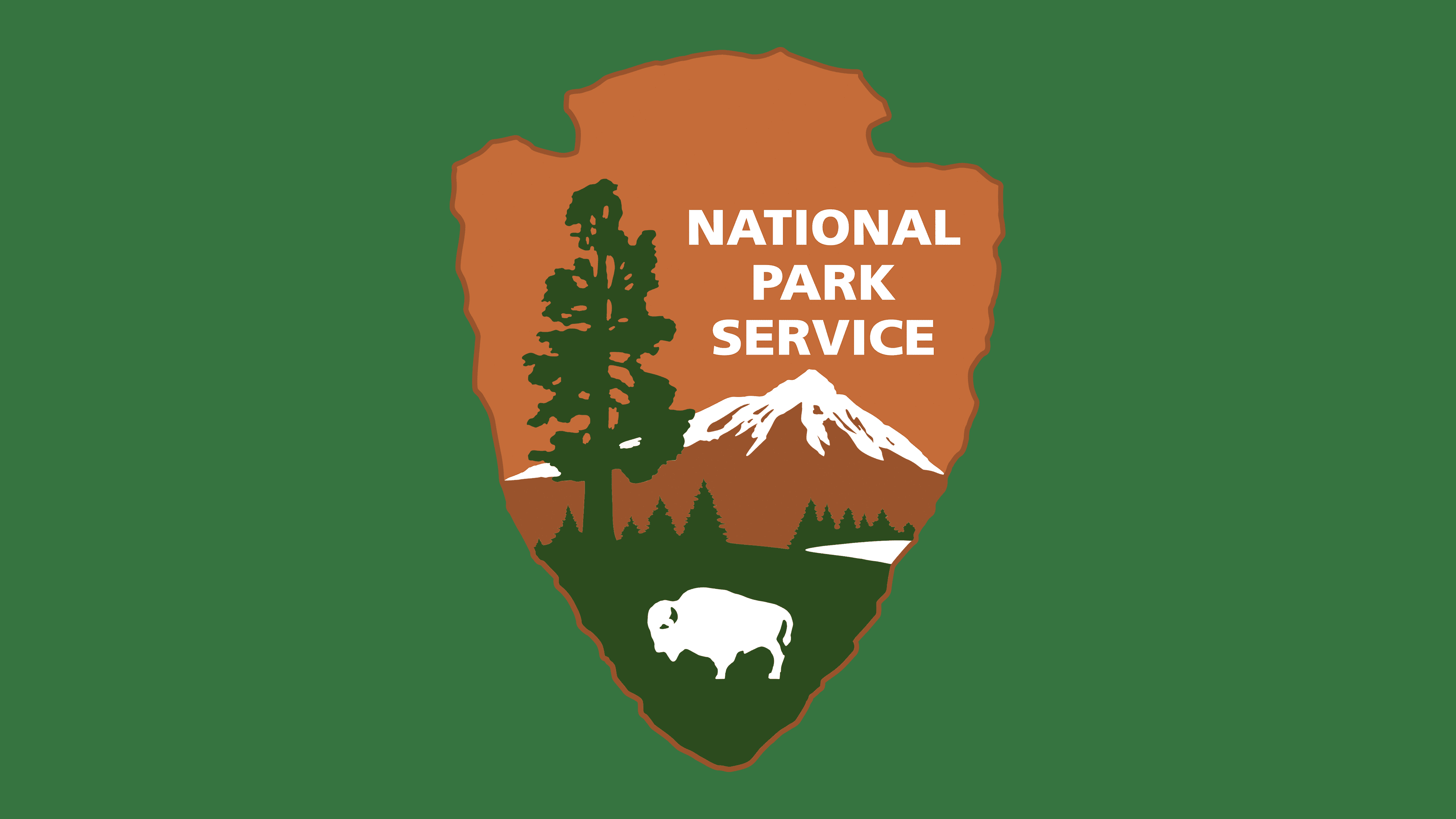
2000 – today
![]()
The main symbol of the National Park Service consists of several elements.
- The arrowhead embodies the agency’s connection to the culture and historical traditions of the indigenous peoples of the Americas. Also, it looks like a pointer that sets the direction of movement. This hints that the NPS is constantly striving for development.
- The bison represents the wild nature of the United States and is a reference to the U.S. Department of the Interior’s seal. It was considered a sacred animal by many tribes because it provided meat, fur, and bones. In addition, the bison symbolizes endurance and strength – qualities that correspond to the concept of the National Park Service. It disappeared from many regions of North America but was restored thanks to conservation organizations.
- The sequoia embodies vegetation. These majestic trees live for several millennia under favorable conditions and can reach heights of more than 100 meters. Ecosystem quality can be used to assess its condition. The sequoia on the emblem suggests that protecting natural resources is a long-term mission requiring constant effort.
- Snow-capped mountain peaks can be seen in many US national parks. They represent grandiose landscapes. And the tree-covered valley at the foot of the mountains is a symbol of pristine, pure nature.
Font and Colors
At the top of the logo is the phrase “NATIONAL PARK SERVICE,” divided into three lines with center alignment. It consists of uppercase bold letters without serifs. Similar fonts include Quebec Serial Black by SoftMaker and DelargoDTPro Bold by DTP Types.
The inscription and some elements are white. For example, the bison and the mountain peak are depicted using negative space. The trees and grass are dark green, and the remaining space is painted in different shades of brown.