


![]() New England Revolution Logo PNG
New England Revolution Logo PNG
The New England Revolution logo conveys the spirit of the American football club from Greater Boston. It embodies energy and patriotism.
The New England Revolution was established on June 6, 1995, by Robert Kraft, owner of the New England Patriots, following the 1994 FIFA World Cup at Foxboro Stadium, which demonstrated the region’s demand for professional soccer. The club was formally registered on October 17, 1995, with a name referencing the American Revolution of 1775–1783.
The first match took place on April 13, 1996, a 2–3 loss to Tampa Bay Mutiny. Robert Ukrop scored the club’s first goal. Despite players like Alexi Lalas, Mike Burns, and Joe-Max Moore, the team missed the playoffs and spent the next few years rotating coaches and rosters.
A turning point came in 2002 when Steve Nicol, a former Liverpool defender, became head coach. Revolution won the Eastern Conference and reached the MLS Cup final at Gillette Stadium, where 61,316 spectators watched them lose 0–1 to the Los Angeles Galaxy.
Forward Taylor Twellman joined in 2002 and became a key figure. In 2005, he won MLS MVP and the Golden Boot with 17 goals, finishing with 101 goals for the club. Under Nicol, the team reached the playoffs for eight straight seasons and played multiple finals.
Between 2005 and 2007, Revolution returned to the MLS Cup finals, losing to the Los Angeles Galaxy and the Houston Dynamo. In 2006, Houston equalized shortly after Twellman’s extra-time goal and won on penalties. In 2007, the club won the US Open Cup against FC Dallas, and in 2008, the North American SuperLiga.
After Nicol left in 2011, results declined. In 2014, the team reached another MLS Cup final but lost 1–2 to the Los Angeles Galaxy.
A new phase began in 2019 with Bruce Arena. In 2021, Revolution set a league record with 73 points, surpassing Los Angeles FC, and won the Supporters’ Shield, with Matt Turner as goalkeeper.
Meaning and History
![]()
The New England Revolution is the most conservative franchise in Major League Soccer’s debut lineup. It is one of the 10 charter MLS clubs that have retained their original logos and never undergone a rebrand.
The club’s logo indicates its territorial belonging. The emblem replicates the flag of the six New England states: a red field with a pine in the canton. The color scheme of blue, red, and white is reflected in the New England Revolution logo, which has remained unchanged since 1996.
What is the New England Revolution?
It is a professional American soccer team based in Greater Boston. It participates in the Eastern Conference and is a member of MLS, being one of the ten clubs that have been in the league since its inception. The club was founded in 1996 and is named after the American Revolution, which took place from 1775 to 1783, during which New England played a significant role. Robert Kraft owns the team and plays at Gillette Stadium.
1995 – 2021
![]()
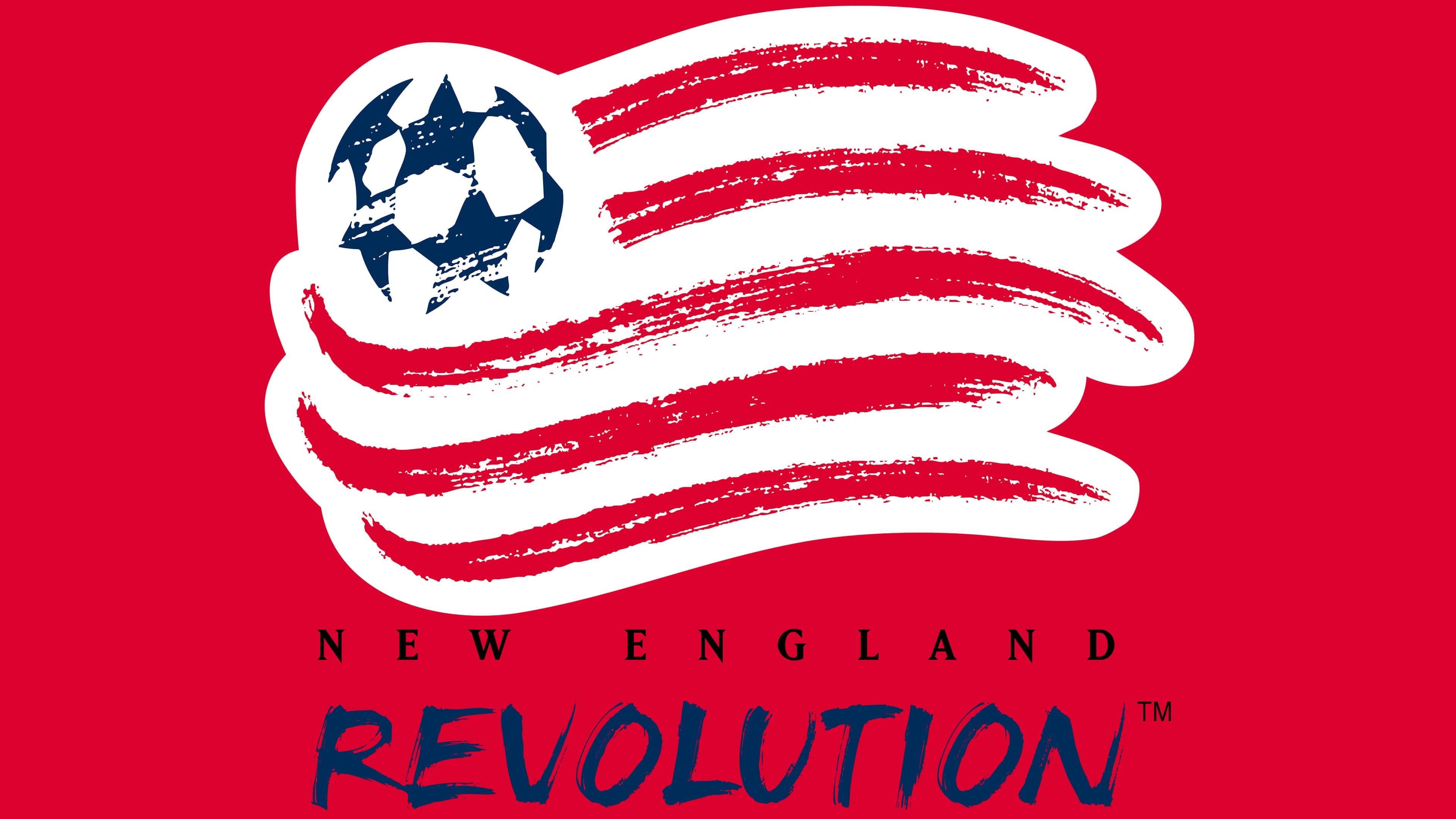
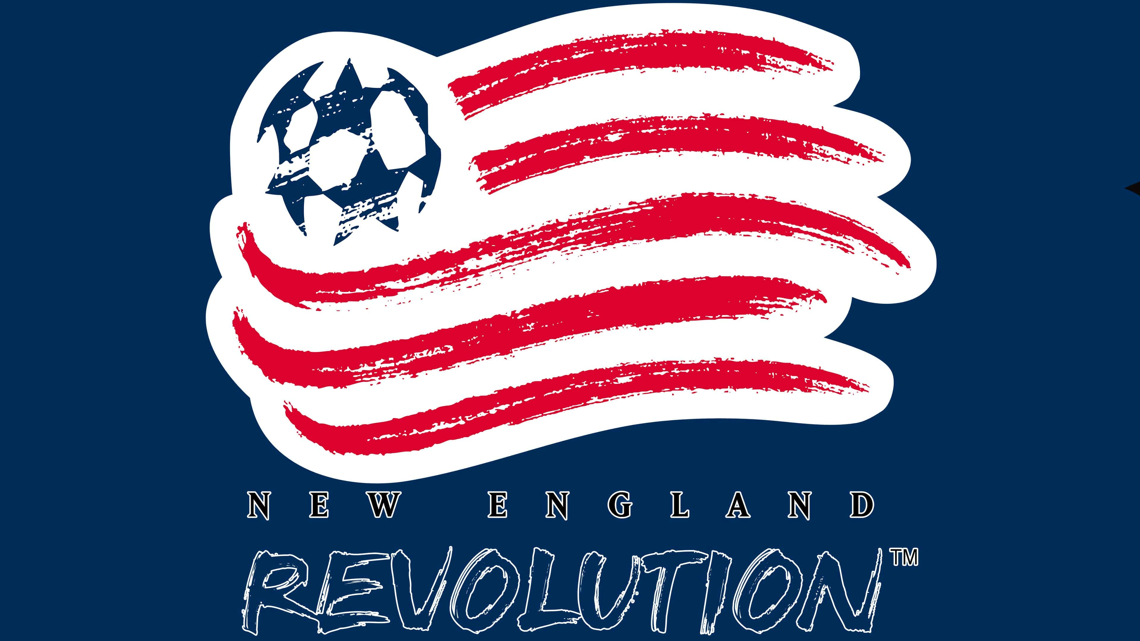
The New England Revolution’s club emblem was inspired by imagery from the 1994 FIFA World Cup. At that time, the American flag painted with freehand brushstrokes inspired the team’s original look. The logo features five red stripes applied loosely and effortlessly, resembling the marks of a wide artist’s brush. In the upper left, a circle of six stars forms a soccer ball. In its details, it echoes the well-known Adidas ball used in UEFA Champions League matches. The six stars emphasize the number of New England states: Maine, Vermont, New Hampshire, Massachusetts, Rhode Island, and Connecticut.
Below the main image, the club name is placed on two lines. The upper line, NEW ENGLAND, is set in black using a strict classical serif typeface. The symmetrical, neat letters are uppercase. The lower text, REVOLUTION, is much larger, rendered in blue with hand-drawn lettering. In places, wear and slight breaks in the lines are visible, creating a lively, spontaneous brushstroke. The lettering conveys the energy of a street slogan or a protest poster.
The emblem refers not only to the American flag but also to the spirit of freedom, reflecting the region’s revolutionary character as the first to declare independence. In this way, the club emphasizes its connection to the history of its home region, New England, while preserving the liveliness and emotional intensity typical of its fans and the team.
2022 – today
![]()
The new New England Revolution emblem departs from the previous one. The club is now represented by a concise circular symbol with a contrasting dark blue border. Inside the upper part of the circle is the inscription NEW ENGLAND, and in the lower part the word REVOLUTION. A strict geometric typeface was chosen for the name, similar in style to Gotham or Montserrat. All characters are uppercase.
To the left and right of the center are the numbers 19 and 96, indicating the year the club was founded.
The inner part of the emblem features a large white letter R in a decorative style with softly curved contours. The letter is set against a dark blue background, with red and dark blue stripes intertwining into a complex shape resembling a knot. The intersecting arcs smoothly follow each other’s contours, creating a sense of interweaving. A bright red diagonal stripe runs over the letter, similar to a brush stroke or a crossing gesture, yet it does not interfere with recognizing the letter.
The new design emphasizes the club’s identity by referencing its 1996 founding and preserving its signature colors.
Font and Colors
The New England Revolution’s graphic sign looks as if it were hastily painted with a brush. But it only seems that the five red horizontal lines are broad strokes. In reality, they are meticulously thought out: designers carefully worked on every detail to achieve perfect proportions.
As a result, the original interpretation of the US flag proved so successful that it was decided not to change it. This version of the logo has been in use since 1996 and remains current. And the six five-pointed stars, like the six states of New England, inspire the team to victories.
Below the five red lines is the name of the northeastern US region where the club is located. Each letter has short and thin serifs. In addition, all the letters “N” have extended lower corners. Such a design does not relate to any existing fonts; it was developed specifically for the New England Revolution and is not intended for commercial use.
The word “Revolution” looks even more unusual. It’s hand-drawn and in the same style as the American flag. The font bears a vague resemblance to Mistral and Chiller, but it is not an exact copy of either. The font creates the effect of handwritten text. The handwriting is far from calligraphic, as the letters resemble brush strokes. There is a slight rightward tilt.
The emblem’s palette is limited to white, blue (#002B5C), and red (#E51938). These colors match the colors of the modern New England Governors’ Conference (NEGC) flag, except for the absence of green. In addition, there’s an evident similarity to a US state’s flag. Here, the shades and their distribution match: the top left corner is white and blue, while the rest is white and red.