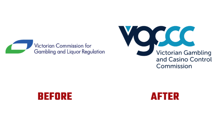
The special commission established to oversee the use of gambling and the sale of alcoholic beverages in Victoria has been reorganized as of January 1, 2022. The organization is an independent, statutory body. Its creation is intended to ensure the integrity of the obligations performed and minimize possible harm to all parties. The transition from the VCGLR to the VGCCC took place with its powers and responsibilities intact until the Department of Justice and Community Safety took full control of the liquor industry. All previously established and permitted forms will remain in effect during the transition. All possible ways to use and purchase them will remain active. All data for communication remain unchanged and active. All current changes were one of the reasons for the change in the visual brand identity recently presented to the general public.
The new visualization focuses not only on creating a more informative and relevant to current reality but also on meeting the requirements of modern display systems, ensuring a high quality of visual elements and color reproduction. The brand received a logo consisting of a verbal sign in the form of an abbreviation of its name, consisting of several words, and a text module, which fully discloses the sign’s content. Executed in a round and equal font, the sign demonstrates the commonality and close connection between the brand and its customers by demonstrating the connections between the letters in a single graphic design. The text of the company’s full name is made in a thin and “serious” font like “Museo Sans 500 by exljbris”, which is used to display official texts. With its help, the formation of the visual significance of the brand is supported.
The brand’s signature colors, light blue and black, visually divide the mark into two parts, communicating the two directions over which the brand exercises control. This reinforces the gap at the bottom of the first letter C. Graphics play an important role in shaping the informative nature of the logo, made with a minimum of elements. Before the gap, the first part is created in black, and the second is in light blue. To increase the effect of attractiveness, a blue triangular icon occupies the negative space of the inner cutout of the first letter V, which plays the role of the accent element.
The logo’s structure and execution ensure the mark is easy to perceive, remember, and recognize.
