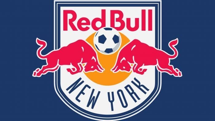
The passion, energy, and power embodied in the New York Red Bulls logo are not only associated with sports. This graphical representation mirrors the concept of Austrian manufacturer Red Bull GmbH, which owns the soccer franchise and has given it its name. Thus, the emblem serves a dual marketing function: promoting both the team and the energy drinks.
New York Red Bulls: Brand overview
| Founded: | 1994 |
| Founder: | Red Bull GmbH |
| Headquarters: | Harrison, New Jersey, U.S. |
| Website: | newyorkredbulls.com |
New York Red Bulls is a professional soccer team located in Harrison, New Jersey. The franchise emerged in October 1994 as the Empire Soccer Club. However, before the inaugural season, club owners Stuart Subotnick and John Kluge changed its name to New York/New Jersey MetroStars, referencing Metromedia, a media company they also managed. At the same time, they rejected the “MetroFlash” option proposed by Nike. The franchise owners also declined the “Cosmos” option, as they didn’t want to purchase rights to this name.
In 1998, the team’s name dropped the New York/New Jersey territorial designation and became simply MetroStars. In the 2000s, the unfortunate franchise lost match after match, setting the worst record in MLS history. Disappointed with the team, Anschutz Entertainment Group announced its sale to the Austrian energy drink manufacturer Red Bull GmbH on March 9, 2006. The new owner conducted extensive rebranding, changing the name, color palette, and logo of the team. The franchise was renamed from MetroStars to Red Bull during a preseason training camp in North Carolina.
Initially, the conglomerate decided to relocate the franchise to New York but didn’t want to spend money on a new stadium and pay MLS for the move. Later, the owners concluded to stay in New Jersey. The team only received a new name: “MetroStars” transformed into “Red Bulls New York,” but fans and the media call it “New York Red Bulls.”
After paying $100 million, the Austrian company acquired both the franchise and 50% of the stadium being constructed. It was supposed to open in 2008; until then, the team continued to play at Giants Stadium. The New Jersey Sports and Exposition Authority, which oversaw the stadium’s construction, sharply criticized the name change, seeing it as disrespect to the state of New Jersey. Fans also protested against this decision, purchasing a billboard ad and forcing Red Bull to abandon the investment project.
Meaning and History
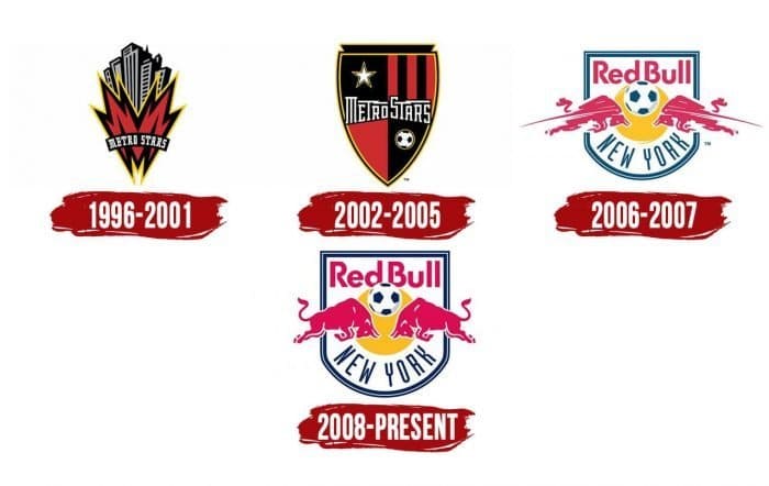
Over its 25-year history, the soccer club has had four logos. The first logo of New York Red Bulls reflected the cultural and historical heritage of the state. The new owner, the energy drink manufacturer, transformed the logo into a commercial tool, placing two red bulls facing off against each other on the background of a yellow sun.
What is New York Red Bulls?
New York Red Bulls is a professional soccer team based in one of New York’s boroughs, USA. It is a member of MLS and is competing in the Eastern Conference. The club was established in 1994 and began competing in 1996 under the name “New York/New Jersey MetroStars.” The club received its new name in 2006 after being acquired by Red Bull GmbH.
1996 – 2001
The franchise introduced its debut logo when it was called New York / New Jersey MetroStars. It remained even after the name change—the logo aimed to connect the club with its geographical homeland. The design heavily imitated the style of American comics. Black and grey skyscrapers seemed to reach for the sky in the background.
The lower part of the logo featured a flame-like capital letter “M.” The orange letter was trimmed with internal black and external yellow outlines. The logo was intended to show the non-stop activity of the metropolis that never sleeps. Skyscrapers stretched from native New York to New Jersey and Giants Stadium. On the black background, the white inscription “Metro Stars” stood out. The logotype was written in an original geometric font with straight angles and straight serifs.
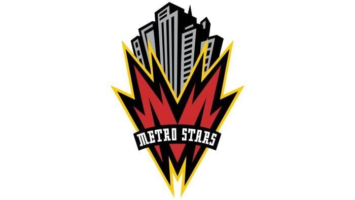
2002 – 2005
Before the 2003 season, the club introduced a new logo. It wasn’t done in a comic style but shifted to a traditional soccer shield – a gothic triangular heraldic shield. Three sides represented the territories of New York, New Jersey, and Connecticut. The shield was divided into black and red quarters – the franchise’s official color scheme. The top-left field featured a five-pointed star, while the top-right quarter was adorned with five red and black pal stripes. The bottom-right part depicted a black-and-white soccer ball with a yellow outline. Across the shield, the club’s name was written in white uppercase letters. The font was the same as in the first logo. Only two letters, “T,” underwent some changes: long horizontal lines appeared from the letters, resembling lightning.
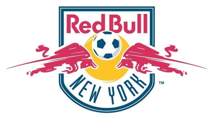
2006 – 2007
When the franchise changed its name from MetroStars to New York Red Bulls, the energy drink manufacturer used the team’s logo as an advertising board for promoting its brand. Thus, the new logo included all significant elements of the owner’s label: two Red Bulls, the sun, and the Red Bulls’ proprietary font.
The New York Red Bulls logo depicted two running animals, ready to collide, with a yellow sun above. Thin red stripes stretching from behind were added to create a sense of dynamism and movement. A soccer ball was placed above the bulls’ heads. The inscriptions “Red Bull” and “New York” were written above and below the shield. The logo looked like a four-sided shield with a rounded base, trimmed with a double-blue outline. Only the bulls stood beyond the border.
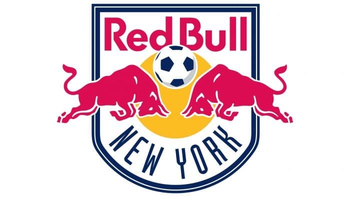
2008 – today
The current logo of New York Red Bulls, introduced in 2008, resembles the 2006 version. Designers made a few minor changes, so the old concept remained unchanged. As before, two bulls are at the center of the emblem. The thin lines indicating movement disappeared. The red color became more saturated. The sun changed from pale yellow to orange and now has a clear shape without protruding stripes.
New York Red Bulls: Interesting Facts
The New York Red Bulls are a big deal in Major League Soccer (MLS), and they are known for their strong play and important achievements.
- How They Started: When MLS began in 1996, the New York/New Jersey MetroStars were first called the New York Red Bulls. In 2006, the energy drink company Red Bull bought them, and they became the New York Red Bulls.
- Where They Play: Their home is Red Bull Arena in Harrison, New Jersey, which opened in 2010. It’s a top-notch soccer stadium that feels a bit like the ones in Europe, and the fans make the place come alive.
- Winning Big: They’ve won the Supporters’ Shield, which goes to the team with the best regular-season record three times (2013, 2015, and 2018). They were the first team in MLS to win it more than once.
- Growing Soccer Talent: Their youth academy is one of the best, helping many young players become pros in the U.S. and overseas. This shows their big role in making soccer better in America.
- Big Rivalries: They have fierce rivalries with New York City FC (the Hudson River Derby) and D.C. United (the Atlantic Cup) is making for some of the most exciting games in MLS.
- Part of a Bigger Family: Because Red Bull owns them, they’re connected to other soccer clubs worldwide, like RB Leipzig in Germany and RB Salzburg in Austria. This helps them share ideas and find new players.
- Famous Players: Stars like Thierry Henry and Bradley Wright-Phillips have played for them, making a big mark on the team’s history.
- Top Training: Their training facility in East Hanover, New Jersey, is one of the league’s best. Everything about it shows they’re serious about being the best, from their first team to their youngest players.
The New York Red Bulls have made their mark on soccer in the U.S., winning titles, training future stars, and bringing exciting soccer to their fans.
Font and Colors
When the New York Red Bulls team was called New York / New Jersey MetroStars, the elements of its identity reflected the region’s heritage. However, the semantic content of the emblems was unconventional. First, the artists depicted skyscrapers in the style of classic comics, and then a heraldic shield with uniquely designed “MetroStars” inscription.
After the club came under Red Bull’s control, its logo became an advertising tool. The energy drink manufacturer placed its trademark inside a rectangular shield with a rounded base: two red bulls run towards each other against a setting sun. This innovation was not well-received by the soccer team’s fans, who believed the emblem should reflect the city’s culture and history.
The top part of the shield contains the phrase “RED BULL,” and the bottom part, “NEW YORK,” although the team is actually called New York Red Bulls. This was specifically done to draw attention to Red Bull. The first two words look the same as on the cans of energy drinks because the designers preserved the proprietary font without changes: Futura SH-Dem Bold with modified letters “B” and “R.”
The state’s name is written in a smooth sans-serif font. However, the letters “R” and “K” have short strokes at the ends, which could be mistaken for mini-serifs. The letters are narrow, creating the impression of very large gaps between them.
The logo’s color palette 100 percent matches Red Bull’s palette, so all elements look just like in the original. Designers used yellow (#FFC425) for the sunset, red (#E31351) for the bulls and company name, blue (#002F65) for the multi-component frame, and the phrase “NEW YORK.” The inner part of the shield and the outlines of the animals are white.
New York Red Bulls color codes
| Alizarin Crimson | Hex color: | #ed1e36 |
|---|---|---|
| RGB: | 237 30 54 | |
| CMYK: | 0 87 77 7 | |
| Pantone: | PMS Bright Red C |
| Delft blue | Hex color: | #23326a |
|---|---|---|
| RGB: | 36 50 106 | |
| CMYK: | 67 53 0 58 | |
| Pantone: | PMS 294 C |
| Selective Yellow | Hex color: | #fabb23 |
|---|---|---|
| RGB: | 250 187 35 | |
| CMYK: | 0 25 86 2 | |
| Pantone: | PMS 1235 C |

