The logo of the football club “Newcastle” is one of the most unusual and beautiful in European football. The emblem is based on the coat of arms of the city of Newcastle-upon-Tyne, which was founded in the second century AD by the Romans under the name Pons Aelius. Later, in the Middle Ages, it was renamed Novum Castellum.
Newcastle: Brand overview
| Founded: | 9 December 1892 |
| Founder: | Public Investment Fund, RB Sports & Media, PCP Capital Partners |
| Headquarters: | Newcastle upon Tyne, England |
| Website: | nufc.co.uk |
Meaning and History
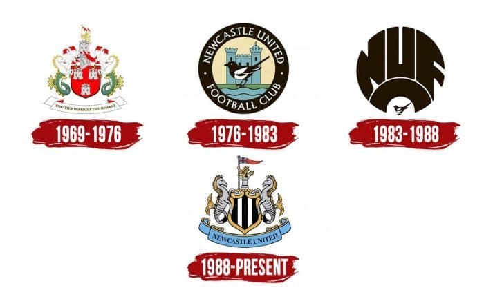
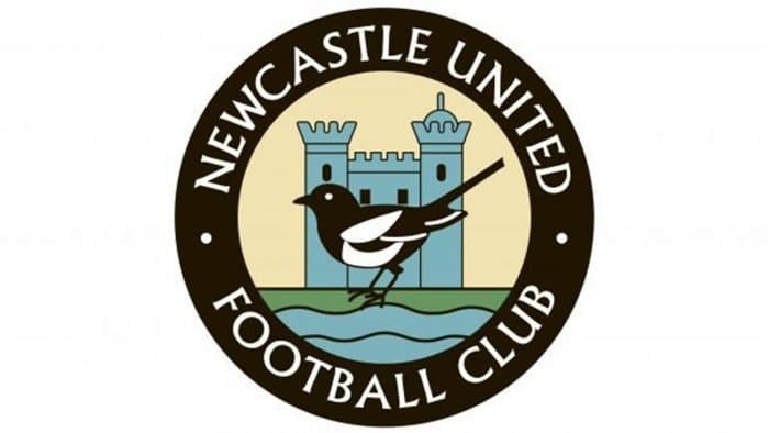
Experiments with Newcastle’s emblem began in 1969, and in 1976, it was first changed beyond recognition. The updated emblem became circular, and a magpie appeared on it, the reasons for which are still debated. Some say it was due to the black and white colors of the club, from which the nickname originated. So it eventually became fixed in the logo for a long 12 years. Others say that after the construction of “St James’ Park,” the team’s home arena, many crows began to nest in its territory, although the stadium was built 12 years before the club’s foundation.
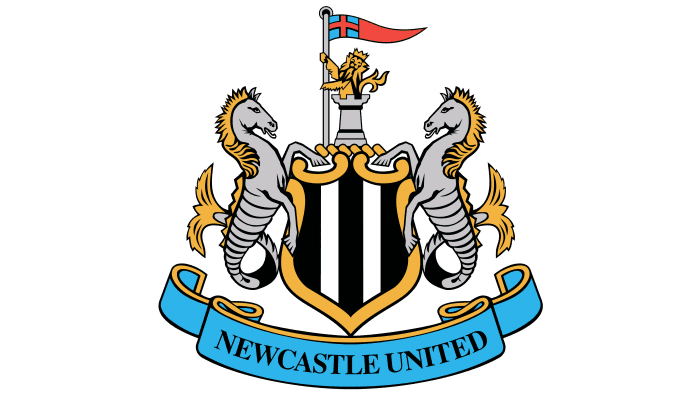
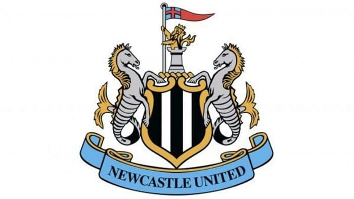
Newcastle only came to its modern emblem in 1988. It was decided to return to the team’s roots and refine the original coat of arms of Newcastle-upon-Tyne. Thus, artists added a shield to the composition, painted with black and white stripes reminiscent of the team’s shirts. But the turret above the shield remained the same. The royal lion with the flag of St. George symbolizes the city’s feats, which was attacked several times in the 14th century and besieged by the Scots during the Civil War. Speaking of the two seahorses, they remained on the emblem, but the inscription “Brave Defenders” was replaced with the club’s name. The modern emblem of “Newcastle” left no place for the magpie, but the nickname of the “Newcastle” players is forever etched in people’s memory.
The “Newcastle United” logo inherited the coat of arms of the city of Newcastle-upon-Tyne. Since the mid-1970s, it has changed three times but always demonstrated a connection with the city. The port and castle are important to the residents, so both are reflected in the club’s symbolism.
What is Newcastle?
“Newcastle United” is a successful football club that has almost always participated in the Premier League, except for a short period. It was founded in 1892 and began its legendary rivalry with “Sunderland” six years later. The main owner of the sports organization is the Public Investment Fund of Saudi Arabia.
1969 – 1976
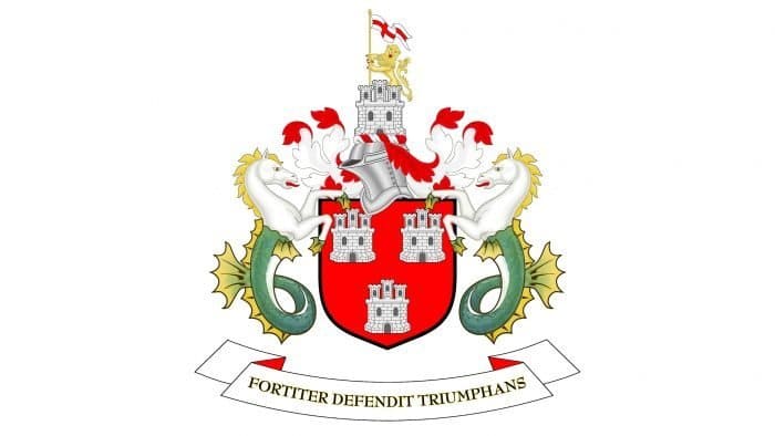
The debut emblem officially appeared in 1969 during the Inter-Cities Fairs Cup final. The emblem depicts Newcastle-upon-Tyne’s coat of arms. In the center are four towers: three inside a red shield and one on a knight’s helmet. They represent the Norman castle called New Castle.
The two seahorses symbolize the port. The lion holding the flag with St. George’s cross reminds us of the city’s feats during the Civil War. The bottom is decorated with a ribbon with the motto “Fortiter Defendit Triumphans” in honor of the confrontation between Scandinavian and English tribes.
1976 – 1983
In the mid-1970s, the club began using a round logo with the inscription “Newcastle United Football Club.” It depicts important symbols of the city: the Norman castle and the River Tyne. A magpie is centrally placed. According to one version, the magpie reflects the team’s nickname (Magpies), which the players received thanks to the famous black and white uniform.
1983 – 1988
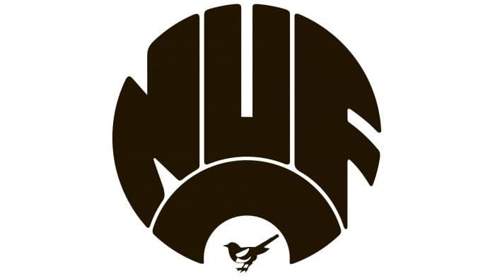
In 1983, another emblem appeared – a stylized abbreviation “NUFC” in the form of a circle. The only remaining element was the magpie.
1988 – today
In 1988, the club again began using the city’s coat of arms, returning to its historical heritage. The symbols remained the same: seahorses, towers, the royal lion, and St. George’s cross. Only the drawing style and color palette have changed.
The heraldic shield is covered with vertical black and white stripes. This refers to the footballers’ uniforms. The Latin motto has been replaced with the team’s name, which is depicted on a blue ribbon.
Newcastle: Interesting Facts
Newcastle United Football Club is a well-known soccer team with many fans and a long history.
- Starting Out: In 1892, two local teams joined to form Newcastle United, which has played at St. James’ Park ever since.
- Their Look: They wear black and white striped jerseys, a look they’ve had for over 100 years. It’s a big part of who they are.
- St. James’ Park: This is their big stadium in Newcastle upon Tyne. It can hold over 52,000 people and is known all over England.
- Nickname: They’re called the “Magpies” because their black and white jerseys look like the bird.
- The Entertainers: In the 1990s, their exciting style of play earned them the nickname “The Entertainers.” They almost won the Premier League in 1996 but ended up second.
- FA Cup Wins: They’ve won the FA Cup six times, with the last win in 1955.
- Champions League: They’ve played in the Champions League, including a memorable season in 2002-2003 when they did well.
- Fans: Newcastle United’s fans are loyal and passionate, sticking with the team through good and bad times.
- New Owners: In October 2021, the team got new owners from Saudi Arabia, starting a new chapter for the club.
- Big Buys: They’ve spent a lot of money on players, like when they bought Joelinton in 2019 for about £40 million.
Newcastle United’s story is full of strong support, memorable moments, and a unique style, making it a beloved soccer club in England.
Font and Colors
The logo of the football club “Newcastle” and the coat of arms of the city of Newcastle-upon-Tyne have much in common. Both feature seahorses holding a shield. In addition, there’s a tower with a crowned lion and a St. George’s cross in the form of a mini-flag at the very top. Borrowing city symbolism is a common practice for many American sports teams. It allows players not only to demonstrate patriotism but also to indicate their location using the emblem.
An important part of the logo is the inscription “NEWCASTLE UNITED,” located on a ribbon under the shield. To make it noticeable, designers used a classic serif font of varying thicknesses called Times Bold, known for its uneven line width, which gives the letters dynamism. The creators of the original font are Walter Tracy and Stanley Morison.
The shield is covered with vertical black and white stripes, reminiscent of the pattern on the club’s uniform. Meanwhile, the shield frame is golden (#F1BE48), as are some other elements: the lion, the manes of the seahorses, and the ribbon border. The flag with St. George’s cross is partly red (#F9423A). The lower ribbon is predominantly blue (#F1BE48), with the inscription on it in black (#241F20). The seahorses with fishtails, towers, and flagpoles are grey (#BBBCBC).
Newcastle color codes
| Picton Blue | Hex color: | #41b6e6 |
|---|---|---|
| RGB: | 65 182 230 | |
| CMYK: | 72 21 0 10 | |
| Pantone: | PMS 306 C |
| Maximum Yellow Red | Hex color: | #f1be48 |
|---|---|---|
| RGB: | 241 190 72 | |
| CMYK: | 0 21 70 5 | |
| Pantone: | PMS 136 C |
| Black | Hex color: | #000000 |
|---|---|---|
| RGB: | 0 0 0 | |
| CMYK: | 0 0 0 100 | |
| Pantone: | PMS Process Black C |
| Medium Gray | Hex color: | #bbbcbc |
|---|---|---|
| RGB: | 63 194 204 | |
| CMYK: | 60 0 23 0 | |
| Pantone: | PMS Cool Gray 4 C |
| Red Orange | Hex color: | #f9423a |
|---|---|---|
| RGB: | 167 30 49 | |
| CMYK: | 5 100 71 22 | |
| Pantone: | PMS Bright Red C |
