The original application Halodoc, an Indonesian developer designed to make it easier to get medical services, has unveiled its new logo. With the help of this platform, in the conditions associated with COVID, users acquire the opportunity to receive some medical services without leaving home or visiting medical institutions. The Indonesian technology, which has received funding for its development from renowned international investors – Bill & Melinda Gates Foundation, Allianz X, and Prudential, used by the owners of funds and their employees, is rapidly developing and expanding the scope of services provided.
Halodoc is today the most comprehensive digital healthcare offering in Indonesia. With its help, users can directly contact and communicate with their doctor or specialist of the desired profile, buy the necessary medicines at lower prices in a health store with home delivery, undergo an online laboratory examination, visit a hospital online, for which an individual consultation slot is provided, work with documents (insurance, binding of your family members, etc.).
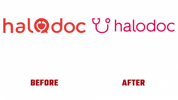
All this is reflected in the new visual identity of the platform. The app’s logo has undergone a series of dramatic graphic changes to demonstrate the improvement in the quality of life of Indonesians. From the previous version, only the concept of using a text format has been preserved. The text of the application’s name – “halodoc,” saved in the new logo, is executed in a single uppercase sans-serif font and is separated by elements. In contrast to the original version, it is made with thinner letters of Hurme Geometric Sans 2 Regular from Hurme, characterized by lightness and ease of perception.
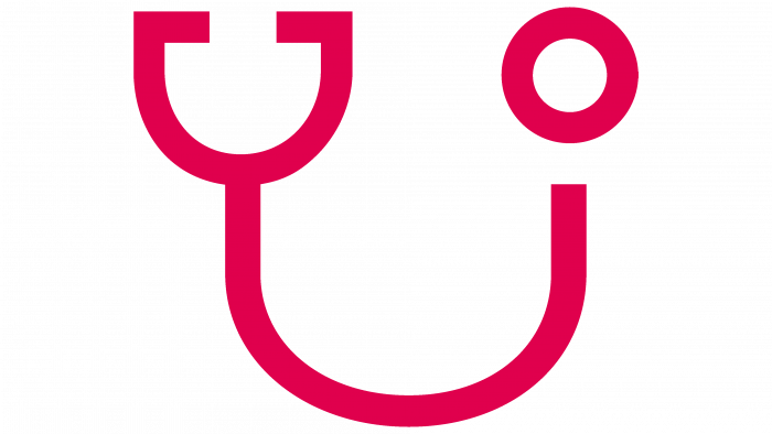
In front of the text, there is a symbol of a medical device – a stylized image of a stethoscope or phonendoscope. Used for listening to the heart, lungs, blood vessels, intestines, this object has been one of the most important attributes of a doctor since its inception. In the graphic design of the emblem, the element was given the shape of a smile – a symbol of health and the success of treatment, which guarantees the application of the application. Its presence visually informs users that such a wide and open smile is inherent only in a healthy person.
The color red has been retained as a symbol of health care worldwide, which increases the logo’s recognition and quickness in determining its purpose.
