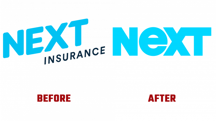
Founded in 2016, Next Insurance, located in Palo Alto, CA, is among the wide variety of insurance companies regarding ease of use and time savings. Refusal from outdated, long, and complex registration processes and participation in insurance events of its clients demonstrate the effectiveness of simplified schemes used by the brand. To more fully convey such advantages to its regular and future customers, Next Insurance has begun to redesign its visual image. The main objective of such changes was to create a simplified and concise graphic display of the goals and content of the brand’s services, its ability to handle all customer affairs – from purchasing a policy to filing a claim online using the appropriate application.
The new company logo symbolizes the simplicity with which the company’s services are used. The insurance participant needs to install the application on the gadget or visit the company page to perform this or that operation. On a simple and intuitive site, you can quickly and conveniently select the type of insurance you need, depending on the type of occupation and the form of the company. All this identifies the logo developed by the agency COLLINS, NY, presented only by the graphic representation of the brand name. The basis for the visual construction of the logo was the emphasis on insurance as a tool that allows you to build a business more efficiently. By focusing on the simplicity of the logo for every potential customer, the client discovers the simplicity of the opportunities that arise and how it becomes easier to make money and do more than intended without focusing on the price.
The title text – Next has that seeming mesmerizing simplicity, which, on the contrary, carries a huge amount of information. And above all, it provides ease of memorization and visual recognition of the brand. At the same time, such a solution makes it possible to significantly expand the use of the logo to form various slogans in self-promotion, depending on its application to a particular type of business.
The bold, serif-free Unicase typeface is visually pleasing thanks to the harmonious combination of the “E” and “X” letters. The desire to connect today with the past, when people managed to endure the hardships and hardships of the Great Depression of the 20s of the last century, the unrest of the 70s, led to the decision to use a somewhat playful style of those times, having drawn elements as an addition. The hand-drawn illustrations applied are filled with simplicity, soulfulness, and sincerity, which added positivity and firmness of spirit to the brand’s style. This reflected the desire to showcase Next Insurance’s creation of a new world of opportunities.
