In sports branding, National Football League (NFL) logos are compelling visual symbols that don’t just take up space on a team’s jersey or paraphernalia. These emblems, often rich with vibrant colors and crisp lines, serve as a rich tapestry that encapsulates a multitude of messages, from the team’s history and heritage to its values and aspirations.
NFL logos have a unique flavor and impact distinct from the symbols often found in various sports tournaments. Each carefully crafted design is meant to give the viewer a window into the multifaceted world of the team it represents.
The visual elements of these NFL logos are rich in symbolism and carefully chosen to evoke a multi-faceted response from fans. Whether it’s a mascot animal that symbolizes ferocity and bravery or a specific color scheme that evokes a sense of regional pride or historical significance, each element contributes to the team’s storyline.
Examining current NFL logos provides insight into their aesthetic composition, meaning, and distinctive features. Each logo is a master class in visual storytelling, providing clues that hint at a team’s past milestones and future ambitions.
The power of NFL team logos
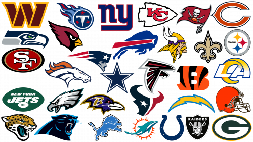
NFL team logos serve as important visual markers that distinguish each club in the league. With 32 teams in the league, these modern emblems are often more memorable than the names themselves.
Created in 1920. The National Football League has carved out a niche for itself as a premier sports organization whose fame spreads far and wide. Its branding is vastly different from soccer and other sports seen around the world and represents a unique sporting style.
Distinctive NFL logos feature brightly colored animated illustrations that are eye-catching, especially when depicted on jerseys or promotional products. In contrast, sports teams in other parts of the world tend to favor more classic and understated designs such as elegant crests, rounded insignia, or protective shields.
Although a common design theme can be identified among NFL logos, each emblem has its own character and backstory. This tapestry reflects a rich history in which some emblems have stood the test of time, retaining their original appeal. Others, on the other hand, have been modified to suit the changing preferences of American soccer fans.
National Football League logos: All NFL logos and their meaning
Over the course of its existence, the NFL has undergone significant changes in the composition of its teams. Starting with just a few teams, the league has expanded to 32 official clubs.
In terms of team logos, each NFL team has a distinctive emblem that clearly represents the team’s affiliation. These emblems are often filled with symbolism, featuring elements such as animals, letters, or geographical landmarks that connect the team with its fans. Each emblem is carefully crafted to evoke certain emotions or convey qualities such as speed, strength, or fighting spirit.
Different color schemes further distinguish one team from another, with their choices often reflecting local culture, history, or geography. For example, oceanic hues are commonly used for teams located near the sea, while earth tones can indicate a connection to a particular locale.
Creating such logos requires considerable effort and design skill. Branding agencies often work with teams to create an emblem that resonates with fans and stands the test of time. Another important consideration when designing or changing a team logo is legal aspects such as trademark protection.
Over the years, some team logos have been revised several times to keep up with current design trends, changes in public opinion, and team relocations and ownership changes. Others, however, have retained their original design, attesting to their continued appeal and recognizability.
Dallas Cowboys
Appearing in the NFL in 1960 as an expansion team, the Dallas Cowboys have since firmly established themselves in American soccer. Their impressive long-run has been marked by sportsmanship and a huge fan base. This support is clearly evident in the unprecedented number of full houses that reflect the team’s widespread acclaim.
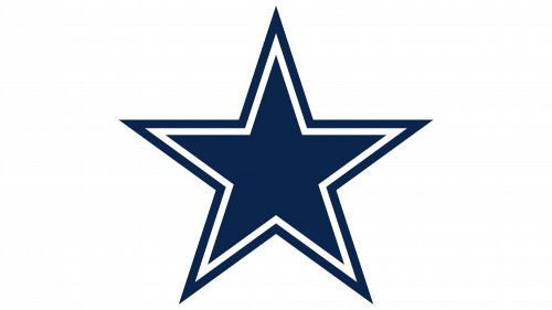
The Dallas Cowboys stand out for their emblem, a clean, unadorned five-pointed star. Contrary to some interpretations, this design does not stand for Dallas in isolation but more broadly reflects the spirit of Texas. The stark simplicity of this star makes it a formidable symbol in the realm of professional sports team logos.
The colors chosen for the emblem, mainly silver and blue, give it an expressive yet vibrant feel. These colors, combined with the austere design of the star, reflect the team’s rich history, its connection to Texas heritage, and its commitment to soccer excellence.
New England Patriots
The New England Patriots team, hailing from Boston, came into existence in 1959 under the original name of the Boston Patriots. With an impressive record in the league, the team holds a significant place in NFL history. They are on par with the Pittsburgh Steelers in terms of Super Bowl victories, making them one of the most successful franchises in the sport.
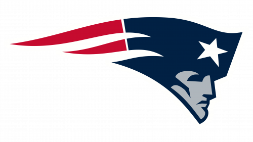
The New England Patriots are distinguished by their emblem, which is colloquially referred to as the “flying Elvis.” The emblem is a figure with long downward-flowing curls made in shades that mimic the colors of the U.S. flag – red, white, and blue. This choice of design fulfills several functions at once: it reflects the geographical position of the team and includes patriotic elements, which resonates with a wide audience of fans.
The combination of athletic performance and effective branding has cemented the New England Patriots’ status as the NFL’s top team. In a league where branding plays a key role in attracting supporters and building loyalty, the New England Patriots have combined athletic success with a powerful and meaningful visual identity.
Green Bay Packers
The Green Bay Packers, whose roots date back to way back in 1919, are the third oldest franchise in the NFL. What sets them apart from other franchises is their unique ownership structure. They are the only major professional sports team in the United States that operates as a non-profit and is community-owned. The Packers have won more championships than any other NFL team in their rich history, cementing their legacy in the league.
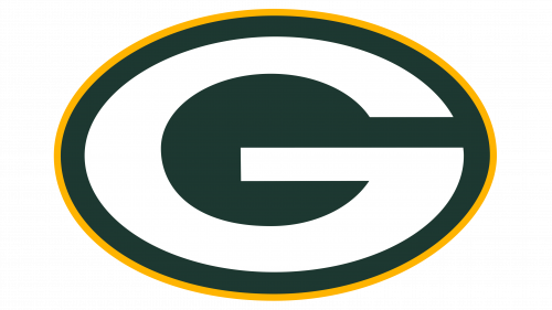
The Green Bay Packers emblem is simple and memorable. The emblem features a prominent white letter “G” set in an oval of rich green and outlined in bright yellow. The choice of colors, while simple, reflects the spirit and commitment of the team, allowing fans to instantly recognize and resonate with the brand wherever it is depicted.
Pittsburgh Steelers
Founded in 1933, the Pittsburgh Steelers are the seventh-oldest team in the National Football League and the oldest team in the American Football Conference. Throughout its rich history, the team has won numerous trophies and loyal fans. This community of dedicated fans, often referred to as “Steeler Nation,” makes itself known in stadiums and homes across America. The Steelers are known for their adoration and track record in the league, including being second only to one team in Super Bowl victories.
The Steelmark emblem is a unique representation of the team’s industrial roots. The emblem is a circular symbol with three colored figures, often referred to as “asteroids.” Each figure symbolizes a key component in the steelmaking process. This design not only embellishes the emblem but also points to the team’s heritage and the city’s historic role in the steel industry. Through the intricacies of the design, the emblem embodies the hard work and resilience of the spirit that characterizes the Pittsburgh Steelers team.
San Francisco 49ers
The San Francisco 49ers, which appeared in 1944 and joined the NFL in 1949, was the first major league professional sports organization to settle in San Francisco. In the decades since, the team has managed to win five Super Bowl titles, cementing its position in the upper echelon of NFL franchises. The team’s success extends beyond the field: it ranks as the sixth most expensive NFL team in terms of financial valuation today.
The San Francisco 49ers take a minimalistic but effective approach. The emblem is built around a red-colored oval with black and gold accents. Central to this shape are the initials “SF,” presented as a monogram. The design bears some resemblance to the Kansas City Chiefs team monogram but remains distinctive. This shape of the letter “SF” serves not only as an aesthetic element but also embodies the spirit and heritage of the team it represents. The use of red, black, and gold hues matches the team’s official colors while still giving it a unique and recognizable identity in American professional soccer.
Kansas City Chiefs
In 1959, the soccer team known today as the Kansas City Chiefs was born as the Dallas Texans. In 1963, there was a significant transition of the team to Kansas City. In 1970, the merger of the American Football League (AFL) and the National Football League (NFL) made the Chiefs team an integral part of the NFL. They subsequently became the second team from the former AFL to defeat an NFL team in the championship game.
The creation of their current logo comes with an interesting backstory. Lamar Hunt, one of the men who played an important role in the team’s history, sketched the iconic arrowhead design on a simple napkin. This impromptu illustration later became the team’s official emblem. Within the outline of the arrowhead is the crossed letter “KC,” reminiscent of a traditional monogram. The monogram was inspired by another NFL team, the San Francisco 49ers, and has since become synonymous with the Chiefs’ emblem.
This arrow design captures the essence of the team: dynamism, historical richness, and connection to roots. The initials “KC,” seamlessly incorporated into the arrowhead, reflect the unity and interconnectedness that is the hallmark of a Chiefs team.
Philadelphia Eagles
Founded in 1933, the Philadelphia Eagles filled the void left by the Frankford Yellow Jackets. Since then, their journey in the National Football League has been marked by significant milestones. Their participation in the playoffs, averaging up to 29 times, is a testament to their consistency and dedication to the sport. Their 16 division titles further emphasize their skill and formidable presence in the league. The enthusiasm and intensity with which they take the field is best exemplified in their long-standing rivalry with the New York Giants, which never fails to thrill soccer fans.
The Philadelphia Eagles visual identity is both commanding and evocative. The emblem features the majestic head of an eagle, rendered with meticulous attention to detail. The meticulously crafted design, characterized by pronounced features and bold lines, is meant to reflect the essence of strength and power. Its design reflects the team’s indomitable spirit and relentless pursuit of excellence on the soccer field.
New York Giants
The New York Giants, hailing from the vibrant metropolis of New York City, offer a glimpse into the rich history of the National Football League. Founded in 1925, the club is a testament to resilience and longevity: it is the only survivor of the five teams that joined the league that year. The club’s deep roots make it the longest-surviving team in the North East region.
The club’s visual style has undergone several changes. In the past, the team used a design depicting a quarterback while throwing, reflecting the dynamism and energy of the game. This design reflected the spirit of the sport and echoed the essence of the team’s hometown – bustling and constantly evolving. Over time, the Giants moved to a more minimalistic and straightforward approach. Their emblem is a sleek and understated monogram, “NY,” made in lowercase letters. The evolution of the New York Giants emblem reflects the team’s journey: from the early days of the league, through times of change and experimentation, to where it stands today in the NFL.
Chicago Bears
The Chicago Bears soccer team, founded in 1920, is one of the two remaining original franchises in the NFL. Over the years, this illustrious organization has tried various unofficial mascots, such as Rocky and Burman. What sets the team apart is that it does not use an animal image in its emblem.
Unlike many teams that use more elaborate animal figures or symbols, the Chicago Bears use a single stylized letter “C” as their emblem, done in their official colors. What sets this variation apart is the unique pointed element at the back of the letter, which distinguishes it from the traditional block lettering. This minimalist yet unique approach gives the logo a memorable and easily recognizable look, making it stand out among the many NFL team emblems.
This logo choice not only provides an easily recognizable brand for fans and followers but also pays homage to the history and tradition of one of the NFL’s oldest teams. The simplicity of the logo aligns well with the straightforward nature of a team from the Midwest, offering a design that has lasted almost as long as the team itself.
Seattle Seahawks
In 1976, the Seattle Seahawks emerged as a team in the NFL. As rookies, they became famous both on the soccer field and among their fervent fans. Their fans, often referred to as the “12s,” left an indelible mark on sports history by setting a Guinness World Record for the loudest noise at a sporting event. This record was not just a testament to loudness; it symbolized the unprecedented enthusiasm and dedication of Seahawks fans.
Over the years, the team’s emblem has undergone various transformations. But among those changes, one element has remained constant: the Seahawk emblematic mascot. The image of a hawk, rendered with elegant design elements, hints at agility and grace. Keeping the hawk as a central branding element emphasizes its importance as a symbol of the team’s spirit and ethics.
Denver Broncos
The Denver Broncos began their career in American soccer in 1960 as an integral part of the Football League. Although the initial journey was not an easy one, with a triumphant season only in 1973, their dedication and resilience paid dividends in the years that followed. With an enviable record of only 11 seasons without success, they have confidently carved out a niche as one of the dominant forces in the NFL.
The Broncos emblem perfectly matches the dynamism and ferocity often associated with NFL teams. Their emblem, reflecting the essence of the stallion, is the epitome of agility and power. The stallion’s mane, blazing bright orange, further emphasizes the animal’s wild energy. This carefully crafted emblem symbolizes the indomitable spirit of the team and is a testament to the Broncos’ unwavering commitment to excellence in American soccer.
New Orleans Saints
The Saints soccer team, which joined the National Football League in 1966, faced many challenges in their early years, making them one of the least beatable teams for several decades. However, with the advent of the 21st century, fortune began to turn in their favor, leading to a resurgence in their performance.
The Saints team emblem is the iconic fleur-de-lis, which has deep historical and cultural meaning in New Orleans. This emblem is reminiscent of the city’s rich history and the royal family of France, connecting the team to the region’s French heritage. The emblem is rendered in a white, black, and gold palette and carries the elegance and sophistication associated with its origins. The New Orleans Saints emblem has allowed the team to excel on the field and firmly connect with the fans.
Baltimore Ravens
The Baltimore Ravens debuted in the National Football League as an expansion franchise in 1996. The team did not immediately take its place in the NFL, quickly becoming one of the most successful teams in the league. As a testament to their success, the Ravens rank 33rd on the list of the most expensive sports franchises in the world. An important cultural fact is that the team’s name is taken from Edgar Allan Poe’s poem “The Raven,” which provides an intriguing backdrop for the franchise’s image.
The Baltimore Ravens’ visual identity was not without its challenges. The previous version of the team’s emblem became embroiled in legal problems related to copyright infringement. Due to this setback, a reorganization of the brand was carried out. The modern logo now features an imposing raven’s head, clearly detailed to convey determination and tenacity. Combined with the gold letter “B,” skillfully embossed, the logo has taken on another deep meaning.
The significance of the logo goes beyond mere aesthetics; it also has implications for brand recognition and marketability. The updated design strikes a balance between maintaining the franchise’s identity and making a bold visual statement. Careful calibration of elements reflects the Baltimore Ravens team ethos of resilience, impact, and unwaveringness – qualities that have made it a staple in NFL conversations and competitions.
Las Vegas Raiders
Founded in 1960 in Oakland, California, the team known today as the Las Vegas Raiders underwent significant changes before settling on their current look. Their journey to the NFL began with the fateful merger of the AFL and NFL, which was a turning point for the team. Prior to adopting the Raiders name, there was a brief period when they were known as the Oakland Seniors. This nickname was short-lived, and the team soon adopted the name “Raiders,” which has since come to epitomize their tenacious spirit.
The Raiders emblem is characterized by its intricacy compared to other NFL emblems. The emblem depicts a figure with an eye patch – an unmistakable symbol of sternness and determination. On the sides of the figure are two cleavers crossed in a sign of readiness and defiance. This corporate style conveys the rich history of the Raiders and their desire to push the boundaries, never to rest on their laurels in the world of soccer.
Los Angeles Rams
As one of two NFL teams based in Los Angeles, the Los Angeles Rams have a history as dynamic as the city they represent. Originating in Cleveland in 1936, the team moved to the City of Angels after winning the NFL championship in 1945. Their move is unlike any other: they are the only NFL team to win championships in three cities.
The Rams logo takes a minimalist yet meaningful approach. The logo utilizes a simple design that includes the initials “LA” to represent the city and serve as the team’s abbreviation. The original design element is the curved stroke on the letter “A” – a subtle allusion to the physical attribute that gave the team its name: the ram’s horn.
It marks the evolution of the team, reflecting a rich history of winning and perseverance in different geographic regions. In a league where every team competes for attention, the Los Angeles Rams have created an identity that stands out both on and off the field.
Minnesota Vikings
Appearing in the NFL in 1960 and beginning to play a year later, the Minnesota Vikings hold a special place in league history. The team pays homage to Minnesota’s rich Scandinavian-American heritage by adopting the name “Vikings” in honor of the Norse navigators from Scandinavia.
The Minnesota Vikings team took a different path than most NFL teams, which often opt for animal-shaped mascots. Instead, the team’s emblem features the profile of a Viking warrior wearing a gold helmet. The use of this iconic figure serves several purposes: it strengthens the cultural connection to Minnesota’s Scandinavian-American population and symbolizes strength, bravery, and exploration – traits commonly attributed to historical Vikings. The choice of the golden helmet, often considered a symbol of courage and distinction, adds another layer of meaning to the emblem, embodying the qualities the team strives to bring to the soccer field.
Through its name and emblem, the Minnesota Vikings team has created a unique identity that appeals to local fans and resonates on a larger historical scale.
Buffalo Bills
Founded in 1959, the Buffalo Bills were originally a team in the American Football League and then moved to the NFL following the merger of the AFL and NFL. The team name is derived from the name of the previous All-American Football Conference team based in Buffalo.
Over the years, the Buffalo Bills team logo has consistently featured a bison. Originally, the bison mascot was red in color. Subsequent changes resulted in a blue-colored bison with a red stripe running from the horn.
The bison emblem symbolizes the team’s close connection to the Buffalo area, conveying the unique features of the region and symbolizing local pride. The emblem has evolved, changing colors and designs while retaining its original essence. The blue charging bison with a red stripe remains a constant symbol, representing the team’s tenacity and spirit on the soccer field. The Bills have had their ups and downs in history, but they have always remained an integral part of American soccer culture.
Tampa Bay Buccaneers
The Tampa Bay Buccaneers team, hailing from Tampa, Florida, was admitted to the NFL in 1976, the same year that the Seattle Seahawks club entered the league. This Florida team is the winner of two Super Bowl trophies and one of only a couple of NFL teams to boast an unblemished record in Super Bowl games.
Over the course of the team’s existence, there have been five variations of its official emblem. The typical emblem is a flag with certain elements: the right side is occupied by a sword, and in the center, there is a skull and crossbones. All of these elements combine to reflect the team’s pirate theme, setting the Buccaneers apart from other NFL teams. Changes made to the logo over the years have generally been minor, indicating a desire to maintain the core aspects of the team’s visual identity while slightly modernizing it.
Atlanta Falcons
The Atlanta Falcons, a team founded in 1965 and entering the NFL a year later, quickly gained prominence in American soccer. The team came into existence in 1962 as the American Football League was gaining prominence. Over the years, the Atlanta Falcons have carved out a niche for themselves and have become one of the most recognizable teams in the NFL.
The Atlanta Falcons emblem is not just a typical mascot image. This unique logo uses bold and aggressive touches to depict a falcon that represents strength and agility. Another interesting aspect of the emblem is its subtle resemblance to a capital “F,” which reinforces the team’s signature style.
The emblem’s combination of aesthetic appeal and functional design reflects the team’s approach to the game – a combination of skill, strategy, and energy. The Atlanta Falcons continue to be one of the strongest teams in the NFL.
Indianapolis Colts
Founded in 1953 in Indianapolis, the Colts have been an important team in the NFL since their inception. They were one of three NFL teams to move to the American Football League and then helped create the AFC after a landmark merger in 1970.
The Colts’ emblem is classic and uncomplicated. The centerpiece of the emblem is a blue horseshoe dotted with small white dots. Initially, the emblem featured stripes, but the need for a more modern and streamlined look led to the adoption of the current, cleaner visual identity.
The blue horseshoe has become synonymous with the Colts team and an easily recognizable symbol in both the sports world and the broader cultural landscape. The transition from a striped to a dotted design signifies the team’s ability to adapt and evolve while staying true to its core values and traditions. The horseshoe, traditionally considered a symbol of good luck, reflects the team’s commitment to success and its rich history in the league. The choice of blue adds elegance and seriousness, matching the team’s long-standing reputation for excellence and commitment on the field.
Miami Dolphins
Founded in 1965, the Miami Dolphins have been a notable representative of the merger of the AFL and NFL and have earned a prominent place in the annals of the league. One of the team’s notable accomplishments is the coveted “perfect season.” With this achievement, the team has won every game from the regular season to the Super Bowl, a feat that no other NFL team has been able to replicate.
The Dolphins chose an emblem that captures the essence of their hometown, Miami. The main figure of the emblem is the dolphin, a creature synonymous with the vibrant sea life on the Florida coast. This aquatic mascot is artistically positioned against a background of a radiant sun, rendered in bright orange and white colors. The bright and cheerful image of the sun symbolizes Miami’s tropical climate and sunny disposition. With this emblem, the Miami Dolphins have created a visual identity that combines the natural beauty of their city with their vibrant legacy in the league.
Cleveland Browns
The Cleveland Browns, founded in 1944, entered the All-American Football Conference as one of its foundational teams. They were a dominant force during this period, winning championship titles on multiple occasions. After a hiatus from professional soccer, the Browns rejoined the NFL in 1999.
Compared to other NFL emblems, the Cleveland Browns logo has a distinctly traditional design. Instead of a mascot or other intricate design elements, the emblem is simple and timeless: it features a well-detailed soccer helmet. The helmet is in the team’s signature colors of brown, orange, and white.
This simple yet distinctive approach to branding speaks to the team’s rich history and traditionalist values. The color scheme further sets the team apart by using a unique combination of brown, orange, and white, making the Cleveland Browns easily recognizable in the diversity of NFL branding.
Tennessee Titans
Originating in 1959 as the Houston Oilers, the soccer team changed its name and location to become the Tennessee Titans. Their journey in professional soccer includes one Super Bowl appearance, which has contributed to their rich history in the league. The lack of multiple Super Bowl victories does not cancel out the importance of the team but adds to their ambition and drive for future victories.
The Tennessee Titans are not standing still. The team’s emblem and uniforms have undergone several changes, especially since the renaming. The current Titans emblem bears a great resemblance to the Tennessee state flag. At the center of the emblem is a stylized letter “T” specifically designed to create a three-dimensional effect. The design choice demonstrates the team’s desire to blend tradition and modernity, embodying the geographic roots and forward-thinking aspirations of the franchise. The emblem serves as a sign and symbol that unites fans and players under a common banner.
Carolina Panthers
The Carolina Panthers are one of the newest teams in the NFL, having officially started play in 1995. They were introduced as the league’s 29th franchise. What makes the logo unique is its shape, which echoes the geographical outline of North and South Carolina.
In 2012, the Carolina Panthers pioneered a logo change in the NFL. The motivation behind this transformation was to give their brand a modern, aggressive look.
The logo adaptation had many implications. First, it symbolizes the team’s updated identity, reflecting a modern spirit while respecting the past. Second, the teal, black, and white colors have their own significance. Teal is associated with tenacity, black symbolizes aggression, and white symbolizes purity, all of which together reflect the ethos of the Panthers organization.
Despite being relatively young compared to other NFL teams, this team has already made a name for itself in American soccer circles. The logo, with its bold design changes and symbolic colors, reflects the dynamic and forward-thinking nature of the team. This 2012 design transformation helped cement the Panthers’ modern identity, making them easily recognizable both on and off the soccer field.
Houston Texans
Emerging in 1999, the Houston Texans team filled the void left by the Houston Oilers’ relocation to Nashville. The Texans team announced themselves to the league in the 2011 season and have since won five league titles, making them a formidable presence in the NFL.
The Houston Texans have a modern, abstract logo featuring a stylized bull’s head. The symbol, originally designed in the shape of the Texas flag, is divided into parts, which brings to mind the Texans’ iconic emblem. In place of the bull’s eye is a star whose five points symbolize various values important to Texans: tradition, independence, strength, courage, and pride.
The presence of the lone star is reminiscent of the state’s historical symbols while also representing the virtues that drive the team. The selection of these particular five virtues emphasizes the philosophical foundations upon which the team is built, attracting fans and reinforcing the team’s uniqueness in a crowded sports market.
Detroit Lions
Founded in Portsmouth, Ohio, as the Portsmouth Spartans, the Detroit Lions became part of the NFL family in 1930. Four years later, the team moved to Detroit and changed its name to the Lions, inspired by the name of the Detroit Tigers, a Major League Baseball team.
Since the move and renaming, the Detroit Lions have maintained consistent visual branding. The image of a lion has become a staple of the emblem, effectively reflecting the spirit and ambition of the team. This enduring motif is rendered in the two primary hues that have come to symbolize the organization: blue and white. The choice of colors not only creates a strong visual uniqueness but also resonates with fans and the community at large. This consistency in visual branding, combined with the team’s rich history, allows the Detroit Lions to be considered a legendary team in the NFL.
Arizona Cardinals
Founded in 1898 as the Morgan Athletic Club, the Arizona Cardinals have a rich history that sets them apart from other soccer franchises in the United States. Joining the National Football League in 1920 as a charter member, the team has unprecedented accomplishments. They are the longest-lived soccer organization in the country and one of only two franchises born after the birth of the NFL that still exists today.
Their longevity in sports isn’t the only notable aspect of the Arizona Cardinals. The team’s visual identity has undergone significant changes over time. Beginning in the late 1940s, the Cardinal bird became prominent in the team’s branding. Over time, the bird’s image has been refined numerous times. The logo designers apparently realized that less is more and continually chose sleeker and bolder options.
The modern logo is based on minimalism and uses only three colors to convey its message. The decision to keep it simple and bold has paid off: the mascot remains one of the most recognizable symbols in American sports.
Cincinnati Bengals
Founded in 1967, the Cincinnati Bengals are among the teams that moved to the NFL from the American Football Conference. The team has had its ups and downs over the decades but has made significant strides in recent times. In the 2021 season, the Bengals won a playoff game for the first time in three decades, breaking a 31-year streak that had plagued the team and its ardent fans.
The Cincinnati Bengals have some unique traits that set them apart from other NFL teams. Like the Chicago Bears, they avoid using a mascot in their official logo. Instead, at the center of their corporate identity is a brightly colored “B” that is not a simple letter but is decorated with stripes. These stripes resemble the markings of a Bengal tiger, being a visual metaphor for the team’s namesake. This design choice gives the emblem ferocity and agility, which is reflected in the style of play of the team. The distinctiveness of this emblem has contributed to the Cincinnati Bengals team becoming memorable in a league filled with different branding styles.
Washington Commanders
Founded in 1932, the Washington Commanders were a pioneer in creating a unique playbook: they were one of the first NFL teams to incorporate the “fight song” played by the marching band during home games into their repertoire. The introduction of the “fight song” was not just an entertainment decision but an attempt to create a special, high-energy atmosphere that set the Commanders apart from other teams.
The Washington Commanders team has gone the way of remarkable consistency. The logo and color palette have undergone minimal changes over the decades, a testament to the effort to preserve the team’s historic brand. It features a single stylized “W,” originally devised to create a sense of depth and three-dimensionality. The illusion is enhanced by an arrangement of yellow lines around and through the letter. This design choice gives the emblem a modern look without straying far from the franchise’s roots.
This hybrid of historical significance and modern appeal is evident in many aspects of the team, from game-day traditions to branding.
New York Jets
Hailing from the bustling city of New York, the Jets have been a prominent team in the National Football League since their inception in 1959. Originally known as the New York Titans, this team began a journey that has had its ups and downs. A notable moment in their history is winning the only Super Bowl, something not many teams can claim. They are one of four NFL teams that have yet to win an AFC title.
The New York Jets team’s visual style is simple but effective. Their emblem captures the essence of the sport, being an oval resembling an American soccer painted in a bold green color. This oval is dominated by the Jets team name, elegantly stylized with dynamism and energy. In addition to the word mark, soccer is depicted seamlessly integrated into the team name, emphasizing the essence of the sport and the team’s identity. This symbol resonates with fans and serves as a beacon for the team’s future endeavors in the league.
Los Angeles Chargers
The Los Angeles Chargers, hailing from a city with a rich lineage of sports legends, have carved out a niche for themselves in the American Football Conference’s West Division. The Chargers have worked hard to build their identity in Los Angeles, home to two NFL teams.
A notable evolution in the team’s branding has been the shift from a traditional logo to a more streamlined and simplified design. This transition captures the essence of modernity while honoring the team’s heritage. The emblem’s centerpiece, an arc-shaped lightning bolt in gold and blue, doesn’t just symbolize the team’s official colors but also serves a deeper purpose.
In a competitive NFL environment where every element of a team’s identity matters, the Los Angeles Chargers effectively use their logo as a beacon that reflects their values aspirations, and energizes every game.
Jacksonville Jaguars
Since its inception in 1995, the Jacksonville Jaguars team has risen to prominence in the NFL, becoming a force to be reckoned with. Their remarkable ascension in the league is highlighted by the fact that of all the expansion clubs, they have been the fastest to achieve a conference championship, indicating a worthy trajectory of growth and achievement.
Branding, an important aspect for any sports team, has been an unforeseen challenge for the Jaguars from the start. The choice of a leaping Jaguar as the team’s emblem led to unforeseen difficulties, given the similarity to the symbol of a well-known automaker bearing the same name. It was, therefore, decided to finalize the team’s visual style.
The new emblem made the transition from a full-body image to a more focused and intense depiction of the jaguar’s head. This eliminated the conflict in branding and created a symbol that embodies the team’s fierce determination and agility. The head-only emblem shows the team’s adaptability on and off the field, emphasizing their commitment to excellence in dealing with unforeseen challenges.
What is the oldest logo in the NFL?
Several common design elements can be identified in the logos of NFL teams. For the most part, these symbols follow modern design principles, often opting for brightly colored letters, combinations of initials, or simplified visual motifs. Most logos utilize mascots that are inextricably linked to the team names.
The Arizona Cardinals have the longest-lasting logo in the NFL. Created back in 1901 by Chris O’Brien, the original owner of the team, the emblem defies change. It has undergone a number of stylistic changes over the years, updating its aesthetics in line with prevailing design trends and public expectations.
Such changes are not an isolated incident but a common practice throughout the National Football League. The modernization of the emblems underscores the importance of maintaining brand relevance in today’s ever-changing cultural environment. Logos serve as visual identifiers and powerful symbols that convey a team’s identity, ethics, and geographic heritage. For example, the use of certain colors or motifs can signify local cultural elements or historical significance, adding another layer of meaning.
The practice of incorporating mascots into team logos has a dual purpose. It contributes to a team’s brand identity, making it easily distinguishable even to those who are not avid fans. On the other hand, mascots are often regionally or historically based, creating an emotional connection between the team and its fans. This synthesis of branding and culture is a crucial aspect of logo design in professional sports.
For a logo to retain its power, it must evolve as the team and its fans do. This emphasizes the difficulty of creating aesthetically pleasing and culturally relevant symbols over time.
