The NIH logo expresses professionalism, stability, and a commitment to scientific progress. It represents the National Institutes of Health as an authoritative organization dedicated to research and constant improvement in healthcare.
NIH: Brand overview
| Founded: | August 1887 |
| Founder: | Department of Health & Human Services |
| Headquarters: | Bethesda, Maryland, U.S. |
| Website: | nih.gov |
Meaning and History
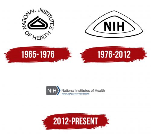
Although the NIH has been around since 1887, it didn’t have visual symbols for long. Until about the 1960s, the agency used the logos of PHS and various departments. It wasn’t until 1965 that a special committee recommended establishing better communication with its clients. As part of this initiative, an emblem was designed in the shape of a triangle with rounded corners, with the letters “NIH” at the center. This was created by the staff of the National Institutes of Health themselves. Eleven years later, the agency transformed the logo, giving it the form of a laboratory container. This version was used for several decades. In the early 2010s, it became clear that all NIH centers and institutes lacked organized branding. They needed a single, shared logo. Designers created a stylized arrow, symbolizing development and continuous forward motion.
What is NIH?
NIH is an acronym formed from the initial letters of the phrase “National Institutes of Health.” It is the name of an American agency composed of 27 research centers and institutes. It conducts and funds the development of new vaccines, drugs, and medical technologies.
1965 – 1976
The emblem is shaped like a triangle with rounded corners and consists of two curved black lines with a space between them. The geometric figure is at the center of a ring made up of the inscription “NATIONAL INSTITUTES OF HEALTH.”
1976 – 2012
This logo first appeared in the header of the NIH Record information bulletin on November 12, 1969. A white triangular frame with convex sides surrounds the black letters “NIH.”
2012 – today
In the fall of 2012, a new National Institutes of Health emblem was presented at the Celebration of Science event: white letters “NIH” inside a gray pentagon. The corners of the base are slightly rounded, giving it a softer appearance. To the right are two blue stripes. They are slightly inclined and resemble an angle bracket. Overall, the sign looks like a pointer with an arrow, symbolizing progress and development. To the right are two inscriptions: gray “National Institutes of Health” and blue “Turning Discovery Into Health.” The agency’s slogan was patented in 2013 and has been added to the logo since then.
Font and Colors
A straight, bold sans serif font, similar to Sequel Sans Disp Semi Bold by OGJ Type Design or Acumin Pro Medium by Adobe, is used for NIH’s full and abbreviated name. The slogan is written in italics, roughly reminiscent of Archivo SemiBold Italic by Omnibus Type.
Since 2012, the logo’s color scheme has been based on white, gray, and blue. This combination creates a sense of reliability and aligns with the organization’s mission, which is tied to healthcare.


