


![]() Noodles & Company Logo PNG
Noodles & Company Logo PNG
Fast food restaurant chain Noodles & Company chose a themed logo. It depicts a piece of noodles, which is the basis of the menu. The pasta is curved and is in front of the brand name. The change in its appearance reflects management’s desire to diversify its menu and expand its customer base. The inscription is in lowercase, with rounded letters.
Noodles & Company was founded in 1995 by Aaron Kennedy in Cherry Creek, Denver, Colorado. Kennedy, a former Pepsi marketing executive, got the idea after visiting a noodle restaurant in Greenwich, New York. He saw potential in a quick-service chain built around noodle dishes, adapted for American customers rather than tied to a single regional cuisine.
The first restaurant offered a menu with Asian, Mediterranean, and American influences. This format gave the chain a broader positioning than a typical fast-food outlet. At the same time, the name remained direct and product-based. Noodles were the main dish, the organizing idea of the menu, and the basis of the brand. During its first decade, the company expanded beyond Colorado into nearby states.
From 2006 to 2013, Noodles & Company grew faster with investment from Catterton Partners. The funding helped the chain open hundreds of restaurants across the United States. In 2013, the company entered the public markets through an IPO on the NASDAQ. Its headquarters later settled in Broomfield, Colorado, as the network continued to spread.
After the IPO, the chain faced stronger competition, higher labor costs, and weaker sales. In 2016, it closed 55 underperforming locations, reorganized leadership, updated the menu with low-carb and plant-based options, and improved digital ordering and delivery. During the COVID-19 pandemic in 2020, Noodles & Company shifted toward takeout, delivery, and third-party services. By 2022, it operated 458 restaurants in 31 U.S. states.
Meaning and History
![]()
The restaurant’s main dish is imprinted on the logo. Visually, the picture underwent several stages of modification, from a realistic image to a schematic composition. Moreover, the design of the corporate emblem went through three stages: an oval element, a flattened rectangle, and no substrate. Despite the noodles, the logo looked serious at all times, attracting visitors with the image of pasta frying in a pan. There are several variants of the Noodles & Company personal sign.
What is Noodles & Company?
Noodles & Company is a US fast food chain. It appeared in 1995 thanks to the efforts of Aaron Kennedy, who was impressed by the noodles he tried at Greenwich. Then he got the idea of opening a restaurant where pasta would be the star of the menu. Now it is one of the largest American chains: its 458 establishments cover 31 states.
1995 – 2006
![]()
For their logo, Noodles & Company used an image of noodles and a frying pan, close to a realistic look. Therefore, they are drawn in detail on the debut sign. Moreover, the theme of pasta is evident in everything: in a frame on an oval background, an inscription with lines in the middle, and letter combinations. The noodles are artfully arranged above the pan, as if expertly tossed by a professional chef to evenly distribute the sauce and maximize flavor. The name is two-level, typed in a grotesque style with smooth glyph transitions. The main colors of the emblem are white, yellow, and black (noodles, text, frying pan), and the additional color is red (to attract customers’ attention and awaken their appetite).
2006 – 2010
![]()
For the second option, the designers redrew the frying pan and noodles, making them less realistic. In addition, they reduced the number of turns of tossed pasta, removed the center line in the letters, changed the font, repainted the background bright red, and depicted the ampersand as a swirling noodle. As a result, the “n” and “d” appeared with sharp cuts at the ends. The rest of the glyphs have been rounded. The correction of the emblem is driven by the need for convenient placement across various advertising surfaces.
2010 – 2013
![]()
Aaron Kennedy, a former marketing executive at Pepsi, noticed a lack of restaurants serving noodle dishes. In 1994, he teamed up with chefs Joe Serafin and Ross Kamens to create a unique menu. By the end of 1995, they opened their first restaurant, introducing a new brand to the culinary world. So says the company’s corporate legend.
The brand’s logo was carefully crafted to stand out with bright red and yellow colors, emphasizing its focus on noodle dishes. The logo displays the words “noodles” and “company” inside a softly curved ellipse in a subdued red tone, bordered in mustard yellow, a color choice reminiscent of ketchup and mustard.
The logo features a spoon holding a stylized noodle above the brand name, enhancing its visual appeal and conveying the nature of the business. This design element ensures the logo is both memorable and functional, supporting the brand’s expansion by emphasizing its commitment to delightful, unique noodle creations.
2013 – 2018
![]()
In 2013, a fast-food restaurant chain experimented with fonts to make the lettering appear larger and more prominent. The developers switched to uppercase letters, smooth, even, high, without serifs, still painted white. The designers also made the ampersand white to make it visible and placed it in a yellow circle. Due to the thin frame and shadow, the oval in the background became three-dimensional. Intense red disappeared instead; it appeared as red brick.
2015 – 2018
![]()
A rectangular logo, slightly concave at the top and bottom, was used in parallel for some time.
2018 – 2019
![]()
After a year of rebranding, an emblem appeared with a two-level inscription “noodles WORLD KITCHEN,” which the company reverted to the lowercase version of the name. A narrow space appeared between the letters, and above them, a frying pan with yellow noodles tossed up. The leg “n” received an expressive bend, like “l.”
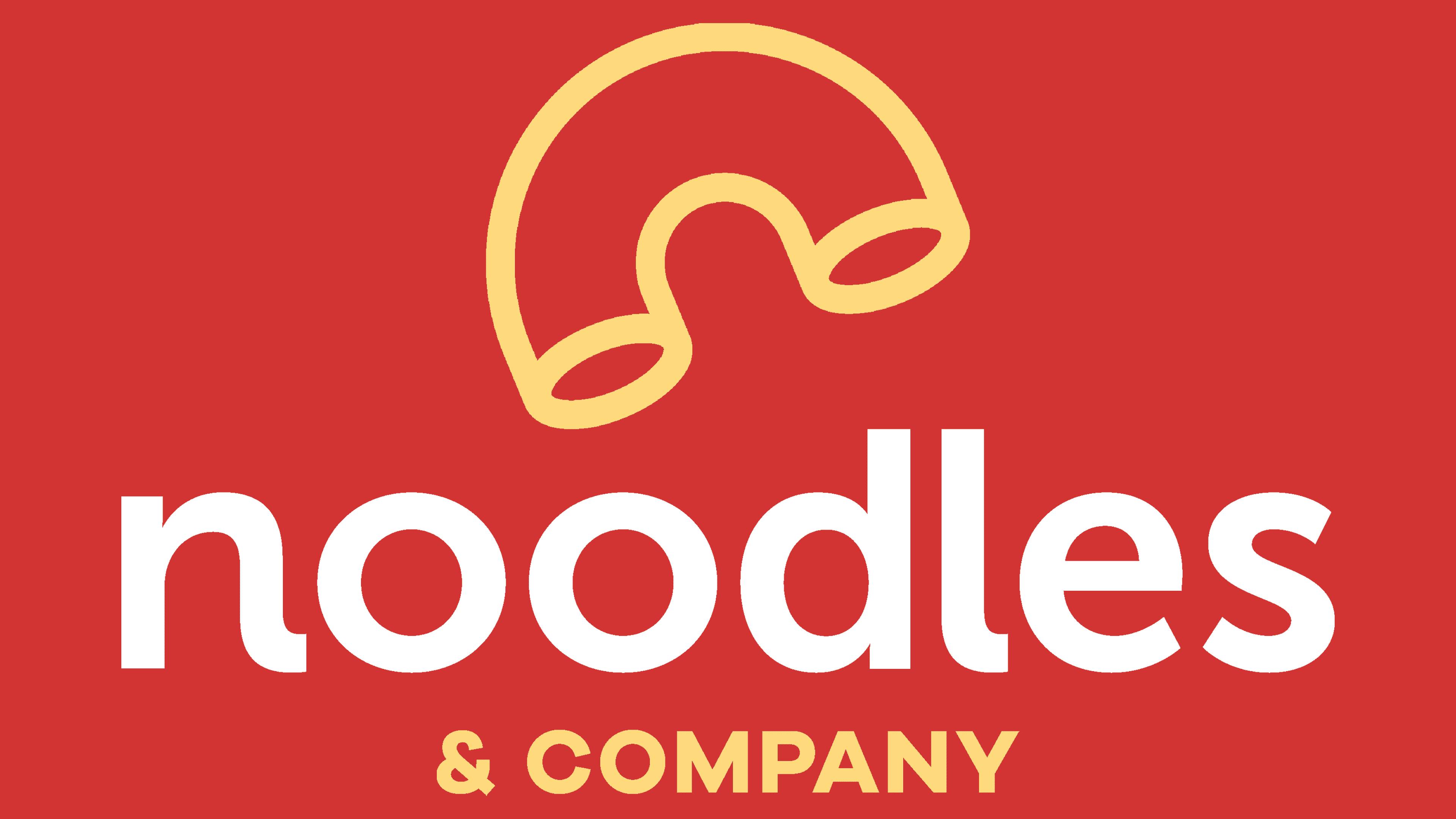
2019 – today
![]()
The modern Noodles & Company logo is simplified as much as possible. Only a horn-like figure (a kind of pasta) and a name taken from the previous emblem remained. In this case, the icon resembles a diagonal “n.” The color palette is red but muted.
Font and Colors
Over the course of evolution, the sign of this fast-food chain has been simplified. As a result, it has lost the black frying pan with noodles tossed up. The color is now also far from tomato; it is restrained and a weak brick shade. Such changes are explained as follows: first, the restaurant expanded its menu and began preparing more than just noodles; second, it adapted the logo for screens across various media.

The typeface in the upper register is very close to the Abadi Condensed ExtraBold grotesque created by Malaysian designer Ong Chong Wah. The lowercase version of the inscription resembles a modified Museo Sans 700 from exljbris Font Foundry: the right side of the “n” is lengthened in the logo. In this way, a modern type of noodle was obtained. Although the colors in the emblem were constantly changing, they certainly remained within the red. So, at different times, scarlet, blood red, raspberry red, and brick were used. They were complemented by white, yellow, and black.
FAQ
What do noodles symbolize?
Noodles symbolize long life and longevity in many cultures, especially in Asia. Their long, unbroken strands represent a journey of life without end. Noodles are often eaten at birthdays and other significant celebrations as a wish for a long, healthy life.
In today’s difficult times, the meaning of noodles has become even more powerful. Life’s unpredictability makes it all the more valuable. Eating noodles can remind us to appreciate every moment and not take life for granted. It highlights the importance of hope and the will to keep going even when times are hard, believing in a path that continues. Noodles, then, are food. They symbolize hope, resilience, and our connection with each other, reminding us to strive for a better, longer life in this complicated world.
What is Noodles and Company’s mission?
Noodles & Company has become a place to eat; it’s dedicated to making a positive impact on everyone it meets, including its team, customers, and communities. It aims to offer great food, inspire and nourish people, and enhance the dining experience.
The company is driven by four main values: care, pride, passion, and a love for life. These principles shape how they interact with customers and prepare their food. They focus on showing care, ensuring everyone feels valued, taking pride in offering high-quality dishes, being passionate about their work, and striving to enjoy and share life’s joys with others. These values and mission set Noodles & Company apart in the restaurant industry.
What is the new name for Noodles and Company?
Noodles & Company began rebranding by unveiling a new name, “Noodles World Kitchen.” This effort aimed to refresh the company’s image and enhance its offerings. With the rebranding, Noodles World Kitchen sought to broaden its appeal by adding new dishes and menu customization options to address a variety of taste preferences and dietary needs. The brand focused on improving customer service by launching a rapid pickup service for faster, more convenient order collection. Noodles World Kitchen introduced a rewards program to keep customers coming back, offering benefits and incentives to loyal customers. These initiatives were strategic moves to transform the brand’s identity, making Noodles World Kitchen a more welcoming and customer-centric dining choice.