 Nouveau Front Populaire Logo PNG
The Nouveau Front Populaire logo reflects the main principles of the political forces that make up the party and conveys their key mood. The emblem is partly restrained and outspoken about the problems brewing in French society. It demonstrates the unity of different movements against the ruling power.
Nouveau Front Populaire: Brand overview
On June 10, 2024, the New People’s Front, known as the Nouveau Front Populaire, was founded in France as a broad left-wing electoral alliance. The far-right parties’ victories in the French elections for the 2024 European Parliament prompted the foundation of this alliance.
The necessity to unite left-wing forces in the face of the far-right’s increasing dominance in the nation spurred the formation of the alliance. To provide voters with an alternative to right-wing and far-right political forces, the coalition was established to participate in the French parliamentary elections in 2024.
This group brought together left-wing movements and parties, such as socialists, communists, environmentalists, and representatives of other progressive organizations. The coalition tried to revive the essence of the legendary Popular Front of the 1930s, which was likewise established in reaction to the advent of far-right organizations.
Amidst the group’s establishment, there were rigorous discussions between different left-wing factions and groups. Given the range of ideological stances on the left, leaders of these groups faced a difficult task in resolving existing disagreements and creating a shared platform.
The coalition’s platform includes combating socioeconomic inequality, defending workers’ rights, bolstering the social assistance system, and opposing the policies of far-right groups.
The formation of this partnership had a profound impact on French politics and society. Left-wing forces interpreted it as an attempt to mobilize and provide a strong alternative in France’s shifting political climate.
Meaning and History
What is Nouveau Front Populaire?
The goal of the French political movement is to revive left-wing politics in the country. This coalition brings together trade unions, grassroots organizations, and historic left-wing parties, drawing inspiration from the Front Populaire of the 1930s. The movement positions itself as an alternative to traditional centrist politics and far-right populism, advocating for social justice, economic equality, and workers’ rights. It emphasizes participatory democracy and promotes public involvement in government policy through online and local committees. Its agenda includes proposals for wealth redistribution, strengthening public services, and advancing the ecological transition. The movement aims to unite socialists, communists, environmentalists, and progressive centrists, bridging ideological gaps within the left.
2024 – today
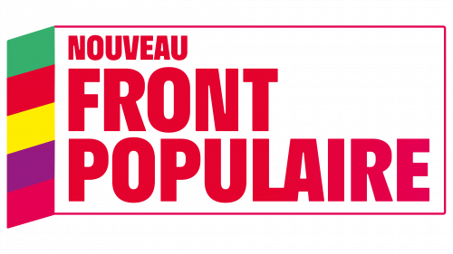
The emblem of the French party Nouveau Front Populaire is a progressive statement in the visual identity of politicians. It is not simply an original sign; it allows a glimpse of the alliance of different forces to reveal their unspoken thoughts. This logo manifests hidden desires, eloquently communicating them to the world.
Although the party’s name references the old Front Populaire, which emerged in 1936, the emblem of this new movement shows they are entirely different and diverge on most points. This is indicated by the font, which in this case is:
- Massive (subconsciously dominating those around it);
- Red (aggressively drawing attention);
- Bold (demonstratively showcasing confidence).
The absence of serifs softens the negative impression, indicating the party’s willingness to compromise. This also suggests its desire to attract other interested parties and make them allies.
Overall, the Nouveau Front Populaire emblem comprises graphic and textual parts. It perfectly characterizes the members of the new French political force, as there are many curious details about its structure, such as:
- The presence of a frame—an expression of a firm stance;
- Connected letters—unity of members;
- Three-level inscription—structured ideas, calculation;
- Sharp angles—determination, intransigence;
- Red color—leadership, desire to be noticeable;
- Massive text—unwavering convictions;
- Vertical parallelogram—demonstration of creativity;
- Clear boundaries between colors—distinct party identification;
- Rounded corner of the frame—possibility of compromise;
- Contrasting line thickness in the glyphs—willingness to change;
- Lack of gaps between colored segments—solidarity.
Additionally, the various parties, which existed separately on the political stage before uniting, use the logo to show aggression towards opponents, openness to new members, unity of goals and objectives, thoughtfulness, and a merger for solidarity. The grotesque style emphasizes the seriousness of convictions, while the multicolored structure shows Nouveau Front Populaire’s intent to appeal to the younger voters.
Another interesting aspect that hints at how long this movement might stay united is that attention should be paid to the distinct boundaries between colors that do not blend. They indicate that each party identifies as an independent social entity, unwilling to compromise its principles. Therefore, they see the new alliance as a temporary structure to confront a common “enemy.”
In other words, several political forces have united for the fight, where each feels equal. The equal size of the colored segments indicates their equivalent capabilities. Five matches the main forces: green, crimson, purple, yellow, and red. The bold font demonstrates the parties’ confidence and determination.
The white background balances everything: it softens emotions, balances the active palette, promotes calmness, and emphasizes sober calculation. At the same time, the emblem has a small gradient. It is visible in the frame, colored in red (top) and crimson (bottom), harmoniously blending in with the right stripe. The inscription notes the same effect: it starts with red and ends with crimson.
The conclusion is clear: the newest player on the French political stage has carefully considered its visual identity to impact a wide range of voters. The logo has everything for this: a precise design, practicality, brightness, creativity, and even cold calculation.


