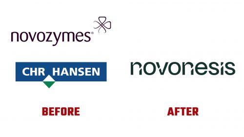
In an ambitious move to consolidate their expertise and resources, Chr. Hansen, established in 1874, and Novozymes, founded in the year 2000, have merged to create a new powerhouse in the bio-solutions industry: Novonesis. The newly formed entity, boasting a global workforce of 10,000 across more than 30 industries, has introduced its brand identity, including the Novonesis logo, signaling a fresh start for the combined expertise of both legacy companies.
Novonesis emerges as a leader in developing solutions that address some of the planet’s most pressing challenges. From enhancing sustainable nutrition and biofuel production to reducing reliance on fossil-based resources, chemicals, and water, Novonesis’s solutions deliver value to thousands of customers worldwide and contribute positively to environmental sustainability.
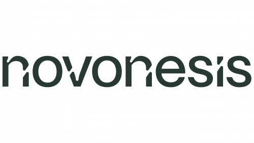
The amalgamation of “Novo” (new) and “Genesis” (origin or beginning) in the company’s name reflects Novonesis’s mission to spearhead innovative solutions from a new beginning. While the name might evoke a corporate or pharmaceutical connotation, the logo design softens this impression. Utilizing a lowercase, slightly rounded sans serif font, the Novonesis logo incorporates subtle design elements like ink traps and the title placement on the “i” to hint at the molecular theme central to the brand’s identity.
However, the selective application of ink traps in the logo’s lettering raises questions about consistency and the missed opportunity for a more unified, stencil-like appearance. Despite this, the molecular “n” symbol creatively represents Novonesis’s focus on organic, molecular-level solutions.
Regarding application, Novonesis’s branding strategy employs close-up imagery of molecular structures to create visually engaging background motifs. It also uses a unique color palette and gradients that underscore the brand’s innovative approach. Using connecting-molecule concepts in iconography and design elements further reinforces Novonesis’s commitment to connectivity and integration in the solutions space.
While the brand’s visual identity leans towards a corporate aesthetic, it unmistakably conveys a scientific vibe, aligning with Novonesis’s core mission of leveraging bioscience to impact global sustainability and health significantly. As Novonesis embarks on its journey to support over 500,000 households in their energy transition by 2030, its new identity serves as a beacon of innovation and hope for a more sustainable future.


