Science is the future of the earth. That is why the NSF logo embodies its support. It remains modern in all circumstances and at all times because relevant discoveries are gradually becoming commonplace, making way for fresh innovations. The symbolism of a progressive agency reflects all this.
NSF: Brand overview
| Founded: | May 10, 1950 |
| Headquarters: | Alexandria, Virginia, U.S. |
| Website: | nsf.gov |
The NSF is in the business of providing grants to fund research done by American engineers and scientists. It can be a variety of projects – from zoological to astronomical. The main thing is that they meet the accepted standards of the National Science Foundation. After all, the organization’s task is to ensure the leadership of the United States in the world ranking of pioneers.
The federal agency NSF was created in 1950 to promote the advancement of science in the United States. This became possible after President Harry S. Truman signed the relevant law. The initial budget of the organization was not too large. Still, over time it grew because the Americans wanted to develop the astronomy program and Antarctic research at an accelerated pace.
Now the National Science Foundation provides grants for cutting-edge projects that many associates with science fiction. Financing is received by both individuals and teams united by a common goal. In addition, the agency provides funds for students and faculty involved in research projects.
Meaning and History
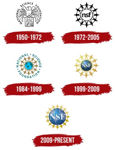
The idea of mutual assistance and friendliness is reflected in the NSF logo, which depicts people holding hands. They surround the globe, which indicates the desire for global discoveries. This image originated in the 1970s, but the designers finalized the concept over time, presenting the round dance in the form of a golden decorative edging.
What is NSF?
NSF is short for the National Science Foundation. This is an American organization that provides financial support to projects in various fields of science. First of all, we are talking about non-medical research and development. Her field of work covers sociology, economics, mathematics, engineering, and more.
1950 – 1972
In 1950, the NSF agency appeared, and at the same time, its first logo was introduced. At the bottom was a quadrangular heraldic shield with a pointed base and protruding upper corners. On it sat a bald eagle, which looked to the left, spreading its wings wide. And on the shield itself were symbols associated with scientific research: a laboratory test tube, an Egyptian pyramid, and a microscope. At the top of the pyramid stood an ancient lamp in the form of a teapot. She radiated light, a hint of enlightenment, the light of knowledge. Surrounding the bird and shield was a ring of black NATIONAL SCIENCE FOUNDATION.
1972 – 2005
The first half of the 1970s became a turning point in the NSF identity because it was then that the American organization began to use the logo with people holding hands. It remained relevant for the next 33 years. It was the simplest image of a paper garland of little men who formed a ring and stood on one central circle. In the middle was the inscription “nsf” of lowercase letters connected to each other. The figurines, abbreviations, and circle frames were all black, while the background was white.
1984 – 1999
Another version of the logo with men appeared in 1984. The “garland” and the ring under the people’s feet were brown, and in the center, there was a simplified illustration of the globe. The globe showed blue-green continents and light-blue oceans. The abbreviation disappeared – the designers replaced it with the inscription “NATIONAL SCIENCE FOUNDATION,” which was placed in a circle as an outer frame. Bold dots separated the aquamarine words.
1999 – 2009
On the eve of the second millennium, an independent agency updated its identity again. As a result, the little men holding hands were enlarged and, together with the inner ring, were repainted in gold. The gradient transitioned from a lighter shade in the upper left corner to a darker one on the right.
The creators of the logo returned to the abbreviated name NSF, so they removed the ring formed from the long inscription. They placed the abbreviation in the center, choosing a large globe as the basis. In this version, the globe was three-dimensional due to the gradient. A dark blue color was used to indicate the body of water, and gray-green with a grainy texture was used for the continents. All three letters were capitalized, white, and had thin, long serifs at the ends.
2009 – today
In 2009, the National Science Foundation logo was redesigned once again. The designers almost doubled the globe’s size and, at the same time, changed its color scheme, making the continents light blue with a purple tint. The gradient remains: the image is “bright” in the center with a slight shift of the pale spot to the upper left corner.
The globe, as before, is surrounded by people holding hands. Only now, the figures look more abstract:
- They are flattened.
- They do not have clearly defined legs.
- The lines imitating the hands are not long enough.
As a result, the ring of little men is shaped like the outer part of the ship’s steering wheel. The color reinforces this association because the so-called “people” are painted in several shades of brown-gold, from light at the top to dark at the bottom.
The “NSF” abbreviation has been enlarged along with the globe to keep the original proportions. The letters remained white, but they had thin dark blue outlines. The font, as before, is antique: it has long serifs of uneven thickness.
Font and Colors
The National Science Foundation’s only visual identifier is the globe emblem. The globe symbolizes the global scope of the agency, which provides grants to fund projects in various fields of science, except medicine. It also hints that the results of NSF-supported research are of global significance.
The second component of the logo is a garland of people holding hands. They are arranged in a circle, representing unity, closeness, teamwork, and striving for a common goal. It also symbolizes the fund’s friendliness and openness to cooperation. In turn, the acronym “NSF,” located in the middle, is an abbreviation for the organization’s full name. To show its importance, the designers enlarged the letters and made them the central object.
The font used in the National Science Foundation logo has several counterparts. Among them are Baskerville Display PT Bold, released in 2016 by ParaType, and Nimbus Roman No9 L Bold by URW++. This is an antiqua with long serifs and with a contrasting thickness of the main and additional strokes.
The color scheme of the NSF emblem contains white, pale blue (PMS 653 CV 35%), blue (PMS 653 CV 100%), and gold with a gradient (the darkest shade is PMS 118 C 75%). White is used to highlighting letters that are located in the center. Gold symbolizes the foundation’s high standards, optimism, wisdom, wealth, and inexhaustibility of resources.
NSF color codes
| Citron | Hex color: | #dfc86d |
|---|---|---|
| RGB: | 223 200 109 | |
| CMYK: | 0 10 51 13 | |
| Pantone: | PMS 1215 C |
| Satin Sheen Gold | Hex color: | #c29c09 |
|---|---|---|
| RGB: | 194 156 9 | |
| CMYK: | 0 20 95 24 | |
| Pantone: | PMS 117 C |
| Spanish Sky Blue | Hex color: | #45a3d7 |
|---|---|---|
| RGB: | 69 163 215 | |
| CMYK: | 68 24 0 16 | |
| Pantone: | PMS 2995 C |
| Dark Cerulean | Hex color: | #1d457a |
|---|---|---|
| RGB: | 29 69 122 | |
| CMYK: | 76 43 0 52 | |
| Pantone: | PMS 654 C |
| Light Steel Blue | Hex color: | #a9c1dd |
|---|---|---|
| RGB: | 169 193 221 | |
| CMYK: | 24 13 0 13 | |
| Pantone: | PMS 543 C |
| Glaucous | Hex color: | #62749d |
|---|---|---|
| RGB: | 98 116 157 | |
| CMYK: | 38 26 0 38 | |
| Pantone: | PMS 7667 C |


