![]() Nwo Logo PNG
Nwo Logo PNG
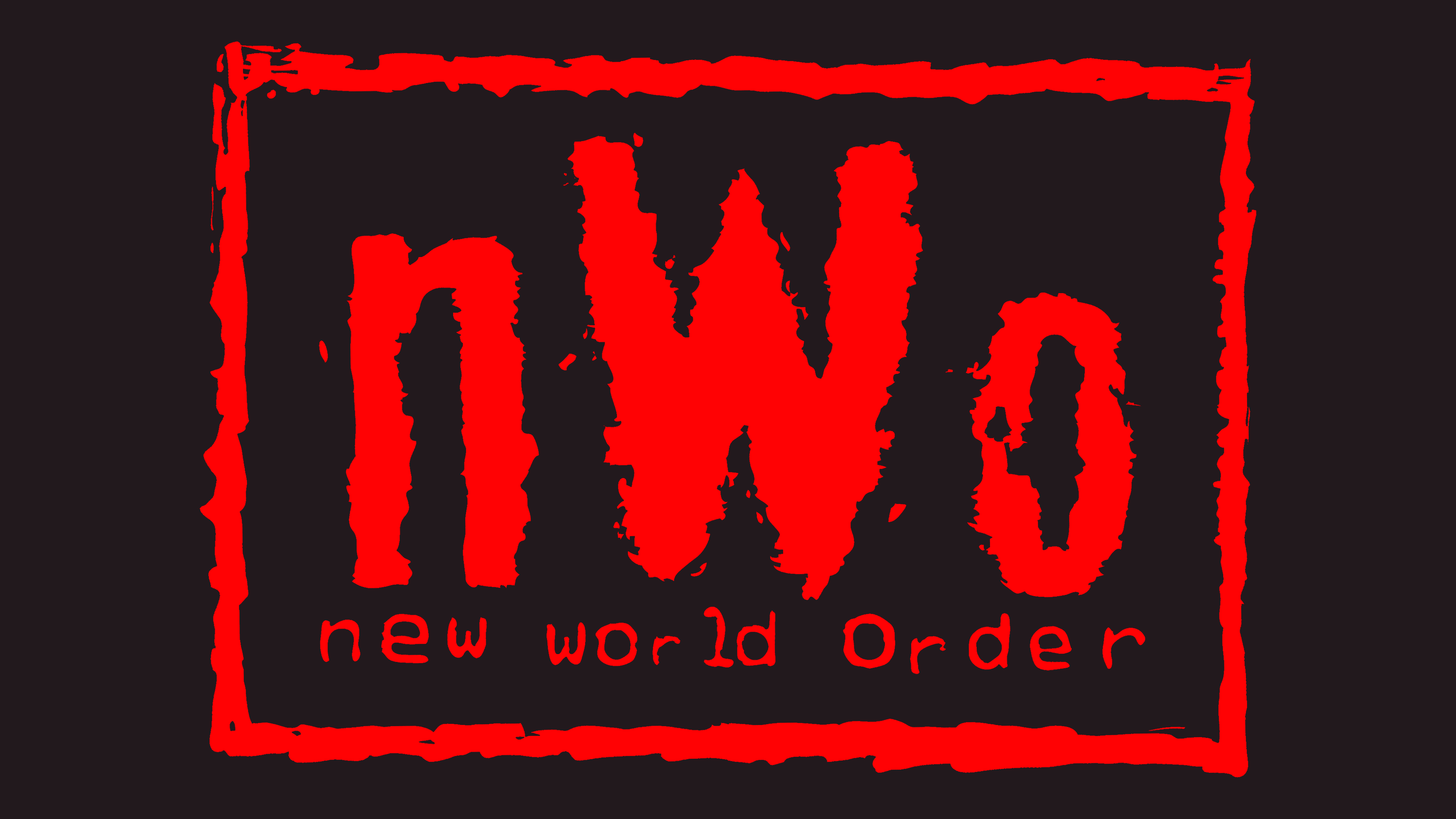
The rugged nWo logo reflects the essence of the sports group that emerged in defiance of the official WCW organization, aiming to control it. The monochromatic emblem conveys unstoppable force, the desire for dominance, superiority, and even professionalism. Through this emblem, the wrestlers illustrate their worldview split into two opposing camps: black and white. Meaning one is either good or bad, either right or wrong. They reject anything in between.
The New World Order (nWo) was formed in 1996 during World Championship Wrestling (WCW), initially appearing as a rebellious faction known as “The Outsiders,” featuring former WWF stars Scott Hall and Kevin Nash. The group dramatically shifted wrestling culture when Hulk Hogan unexpectedly joined, turning heel at Bash at the Beach, and transformed wrestling into a spectacle that appealed to adult audiences. With iconic black-and-white imagery and aggressive tactics, nWo dominated WCW programming, enabling WCW Monday Nitro to surpass WWF Monday Night Raw ratings for 83 consecutive weeks. Internal divisions weakened the original unity, leading to separate factions like nWo Hollywood and nWo Wolfpac. After WCW’s collapse and acquisition by WWE, the group briefly returned to WWE in 2002, ultimately dissolving shortly after. In 2020, the core members Hogan, Nash, and Hall were inducted into the WWE Hall of Fame, recognizing their lasting influence on wrestling, storytelling, and entertainment.
Meaning and History
![]()
Having originated within the framework of World Championship Wrestling, nWo transitioned to the WWF (World Wrestling Federation) and gradually became the most influential group in storyline matches. It effectively became the leader of the wrestling industry, elevating it to an incredibly high level of fame. The loud success of this sports organization came in the mid to late 1990s. Their influence made North American professional wrestling a unique and highly sought-after show. The visual identity played a huge role, designed to captivate the imagination. And it indeed did.
The nWo logo is closely tied to the WCW wrestling era, when the New World Order faction became one of the most defining movements in the industry. In his book “Nitro: The Incredible Rise and Inevitable Collapse of Ted Turner’s WCW,” Guy Evans detailed how the logo came to be. The design was created by Jenny Sloan, who worked at Disney/MGM Studios, where WCW Monday Nitro was broadcast live in 1996.
The design follows street graffiti style, resembling gang markings used to claim territory. WCW producer Neil Pruitt suggested this concept, and Jenny Sloan brought it to life. The initial design was created based on simple instructions: it must be in a rough printed font with jagged edges. When she presented the first sketch, she was asked to make it even less polished. She hand-drew the edges to achieve the desired effect, making them uneven, as if the paint was dripping or fading.
The logo’s font is intentionally rough, with bold strokes and distressed details, as if spray-painted or brushed onto a wall. At the bottom, the phrase “new world order” is written in a typewriter-style font, giving it the look of text printed on an old typewriter. The logo’s border also features jagged edges, reinforcing the chaotic and anarchic feel.
Sloan also decided to format “nWo” with a lowercase “n” and uppercase “W” and “O.” She doesn’t recall exactly why she chose this style, except that it simply looked more interesting. While working on the logo, she drew inspiration from New Age culture and the punk movement, which is evident in the overall aesthetic.
What is nWo?
nWo stands for New World Order, an association of professional wrestlers. It emerged during the World Championship Wrestling (WCW) tournament to control the existing organization and later became a driving force in popularizing professional wrestling. The group was formed on the initiative of Terry Gene Bollea, who performed under the pseudonym “Hollywood” Hulk Hogan. Its debut took place in the summer of 1996.
1996 – today
![]()
True to its stylistic intent, the nWo logo is unyielding. It leaves no room for ambiguity: by its standards, the world is white or black. The audience must choose the right side monochrome, where two contrasting colors unite. It’s precisely so in the emblem: a white frame and white lettering set against a black background. There’s no middle ground because wrestlers are either adored or despised. This sentiment is echoed in their visual identity, built on the balanced combination of the seemingly incompatible.
The background is a rectangle. Centered within it is the name of a sports group, split into two lines. The first line features an abbreviation. It’s prominent but not entirely in uppercase: only the “W” is capitalized, while the other glyphs are lowercase. The second line states the organization’s full name, “New World Order.” There are no repeating letters; each is unique in style and shape. The only thing tying them together is the thin font. Another shared characteristic is the trembling lines.
In contrast, the upper line uses bold glyphs, but they appear battered in fierce battles, as evidenced by their frayed edges. The surrounding frame has a similar appearance. Slashed lines with uneven edges mark it.
Font and Colors
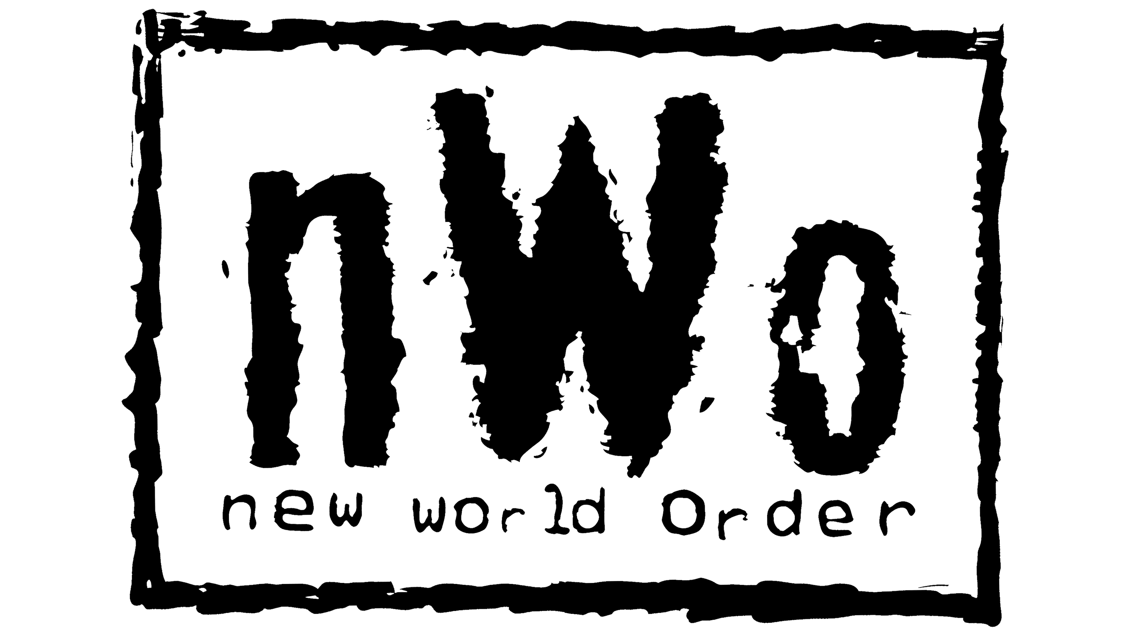
The logo inscription “nWo” has nothing to do with typography. It’s a drawing, not text. It resembles the Graffiare font by Tomoyuki Watanabe or the later NWorder. The brand’s color palette consists of two starkly contrasting colors: black and white.