The Oakley logo very accurately conveys the brand world. After all, this company produces sports clothing and glasses for athletes and active lifestyle enthusiasts. A hint at such a type of accessory is the round “O” sign. Its elongated oval shape clearly resonates with glasses or, more precisely, with lenses.
Oakley: Brand overview
| Founded: | 1975 |
| Founder: | Jim Jannard |
| Headquarters: | Foothill Ranch, California, United States |
| Website: | oakley.com |
Meaning and History
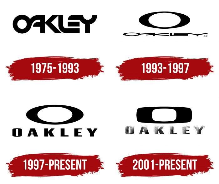
The brand’s style reflects the essence of Oakley’s business. The horizontal flattened oval is associated with glasses and adorns every frame as the main decorative element. However, before its appearance, the brand could only boast an emblem with the inscription “OAKLEY,” where “O” and “K” with two connecting strokes formed the letter “A,” and “L” and “Y” were part of “E.”
Everything changed in 1993 when the manufacturer first placed the flattened oval on the logo. It also compressed and stretched the inscription, making it unreadable. In 1997, it had to sharpen the oval and change the font of the word “OAKLEY” to improve the perception of the branding style. This led to the version with bold sans-serif font, in which the first letter “O” was shaped like a rectangle with rounded edges and resembled a glass frame.
At the same time, a variant with a gray inscription and a complex multi-component oval was adopted. The artists gave it realism using a gradient. Both emblems, both simple and stylized, are still used. There is another logo with a horizontal rounded rectangle and the hatched word “OAKLEY.” The year of its appearance is unknown.
What is Oakley?
Oakley is a company founded by a professional motocross athlete. It produces clothing, shoes, glasses, gloves, and other sports equipment.
1975 – 1993
In the debut logo, the designers focused on the play of letters and meaning, so they used only the word “Oakley.” They designed it originally, combining adjacent elements. As a result, the emblem consisted of two fragments: “oak” and “ley.” A dividing border runs between them, and the other signs are grouped three each. “O” smoothly transitions into “A,” the right part of which serves as the leg of “K.” A similar situation with the other names: “L” is a platform for “E,” and its upper half connects with “Y.”
1993 – 1997
This time, the developers highlighted the letter “O” as a separate element, enlarged it, and placed it above the word “Oakley.” They did not change the original writing style, but the shape – yes. Therefore, the company’s name seems flattened with a huge oval “O,” demonstrating an extreme situation.
1997 – today
The administration abandoned the poorly readable inscription and approved a version with a noticeable “Oakley.” There is enough space between the letters, and they resemble the signs on an ophthalmological chart for checking visual acuity (also called the Golovin-Sivtsev chart).
2001 – today
Currently, another logo is used, which appeared a little later than the previous one. It depicts a combined sports glasses frame, formed from the first letter of the company name – “O.” It has wide sides and a narrow top and bottom. Below it is the word “Oakley,” executed in the form of a dash. Due to the alternation of thin black and white stripes, it seems much lighter, although the designers used the same colors – black and white.
Oakley: Interesting Facts
Oakley, Inc. is a famous company that makes sunglasses, especially for sports.
- Start: In 1975, Jim Jannard named the company after his dog, Oakley Anne. He began by selling motorcycle grips at racing events.
- Unobtainium: The first product was a special kind of handle for motorcycles called “Unobtainium,” which works better when wet. They still use this material for parts of their sunglasses.
- First Sunglasses: In 1984, Oakley made its first sunglasses, called “Eyeshades,” for cyclists. They were different because they covered more faces and worked well for sports.
- Cool Technology: Oakley’s sunglasses are made to help you see clearly and protect your eyes from the sun. They have created over 600 different inventions for their products.
- Famous Fans: Many athletes and celebrities wear Oakley sunglasses, which has helped them become very popular. They’ve been used by famous sportspeople and even in movies.
- Military Gear: Oakley also makes special gear for the military and police to help them do their jobs safely.
- Joining Luxottica: In 2007, a big company named Luxottica bought Oakley, which helped Oakley sell its products worldwide.
- More Than Sunglasses: Oakley now also makes prescription glasses, ski goggles, clothes, shoes, and more, not just for sports but for everyday wear, too.
- Special Editions: They sometimes collaborate with artists or athletes to create special, unique sunglasses people like to collect.
Oakley started small but has become a big name for sunglasses worldwide because they keep coming up with new ideas and making their products better for everyone, from athletes to people just looking for cool sunglasses.
Font and Colors
The corporate trademark consists of two parts: graphic and textual. The first is a round frame. The second is the inscription “OAKLEY.” Both elements are characterized by uneven line thickness: the geometric shape narrows from top to bottom, and the letters combine wide and thin strokes.
Both the horizontally located oval and the rounded rectangle represent a glass frame. In shape, they also resemble one of the buildings of the Oakley headquarters. The manufacturer releases logos in the form of interchangeable decorative elements that can be attached to the temples. They are available in several colors:
- Gray, polished black, polished chrome
- Blue, red, matte gray, polished gold
- Matte black
For the word “OAKLEY,” the company chose a standard sans-serif font. Jim Jannard’s palette includes a combination of white and black colors. The monochrome contrast looks sophisticated, as do the brand’s products.
Oakleys color codes
| Black | Hex color: | #000000 |
|---|---|---|
| RGB: | 0 0 0 | |
| CMYK: | 0 0 0 100 | |
| Pantone: | PMS Process Black C |
FAQ
What does the Oakley logo represent?
The Oakley logo contains the brand name, typed in bold, high-contrast font. At the top is a large letter “O,” which looks like an elliptical ring with bulges on the sides.
What do Oakleys produce?
The Oakley range includes clothing, shoes, optical frames, backpacks, watches, glasses, and a wide range of sports equipment.
How do we identify if Oakleys are fake?
Fake Oakley glasses are cheap and of poor quality; paint peels off the frame. A logo on non-prescription lenses indicates a fake, but this does not apply to other types of glasses. Sticky stickers that leave glue traces are another sign of a fake.
Is Oakley a designer?
Yes, the Oakley company designs its products.

