


![]() Off-White Logo PNG
Off-White Logo PNG
Clothing for all occasions is hidden behind the fashion house’s emblem. The lines and symbols of the Off-White logo are straight and simple, a sign of comfort and versatility. The brand’s outfits perfectly match urban style.
Meaning and History
![]()
Initially, this company was called Pyrex Vision, but then it was renamed. The reason is the failed start, as it was heavily criticized for lack of a concept and for deception. Ralph Lauren’s flannel tees were printed with “PYREX 23” on the labels and then resold at $550.
Soon, Virgil Abloh gave its trademark a different name and filled it with ideology. She now positions herself as a gray area between black and white. Her collections have repeatedly participated in Parisian fashion shows and are now sold in the best boutiques in New York, London, Tokyo, and Hong Kong. In 2019, José Neves, the owner of Farfetch, took over the fashion brand after acquiring Off-White’s parent company, the New Guards Group.
What is Off White?
This brand blurred the lines between streetwear and high fashion, redefining modern style. Black-and-white colors, diagonal stripes, quotation marks around words, and memorable design elements characterize it. The company collaborates with major industry players to create clothing, footwear, and home decor. The collections combine elements of industrial design and street culture, making the products instantly recognizable. The range includes evening dresses, functional jackets, and T-shirts with original patterns.
As a young representative of the fashion market, he has only one logo. However, some icons are also used as corporate product prints and as trademark identification symbols. She has two of them.
She is very simple and humble. Despite the brand’s claims to the Parisian and Milan catwalks, there is nothing extraordinary about it. But this is his trick. Concise, practical, and youthful are the three pillars on which his glory rests. This minimalism fits perfectly into the casual style.

The logo features the fashion brand’s name in classic lettering. The first characters in words are uppercase; the rest are lowercase, as generally accepted spelling norms require. On the right (at the end) is an indication of the identity’s official status “TM.” Black text on a white background is perceived as both catchy and familiar. This fits perfectly into the founder’s concept of a gray area between black and white.
The same colors are used for the corporate icons added to the clothes. The most famous drawing consists of four arrows pointing outward from the center in different directions. They are arranged to form a square. This symbol was spied on and borrowed by designer Virgil Abloh from Glasgow Airport. Kinneir Calvert Associates developed the identity mark to mark the internal design system.
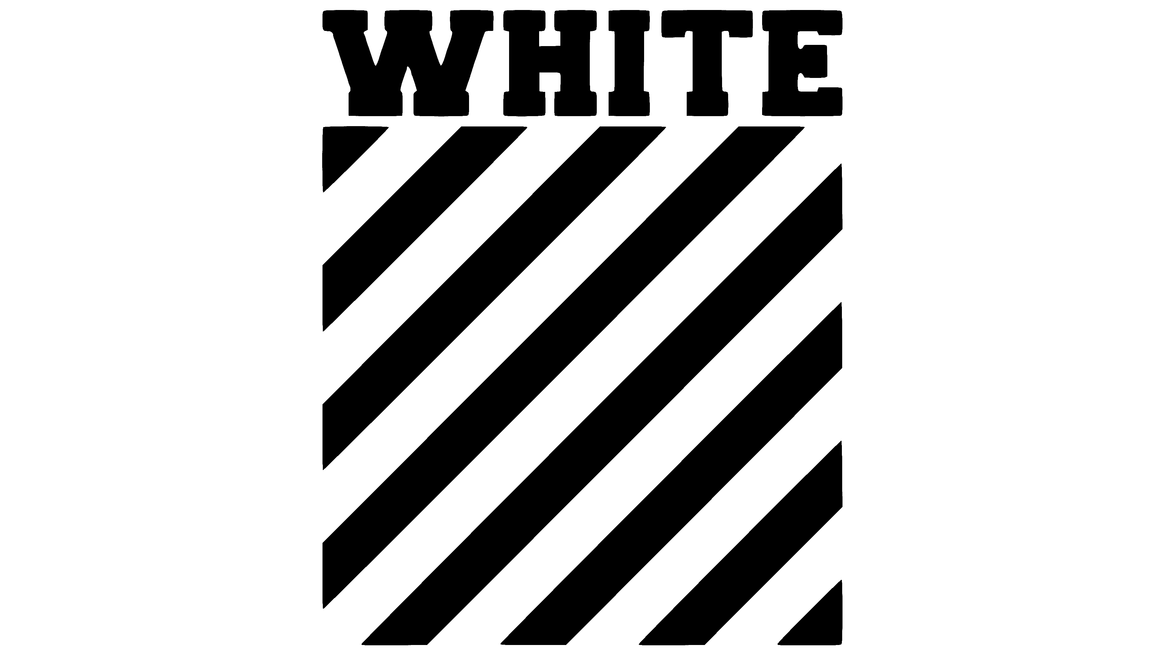
Another emblem looks like a striped square with diagonal lines from corner to corner. Above it, “WHITE” is written in black and white. The brand name is printed in capital letters with large serifs. There are 15 wide stripes on the square, which were previously used as identification marks. They were part of the Glasgow airport gangway and vehicle paint scheme, making them instantly visible from any angle. They were brightened with yellow lines (this is what the original squares look like), which Virgil Abloh replaced with white ones. Jock Kinneir and Margaret Calvert designed the iconic icon. Designers introduced such markings back in 1964.
These two symbols have become emblems printed on the company’s products. They come in the form of large prints and miniature labels. The manufacturer specializes in black-and-white clothing, decorated in contrast.
Font and Colors
The brand’s emblem uses the Rail Alphabet series typeface, developed in 1960 by the pioneering designers Jock Kinneir and Margaret Calvert for the British Railway. She has six spellings, including one called Off-White.
The trademark’s corporate range is monochrome. It corresponds to its name and consists of black and white.
FAQ
Is Off-White a luxury brand?
The brand, founded by American designer Virgil Abloh, is based in Milan. Like other luxury brands, it sells high-priced clothing and accessories. The brand is known for its unique design elements, such as quotes, vibrant graphics, and diagonal stripes, which help it stand out in fashion. Partnerships with renowned brands and designers, such as Nike and IKEA, strengthen its image in the luxury fashion sector.
Does Louis Vuitton own Off-White?
LVMH owns 60% of Off-White as part of a plan to expand its presence in the sportswear and luxury fashion markets. Owning this stake in the company helps diversify its portfolio of high-end brands, increasing its global influence. The founder, Virgil Abloh, is a key player in the fashion world. His innovative designs have transformed luxury fashion, making his brand a perfect fit within the LVMH portfolio.
What does the Off-White logo mean?
The logo depicts the hands and faces of a drowning man. The designers chose this bold, vibrant image to attract attention. It demonstrates the brand’s desire to be visible and memorable in the competitive fashion industry. This approach helps the brand stand out by making bold design statements.
What is the brand Off-White?
According to Business of Fashion, Off-White is a premium brand quickly becoming one of the top three most popular clothing brands. It is known for combining contemporary culture and high fashion with innovative designs, quality materials, and unique craftsmanship. The brand is recognized for its use of quotation marks, zippers, and distinctive stripe patterns, which make its products stand out.
Targeting a young, trend-setting audience who appreciates bold, distinctive pieces, it fuses street culture with luxury elements, bridging the gap between high-end and streetwear. This has made it popular worldwide.
Who designed the Off-White logo?
Virgil Abloh, artistic director and founder, designed it. Known for his innovative approach, Abloh played a critical role in defining the brand’s visual and artistic direction. This distinctive logo was intended to make a strong impact and help the brand stand out in the competitive fashion industry.
Does Off-White have a logo?
Yes, Off-White has a logo depicting the hands and face of a drowning man. Introduced in 2019, it is located under the brand name. The quirky and bold designs reflect the brand’s approach to fashion, challenging traditional norms and incorporating strong, thought-provoking imagery. This visual symbol helps the brand stand out in the competitive fashion industry.
What font is the Off-White logo?
The logo uses the Helvetica Neue Bold font, which appears in many of the brand’s designs, especially those featuring signature quotes. Known for its clean, modern appearance, this font aligns with the brand’s minimalist, vibrant aesthetic. It plays an important role in the brand’s visual identity, helping to create a distinctive and memorable appearance.