 Olympique de Marseille Logo PNG
Stardom and grandeur are read in the Olympique de Marseille logo. The emblem reflects the desire for a dream, the high bar that the players set for themselves. The symbols include gold cups and medals won by members of the club. The team’s balls always hit right on target.
Olympique de Marseille: Brand overview
| Founded: | 31 August 1899 |
| Founder: | Frank McCourt, Margarita Louis-Dreyfus |
| Headquarters: | Marseille, France |
| Website: | om.net |
The French club Olympique de Marseille was created in 1899 as a multisport organization formed from two communities – L’Epee and Football Club de Marseille. Its name reflects the city’s history because the ancient Greeks founded Marseille 600 years before the beginning of our era.
In the 1920s, OM reached the national level, and in the 1930s received professional status. Despite this, by 1981, it had gone bankrupt. But the decline did not last long: after five years, the team was bought by businessman Bernard Tapie, who made it one of the best in Europe.
Meaning and History
Olympique de Marseille has strengthened its hometown’s presence by marking the area with the famous O and M logo. A simple yet memorable monogram adorns homes, shops, public transport, and even boats because it has an impressive fan base.
The iconic emblem was taken from the personal seal of the club’s founder, Rene Dufaure de Montmirail. The original contained the initials of a businessman: “D” and “M.” But the designers replaced the “D” with “O” so that the monogram exactly reflects the name Olympique de Marseille.
What is Olympique de Marseille?
Olympique de Marseille is a professional football team from France. It was founded in 1899 and is based in Provence-Alpes-Côte d’Azur. The club competes in Ligue 1, where it has won 9 titles. They also have one UEFA Champions League victory and numerous other sports achievements.
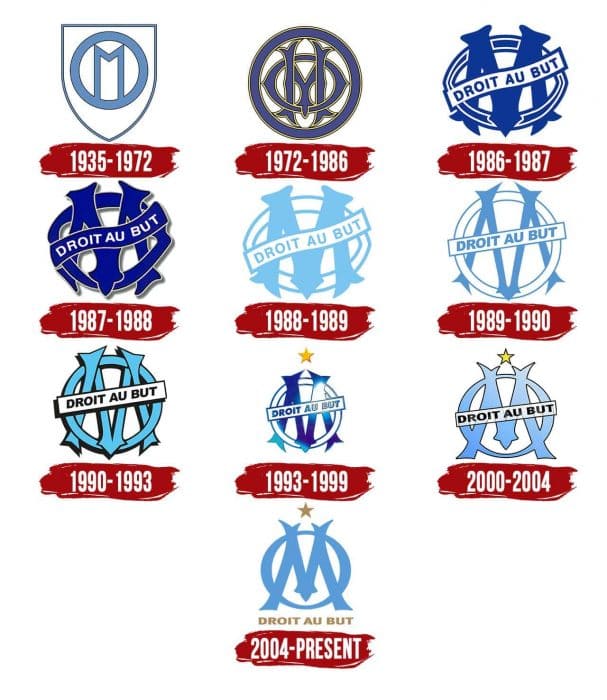
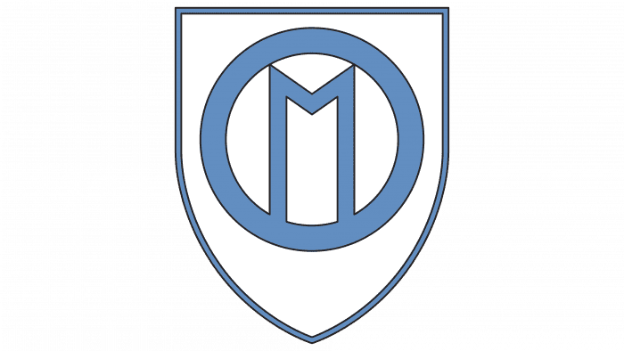
1935 – 1972
In the 1930s, a simplified Art Deco coat of arms appeared. It consisted of a white shield, a circular “O” in the form of a ring, and an “M” with very long side strokes. The outline of the shield and letters were blue.
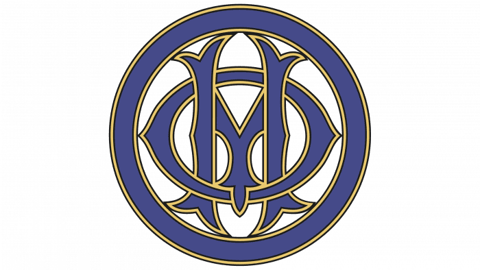
1972 – 1986
Only the “M” remains on the emblem, surrounded by a blue stripe with yellow outlines. Moreover, the ring and the “O” were no longer identified: the “O” was intertwined with the “M” and looked like a horizontal oval. In turn, the ring marked the borders of an around the heraldic shield, inside which was a monogram. The letters were decorated with Art Nouveau serifs.
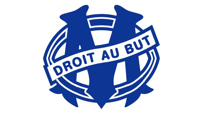
1986 – 1987
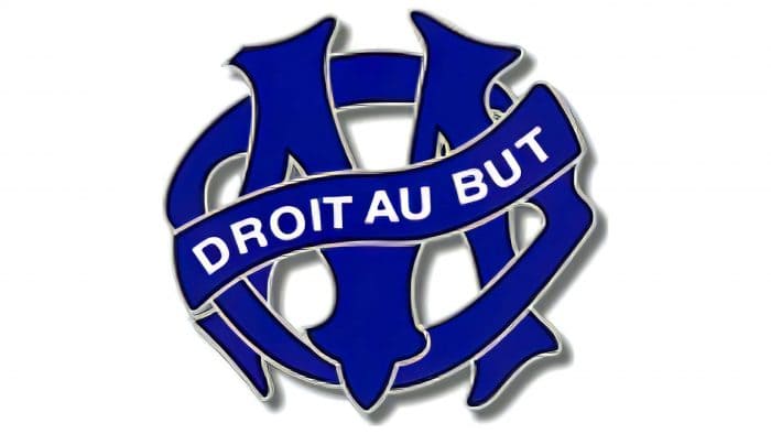
The old motto Olympique de Marseille, which was found on the club’s logos until the 1930s, has returned. This time, the designers placed it on a white diagonal ribbon across the “M.” The phrase “Droit au but” is taken from rugby and, in translation, means “Right on target.”
1987 – 1988
The shapes and proportions have not changed – the developers have made edits only in the color scheme. As a result, the monogram is dark blue, and the lettering is white. Light gray outlines appeared around “O” and “M” that looked like shadows.
1988 – 1989
Continuing the experiment with the palette, the designers made the “M” blue. The lettering “DROIT AU BUT” was painted in the same color, as well as the outlines of the white ribbon and “O.”
1989 – 1990
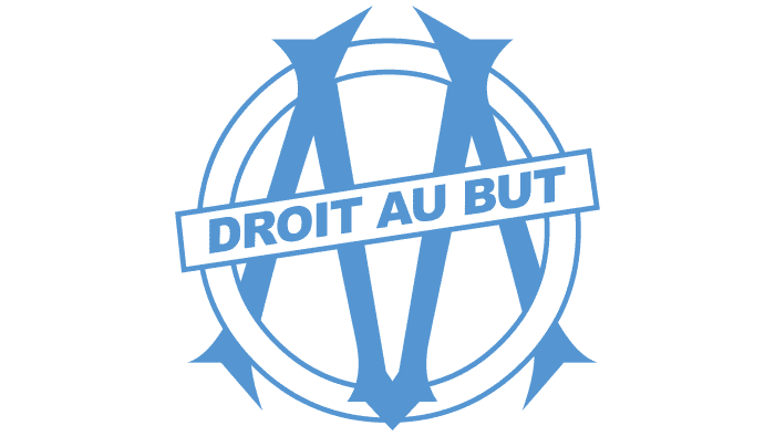
The letters’ shape has changed: “O” has become a perfectly round ring, and “M” has become much thinner. A rectangular plaque replaced the curved ribbon with straight sides.
1990 – 1993
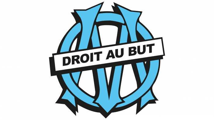
In the early 1990s, the designers for the first time gave the logo a three-dimensional look using black lines of different widths. The darker lines make the blue monogram look even more distinctive.
1993 – 1999
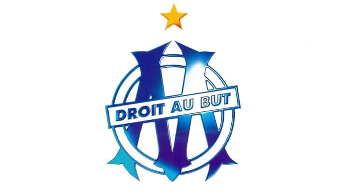
To celebrate their Champions League title, the team added a yellow five-pointed star to the emblem. The shadows around the edges of the letters disappeared – they were replaced by a white-blue gradient, which also created a 3D effect.
2000 – 2004
The “O” began to look unusual due to the sides’ uneven thickness: the top and bottom are noticeably narrower than the sides. The “M” has no branches at the lower ends. Despite many changes, the designers retained the blue-white gradient and kept the club’s old motto.
2004 – today
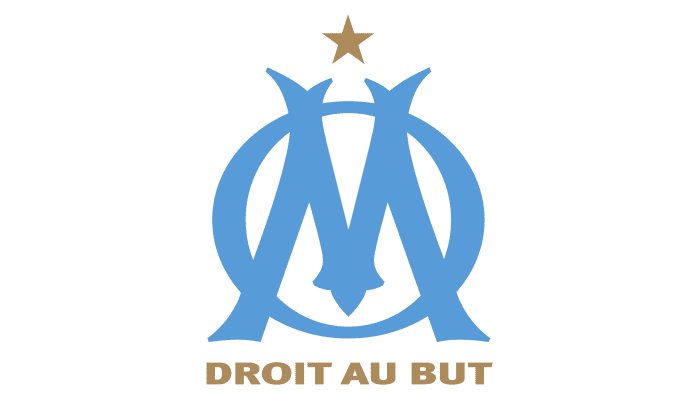
The gradient has disappeared – now the monogram is completely blue. Moreover, the letters do not have contours either, so they no longer intertwine. For the first time, the inscription “DROIT AU BUT” is located not across the initials but below. She is the same golden color as the star representing victory in the Champions League.
Olympique de Marseille: Interesting Facts
Olympique de Marseille, often called OM, is a famous soccer club in France. It’s been around since 1899, making it one of the oldest clubs.
- Starting Up: René Dufaure de Montmirail, a guy who loved sports, started the club. It quickly became a big part of Marseille and its culture.
- Big Win in Europe: OM is the only French team to win the UEFA Champions League. They did this in 1993 by beating AC Milan, which was a huge deal for them and their fans.
- Their Stadium: They play at Stade Vélodrome, one of the biggest stadiums in France. It’s famous for being loud and exciting during games.
- Biggest Rivals: Their biggest rival is Paris Saint-Germain, and their games are called “Le Classique.” These matches are a big deal, with lots of excitement and competition.
- Loyal Fans: OM fans are super passionate. They have groups like the “Ultras Marseille” who are loud and proud of their team.
- Winning Lots: They’ve won the French league, Ligue 1, many times, including four times in the 1990s.
- Famous Players: Some great players have been part of OM, like Jean-Pierre Papin and Didier Deschamps.
- New Ownership: Since 2016, an American businessman named Frank McCourt has owned the club, starting a new chapter for OM.
- Helping the Community: OM does much more than just play soccer. It helps out in its community with the OM Foundation, which focuses on education and helping kids.
- More Than a Club: OM isn’t just about soccer; it’s a big part of Marseille’s culture and brings people together.
OM’s long history, big achievements, passionate fans, and community make it a very important soccer club in France and around worldwide.
Font and Colors
The iconic emblem was based on the personal seal of Rene Dufaure de Montmirail. But it has come down to our times with significant changes, which allow us to call it a completely new sign, which has nothing to do with the original coat of arms. Not only did the designers change the “D” to “O” – they went even further, choosing a different color scheme and transforming the letters. As a result, they managed to perpetuate the memory of the founder of Olympique de Marseille and create a unique image of the club.
The motto “DROIT AU BUT” is a reminder of the days when the OM united rugby, billiards, and fencing teams. Bold sans serif is used for the lettering. The logo palette is very simple, featuring only blue (# 2faee0) and gold (# bea064). They are also the official colors of the club.
Olympique de Marseille color codes
| Spanish Sky Blue | Hex color: | #2faee0 |
|---|---|---|
| RGB: | 47 174 224 | |
| CMYK: | 79 22 0 12 | |
| Pantone: | PMS 306 C |
| Aztec Gold | Hex color: | #bea064 |
|---|---|---|
| RGB: | 190 160 100 | |
| CMYK: | 0 16 47 25 | |
| Pantone: | PMS 7509 C |
