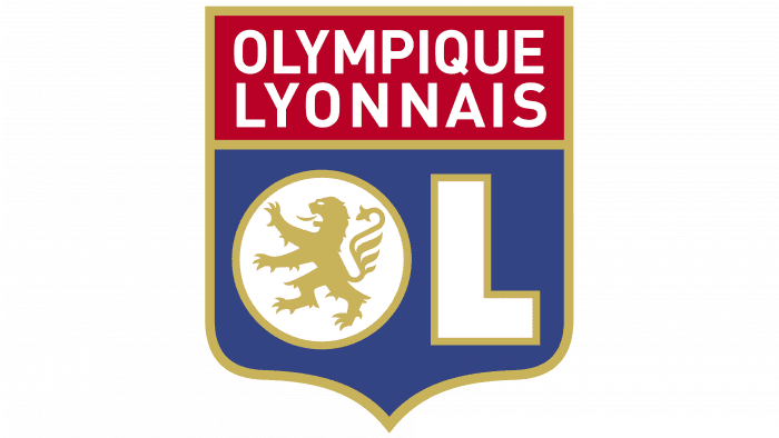
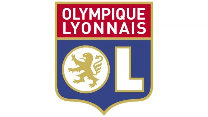
The Olympique Lyonnais logo contains traditional elements that make this football club recognizable. The emblem testifies to national pride and love for the native city. And specially selected colors create a visual harmony that emphasizes the desire for epic victories.
Olympique Lyonnais: Brand overview
| Founded: | 3 August 1950 |
| Founder: | John Textor |
| Headquarters: | Lyon, Auvergne-Rhône-Alpes, France |
| Website: | ol.fr |
Meaning and History
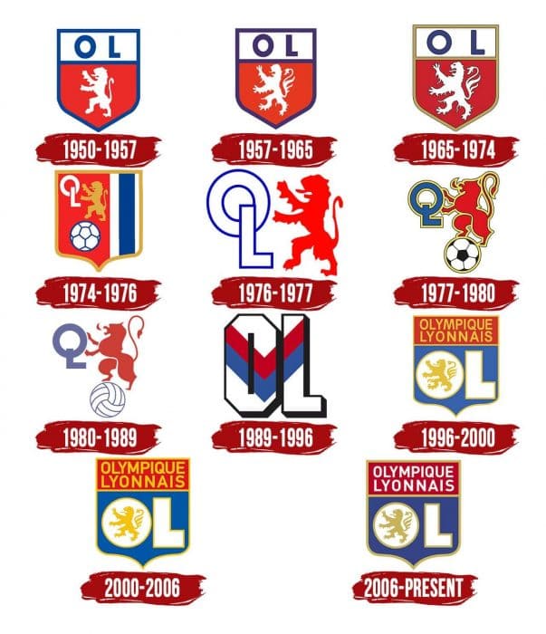
The city’s main symbol and the club is the heraldic lion, which stands on its hind legs. Of course, it does not look the same as in the original: the designers experimented for a long time before they came to the final version at Olympique Lyonnais. Additional elements also changed frequently: for example, the traditional shield would disappear and then reappear to acquire a new shape, and the initials of the team moved all the time.
What is Olympique Lyonnais?
Olympique Lyonnais is a French professional football club. It is based in the eponymous city in the Auvergne-Rhône-Alpes region, competes in Ligue 1, and achieved a brilliant victory in 2002. The club was founded in 1950. The team has 8 Trophées des Champions wins and 5 Coupes de France.
1950 – 1957
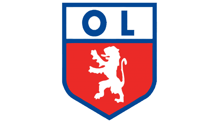
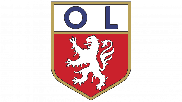
The lion and shield on the first emblem of Olympique Lyonnais are the same as on Lyon’s national coat of arms. The designers did not change the color scheme, keeping the classic combination of blue, white, and red. They only transformed the shield’s top, replacing the three golden fleurs-de-lis with the club’s initials.
1957 – 1965
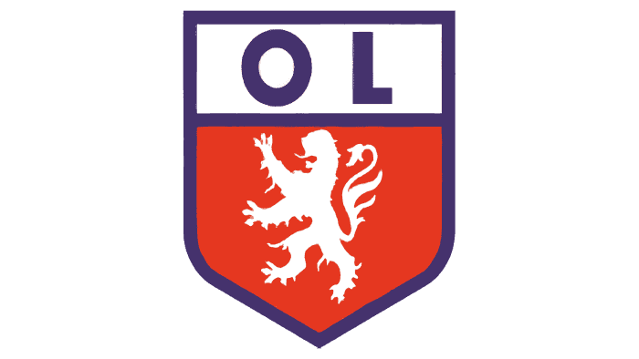
In 1957, artists added long claws and thick fur to the lion, making it as close as possible to the animal from the Lyon coat of arms. The color scheme also looks new: instead of blue, purple is used, and the red is darker than in the first logo.
1965 – 1974
The lines outlining the shield turned to gold. The lettering “OL” is blue again, with the letters wide apart. The lion has developed dark outlines that separate it from the red-crimson background.
1974 – 1976
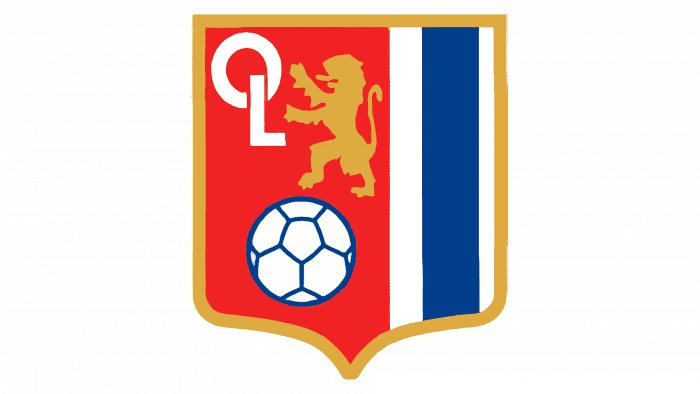
In 1974 the arrangement of the elements was changed. The shield does not look the same as before: now its base is not sharp but pointed. On the right are three vertical lines of varying thickness – two white and one blue. There is a golden lion on the left side, which reaches with its front paws to the letters “OL.” The club’s initials are shown as a white monogram. Below is a ball with blue outlines.
1976 – 1977
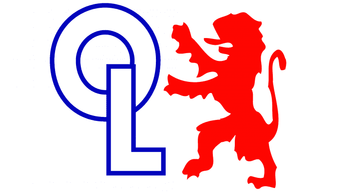
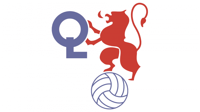
In the 1970s, the first version of the Olympique Lyonnais emblem without a shield appeared. It was a two-piece sign consisting of a red lion and a white and blue monogram “OL.”
1977 – 1980
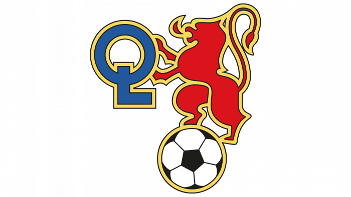
A black and white soccer ball has been added to the existing logo. To make it fit, the developers had to change the monogram’s size: they reduced the diameter “O” and shortened the vertical stroke “L” three times. The redesign is also reflected in the lion’s proportions: the flattened animal with a long tail bears little resemblance to the original. This makes the image appear cluttered due to the wide gold outlines.
1980 – 1989
The creators of the emblem removed the outlines and changed the soccer ball. If earlier, it consisted of black and white pentagons, its surface is now covered with wide white stripes with blue borders.
1989 – 1996
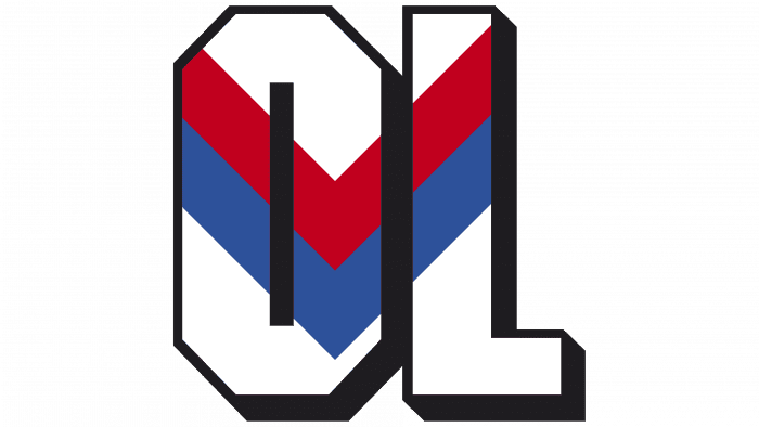
The initiator of the next redesign is Jean-Michel Aulas, the new owner of Olympique Lyonnais. He got rid of the club’s traditional symbols and approved the emblem with large three-dimensional letters “OL,” which were decorated with a V-pattern in the form of two stripes in red and blue. The same ornament adorned the players’ shirts.
1996 – 2000
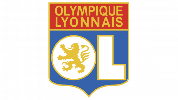
In 1996, the long-awaited lion returned, and not alone, but together with the coat of arms. They were the same as on the 1974-1976 logo. This adds one new element – the club’s name, located at the top in a red rectangle. But the abbreviation “OL” has not disappeared anywhere either: the designers depicted it in the lower half of the shield against a blue background and placed the lion inside the “O.”
2000 – 2006
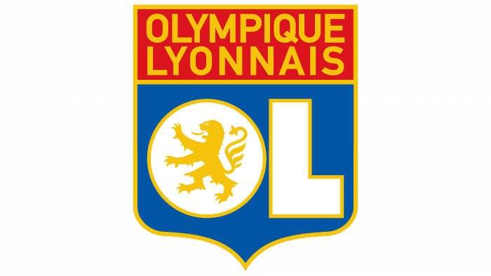
To highlight the dominance of Olympique Lyonnais in French football, the designers enlarged its name.
2006 – today
As a result of the latest logo redesign, the colors have become darker, and the letters “O” and “L” have been slightly reduced.
Olympique Lyonnais: Interesting Facts
Olympique Lyonnais, also known as Lyon or OL, is a well-known soccer club from Lyon, France. It has a rich history and has made a big impact in both French and European soccer.
- Starting Out: Lyon was founded in 1950, a bit later than other French clubs. It grew out of a university sports club that started back in 1899.
- Their Stadiums: They used to play at the old Stade de Gerland but moved to a fancy new stadium called Groupama Stadium in 2016. This new place can hold over 59,000 fans and shows how big the club has gotten.
- Winning Streak: In the early 2000s, Lyon was unbeatable in the French league, winning the title seven times from 2002 to 2008.
- Women’s Team: Lyon’s women’s team is amazing. They’ve won many championships in France and Europe, and they’re one of the best women’s teams in the world.
- Youth Academy: This organization is known for its great program for young players, which has helped many become soccer stars.
- Leadership: Jean-Michel Aulas has been in charge since 1987, turning Lyon into a top team in France and Europe. He’s focused on finding young talent and smart buying and selling of players.
- Smart Business: Lyon does a good job making money through their stadium, a training center for players, and a commercial area called OL City.
- European Success: They’ve done well in European tournaments, especially when they reached the semi-finals of the UEFA Champions League in the 2019-2020 season.
- Famous Players: Some big soccer stars, like Karim Benzema and Juninho Pernambucano, started their careers at Lyon.
- Helping the Community: Lyon also does a lot of good work outside of soccer, with their OL Foundation working on education, health, and social projects.
Lyon is more than just a soccer club; it’s a place that has grown successful teams, helped young players shine, and worked hard to be a positive force in the community.
Font and Colors
The lion depicted in almost all Olympique Lyonnais graphic signs has much in common with the lion represented on the Lyon flag and coat of arms. And this is not a coincidence: the founders of the club wanted to show its close connection with the city, for which they used the famous heraldic symbol.
The creators of the logo chose one of the standard fonts of the Sans Serif group. It has neither serifs nor any decorative elements. The letters look strict and have equal thickness strokes.
A little more attention was paid to the selection of colors. The designers combined red (# DA0812), blue (# 14387F), white (#FFFFFF) and gold (# D29D46), achieving visual harmony.
Olympique Lyonnais color codes
| Red | Hex color: | #da0812 |
|---|---|---|
| RGB: | 218 8 18 | |
| CMYK: | 0 96 92 15 | |
| Pantone: | PMS Bright Red C |
| Blue | Hex color: | #14387f |
|---|---|---|
| RGB: | 20 56 127 | |
| CMYK: | 84 56 0 50 | |
| Pantone: | PMS 288 C |
| Aztec Gold | Hex color: | #d29d46 |
|---|---|---|
| RGB: | 210 157 70 | |
| CMYK: | 0 25 67 18 | |
| Pantone: | PMS 7563 C |
