 Oregon State University Logo PNG
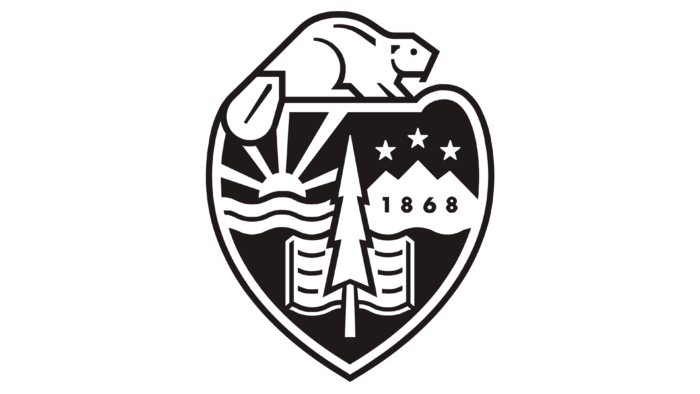
The Oregon State University logo introduces the user to the peculiarities of the region in which the university is located. The emblem contains all the identification marks that characterize the state and indicate the place where the sciences are taught.
Oregon State University: Brand overview
| Founded: | 1868 |
| Headquarters: | Corvallis, Oregon, U.S. |
| Website: | oregonstate.edu |
Meaning and History
Oregon State University is one of the few US universities that simultaneously participate in the Land Grant, Sun Grant Association, National Space Grant, and National Sea Grant programs. This means that he is engaged in agriculture, conducts ocean research, studies alternative energy sources, and develops the aerospace industry. This versatility is reflected in the logo created in 2017 by Pentagram. The designers looked to the institution’s history and borrowed elements from the seal to easily identify OSU.
1868 – 2017
The old logo of Oregon State University appeared in 2003. It contained only inscriptions because it was intended primarily for paper media. The entire space was visually divided into two parts. In the left half was the full name of the university: the phrase “OREGON STATE” at the top and the word “UNIVERSITY” just below. The designers took bold black sans serif as a basis and combined letters of different sizes to highlight the first line. And the area on the right was reserved for the orange abbreviation “OSU.”
This graphic symbol was used for a long time, but it did not reflect the uniqueness of the educational institution. For example, the abbreviated name OSU simultaneously belonged to two more universities: Oklahoma State University and Ohio State University. So the initials did not allow for the unmistakable identification of Oregon State University.
2017 – today
In honor of the 150th anniversary, the educational institution updated its identity, for which its owners turned to Pentagram for help. The designers linked the university’s logo with an old presidential seal and with the emblem of the sports teams of the Oregon State Beavers, which was created in 2013. So the beaver sitting on the shield became the main symbol of the university. But where did this animal come from? It turns out the beaver is featured on one side of the Oregon flag. It is considered the national symbol of the state.
Pentagram employees decided to combine elements from the flag and coat of arms. They ended up with an unusual combination, although they had to remove any “extra” elements, such as a covered wagon, ships, and a bald eagle. The new heraldic shield contains the most important, according to the designers, objects: one Pseudotsuga menziesii fir, mountain peaks with three stars, the setting sun, ocean waves, and an open book.
The second part of the OSU logo is the inscription “Oregon State University,” divided into two lines. Bold geometric font and a combination of contrasting colors (black and orange) make the wordmark look like the previous graphic symbol. The text may be on the right or below the coat of arms, but it is forbidden to separate them.
Seal
The presidential seal is affixed to the diplomas of graduates, is found in the official documents of the university, is used in the Office of the Provost and the Office of the President. This symbol is the same as the coat of arms of the state of Oregon, adopted in 1857. OSU approved it as a seal in 1859 when Oregon officially became the 33rd state of the union.
There are a lot of allegorical images in the visual sign. Firstly, it looks like a heraldic shield – a sign that its predecessor was a coat of arms. Secondly, the seal contains many historical metaphors. Above is an eagle, the national bird of America. In the center of the shield is a closed wagon with two oxen harnessed. These are the pioneers who came to the empty lands of Oregon. The place on the right is occupied by a whole artistic composition: a landscape of three trees and a lone elk against the backdrop of mountains. Pseudotsuga menziesii evergreen firs grow in a makeshift “forest.” They represent the picturesque nature of Cascadia. Somewhere behind the mountain, the sun is setting, which hints at the western side of the horizon.
The ocean occupies almost a third of the shield. Two warships are sailing on the water: English and American. The artists tried to convey the technical excellence of the American ship and presented it as a pursuer. The most important element for OSU is at the bottom. It is a haystack with a plow, which represents its connection with the agricultural heritage on the state emblem. The seal of the university symbolizes the agricultural focus of the institution.
Oregon State Beavers Logo
OSU sports teams have been around since the founding of the university. Their first mascot, Jimmie the coyote, appeared in 1893. And the name Beavers and the corresponding symbol began to be used already in the 20th century: according to various sources, either in 1910 or 1916. Later Benny Beaver became the mascot. It is his portrait that is depicted on most of the emblems.
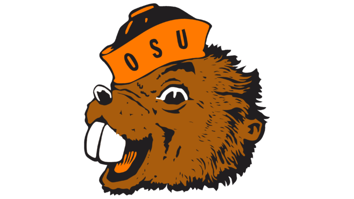
1951 – 1998
Arthur Evans designed a cartoon beaver head logo with “OSU” on a cocked hat for sports teams. As far as we know, this happened in 1951. An artist from Angeles Pacific offered the same badge to several schools, so Cal Tech had a similar emblem, but with a different caption. At Oregon State University, this anthropomorphic beast was named Benny Beaver.
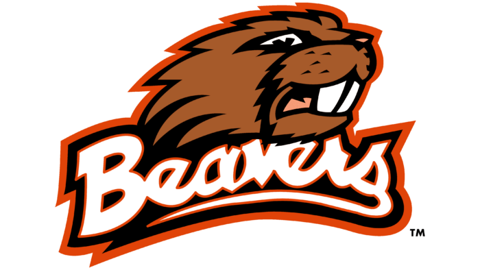
1998 – 2013
In the new millennium, the kind smiling beaver has been replaced by Angry Benny. He did not have the usual cap with an abbreviation. The designers replaced it with a white “Beavers” lettering with a double black and orange outline. The animal’s head peeked out from above.
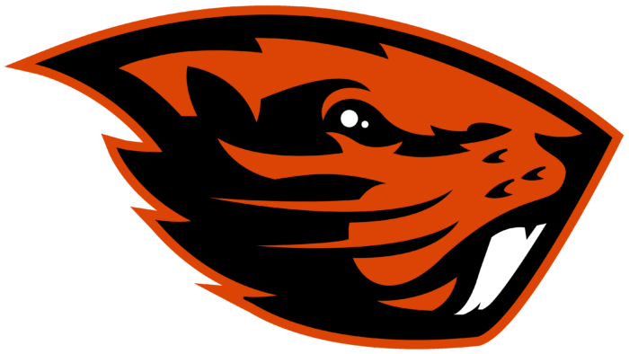
2013 – today
In 2012, it became known that Nike was working on a modernized Oregon State Beavers logo. The final version was presented in 2013 at the Alumni Center. The designers have tried to make the badge more professional so that it can attract experienced athletes to the teams. At the same time, the new beaver has become a continuation of evolution: the central element, as before, is its head, only without inscriptions. The drawing style is concise and sophisticated.
Oregon State University: Interesting Facts
Oregon State University (OSU) in Corvallis, Oregon, is a well-known public research university with a long history and many contributions to education, research, and community service.
- History: Founded in 1868 as Corvallis Academy, OSU has evolved from a small college to a major public research university.
- Unique Grants: It’s rare because it has all four grants: Land, Sea, Space, and Sun. This shows OSU’s wide-ranging research and public service commitment in agriculture, oceanography, space, and renewable energy.
- Research: OSU is known for spending over $400 million annually. It leads in forestry, oceanography, robotics, and environmental sciences.
- Global Reach: With global research partnerships and students from over 100 countries, OSU has a strong international impact.
- OSU Ecampus: Its Ecampus is top-ranked in the U.S. and offers over 70 online degree and certificate programs globally.
- Athletics: Competing in the NCAA Division I Pac-12 Conference, OSU is especially proud of its baseball team, which has won several national championships.
- Sustainability: Committed to sustainability, OSU was among the first to earn a gold STARS rating for its achievements in this area.
- Distinguished Alumni: OSU’s alumni include Nobel laureate Linus Pauling, the only person to win two unshared Nobel Prizes, author Beverly Cleary, astronaut Donald Pettit, and businessman Ken Austin.
- Forestry Program: The College of Forestry is globally recognized, consistently ranking among the best worldwide.
- Innovation District: OSU is creating an Innovation District to boost collaboration with industry and community partners, aiming to drive innovation and economic growth.
OSU’s contributions reach beyond its Corvallis campus, significantly impacting various fields, supporting its community, and enhancing global academic pursuits.
Font and Colors
The shield on the logo reflects the university’s participation in four grants. The cosmos is represented by three stars, which at the same time symbolize the OSU campuses. The sun represents the development of alternative energy sources. The waves show a link to the National Sea Grant and the tree to the Land Grant. The peaks of the Three Sisters inspire the mountain peaks. A beaver sits the mascot of the Oregon State Beavers sports teams and the state’s national animal on the heart-shaped shield.
Designers from Pentagram have developed new typography for the OSU logo. It is based on the Roman type Newzald, created by the Klim Type Foundry. In addition, the university acquired a changed color scheme during the rebranding process. It consists of Beaver Orange (#D73F09), Bucktooth White (#FFFFFF), and Paddletail Black (#000000).
Oregon State University color codes
| Sinopia | Hex color: | #dc4405 |
|---|---|---|
| RGB: | 220 68 5 | |
| CMYK: | 0 69 98 14 | |
| Pantone: | PMS 1655 C |
| Black | Hex color: | #000000 |
|---|---|---|
| RGB: | 0 0 0 | |
| CMYK: | 0 0 0 100 | |
| Pantone: | PMS Process Black C |
