OshKosh B’gosh Logo

OshKosh B'Gosh LogoOshKosh B’Gosh Logo PNG

The OshKosh B’gosh logo symbolizes heritage, quality, and care for children, reflecting the brand’s long history of producing durable and comfortable clothing. With its vintage elements and simplicity, the emblem’s design emphasizes tradition and reliability, highlighting parents’ trust in this brand.

OshKosh B’Gosh: Brand overview

OshKosh B’gosh’s history began in 1895 in Oshkosh, Wisconsin, USA. The company was founded by William Poland and his partners under Grove Manufacturing Company. It initially produced workwear for adults, including overalls and clothing for laborers and farmers.

The name “OshKosh B’gosh” first appeared in 1908. According to company lore, a partner suggested using the phrase after hearing “Oshkosh b’gosh!” in a popular song. This catchy name quickly became associated with durable, high-quality workwear.

For many years, the company focused on producing reliable workwear, establishing a strong reputation in the industrial and agricultural sectors. However, the 1960s brought a pivotal moment. A customer requested a baby jumpsuit that matched the quality of adult overalls, prompting the business to enter the children’s clothing market. In 1962, the first line of baby jumpsuits was introduced, essentially miniature versions of their adult counterparts.

The baby line became an instant hit. Children loved the bright colors and comfort, while parents appreciated the durability and quality. The success of the children’s line soon became the company’s primary focus.

Throughout the 1970s, the brand expanded its range of children’s clothing, adding T-shirts, pants, jackets, and more. Every product maintained the brand’s signature durability and quality, helping to build a loyal customer base.

The 1980s were a period of significant growth. The company opened its retail stores, allowing direct customer interaction, and expanded internationally. In 1985, the business went public on the NASDAQ, attracting additional capital to fuel further expansion.

The 1990s brought new opportunities and challenges. The company introduced new clothing lines and aggressively pursued licensing deals, allowing other manufacturers to produce items under its name.

However, the early 2000s saw financial difficulties due to increased competition and changing consumer preferences. To reduce costs, the business closed some U.S. manufacturing facilities and shifted production elsewhere.

In 2005, a significant turning point occurred when Carter’s Inc., a major children’s clothing retailer, acquired the brand for $312 million. The acquisition allowed the company to maintain its identity while benefiting from Carter’s resources and expertise.

Under Carter’s ownership, the brand continued to grow, updating product designs and expanding distribution channels. The company also embraced e-commerce to meet changing consumer habits.

Throughout the 2010s, the business reinforced its position in the children’s apparel market. The brand launched successful marketing campaigns highlighting its heritage and commitment to quality, such as the “B’gosh Jeanius” campaign focused on denim.

In 2015, the company celebrated its 120th anniversary by releasing a limited-edition collection inspired by vintage designs, reminding customers of its long history.

In the following years, the brand continued to adapt to the evolving market, increasing its social media presence and expanding its product range to include newborn and teen lines.

From 2020 to 2022, the company focused on innovation and adaptation, enhancing the online shopping experience, offering customization options, and growing its digital sales channels.

As of 2023, the brand remains a leading name in children’s clothing in the U.S. and internationally. The company continues to blend its rich heritage with modern fashion trends and technology while staying true to the quality and comfort that have always defined the brand.

The journey of this iconic brand from a workwear manufacturer to a top children’s clothing name highlights its ability to adapt to changing consumer needs, maintain a focus on product quality, and leverage its strong heritage in marketing strategies.

Meaning and History

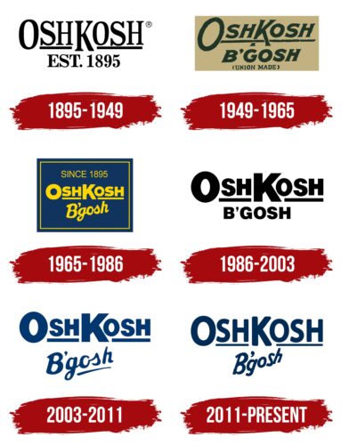
Oshkosh Logo History

What is OshKosh B’gosh?

The OshKosh B’gosh Company came into existence in 1895 in Oshkosh, Wisconsin through the combined foresight of Frank E. Grove, J. Howard Jenkins, and James Clark. Grove Manufacturing Company originally produced hickory-striped overalls for railroad workers and farmers. The catchy slogan “OshKosh B’Gosh” became famous only after it was mentioned in a New York vaudeville show in 1911.

1895 – 1949

OshKosh B'Gosh Logo 1895

1949 – 1965

OshKosh B'Gosh Logo 1949

1965 – 1986

OshKosh B'Gosh Logo 1965

1986 – 2003

OshKosh B'Gosh Logo 1986

2003 – 2011

OshKosh B'Gosh Logo 2003

2011 – today

OshKosh B'Gosh Logo

The OshKosh B’gosh logo is presented in two tiers, giving it originality and ease of remembering. The upper part features “OshKosh ” in large, bold capital letters. The thick font and the solid horizontal line beneath the word convey stability and confidence. The line underlining the text enhances the sense of completeness and harmony. The letters are simple and straightforward, free of unnecessary elements, creating an impression of honesty and accessibility.

The lower tier features the word “B’gosh,” contrasting with the upper part. It is written in an italicized font, adding dynamism and a casual feel. The lowercase letters make it lighter and friendlier, while the diagonal slant creates a sense of motion. The apostrophe above the text line adds uniqueness, associating the logo with a playful character. Visually, it softens the text, making it less formal and more personal, reflecting the childlike spontaneity and joy linked to the brand.

The color palette, consisting of a rich dark blue, highlights professionalism and reliability. This color is associated with trustworthiness, an important quality for a brand focused on children’s clothing. Combining bold uppercase letters at the top and the slanted text below creates a balance between seriousness and playfulness, effectively emphasizing the brand’s focus on family values.

The brand’s name originates from its foundation in Oshkosh, Wisconsin. The second part of the name, “B’gosh,” adds a historical and local touch to the logo, reflecting a folk style and casual charm. The emblem embodies the brand’s spirit, combining tradition, quality, and friendliness while remaining relevant and modern.