In recent years, there has been a noticeable surge in the simplification of logos. This phenomenon has been influenced by popular design philosophies such as minimalism and flat design. However, this raises an important question: Is logo optimization always in the best interest of the brand?
The mantra “simplicity is the essence” is often heard in the realm of design. An abundance of visual details can introduce unnecessary intricacy, obscuring the meaning of a logo. However, one must take into account the enormous responsibility that logos carry. These compact visual symbols should encapsulate the company’s ethics, core principles, and main goals without text.
The move towards simpler logos is not limited to any one sector. Technology giants like Google, fast food restaurant chains like Burger King, and even snack brands like Pringles and Dunkin’ Donuts have opted for a more refined approach to logo design. While this trend undoubtedly provides a cleaner visual experience for audiences, there is also a concern: Could these simplified symbols compromise the rich narratives and meanings historically associated with these brands?
The phenomenon of logo simplification is worth examining further to understand its merits and potential pitfalls. Understanding the broader implications of this decision is critical for companies thinking about changing their visual identity.
What is an oversimplified logo? How do you simplify a logo?
In today’s digital age, there is a trend towards more simplified logos with an emphasis on flat and minimalistic design. This approach to logo design aims to reduce the logo to the most important visual elements, which often results in the removal of various decorative elements such as gradients, borders, and accompanying word markings.
The main motivation behind this simplification is to increase brand awareness, especially on digital platforms where space constraints can limit branding opportunities. Adopting a simplified logo for brands with an established market presence can emphasize their dominance and convince consumers of their continued relevance.
The process of logo simplification can be described in clear steps. First, the design is reduced to basic forms, including fundamental shapes or a limited color palette, and superfluous elements, such as duplicate letters or words, are discarded. The challenge is to ensure that the logo remains distinctive and does not become generic.
To successfully simplify a logo, it is essential to pinpoint the core message or brand attribute it is meant to convey. For example, when the Dunkin’ Donuts brand was rebranded to Dunkin’ Donuts, the focus shifted to the first half of its name, signifying an expanded product offering beyond just donuts.
A systematic approach to logo simplification might include the following:
- Eliminating excesses: Discarding details, textures, shadows, and gradients that do not contribute to the core idea of the logo.
- Focusing on essential elements: If the mark or brand name is strong enough, consideration should be given to removing additional, non-essential elements.
- Evaluating scalability: It is very important that the logo maintains clarity and legibility across a variety of sizes and media.
- Color Consolidation: Strive to limit the color scheme to a few basic shades so that the design remains cohesive and easily recognizable.
While simplifying a logo can make it more modern and digitally adaptable, it’s important to keep the essence of the brand and keep it simple.
Why are logos being oversimplified?
The emergence of more simplistic logo designs has been evident for a long time. Many well-known companies have switched to less intricate logos over the years. Prime examples are tech giants like Google and Yahoo, whose evolution reflects a general trend in the design industry.
The main benefit of moving to a cleaner design is its accessibility and user-friendliness. With clean lines and fewer components, the design feels more immediate and appealing to the audience. This simplicity is not only an aesthetic choice but also a practical benefit for various industries. For example, an uncomplicated logo design makes it easy to turn it into a car badge in the automotive industry. Similarly, minimalistic logos can be seamlessly combined with various apparel items in the fashion industry, ensuring constant brand recognition.
There are many factors behind the desire to simplify logos. Technological advances have given designers the tools to experiment and look for different ways to simplify designs. In addition, the ubiquity of smartphones and shrinking screen sizes are forcing designers to focus on logos that retain clarity even on these platforms.
Simplicity in logo design can be a strategic move to create a modern image. In an era where many companies are leaning toward more straightforward designs, maintaining a confusing logo can unwittingly portray a brand as outdated or not in tune with modern aesthetics.
While aesthetics change with the passage of time and cultural shifts, the tendency to simplify logo design can be driven by both technological advances and ever-changing market dynamics. Brands strive to stay relevant and resonate with their audience, and their logos often reflect these intentions.
Why are companies oversimplifying their logos?
The shift towards minimalistic, flat, straightforward graphic design is being felt across many industries. Whether it’s tech giants, retailers, or fast food restaurants, the desire for simplicity in logos is evident.
But what is at the heart of this move towards simplified design? While each company may have different motivations, there are several universal benefits to this design evolution:
A simpler logo allows for easier adaptation as brands diversify their presence across platforms, from mobile apps to merchandise. The simpler the design, the easier it is to transfer across different mediums.
Quick brand recall: In an era of information overload, brands compete for a fraction of a second of a consumer’s attention. A less intricate logo can imprint itself in the viewer’s mind more quickly, contributing to quick brand recall.
While intricate designs can fall victim to changing trends, minimalist logos tend to remain timeless. Brands seeking longevity often opt for simplicity to keep their logo from becoming outdated.
In mass production, be it promotional products or packaging, simplicity of design often leads to a reduction in the complexity of production and, therefore, lower costs.
This is especially true for industries such as technology, where a simplified logo often creates a sense of innovation and progressiveness. This shows that the brand is in line with current trends.
Without the noise of unnecessary design elements, the core meaning or value of a logo is often revealed more clearly. A purposeful design can say more than a chaotic one.
Brands often evolve, and as they evolve, there is often a need to tweak the design. The basic structure of a logo can be more malleable, allowing changes to be made to it without resorting to a complete redesign.
The appeal of simplicity in logo design is more than just aesthetics. It’s a calculated strategy that provides tangible benefits aligned with consumer behavior and business goals. As the commercial sphere becomes more dynamic, a penchant for simplicity may well define the branding of the future.
Brand strength
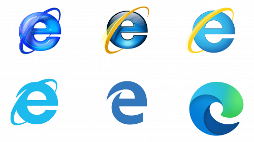
The penchant for simplistic logo design is becoming increasingly common, and its origins can be traced back to some corporate giants such as Google and Internet Explorer. The decision of such industry leaders to use minimalistic designs has played a crucial role in the fact that simplicity is associated with qualities such as reliability and brand strength.
A minimalistic logo characterized by clarity and lack of clutter can create an aura of confidence. A clear brand message emphasizes the brand’s core values and characteristics. Following this trend allows a brand to remain modern and not be inferior to competitors in visual appeal, thereby maintaining its position in the competitive market.
Logo optimization can enhance brand perception if done with finesse, giving the brand a more polished, elegant, and distinguished image. The point is to simplify and convey the spirit of the brand in a design that resonates and remains relevant.
Cost savings
In branding, the initial investment in image rejuvenation or a complete rebranding may seem like a significant expense. When analyzed in depth, an optimized logo design can turn into significant savings in the long run, especially in industries where the logo is prominent in products or their packaging.
The fashion industry is a case in point. If a clothing brand decides to embroider its logo on multiple products, from shirts to dresses, the complexity of the design directly affects the cost. A complex design requires more threads, a variety of colors, and more manual or machine labor. A simpler design, on the other hand, involves fewer resources spent on embroidery and, as a result, a more economical production process.
The principles of saving money through simplicity of design also apply to other industries. Using fewer colors and simpler designs typically reduces the cost of printing logos on packaging. Design subtleties often require specialized printing techniques, which invariably increases cost. Thus, using minimalistic logo designs allows companies to keep up with current branding trends and realize potential cost savings.
Digital transformation
In the digital age, the interaction between consumers and brands has undergone significant changes. The shift towards the online sphere means that for many, the first encounter with a brand is online rather than face-to-face. This raises new challenges and constraints around brand representation.
Many online platforms have certain guidelines and restrictions regarding logo presentation. Whether it is the website header, email footer, or social media profiles, there is limited space allocated for branding. These digital platforms often impose certain restrictions on the size of images and graphics.
Adapting to these limitations means that logos must be optimized for digital media. Reducing design complexity and cutting down on unnecessary elements keeps the core message and brand identity consistent across multiple digital platforms. This simplification ensures consistency and makes it easy to identify the brand essence and resonate with audiences across all digital touchpoints.
Greater flexibility
The benefits of a simplified logo design are manifold. As mentioned above, a simple design provides a significant degree of adaptability. Think about how easily a basic logo can be transformed into symbols for different products, such as cars or clothing. If the design is uncomplicated, it can be transferred to various surfaces through engraving on metal or embroidery on fabric.
In an era of digital dominance, where small-screen devices and app-driven interfaces are ubiquitous, a clear and concise logo can be an invaluable asset. This design keeps a brand recognizable and memorable even on tiny displays. Mobile browsers and the proliferation of app-centric platforms underscore the importance of this adaptation.
Adopting minimalistic logos allows companies to adapt their brand to different environments and substrates without sacrificing crucial aspects of their identity. A design replete with complex details sometimes limits its applicability across different platforms and mediums. On the other hand, simplicity of design provides versatility and wider applicability.
Visual and user comfort
An intricate logo design can convey many ideas about a company. But there is a downside: as the complexity of a logo increases, it runs the risk of becoming too difficult to grasp. In an age where consumers are constantly bombarded with numerous branding messages and marketing tactics, simplicity is increasingly valued.
A minimalistic and simple logo design is not only visually appealing but also promotes quick recognition and memorization. When the design is reduced to its core elements, it becomes something that consumers can easily internalize and remember for the future. Eliminating unnecessary elements allows a company to emphasize its core values and ethical principles more effectively.
When is the simplification of logos a bad thing?
Logo design is a delicate art form with no one-size-fits-all template that guarantees success. While the trend of logo simplification resonates across many industries, it only suits certain brands and audiences.
Some industries, such as the technology sector, cosmetics segment, and others, are seeing a surge in logos that focus heavily on overall aesthetics. The inclination towards simplification can sometimes strip a brand of its distinctive features, making it virtually indistinguishable from its competitors.
A significant disadvantage of this approach is the risk of homogenization. The market can become oversaturated with logos that, while elegant, are not distinctive. Conforming to industry norms is important, but it is equally important that a brand maintains its uniqueness in order to stand out in a crowded marketplace.
Logo changes invariably generate discussion and controversy. Consumers form perceptions and emotional connections to brands through prolonged interactions and experiences. Over the years, strong associations have been formed with a brand’s visual elements, primarily its logo. A sudden change in this familiar image can trigger strong emotions, often discomfort or dissatisfaction.
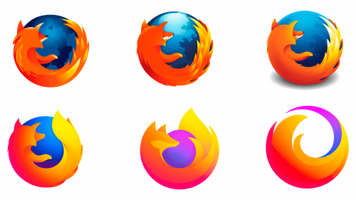
In the realm of logo redesign, there are both triumphs and failures. While Burger King’s redesigned logo was well received, Firefox’s decision to abandon its iconic fox was met with great skepticism and negative reaction. Examples like these emphasize the importance of balance when simplifying a logo. The logo needs to be modernized and adapted, but at the same time, it should not be stripped of many of the integral components that make up the essence of the brand.
Do customers like the oversimplification logo trend?
In logo design, a simplistic and flat approach has its merits. Well-known corporations such as Coca-Cola, IBM, and Shell have embraced the trend with more refined logos.
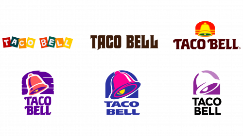
In an era of skepticism toward big business, consumer acceptance of minimalist logos can be challenging. Some feel that minimalism, often devoid of intricate details, looks sterile and lacks personality. The evolution of the Taco Bell logo over the years has shown a trajectory toward a reduction in brilliance and quirkiness.
Research supports the notion that simplistic logos are not always the most successful choice. A comprehensive study initiated by Harvard Business Review and published in the Journal of Marketing Research scrutinized the emotional resonance of nearly 600 logos, categorized by how descriptive they were.
The results of the study revealed a striking trend: about 60% of well-known corporations lean towards logos without description, minimalistic, and a clear preference for flat design. About 40%, on the other hand, opt for more illustrative logos. When study participants were asked to rate companies on their logos, evaluating aspects such as attractiveness and authenticity, illustrative logos consistently outperformed their minimalist counterparts.
While minimalistic logos may be more recognizable and look modern, they often fail to evoke emotion and appear authentic. The exception to this rule is iconic brands. McDonald’s, a world-renowned company, may not need intricate imagery to touch audiences.
Emerging brands are a completely different matter. At least until they have established a strong rapport with their target audience, oversimplification should be avoided in their logos.
Oversimplified logo examples
The trend of simplifying logos carries both advantages and disadvantages. For some companies, minimalism in logo design can be an advantage, enhancing clarity and modernity. Others may find that oversimplification leads to a decrease in emotional resonance and recognition of their brand.
To understand how minimalism in logos can affect a brand’s image, let’s look at a few examples of such logo redesigns. Such examples shed light on the delicate balance between simplicity and the need to retain the essence of the brand. As trends evolve, companies need to weigh the importance of keeping up with modern design aesthetics while maintaining brand uniqueness.
Apple
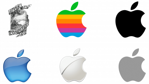
The evolution of logos over time is indicative of changing design preferences and the importance of branding. One prime example of this transformation is Apple’s emblematic symbol. In 1976, Apple’s logo depicted a scene of Isaac Newton sitting under an apple tree, reflecting in detail the company’s original branding aspirations. Despite the fantasy nature, the design was quite intricate.
In 1977, a fundamental change was made, marking a shift to a more recognizable apple silhouette. This updated design presented a more streamlined, easily recognizable image that has since become synonymous with the tech giant. Over the decades, while the basic shape of the apple has remained constant, there have been subtle changes in hues and details.
Coca-Cola
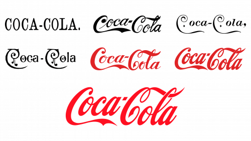
The evolution of the Coca-Cola logo demonstrates the brand’s journey through the complex dance of preserving tradition and embracing modernity. The Coca-Cola Company experimented with different versions of its logo, each of which reflected the relevance of a particular era. Amidst all the design changes, two elements remained constant: the flowing cursive script and the signature red hue.
It became obvious that these two elements are the essence of the brand’s visual appeal. They resonate with the audience, evoking recognition and a certain familiarity. Realizing this, the company eliminated all unnecessary details that detracted from the core characteristics, resulting in a cleaner and more impactful design.
The logo touched the memories of longtime fans, reminding them of the brand’s heritage while appealing to new audiences with its modern simplicity.
Ford
In the automotive sector, which is often seen as a combination of engineering marvels and aesthetic beauty, logos play a key role in brand representation. These symbols, often embossed on the front and rear of vehicles, not only identify the brand but also signify its core values and attributes. Given the physical constraints of placing such logos on metal surfaces, it becomes imperative that they are both concise and adaptable.
Logos are placed on vehicles – from busy highways to suburban driveways. Given that these emblems are in a variety of environments, they must be consistent in both their form and functionality. They must maintain their visual clarity in a variety of environments, whether it’s the shiny hood of a sedan or a digital ad on a website.
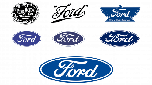
Ford, an iconic name in the automotive industry, is a prime example of this design journey. The company’s emblem, which evolved from the signature of its founder, Henry Ford, reflects its rich history and commitment to innovation. However, even such a weighty symbol does not remain unchanged.
There is a careful reduction of the Ford emblem. While the foundational element – Henry Ford’s signature – remains, superfluous elements have been carefully trimmed. This evolutionary approach gave the logo the dual benefit of preserving its rich heritage while at the same time showcasing modern minimalism.
The automotive industry, with its unique demands, demonstrates how brands, even those with a history as deep as Ford’s, can embrace change without losing their essence. The art of logo simplification, while seemingly purely aesthetic, is closely intertwined with functionality, history, and forward-thinking.
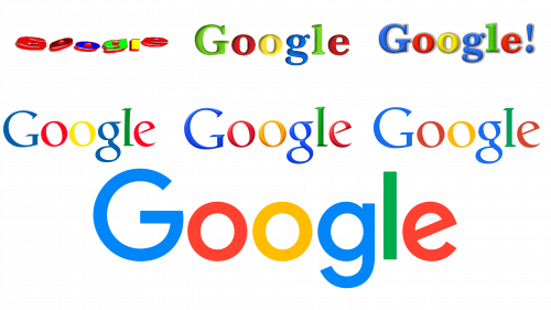
Google’s iconic logo design journey is a telling example that illustrates how branding strategies can adapt to technological advances. The company optimized its logo to reflect the changes and nuances of the era in which each redesign took place.
Google’s visual style transformations have often reflected prevailing trends in technology branding. As digital platforms evolved, the desire to create designs that harmonized with various communication mediums, from desktop computers to mobile devices, became increasingly evident. The current version of the Google logo embodies this adaptability. It is easy to read and optimally configured for clarity and legibility across a variety of digital locations.
McDonald’s
The fast food industry, characterized by the need for quick brand recognition and fast service, requires its visuals to be striking and easily recognizable. Highways and busy streets serve as the backdrop against which these brands compete for attention. In such an environment, the simplicity of a logo can have a significant impact on a potential customer’s decision-making.
Companies in this sector are challenged to create logos that are quickly understood by passers-by, especially those traveling at high speeds. A complex or intricate design will be lost on a motorist who only has a few minutes to notice the brand’s presence. Therefore, clarity and memorability are paramount.
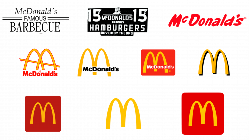
For example, McDonald’s is a giant in the fast food world. As the brand has established itself in the global consciousness, its symbolic “golden arches” have undergone a number of refinements. Initially appearing as a design element, these arches soon became synonymous with the brand itself. Over time, as the brand spread, there was no need to clutter the logo with additional elements.
The modern version of the McDonald’s logo is a testament to the power of minimalism. By combining the basic components of the design, the brand provides instant recognition even from a distance. In the latest version of the design, arches take center stage, offering a clean and unambiguous visual signal that everyone can understand.
The fast food industry emphasizes the importance of visual brevity. As brands such as McDonald’s demonstrate, a simple and recognizable logo can help capture the attention of potential customers even in the most fleeting moments.
Netflix
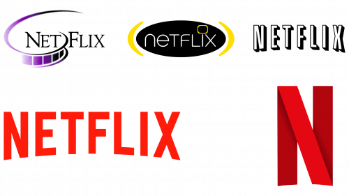
Netflix is one of the youngest companies in the world of large corporations. It is a prime example of how appealing simplifying a logo can be in the digital age. The company was founded in 1997 to distribute DVDs and media content through the mail, and the initial branding was more complex and sophisticated than its modern representation.
Progress and digital transformation came to the forefront, and a metamorphosis occurred with the Netflix brand. This transformation was all about going digital and reflecting an updated, modern brand image.
In today’s digital-centric world, where content is consumed across multiple devices, from smartphones to smart TVs, the Netflix logo stands out with clarity and definition. Its design keeps the brand’s identity consistent and easily recognizable on both mobile and large TV displays, reinforcing its dominance in digital streaming.
Shell
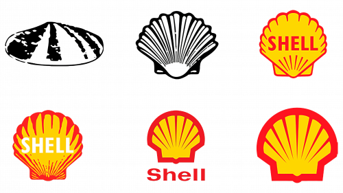
The evolution of Shell’s emblem is a telling example of effective logo design simplification. Initially, the brand’s emblem drew elements from maritime themes, and its visual identity invariably included the recognizable shape of a clam. In the early years, the logo was a more complex, almost realistic image.
The Shell brand underwent changes later on, aiming for a clearer and more streamlined design. The result is a distinct, polished design that emphasizes the brand’s prestige and authority in the industry. With this clarity and distinction, the image became instantly recognizable, and the word “Shell” became redundant. The decision was made to rely solely on the emblem, demonstrating the brand’s confidence in its visual representation.
Considering the logo oversimplification trend
The movement towards logo simplification is becoming increasingly prominent in the branding industry. While the future trajectory of this trend remains ambiguous, many companies have recognized the benefits of taking a clean, minimalist approach to their visual identity.
Simplified logos have their benefits. They often reduce branding costs by reducing the number of colors and complex details. In addition, a minimalist design allows it to be adapted to different platforms and mediums, which increases brand recognition. A streamlined logo can also enhance the overall perception of the brand, giving it a modern look and fit with contemporary design concepts.
There is a flip side to the coin. Over-simplifying a logo can cause it to lose its uniqueness or the essence that makes it special. The art is in finding the perfect balance. Excessive simplicity can make a brand look formulaic, and in some cases, it may not be perceived by the target audience at all.
Logo design isn’t just about following existing trends; it’s a delicate process that takes into account a brand’s ethos, its audience, and what it wants to convey. While minimalism has its proponents, brands must evaluate whether such a style aligns with their core values and resonates with their audience. Speaking to professionals who specialize in branding can provide invaluable insight into which design direction best suits a company’s vision and goals.
