Oxfam: Brand overview
In 1942, Cecil Jackson-Cole Canon, Theodore Richard Milford, and other compassionate individuals launched a humanitarian initiative in the academic town of Oxford, UK. The initiative, called the Oxford Famine Relief Committee, was prompted by the need to provide urgent relief to those suffering from starvation in Greece, occupied by the Axis powers during the Second World War.
As the tumultuous times of World War II subsided, Oxfam’s desire to alleviate human suffering did not falter. In the post-war period, the organization became involved in rebuilding devastated regions and developing countries. By the 1960s, Oxfam shifted to emergency relief, advocating for sustainable solutions to poverty and systemic injustice.
Oxfam International was created in 1995 to streamline efforts around the world. Its goal is to unite Oxfam’s expanding network of organizations worldwide. Today, this global network includes 21 independent Oxfam organizations.
Throughout its journey, Oxfam’s ambitions have remained wide and varied:
- Providing immediate relief after natural disasters
- Economic empowerment
- Supporting gender equality
- Expanding access to education and healthcare
- Lobbying for fair trade rules.
The organization has been on the front lines during numerous global emergencies, from the famine in Ethiopia in the 1980s and the horrors of the Rwandan genocide in the 1990s to recent disasters such as the 2004 Asian tsunami and the displacement crisis in Syria.
Despite its laudable achievements, Oxfam has not been without its challenges. It has faced scrutiny, particularly allegations of inappropriate behavior by staff members during earthquake relief operations in Haiti.
Today, with more than 90 countries and more than 5,000 employees, Oxfam is a beacon in the fight against global poverty and systemic injustice.
Meaning and History
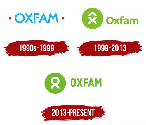
1990s – 1999
1999 – 2013
2013 – today
A British charity has chosen a green logo with white highlights to represent its mission and values. At the center of the design is a unique triple element made of semicircles, meticulously balanced to resemble a human figure. This intricate detail is encased within a larger circle, symbolizing unity and the organization’s holistic approach to its cause.
Adjacent to this central symbol, the organization’s name appears olive green, creating a harmonious visual flow with the logo’s primary color scheme. The name is crafted in uppercase, sans-serif letters that are smooth, geometrically precise, and evenly spaced. A distinctive touch is applied to the letter “M,” where its central peak is truncated and smoothed, making it shorter than usual and adding a unique flair to the overall typography.
This logo’s design conveys the charity’s commitment to humanity and interconnectedness. Green symbolizes growth, renewal, and health, aligning with the organization’s goals of fostering community well-being and support. The white accents within the logo add clarity and focus, drawing attention to the human-like figure and emphasizing the charity’s human-centered approach. Through this thoughtful combination of color, shape, and typography, the logo effectively communicates the charity’s essence and dedication to making a positive impact.


