Oxy, a well-known skincare brand specializing in acne care, has recently rebranded with a refreshed logo and updated visual identity. Oxy’s new design aims to appeal to a younger audience, particularly Generation Z, while maintaining its reputation as a trusted brand recognized for its effectiveness in treating acne.
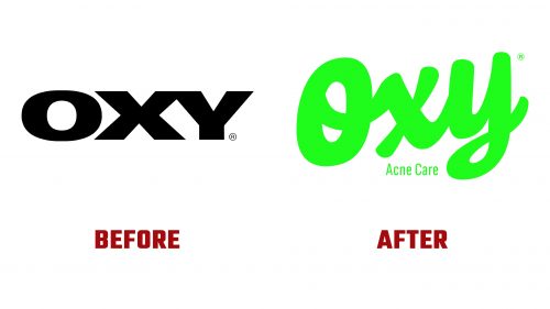
The previous logo featured a bold and minimalist design, using a black-and-white color scheme to convey professionalism and reliability. Though clean and effective, it eventually began to feel outdated, especially for younger consumers.
The new logo introduces a softer, more approachable font with rounded edges, giving it a friendlier and modern appearance. Vibrant neon green adds energy and freshness, aligning with the brand’s focus on natural ingredients. This updated color scheme and design help connect Oxy with a younger, more skincare-conscious audience.
A key change in the new logo is the inclusion of “Acne Care” as a subtext, which communicates the brand’s primary focus. This addition helps new customers easily identify Oxy’s purpose and reinforces its position as a leader in acne care.
The rebranding highlights Oxy’s effort to stay relevant in a competitive market. By modernizing its look with a vibrant and dynamic design, Oxy aims to appeal to a new generation while maintaining the trust of its long-time customers. The fresh style and colors reflect the brand’s commitment to innovation, ensuring it remains effective and accessible.
This updated logo gives the brand a contemporary look and shows its readiness to evolve while staying true to its core values of efficacy and reliability.


