


![]() Panera Bread Logo PNG
Panera Bread Logo PNG
The Panera logo conveys the sale of natural, healthy products. Baking in the oven and fresh ingredients make the muffin fragrant and tasty. The emblem’s symbols communicate that love is the main ingredient in the cooking process.
Panera’s history began in 1981, when Ron Shaich founded Au Bon Pain Co. in Boston, Massachusetts, selling fresh-baked goods and sandwiches. The future Panera format took shape in 1993, when Au Bon Pain bought Saint Louis Bread Company, a Missouri bakery-cafe chain built around bread, cafe seating, and a broader lunch menu.
In 1999, after selling Au Bon Pain, the company focused on Panera Bread. Throughout the 2000s and 2010s, the chain expanded across the US and Canada, with bakery-cafes offering in-house-baked bread, sandwiches, soups, salads, pasta, pizza, coffee, smoothies, fruit, chocolate, and takeout meals. In Greater St. Louis, the chain kept the Saint Louis Bread Company name.
Panera moved toward healthier menu positioning in the mid-2000s. In 2004, it introduced items such as an antioxidant salad and a turkey-avocado roll. In 2010, it became the first national restaurant chain to post calorie information on menus. By 2017, the company had removed artificial ingredients from its food, strengthening its clean-menu strategy.
The 2010s brought a focus on ordering technology and convenience. MyPanera launched in 2012, followed by Panera 2.0 in 2014, which introduced self-service kiosks, mobile ordering, delivery updates, and a smoother cafe workflow. In 2017, JAB Holding bought Panera for about $7.5 billion and took it private. The company later added express delivery and a coffee subscription. At the same time, its network grew to more than 2,000 locations in the US and Canada, with headquarters in Sunset Hills, Missouri.
Meaning and History
![]()
Rosenthal’s spouses, Ken and Linda, started the successful café-bakeries. They opened a firm in Kirkwood (Missouri) called The St. Louis Bread Company. For business, start-up entrepreneurs received a $150,000 loan and fully invested it in the business. They developed and supported their enterprise in every possible way, turning it into a popular network that Au Bon Pain acquired in 1993 for $23 million. She also renamed it Panera, taking as a basis the Latin concept meaning “breadbasket,” “breadbasket.” This landmark event took place in 1997.
Then, the brand sold Au Bon Pain and focused on bakery baking, for which it renovated 20 buildings. Every year, their number increased, and the head office moved to larger settlements until it ended up in Sunset Hills. At the same time, the company bought out its competitors and adopted their names. In 2008, the brand expanded beyond the United States and Canada. Around the same time, the company’s concept was radically changed: it announced that it uses only natural products and refuses any artificial additives.
In 2014, Panera introduced a digital payment option: customers could order goods online and pay remotely via tablets or smartphones. The assortment of ready-made meals has also expanded: soups, side dishes, hot chocolate, soft drinks, coffee, salads, etc., have been added to the menu, intended for both on-site consumption and take-away. In 2018, the company launched its delivery service for dishes and other products. In 2020, pizza was also added to the list. All shops operate under one sign, regardless of location. In total, the network has five emblems.
What is Panera?
It is a chain of restaurants that is concentrated mainly on the East Coast of the United States. Its establishments operate as bakeries and cafes, so the menu, in addition to soups, side dishes, salads, and other dishes, includes a wide variety of pastries, from sweet muffins and cakes to tortillas and bread for sandwiches. The company has operated since 1987, and its logo has depicted a woman carefully hugging a bun since then.
1987 – 2005
![]()
At first, the image was black and white. A woman with flowing hair was drawn in dark contour lines on a light background. Long strokes represented an arm, shoulder, face, and bread. It was a classic oval-shaped loaf. The granary held him like a baby and looked tenderly at the freshly baked bun. Under the bottom was an inscription of the trademark’s name. The words were arranged in two lines: “Panera” at the top and “Bread” at the bottom. The last of them was taken into an ellipse that resembled a loaf. The Asian-style font was custom-designed.
2005 – 2011
![]()
The designers have kept the curly letters and the image of a woman hugging a loaf of bread. They only added color to the existing version, using beige as a background. It most closely matches the shades of freshly baked goods.
2011 – 2020
![]()
The developers smoothed the body text without changing a single letter. However, for the additional inscription at the bottom, they used a different font and an even, strict grotesque. The authors also removed the oval that surrounded it. The woman’s hair and head were placed against a beige background.
2019 – 2020
![]()
The emblem underwent a redesign, resulting in a new look and shape. The key change affected the girl’s image: a bundle of ears appeared in her hands rather than a loaf of bread. The artists redrew the “mother of loaves” pose so that the face was positioned not in frontal view but in profile. Hair no longer fluttered: their designers neatly “styled.” The brand name was placed in one line, not two. The letters turned white, gained a dark outline, and were backlit, making them three-dimensional. All elements were in a black rectangle.
2020 – today
![]()
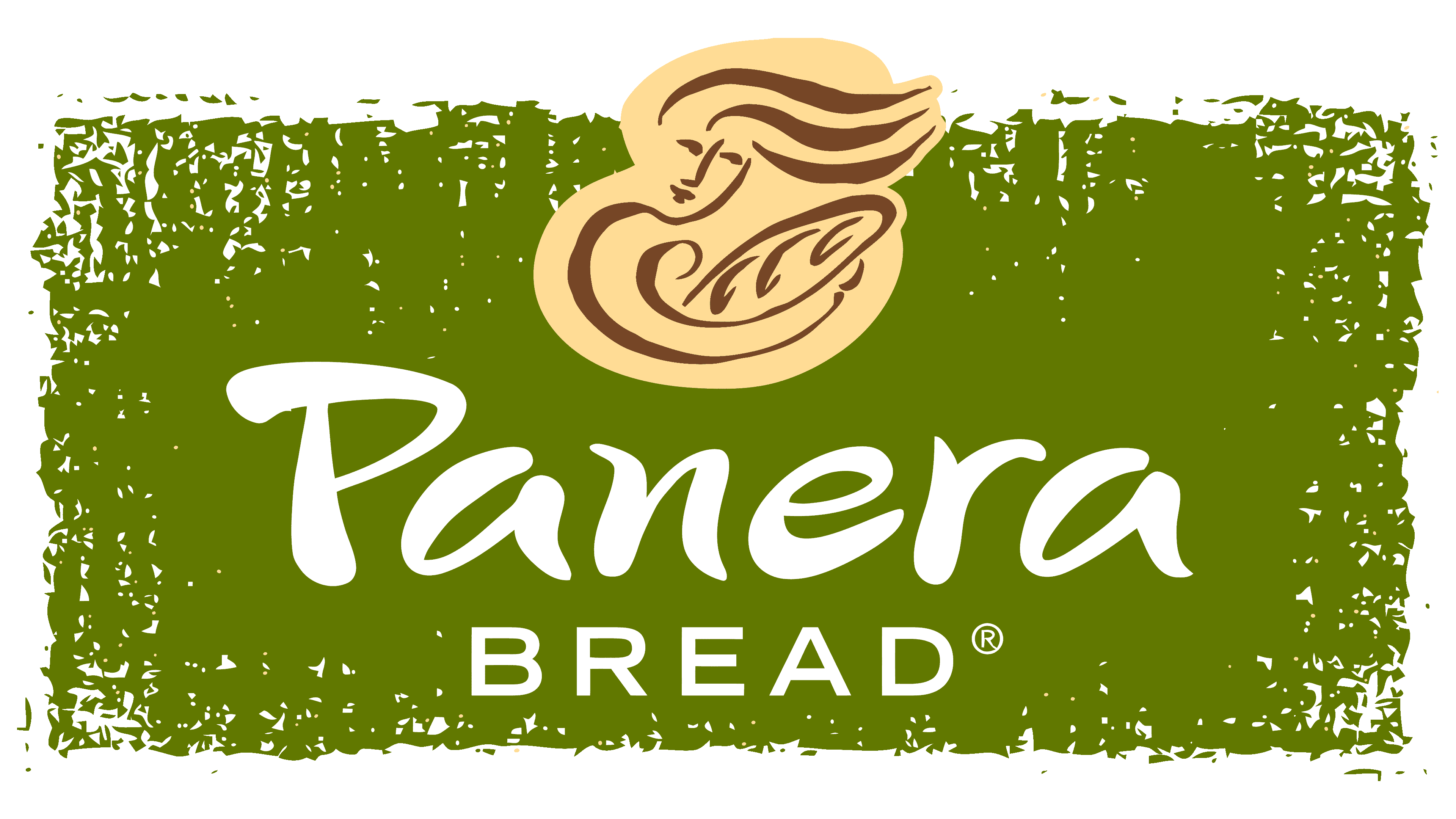
The modern interpretation of the logo is an almost identical repetition of the old version. There is a difference, of course, but it is not striking. You will notice a different form of the woman’s disposition. She is depicted straight ahead, looking ahead. A loaf of bread in her hands, a third of which the “granary” has broken off. The word “Panera” is spelled in the same font, with letters connected: “a” in conjunction with “n” and “e” with “r.” The Bread lettering is at the bottom and is painted beige. Now, all the elements are placed on a semi-oval green background. It looks like the oven’s mouth where bread is baked. And green indicates the products’ environmental friendliness and the ingredients’ naturalness.
Font and Colors
The visual identity of the bakery and coffee shop chain is based on stereotypes: bread plus a woman-mother. In this case, it is the “breadbasket,” the “breadbasket.” Her image was redrawn twice, but it never disappeared from the logo because it completely matches the theme of bakery products – home, family, giving warmth.
For the main inscription, a typeface of the same name was used, with letters in an Asian style, as if they were drawn with short strokes. It was first published in Fontmonger.
The colors correspond to the bread theme, with a predominantly light beige. White, black, and olive green are also present. The first one is used as a background in the early logos. The second one contains all the inscriptions. The third one serves as the background for the last emblem and attests to the product’s environmental friendliness.
FAQ
Is Panera a brand?
It is a well-known brand and a key player in the fast-casual dining market in the United States. It falls under Panera Brands, a major name in the fast-casual restaurant industry, which also includes brands like Caribou Coffee and Einstein Bros. Bagels. The company stands out for its high-quality bakery items, nutritious meals, and cozy cafe vibe, making it a favorite among customers looking for good food in a comfortable setting.
Who owns Panera?
Panera, a well-liked bakery-café chain that serves fresh bread, sandwiches, soups, and salads, is owned by JAB Holding Company. They took over on July 18, 2017, which meant Panera was no longer a public company after 26 years. This move was a big deal for the company, showing its success and value.
JAB Holding Company has a significant global impact, working in consumer goods and services, including coffee shops and fast-food restaurants. The deal was important for Panera Bread, too. With JAB’s help, Panera drew on more resources and knowledge from the global food and drink industry.
Hamra Enterprises is one of Panera Bread’s major franchises, operating many of its locations. Franchisees are super important because they help the company grow and ensure customers everywhere get the same great brand experience. Even though they don’t own Panera, their work managing the cafes is key to keeping customers happy and the business doing well.
What does the logo symbolize, Panera Logo?
The logo, depicting a woman carefully holding a piece of bread, showcases the company’s deep love for baking and its commitment to offering nutritious, high-quality food. This image is a key part of how Panera communicates the care, warmth, and authenticity it puts into its food and service. In 2020, Panera Bread refreshed its logo, adding deeper significance to its design. The logo now features a shape resembling the top part of an oven, highlighting the central role of baking in Panera’s operations.
The logo’s color scheme also contributes to its meaning. A golden-brown color evokes freshly baked pastries, with warmth and the allure of goods straight from the oven. This color choice aims to beautify the logo and awaken a desire for comforting, tasty food. The logo includes a vibrant shade of green, representing Panera’s pledge to use fresh, natural ingredients. The green color serves as a reminder of Panera’s transparency in sourcing and its goal to offer foods that are as good for the body as they are for the palate. Through its deliberate design and symbolism, the logo conveys Panera’s passion for baking, its commitment to quality, and its focus on wholesome ingredients.
Who is the lady on the Panera Bread logo?
The logo depicts a woman gently holding bread, nicknamed “Mother Bread.” This image comes from the designers at Heckler Associates, who wanted to show how much Panera cares about baking and making food. “Mother Bread” isn’t based on a real person. Instead, she stands for the baking process, especially the part where the dough is fermented to make bread soft, airy, and tasty. In sourdough baking, the starter is often called “mama” because it needs care and feeding, much like caring for a child.
This idea aligns with Panera’s approach to baking with care, using high-quality, natural ingredients. It’s about being precise and putting love into making bread. Panera wants its food to feel warm, genuine, and comforting, like home.
Why did Panera change its logo?
In 2020, Panera Bread updated its look and logo in response to the challenges posed by the COVID-19 pandemic. At a time when businesses everywhere were changing how they served their customers, focusing on safety, convenience, and staying attuned to what people now needed, Panera saw this as the perfect chance to freshen its image to better reflect its history and what it stands for.
Panera mainly changed its logo to strengthen its ties to traditional baking and honor its history, especially its focus on sourdough bread. The new logo spotlighted “Mother Bread,” symbolizing Panera’s commitment to careful baking and the use of quality ingredients. It was a nod to Panera’s roots and its role as a place that serves fresh, good-for-you bread.
What is Panera Bread’s slogan?
Panera Bread is a restaurant chain that cares about serving good, healthy food. Their main message, “One Panera for a Healthier and Happier World,” shows their commitment to making fresh, natural food, bringing people together, and helping them feel good.
In 2013, Panera wanted to show everyone how much they care about being responsible and making a positive impact, so they started saying, “Live Consciously. Eat Deliciously.” This slogan is all about making food that tastes great without harming the planet or the community. It encourages people to think about where their food comes from and enjoy good-quality meals.
Panera has used other catchy phrases, such as “Fresh Bread Makes Friends” and “Food as it should be,” to discuss different aspects of their work. “Fresh Bread Makes Friends” tells us how important their bread is for making sandwiches and making people feel welcome. “Food as it should be” is about being transparent about how they make their food and using ingredients you can trust and that are good for you. Even though these slogans haven’t been part of their logo, they’ve helped Panera share what they’re all about.
When did Panera change its logo?
In 2020, Panera Bread updated its logo to address the challenges of the COVID-19 pandemic. It was a small change but a major step, showing that Panera keeps up with the changing world and focuses on safety and convenience for its customers. Even before this big change in 2020, Panera was always experimenting with its logo to better convey what the brand is all about. For instance, in 2005, they added brown to the logo, hinting at the warmth of their freshly baked bread.
Then, in 2011, Panera swapped all the black in its logo for dark brown. This small change made the logo feel warmer and more welcoming, linking it to baking and to the use of natural ingredients. By 2019, Panera had updated its logo again, giving it a modern, neon-like flair. This new look was part of Panera’s effort to stay fresh and appealing to everyone. Through all these updates, Panera has shown its dedication to offering tasty, healthy food and to staying true to its values while adapting to new times.