


![]() Papa John’s Pizza Logo PNG
Papa John’s Pizza Logo PNG
The Papa John’s logo clearly shows the company’s strong customer base and scale. The number of establishments in the network is growing each year. The emblem promises delicious fresh pastries and fast service, which wins customers’ love.
Papa John’s began in 1984, when John Schnatter opened his first pizza spot inside his father’s bar in Jeffersonville, Indiana. He financed the start by selling his Camaro Z28, then shaped the brand around a direct promise, later known through the slogan “Better Ingredients. Better Pizza.” The company’s headquarters later settled in Jeffersontown, Kentucky.
By 1985, Papa John’s had moved into franchising and expanded into Kentucky and Indiana. The 1990s brought faster national growth across the United States, helped by a focus on ingredient quality and a clear delivery-based format. In 1993, the company went public on NASDAQ under the ticker PZZA, giving the chain a stronger base for expansion.
In the 2000s, Papa John’s became one of the early pizza chains to invest in online ordering. The brand also moved deeper into international markets, opening restaurants in the United Kingdom, Mexico, and China. By 2010, the network had passed 4,000 stores in more than 35 countries, placing the company among the largest pizza chains in the world.
The late 2010s brought pressure on the brand and changes in leadership. In 2019, Rob Lynch became CEO and focused on rebranding, product quality, and repairing the company’s reputation. During COVID-19 in 2020, Papa John’s added contactless delivery, real-time pizza tracking, and new products such as Papadias. Today, the chain operates more than 5,500 locations in 49 countries.
Meaning and History
![]()
A massive project started with a small idea. First, the future businessman set up a closet for brooms. It was the backyard of the tavern owned by his father, Mick’s Lounge. She was in Jeffersonville, Indiana. The young man sold the car and bought used pizza-baking equipment, spending $1,600. Gradually, he set up the point of sale in the former toilet building. Such harassment occurs because the father forbade his son from doing business and sent him to study. However, he insisted on his own and still became an entrepreneur. And successful.
That is, the conditions for the launch were, to put it mildly, extremely limited. However, this did not stop the businessman from building the fourth-largest pizzeria chain in the United States, because big things start with small steps. And so it happened: takeaway pizza was to many people’s taste. A year later, Schnatter moved into the next room. He also pioneered a special sauce for dipping the crust, which was deliciously done.
In 1993, the company went public and began to develop rapidly. In 1994, she already had 5,000 points of sale, and in 1997, 1,500. In 2009, the founder of the pizza chain could return his car, which was sold to buy equipment. Now he paid $250,000 for it, not the amount he sold it for ($1,600). This was the result of the company’s global fame, with its logo known worldwide. It decorates the shops’ entrances and the bakers’ branded uniforms.
What is Papa Johns?
It is the trade name of the company, Papa John’s International, Inc. This is one of the largest pizza chains in the United States. Its establishments operate like restaurants but allow food to be ordered, taken away, or delivered. The logo, in the form of a convex red inscription, is known to residents in at least 49 countries, as the company has about 5.5 thousand locations worldwide, spread across different continents. In addition to traditional pizza, desserts, chicken wings, and drinks are served there.
1984
![]()
The original emblem is simple: a geometric figure with an inscription inside. It is a red-and-white banner with an image of an “upside-down plate.” It is painted white, arched, and topped with a rectangle bearing the word “Pizza.” The name is written in blue letters that taper from the center to the edges.
1984 – 1995
![]()
The designers kept the inverted-arch shape, completely encircling the geometric figure with a thin green line. All lettering is red. The central letters, as before, are much larger than those on the right and left, making the emblem stand out from the rest. The font in the phrase “Papa John’s” also did not change: there were bold characters in upper case without serifs.
1995 – 2019
![]()
The developers designed it differently to modernize the logo without affecting the main configuration. They added wide square serifs and green shadows, placed the word “Pizza” on a ribbon with triangular ends, and circled it with a red line.
2018
![]()
The emblem consists of two diagonally arranged rectangles. They are docked closely together and slightly offset. The right figure is red; the left is green. They contain the name of the pizzeria chain, divided into two parts. The last “s” is smaller than the others and underlined with a short stripe. Font capital, chopped.
2019 – 2021
![]()
After a few years of experimenting with the visual identity badge, pizzeria management settled on a 1995 version with a font from the 2018 logo. During the transformation, a massive sign that initially served as an emblem became a miniature advertising icon. The author of The Eternal Sign was a marketer who lived next door to John Schnatter during his student days. Like himself, the developer’s name was lost, although the future owner of the Papa John’s chain promised him free weekly pizza for such work.
The old shell is preserved in the modern logo, but the content has been changed. Designers have introduced a new font into the old frame, smooth, even, sans-serif. They did the same with the inscription on the tape, using the grotesque. Another modification concerned the color: now the letters are painted in light scarlet instead of rich red.
Serif typefaces were used only in the middle years: Aachen Bold, created by designer Colin Brignall. The Italian Plate is currently using a smooth, even, wide font.
The color palette is stable because red and green are always present in any logo configuration. Red attracts, green inspires confidence, and white calms.
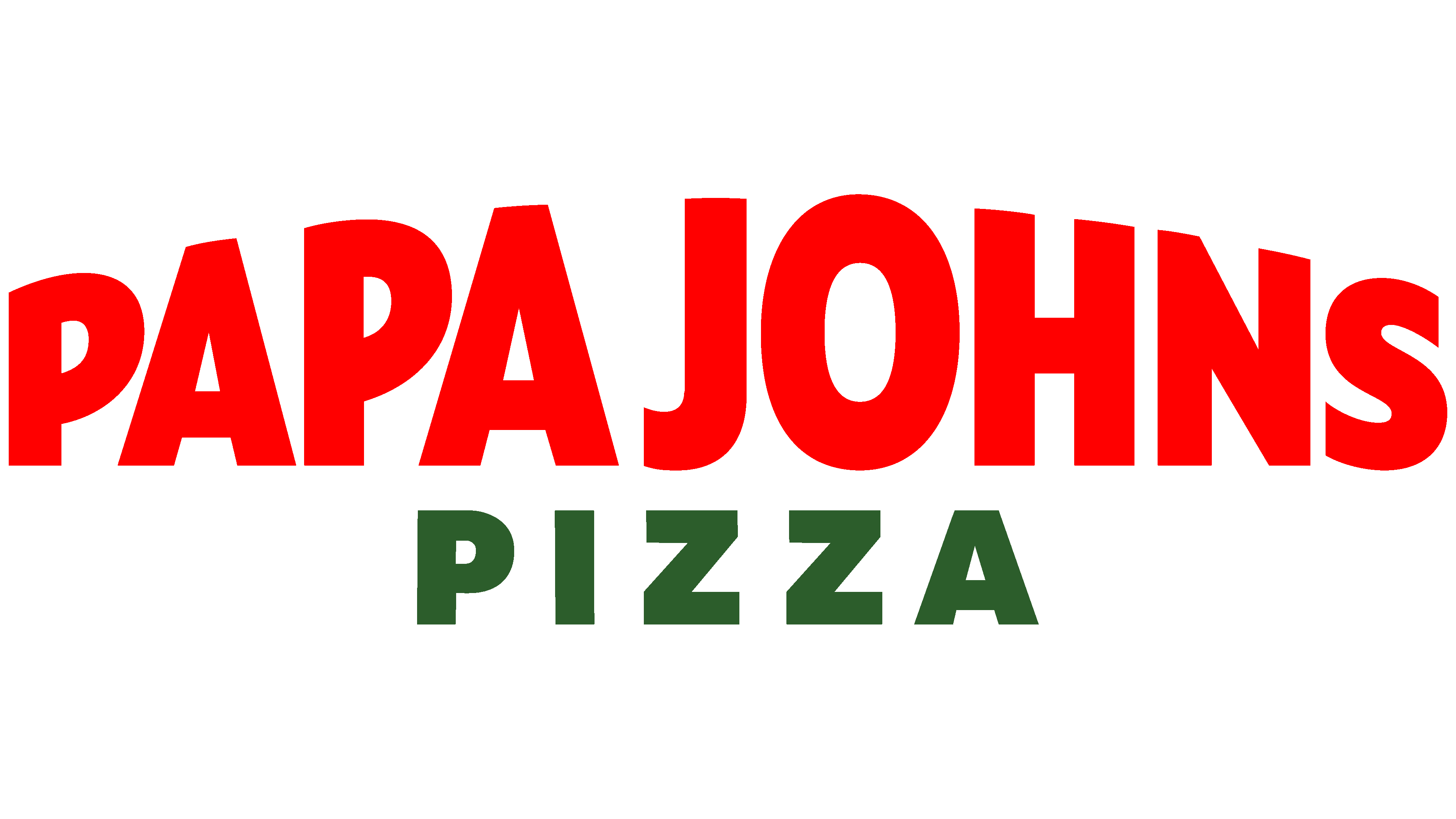
2021 – today
![]()
At the end of 2021, the fast-food chain Papa John’s launched a major rebranding. She focused on keeping the identity simple, ditching the “Pizza” ribbon and the possessive apostrophe. Now, the pizzeria is called Papa John’s. The redesign also removed the green outline around the text, and the name itself took on the shape of an inverted plate. For this, the Mathews Hale Design studio specialists, entrusted with updating the emblem, left the letters in the form of a ladder, with a decrease from the middle to the sides.
Font and Colors
The designers replaced the Italian Plate typeface with one with slightly wider stems and shorter cuts for the “J” and “S.” Papa John’s corporate palette now consists solely of red. At the same time, all previous logos also feature green.
FAQ
What was Papa John’s slogan?
The slogan “Better Ingredients. Better Pizza. Papa John’s” is a catchy line that captures what it stands for. It shows the company’s promise to use top-quality ingredients to make the best pizza. This slogan is a key part of Papa John’s story, underscoring its dedication to excellence and quality. From the start, the company wanted to be different from other pizza places. Founder John Schnatter believed using better ingredients would make his pizza stand out.
The slogan came from this strong belief in quality. It was a way to get attention and to reassure customers that Papa John’s pizza is made with the best ingredients. Over time, this slogan symbolized the company’s commitment to quality, assuring customers they would get a superior pizza every time they ordered. John Schnatter’s name at the end of the slogan is like his personal guarantee of the pizza’s quality. It suggests that he stands behind every pizza made, ensuring it meets the company’s high standards.
Who designed the Papa John’s logo?
The brand chose the San Francisco design firm Su Mathews Hale Design for a big project: giving their logo a new look. This was all about making the Papa John’s brand feel more modern and work better online, since many of their orders are placed online. They wanted a logo that people could easily recognize and look good on any screen, big or small.
Working with Su Mathews Hale Design was a clear sign that the brand was ready to keep up with the latest trends and meet customers’ needs in new ways. They picked this firm because it’s known for creating modern, creative designs. The goal was to make the Papa John’s logo stand out more in the crowded online space so customers could quickly identify it.
What does the Papa John’s logo represent?
In 2021, Papa John’s introduced a new logo that adopts a minimalist style, emphasizing simple lettering. This update shows the core of what the company is about. The old logo was red and green, hinting at classic pizza toppings like tomato and basil. Now, red is the main color, and green is shown with the slogan. This shift to red highlights tomatoes, underscoring the brand’s dedication to using fresh, quality ingredients.
Choosing a simpler logo matches the brand’s values of honesty and bravery. This move to minimalism sends a clear message: the brand focuses on the quality of its pizzas. The design aims to show that great pizza comes from great ingredients, with a special emphasis on tomatoes to highlight their commitment to freshness. This minimalist design aligns with what today’s customers prefer: clear, simple branding. In a busy world, the new Papa John’s logo stands out for its ease of recognition and understanding.
What does the Papa John’s logo mean?
The brand’s logo, known for its deep red color, highlights the key role of tomatoes in its pizza, particularly the tomato sauce, a basic element of most pizzas. This color choice is intentional, highlighting the brand’s focus on fresh, high-quality ingredients, with tomatoes a crucial ingredient in their recipes. The red in the logo reminds customers of the tasty flavors and high-quality food the company aims to provide with every pizza.
The logo’s simple design reflects the company’s belief in straightforward, high-quality service. This simple design approach suggests that great quality can be achieved without making things overly complex. While red focuses on tomatoes, the logo’s green elements occasionally nod to basil, another essential pizza ingredient, highlighting the brand’s attention to flavor-enhancing ingredients. These aspects assure customers that choosing the company means getting a delicious and carefully made pizza.
What is Papa John’s new logo?
In November 2021, the company introduced a new logo that’s much simpler than its previous one. Now, it just shows the name “PAPA JOHNS” without the green frame or the “PIZZA” ribbon from the old design. This change makes the logo look modern and minimalist.
The logo is dark red and uses bold capital letters in a straightforward sans-serif font. The letters get bigger towards the middle and smaller again towards the ends, which draws your eye to the center. The words “PAPA” and “JOHNS” are also very close together, making the logo look neat and connected. This new logo is a big step for the brand, showing they want to keep up with the times and stand out online, where a clear, bold look is important.
What does Papa stand for in Papa John’s?
The company, Papa John’s International, Inc., is named after its founder, John Hampton “Papa John” Schnatter, an American entrepreneur who started the business in 1984. Schnatter opened his first pizza place in an unusual location, a broom closet in his father’s tavern. This move highlighted his dedication and innovative approach to achieving his goal of providing high-quality pizza.
“PAPA” stands for “People Are Priority Always,” which reflects the company’s core values. This motto emphasizes the brand’s commitment to valuing both its customers and its employees. It shows the company’s commitment to great service, a positive work environment, and delivering pizzas made with attention to quality. Since the beginning, this philosophy has been key to the brand’s operations and its identity.
Why did Papa John’s change its logo?
In 2021, the brand decided to refresh its look, including a new name and logo. This change was part of a bigger plan to improve how it serves customers worldwide. By updating its look, the company wanted to show that it was serious about providing top-notch service and making great pizza.
A key update was changing the spelling of ‘Johns’ in their logo by removing the apostrophe. It was about looking modern and making the brand simpler and more unified for all customers. This step towards simpler branding makes the company’s name easier to remember and better fits across platforms, from online to storefronts. The new logo and branding refresh were about setting the brand up for the future, showing they’re a company that listens and adapts. The rebranding was the company’s chance to start fresh, focusing on what they do best: making quality pizza and taking good care of their customers, reflected in their new, simpler logo and name spelling.
What’s the controversy surrounding the Papa John’s logo and slogan?
In 1988, the company faced a lawsuit from Pizza Hut over its slogan “Better Ingredients. Better Pizza.” Pizza Hut, which used the slogan “best pizza under one roof,” claimed its slogan falsely represented its product quality. However, the lawsuit was unsuccessful. The brand defended its slogan, stating that it was meant to be a subjective opinion, much like Pizza Hut’s. This legal battle highlighted how pizza companies use subjective slogans to compete and attract customers.
How much did the symbol Papa John’s cost?
A quirky story about a promise from the founder accompanies the creation of the brand’s logo. He was so taken with the logo design that he promised the designer free pizza every week for life if his business succeeded. Over 30 years have passed, and this promise has amounted to about $16,000 in pizza. Unfortunately, the founder never got the designer’s name, and the designer hasn’t come forward to claim their pizzas. This funny yet telling story adds an interesting dimension to the company’s history, highlighting the unexpected promises made during the early days of a successful business.