![]()
Paul Scherrer Institute (PSI), one of Switzerland’s leading research centers, has introduced a new logo to reflect its focus on scientific advancements and innovation. Known for its work in physics, materials science, biology, and medicine, the institute has updated its visual identity to align with its forward-thinking mission. The new logo incorporates modern design elements with symbolic imagery, highlighting the institute’s role in advancing research across various fields.
With its retro style and rectangular layout, the previous logo displayed the acronym “PSI” in bold, clear lettering, conveying stability and scientific rigor. However, the design felt outdated and didn’t fully capture the institute’s dynamic nature.
![]()
The new logo features an abstract cluster of dots forming a unified shape, symbolizing the concentration of knowledge and collaboration across scientific disciplines. This visual representation reflects the institute’s commitment to growth and innovation.
Regarding typography, the abbreviation is now presented in a sleek, modern sans-serif typeface, giving the logo a clean, contemporary look. Retaining the black-and-white color palette maintains professionalism, while the lighter structure conveys openness to new ideas and discoveries.
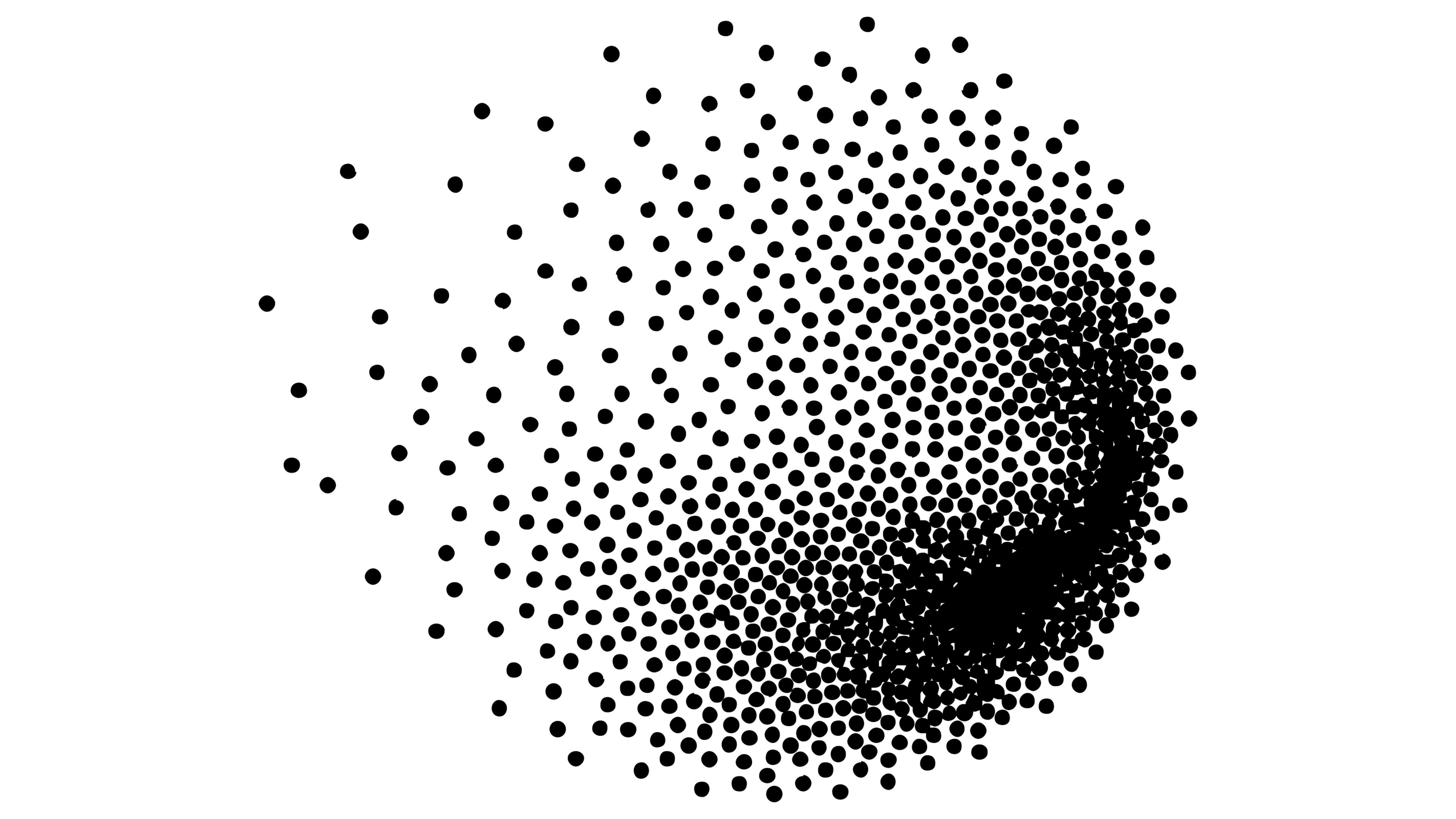
The particle-based design stands out. Each dot represents a key component of the scientific process, symbolizing how individual efforts combine to create a larger impact. This aligns with the institute’s focus on collaboration and multidisciplinary research, while the flexible arrangement of particles suggests the ever-evolving nature of scientific discovery.
The rebranding includes a custom typeface called “Accelerate,” developed in partnership with Lukas Schneider of Revolver Type Foundry. The typeface incorporates elements from Greek and Latin alphabets, along with mathematical symbols, reflecting the precision and clarity needed in scientific research.
![]()
Another important aspect of the new identity is its flexibility across different platforms. Whether in animations, sub-brands, or printed materials, the particle cloud design remains consistent, symbolizing unseen forces at work and reinforcing the idea that science is always evolving, driven by curiosity.
The new identity encapsulates the institute’s commitment to exploration, innovation, and collaboration.