


 Payoneer Logo PNG
The Payoneer logo represents the integrity and stability of the company’s financial solutions to its users worldwide. The emblem depicts a circle of clients interacting within a dynamically evolving system that operates without interruption. The core idea behind the design is the convenience and versatility accessible to large businesses and freelancers, emphasizing its global focus. The symbol depicted in the visual mark highlights the simplicity of currency exchange and money transfers across the globe.
Payoneer was founded in New York in 2005 by Yuval Tal, who saw a market for simpler cross-border payments to contractors, employees, and freelancers. Carmel Ventures invested $2 million in 2007, helping the company expand its team and financial tools. In 2008, it introduced a MasterCard debit card that let users receive funds through virtual accounts and withdraw cash from ATMs worldwide.
Greylock Partners and Carlyle Witner provided $4 million in 2010. A mass-payout service followed in 2011, allowing companies to process many international transfers at once and drawing interest from online marketplaces and freelance platforms. Susquehanna Growth Equity and other investors added $16 million in 2012, while offices opened in the Philippines and Japan in 2013.
In 2014, a banking partnership program gave users local account details in several countries. Technology Crossover Ventures invested $180 million in 2016. Payoneer launched short-term working-capital financing in 2017 and a cross-border payments service for banks in 2018. During 2019, it expanded further into e-commerce with services aimed at online sellers and digital platforms.
Payoneer announced plans to merge with FTAC Olympus Acquisition Corp. in 2020. In June 2021, Payoneer began trading on Nasdaq under the ticker PAYO, gaining new capital for product development and geographic expansion. By 2023, the company was widening its services for small and midsize businesses while increasing its presence in emerging markets.
Meaning and History
What is Payoneer?
This is a global financial services provider that has established itself in cross-border payments. By focusing on digital payment solutions and international money transfers, the brand has become an essential resource for independent contractors, online retailers, and companies operating in the global digital economy. The platform offers various services, such as prepaid debit cards, multi-currency accounts, and streamlined payment methods for businesses and marketplaces. Its primary advantage lies in simplifying complex international transactions, allowing users to receive payments from companies worldwide as easily as if they had a local bank account. This makes the platform popular among freelancers working with overseas clients and online retailers conducting business in international markets.
Before 2021

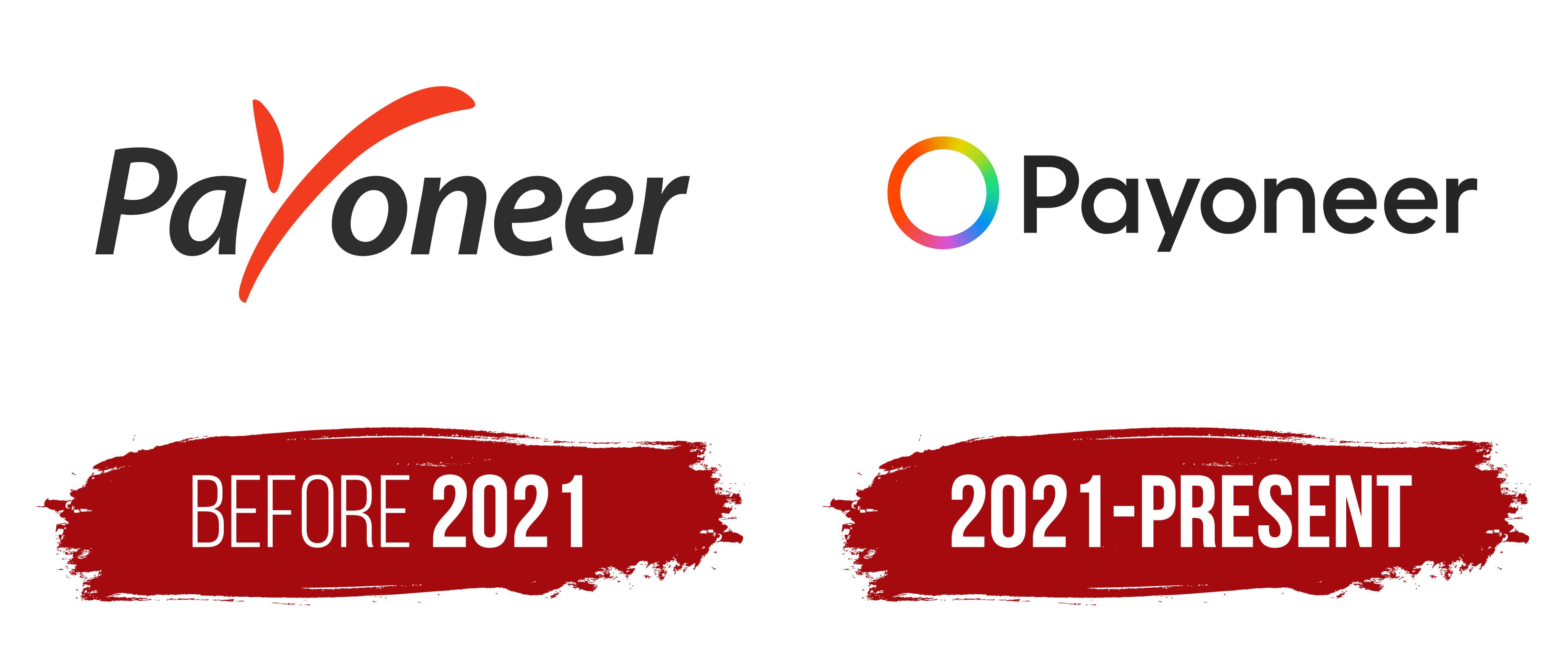
The company emblem represents the name and conveys the brand’s key idea. The name was chosen because it combined two words, “Pay” and “Pioneer,” highlighting the company’s primary mission of providing international payment and transfer services. The word “Pioneer” embodies innovation, reflecting the company’s forward-thinking approach to financial technologies and solutions. This brand aims to be a leader and pioneer in global payments, offering clients modern, convenient methods for managing financial resources worldwide.
The most attention in the logo is given to the letter “y,” creatively transformed into a symbol resembling a checkmark. This design choice symbolizes confirmation, confidence, and reliability. However, there is another interpretation: its shape resembles a bird’s silhouette, which is associated with ease and swiftness, metaphorically reflecting the speed of money transfers within the Payoneer system. This interpretation adds meaning to the logo, connecting it to fast, unrestricted cross-border transactions.
Orange represents the connection between people and the support the company provides its users in purchases and transfers. This color conveys friendliness and openness, fostering trust and reliability in every transaction. The orange accent helps to express the idea that Payoneer simplifies the process of purchases and transfers for everyone who uses its services.
2021 – today
After the merger with FTAC Olympus Acquisition Corp., the company’s emblem changed, becoming more modern and symbolic. It is now represented as a ring in which the colors of the rainbow smoothly transition into one another. This element serves as decoration and a symbol of the program loading, the processes related to sending money, and the constant movement of financial flows. The design emphasizes continuity and interaction when working with various currencies and users from around the world. The ring in the logo represents globality and unity, reflecting Payoneer’s essence as a system that connects people and businesses internationally.
The emblem is a visual representation of the company’s work and a symbol of its mission to provide cross-border financial services. Each shade in the ring highlights the diversity of currencies and clients with whom Payoneer interacts globally. This ring conveys that the company ensures connectivity, creating reliable financial bridges between countries and continents, helping people and businesses work together regardless of distances and economic boundaries.
Following the ring is a light and clear inscription, where the thin black letters appear modern and minimalist. This design choice reflects the company’s dynamism and readiness to adapt quickly to new challenges and changing realities. The simplicity of the lines emphasizes flexibility and openness, as well as the company’s ability to remain a reliable partner under any conditions, helping users complete financial tasks, no matter how quickly things change.