


![]() Google Wallet Logo PNG
Google Wallet Logo PNG
The Google Wallet logo symbolizes the convenience and accessibility of the payment service. Its simple design reflects the ease of transactions and focus on users’ everyday financial activities.
Google Wallet was launched on May 26, 2011, as a mobile payment system for Android devices with NFC support. The service enabled users to store credit card information and make contactless payments. Initially available only on the Nexus S 4G in the U.S., the launch was challenged by eBay over alleged trade secret violations.
In 2012, Google Wallet added support for Visa, Discover, and American Express and introduced peer-to-peer transfers. In 2015, Google shifted its strategy by launching Android Pay to simplify payments. Google Wallet then became an app for storing tickets and loyalty cards.
In 2018, Google combined the two services into Google Pay, but in 2022, it relaunched Google Wallet separately as a digital wallet for documents, tickets, and digital keys. By 2025, Google Wallet had become a versatile digital platform integrated with Google apps and was available on Wear OS and Fitbit devices.
Meaning and History
![]()
What is Google Wallet?
It is a Google mobile app for contactless payments and digital document storage. Users can pay by tapping their NFC-enabled smartphone at payment terminals. The app stores payment cards, tickets, and digital keys and automatically synchronizes with other devices and Google services.
2011 – 2015
![]()
The Google Wallet logo, created for the mobile payment service, featured a stylized composition shaped like the letter “W.” The emblem consisted of four separate curved lines resembling abstract waves or flowing streams. These lines had smooth, rounded ends, and their curves created a sense of motion and visual rhythm, symbolizing the transfer of information and the ease of contactless payments.
The color palette reflected Google’s corporate identity, with each stripe colored in one of the brand’s signature colors: blue, red, yellow, and green. This combination symbolized accessibility, variety of services, and the platform’s universality. The bright, saturated colors enhanced the logo’s visual impact, reinforcing the brand’s modern and innovative image.
Below the symbol, the text was divided into two parts. The word “Google” was set in the brand’s characteristic serif typeface, representing stability and trust. In contrast, the word “wallet” was set in a thin, elongated sans-serif typeface in a light blue. This lighter typeface emphasized the service’s utility and technological focus, balancing the visual weight of the first word and giving the logo a sense of completeness.
The typography created a contrast: the first part of the name appeared traditional and dependable, while the second looked light and modern, highlighting the application’s innovative nature. The logo combined visual metaphors of movement and communication with the professional authority of the parent brand.
The Google Wallet logo conveyed convenience and speed in digital payments, symbolized new technologies in mobile commerce, and maintained recognition and continuity within Google’s overall visual system.
2015 – 2018
![]()
The updated Google Wallet logo marked a shift toward a cleaner, more streamlined design, emphasizing the company’s visual identity and its focus on simplifying the symbolism of its mobile products. The logo was introduced on September 1, 2015, and remained in use until January 2018, when Google Wallet was rebranded as Google Pay Send and integrated under the Android Pay brand.
The main emblem took the form of the letter “W,” now composed of four individual bars with straight, horizontal cuts. Each bar had sharp edges and angular ends, giving the symbol a compact, geometric look. The palette remained consistent with the company’s signature green, red, blue, and yellow, but the color sequence was reordered from the previous version, adding a fresh visual twist.
The new shape reflected Google’s goal of ensuring maximum legibility and optimal display on small mobile screens. The bars appeared shorter and more defined, conveying precision and technological refinement. The composition evoked both wallet card slots and signal bars, reinforcing the connection to financial and digital transactions.
The typographic portion was positioned to the right of the symbol. The lettering was set in a clean, evenly weighted sans-serif typeface. The word “Google” appeared in a slightly bolder weight than the lighter, more delicate rendering of “Wallet.” The typeface was set in a light gray, conveying a sense of minimalism and restraint and harmonizing with the bright emblem. This preserved visual balance and highlighted the primary brand name as the logo’s leading element.
2022 – today
![]()
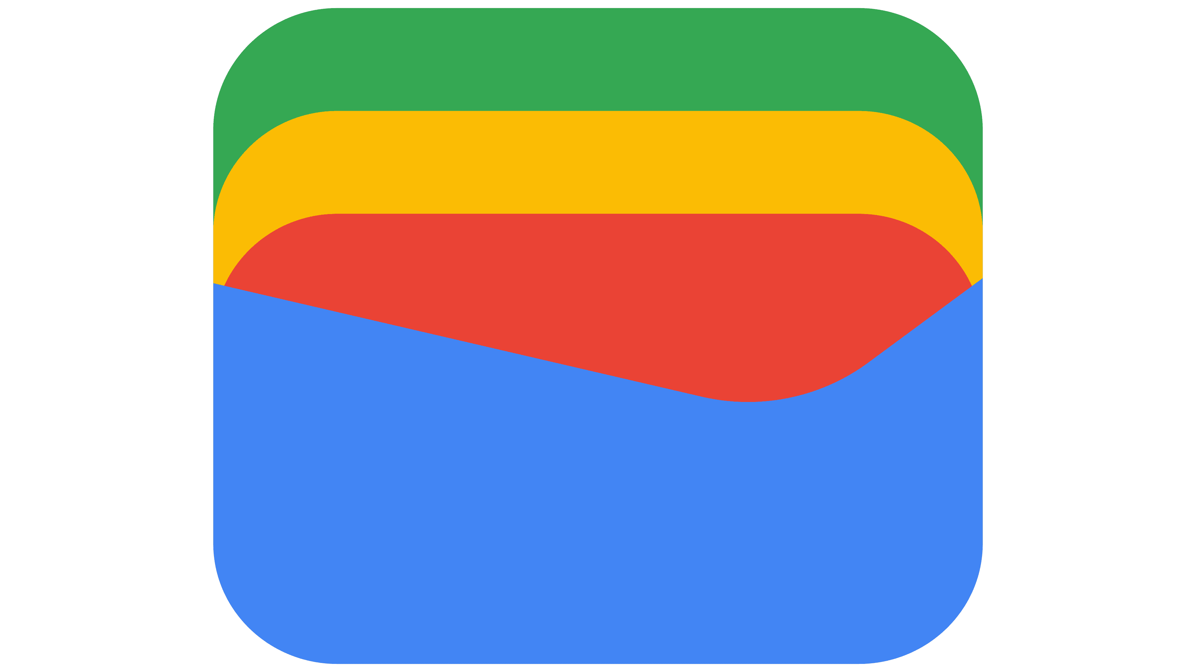
The 2022 Google Wallet logo features a square icon with rounded corners and text set in the proprietary Google Sans typeface. The icon serves as a visual metaphor for a wallet and is presented in Google’s signature color palette. The composition’s foundation is a deep blue (#4285F4), occupying the lower and most prominent part of the emblem. This blue block represents the wallet’s pocket, into which three rectangular elements are inserted, symbolizing payment cards or identification cards. The upper elements are colored in the classic Google brand palette of red, yellow, and green. Stacked vertically, they create a sense of depth and fullness, emphasizing the wallet’s functionality in storing various digital items.
The new Google Wallet icon directly replaced earlier versions that were based on an abstract pictogram of the letter “W.” First introduced on May 11, 2022, during the Google I/O conference, the logo marked the beginning of a transformation period for the service, which launched for Android users on July 18 of the same year. The shift toward a more object-based visual design reflects Google’s intent to position Wallet as a universal digital container for boarding passes, access cards, payment cards, and IDs, rather than limiting it to payment functions.
The typography uses Google Sans, an in-house typeface that evolved from Product Sans. It is a modern sans serif with clean lines, moderate stroke contrast, and neutral proportions, ensuring legibility and scalability across all digital platforms. The text is gray, creating visual balance with the bright, saturated icon. This restrained gray tone reinforces the brand’s professional, technology-focused image without overwhelming the composition with excessive color.
The emblem change marked Google Wallet’s move to a new level of audience communication, from a letter-based service identifier to an intuitively recognizable object that reflects the purpose and versatility of a digital wallet. By retaining the typeface’s traditional colors and stylistic characteristics, the company maintained continuity with prior identity versions while demonstrating the evolution of its digital products and its adaptation to modern user expectations.
Font and Colors
The text portion of the logo is set in Google Sans, a geometric sans serif created specifically for the company’s needs. The font features smooth glyph shapes, open apertures, and moderate stroke weight, resulting in a visually balanced and easy-to-read experience. The letterforms are defined by the absence of serifs, minimalist geometry, and proportions that ensure clear legibility even at small sizes. Among commercial typefaces, Free Zone Medium is the closest match, sharing similarities with Lonely Armadillo Regular. However, Google Sans stands out for its smoother curves and precise shaping.
The logo’s color is drawn from Google’s standard brand palette of four signature shades: deep blue (#4285F4), bright red, yellow, and pure green. These colors are used in the icon to metaphorically convey the digital wallet’s multifunctionality and its belonging to the Google product family. The “Google Wallet” text is displayed in neutral gray, which contrasts with the icon’s vibrant palette and underscores the brand’s clean, professional, and tech-oriented image. The gray conveys stability, reliability, and business confidence, balancing the composition and enhancing legibility across devices of all sizes.