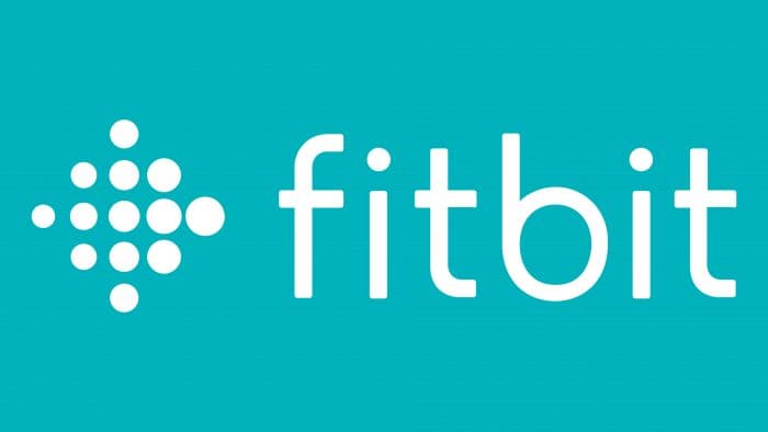
The Fitbit logo is an example of style and harmony, care through control. Human health can be measured. This is a set of many parameters, and the company knows them all. The individual symbols of the emblem create the overall picture, like the numbers on the monitors of Fitbit gadgets.
Fitbit: Brand overview
| Founded: | March 26, 2007 |
| Founder: | James Park, Eric Friedman |
| Headquarters: | San Francisco, California, U.S. |
| Website: | fitbit.com |
Meaning and History
The company’s founders are entrepreneurs James Park and Eric Friedman, who serve as CEO and CTO. The first named it Healthy Metrics Research, Inc., later giving the current name. The range of products has also changed: if until 2016, the manufacturer specialized in consumer electronics, then later switched to progressive digital devices to maintain health.
Gradually, the company started producing its products in collaboration with well-known brands. Moreover, the whole history of Fitbit is a series of acquisitions of specialized enterprises that it bought. The startup has several such deals, the very first and most important of which occurred in 2015. The company itself is in a state of acquisition: Google intends to buy it for $ 2.1 billion, as announced in 2019. It is assumed that the trademark will pass to him at the end of 2020.
Naturally, key milestones in the brand’s history are reflected in its symbolism. The first time this happened was in 2015. Another redesign is already expected – after the alleged transition under the leadership of Google. In the meantime, today, the brand has two logos. The second one, although it was redesigned, still retained the original composition and mood.
What is Fitbit?
Fitbit is an American manufacturer of fitness trackers, pedometers, smartwatches, and other devices designed to monitor physical activity. These multifunctional devices allow users to track their health, monitor sleep quality, and count the number of calories burned. The company was founded in 2007 and was previously called Healthy Metrics Research, Inc. Since 2021; Google LLC has owned it.
2007 – 2016
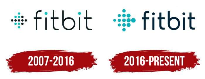
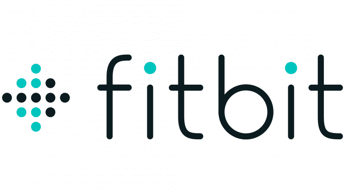
The debut emblem consists of two parts – graphic and text. The first is a rhombus made up of thirteen dots of the same size but different colors. It is mainly black and turquoise, forming an arrow that points to the right to the name of the company.
The lettering is in thin, rounded characters with wide spacing. The characters are in lower case and have high legibility. Moreover, both “t” and “f” are completely identical: they look like the same letter in the upright position and the inverted position. Unique are the dots above the “i” – turquoise-blue, echoing in color with the graphic element.
2016 – today
After switching to digital health monitoring devices, the company changed its image and adopted a new logo. It is based on the previous version and has no striking differences because the adjustments made are minimal. The designers changed the black dots’ color on the left and enlarged them, and the letters were completely painted in the dark. They also tweaked the font by making the lines thicker and shortening the “t” leg so it doesn’t look like an inverted “f.” Also changed the color: instead of black, it now uses dark turquoise.
Fitbit: Interesting Facts
Fitbit has been a big name in wearable tech, focusing on fitness trackers and smartwatches.
- Beginnings: Founded in 2007 by James Park and Eric Friedman, Fitbit started to make health and fitness personal and data-driven through wearables.
- First Product: The Fitbit Tracker, launched in 2009, could track steps, distance, calories burned, and sleep. It got a lot of attention and orders right from its debut.
- Innovations: Fitbit is known for being the leading fitness tracking market, introducing devices that track health metrics like heart rate, sleep, and stress.
- Community: Fitbit uses social features to let users connect, share achievements, and motivate each other, which helps keep people active.
- Joining Google: Google acquired Fitbit in January 2021, opening up new possibilities for integrating Fitbit’s tech with Google’s services.
- Health Research: Fitbit supports health research on sleep and activity levels by using data from its devices, showing its commitment to public health.
- Worldwide Presence: Fitbit sells its products in over 100 countries and offers its app in many languages, showing its global appeal.
- Fitbit Premium: This service offers personalized health insights, workouts, and nutrition plans, meeting a demand for tailored health guidance.
- Eco-Friendly Moves: Fitbit is working on reducing its environmental impact, using recycled materials, and improving production efficiency.
- Supporting Charities: Fitbit’s FitForGood campaign turns user steps into charitable donations, blending fitness with social good.
Fitbit’s story highlights the growth of health and fitness tech, emphasizing innovation, community, and improving health, shaping how we use technology today.
Font and Colors
The transformation of the individual brand symbols is associated with the company’s transitional stages, which in 2015 decided to update the assortment, which subsequently did. The original logo was based on different components and tones: light turquoise combined with black, and geometric with streamlined. Some of these features have disappeared in the current version – for example, now there is no black, only turquoise.
The developers offered a special typeface for Fitbit – an individual spectrum. It is called Seville and is used in all lettering, not just in the emblem. It belongs to the Sans Serif category because it is smooth and chopped. Moreover, the letters have a streamlined shape.
The color palette is pastel – there are no bright colors in it. Muted tones look restrained and strict. The scheme includes two shades of turquoise: Tiffany Blue (# 00B0B9) and Maastricht Blue (# 002A3A), which, depending on the environment, are sometimes perceived as blue.
Fitbit color codes
| Maastricht Blue | Hex color: | #002a3a |
|---|---|---|
| RGB: | 0 42 58 | |
| CMYK: | 100 28 0 77 | |
| Pantone: | PMS 303 C |
| Tiffany Blue | Hex color: | #00b0b9 |
|---|---|---|
| RGB: | 0 176 185 | |
| CMYK: | 100 5 0 27 | |
| Pantone: | PMS 7466 C |
