![]() Android Logo PNG
Android Logo PNG
The Android logo is an immediate visual cue, signifying a technologically advanced yet approachable assistant robot. The emblem embodies readiness to assist as a vigilant guide through various tasks and processes. This symbolism fosters trust and a sense of accessibility, conveying that assistance is readily available.
Android Inc. was founded in Palo Alto in October 2003 by Andy Rubin and Chris White, soon joined by Rich Miner and Nick Sears. Rubin already knew mobile devices through Danger, maker of the Hiptop, which T-Mobile later sold as the Sidekick. The first idea was not a phone system. Rubin and White planned software for digital cameras, but weak market prospects led the startup to shift to mobile phones in April 2004.
Money ran out fast. At one point, Rubin borrowed $10,000 in cash from Steve Perlman, who refused equity in return. Google bought Android Inc. in July 2005 for about $50 million, keeping Rubin, Miner, and White on board. At Google, the team built a Linux-based mobile platform. On November 5, 2007, the Open Handset Alliance was announced with Google, HTC, Intel, LG, Motorola, Qualcomm, Samsung, Sprint, and T-Mobile.
That same day, Android was presented as a Linux-based platform. Google designer Irina Blok created the green robot logo for open use and remixing. Android was released to the public on September 23, 2008, with the HTC Dream, sold by T-Mobile as the G1. It included Android 1.0, Android Market, Gmail, Google Maps, and YouTube.
Unlike Apple’s iPhone, Android was built as an open platform for many manufacturers, without OS license fees. Early versions used dessert names such as Cupcake, Donut, Eclair, Froyo, and Gingerbread. In 2010, Google launched the Nexus One with HTC. Andy Rubin left Android leadership in 2013, and Sundar Pichai took over. Android later expanded to Wear, TV, and Auto, while Android 10 ended the dessert-name tradition in 2019.
Meaning and History
![]()
The mobile operating system was released in 2007. At the same time, Google’s leaders began considering the visual identity of their new product and brought in a team of designers. Irina Blok received the order to develop the logo. Together with her colleagues, she created sketches of all kinds of androids because the delusional owners wanted a robot to be the star of the image. Before the chosen option became a well-known Android icon, it underwent many changes.
What is Android?
Android is an operating system for smartwatches, TV set-top boxes, tablets, smartphones, and other mobile devices. It is based on the Linux kernel and supports a wide range of features found in modern gadgets. Its initial version was released in 2008 on the touchscreen phone HTC Dream. Android has many developers united in the Open Handset Alliance, with Google considered the most prominent among them.
2008 – 2019
![]()
The first version of the robot was black and white, but that did not stop it from becoming an international symbol. Graphic designer Irina Blok used simple geometric shapes as building blocks. The torso is an asymmetric square, the head is a semicircle, the antennae are small, thin lines, the eyes are white circles, and the limbs are wide stripes with rounded ends. A memorable logo has turned out from a banal set of elements with which all Internet users are now familiar.
Irina Blok experimented for a long time before arriving at the final version. She looked for inspiration from a variety of sources, including science fiction films. But the pursuit of the stars was not inspiring enough. In the end, Irina Blok took the tablets from the toilet doors, where figures of men and women are drawn from circles, triangles, and squares. This option was the most successful because it is easy to understand for people worldwide. There were also rumors that the android was copied from a character from the arcade game Gauntlet: The Third Encounter, but the designer denied the plagiarism charges.
2008 – 2014
![]()
![]()
After a little tweaking, the operating system symbol turned green. For him, a light green shade (#A4C639) was chosen to create contrast with other colors. Simultaneously with the robot icon, a blue wordmark was used: the stylized inscription “ANDROID.” Most letters lacked sidelines, with the first “A” looking like lowercase. It was assumed that such a font would be the most technologically advanced and “computer.”
2014 – 2019
![]()
![]()
In 2014, the Android 5.0 Lollipop system was released with a new logo. The designers kept the robot’s classic image but repainted it in a darker shade. “Android” is now light green with all characters converted to lowercase. The developers chose an easy-to-read font for the updated wordmark: a round, geometric sans serif. Users first saw this design option in Android 4.4.4 KitKat, but it received official text logo status only in Lollipop.
2017 – 2019
![]()
![]()
Shortly before the global redesign, the operating system creators updated the inscription, bolding the letters. The new version appeared on the loading screen, in advertisements, and on the platform’s website.
2019 – 2023
![]()
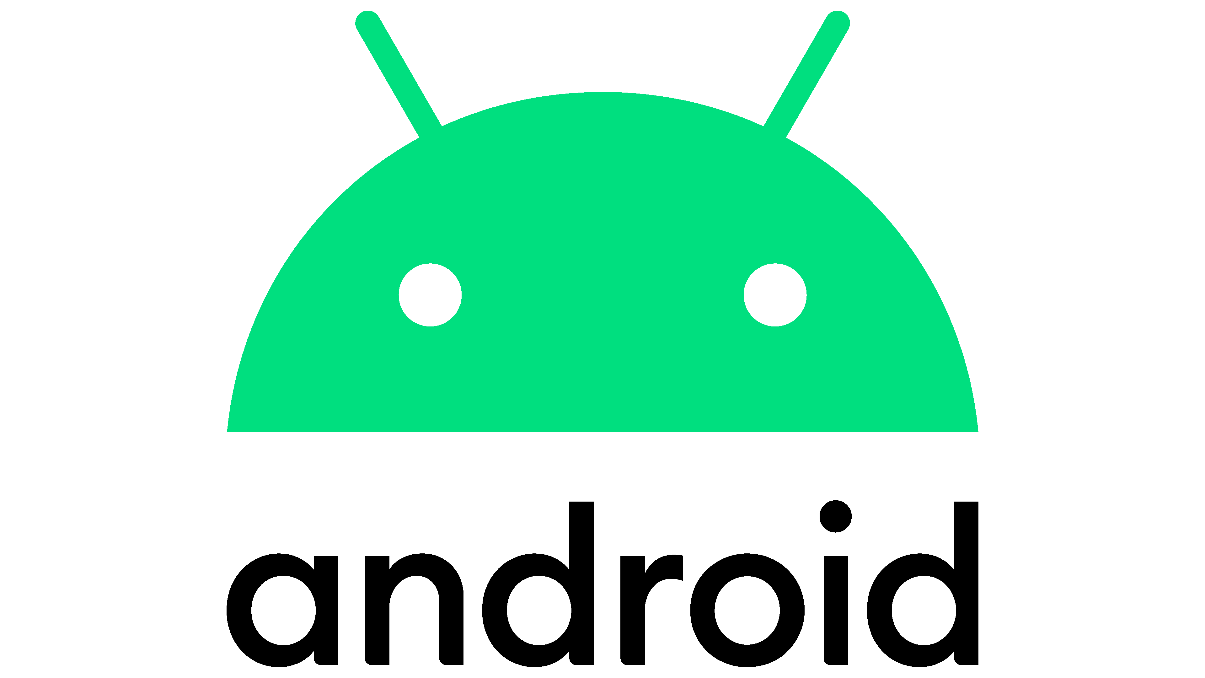
The current Android logo is the result of HUGE’s painstaking work. Representatives of the creative agency completely revised the familiar brand to add modernity and accessibility. The basis of the identity is the green head of a robot shaped as a semicircle, with eye circles and two antennas. Everything is as usual, but the color is now close to mint.
For the lettering, the designers used a thinner black font. This made the title well readable against any background. The changes took effect with the release of a new version of the operating system – Android 10.
2023 – today
![]()
The Android logo’s transformation marks a pivotal shift in brand perception. With a revamped capital “A,” the logo now radiates maturity, in contrast to its previous playful vibe. The change speaks to Android’s growth and its ambition to be seen as a serious competitor in the OS market.
While flat design remains a prevailing trend in tech, Android defies this norm by evolving its iconic robot mascot into a 3D entity. This bold move endows the mascot with a richer personality, elevating it from a mere symbol to a character that can adapt to various scenarios and apps.
Android’s rebranding strategy includes tighter integration with Google. The new, sharp “A” serves a dual purpose: it makes a bold aesthetic statement while fortifying Android’s association with Google. This symbiosis is designed to create a more cohesive user experience and strengthen brand alignment between Android and its parent tech giant.
This visual shift aims to redefine user interaction across millions of devices, marking a significant change in how consumers perceive Android and its products and services.
The redesigned logo, complete with its 3D robot, captures Android’s nuanced character, aligns it more closely with Google, and signals the brand’s readiness for the evolving tech world.
Font and Colors
The iconic platform icon was named Bugdroid because its upper part resembles a beetle. The Android team created this comic nickname, which is still used today, even though the robot’s torso is missing on the emblem. The friendly mascot originally symbolized the curiosity and fun at the heart of open operating system standards.
The Android logo font changed from a complex to a simple one because the developers realized the importance of clarity and legibility in the lettering. Designers at HUGE have selected a sans-serif typeface suitable for display across all screen sizes. It is similar to Montreal Serial Medium, but the letters at the bottom have slight curves. At the same time, the inscription has become completely black, which is also designed to increase readability.
After the redesign, Bugdroid received an updated green color (# 3DDC84). In addition, experts have developed a range of additional shades to improve contrast. Even the greenish-yellow, orange, and blue logos are considered official and allowed for use in different visual contexts.