 Edenred Logo PNG
Corporate programs include meal reimbursement, bonus cards, and employee services used for everyday expenses. Such solutions help companies manage benefits and costs. The Edenred logo represents a company that provides payment solutions and services for corporate clients and their employees.
Edenred was founded in France in 1962, when entrepreneur Jacques Landais created Ticket Restaurant, a meal voucher system for company employees. The model proved successful. Companies received tax benefits, workers gained access to subsidized meals, and restaurants received a steady flow of customers.
In 1983, Accor acquired Ticket Restaurant. It began expanding internationally in Spain, Italy, Belgium, and Switzerland. In the 1990s, the range expanded to include grocery and fuel vouchers, gift certificates, and employee programs. In 2000, Accor united all its service divisions under the Accor Services brand.
In 2008, the division was renamed Edenred. In 2010, Accor spun it off into a separate public company. The shares began trading on the Paris Stock Exchange under the ticker EDEN. By that time, the business covered 40 countries and had more than 26 million users.
In 2011, the company strengthened its position in Latin America by acquiring Ticket Serviços in Brazil. In 2014, it acquired Turkey’s Ticket Completo. In 2017, the company bought Brazil’s Embratec. In 2018, it launched the Edenred Pay platform to integrate corporate payment solutions.
In 2019, Edenred acquired the American company CSI. In 2020, it bought Italy’s Reward. In 2021, it began investing in blockchain technologies. In 2022, it integrated its services with Apple Pay and Google Pay. In 2023, Edenred acquired Spain’s Cobee. In 2024, the company launched cashback partnership programs with major retailers.
The company operates in forty-five countries. It serves sixty million users and more than one million corporate clients.
Meaning and History
What is Edenred?
A French digital payment platform operating in 45 countries and serving 60 million users. It was formed after separating from a hotel group and connects employers, employees, and business partners. The main business areas include electronic meal vouchers and applications, gift cards, mobility solutions, and corporate payments with virtual cards. Most transactions are processed through online platforms.
1998 – 2006
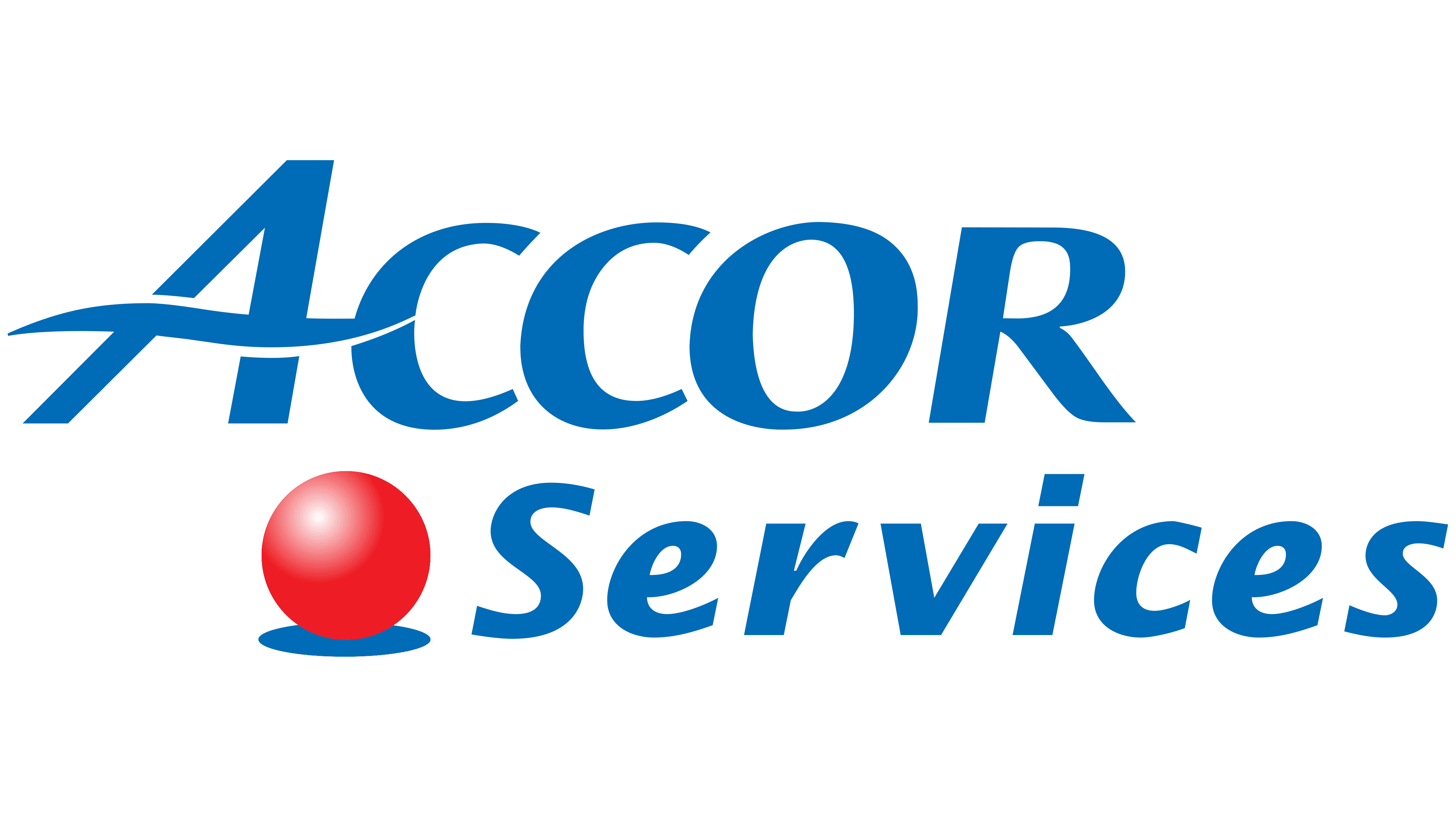
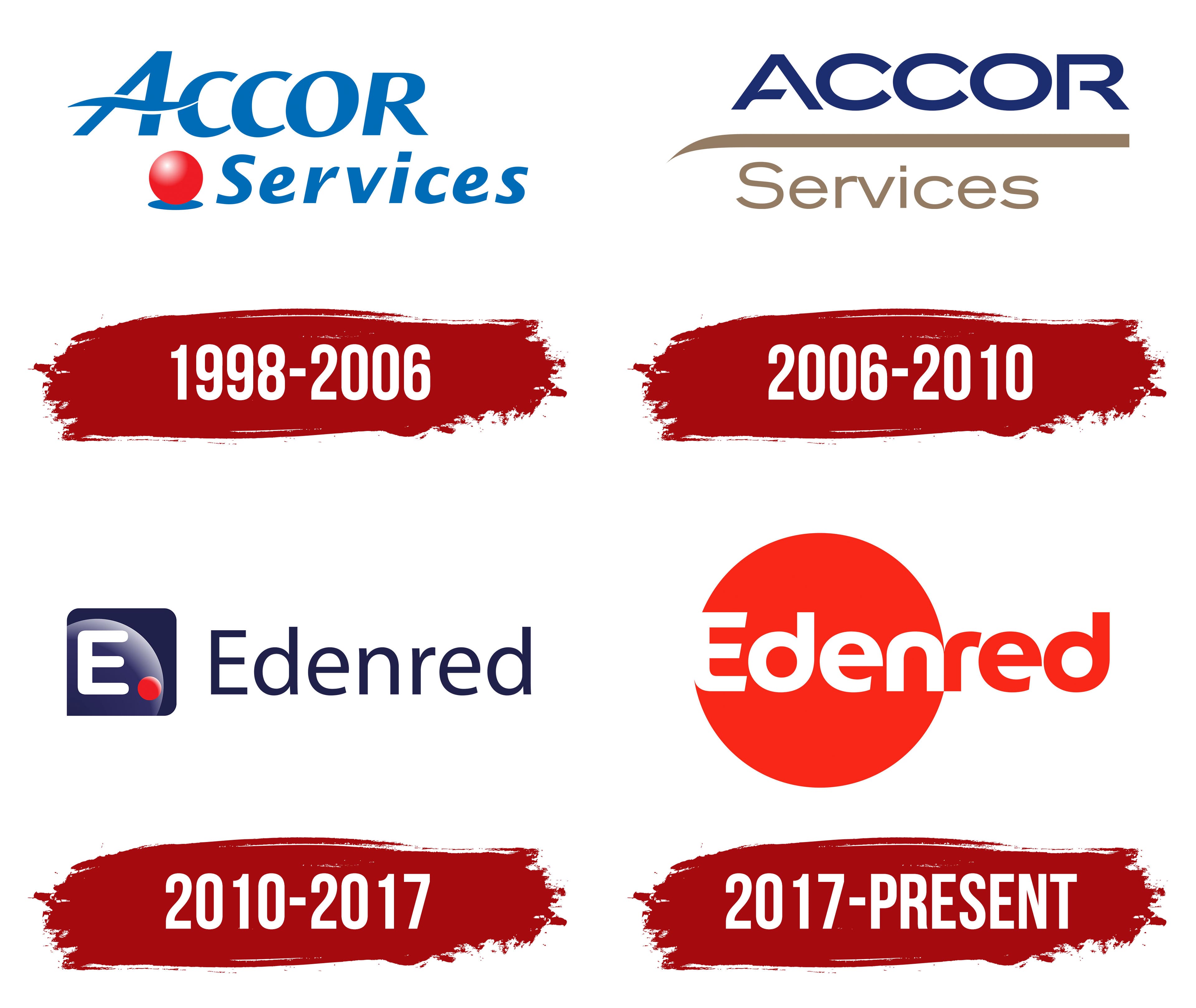
Before the Edenred name appeared, the corporate services division operated under the Accor Services brand. The 1998–2006 logo combined the ACCOR name with the red sphere from the Ticket Restaurant identity. Services appeared on the lower line and identified the Accor group division’s business area.
The business began in 1962 when French entrepreneur Jacques Borel created Ticket Restaurant, a meal voucher system for employees. Similar vouchers received legal status as an employee benefit in France in 1967. The program began expanding internationally in 1976, and Ticket Restaurant joined the Accor group in 1983.
The corporate services division became Accor Services in 1998. Edenred was created in 2010 after Accor separated its hotel business from its prepaid corporate services division. Shares in the new group began trading on Euronext Paris on July 2, 2010. The year 1962 therefore refers to the origins of Ticket Restaurant, while the company’s history under the Edenred name began in 2010.
The Accor Services logo consisted of 2 lines of text and a red sphere. ACCOR appeared at the top and was left-aligned. Large blue uppercase sans-serif letters had a slight slant. The initial “A” was larger than the other characters.
The “A” featured a broad wavy line across its lower section. It replaced the standard crossbar, extended beyond the letter’s boundaries, and narrowed at the ends. The form preserved the custom appearance of the Accor name and distinguished it from conventional typesetting.
Services appeared below and shifted to the right. The initial “S” was uppercase, followed by lowercase letters. Its blue italic typeface had thinner strokes than ACCOR. Differences in size and weight separated the parent group’s name from the division name.
A red sphere inherited from Ticket Restaurant appeared to the left of Services. Its color transitioned from bright red near the top to a darker shade at the base. A white highlight in the upper-left area created depth. At the same time, a small blue ellipse beneath the sphere represented a shadow. The red sphere connected Accor Services with the voucher business. At the same time, the blue wordmark indicated its affiliation with the Accor group.
2006 – 2010
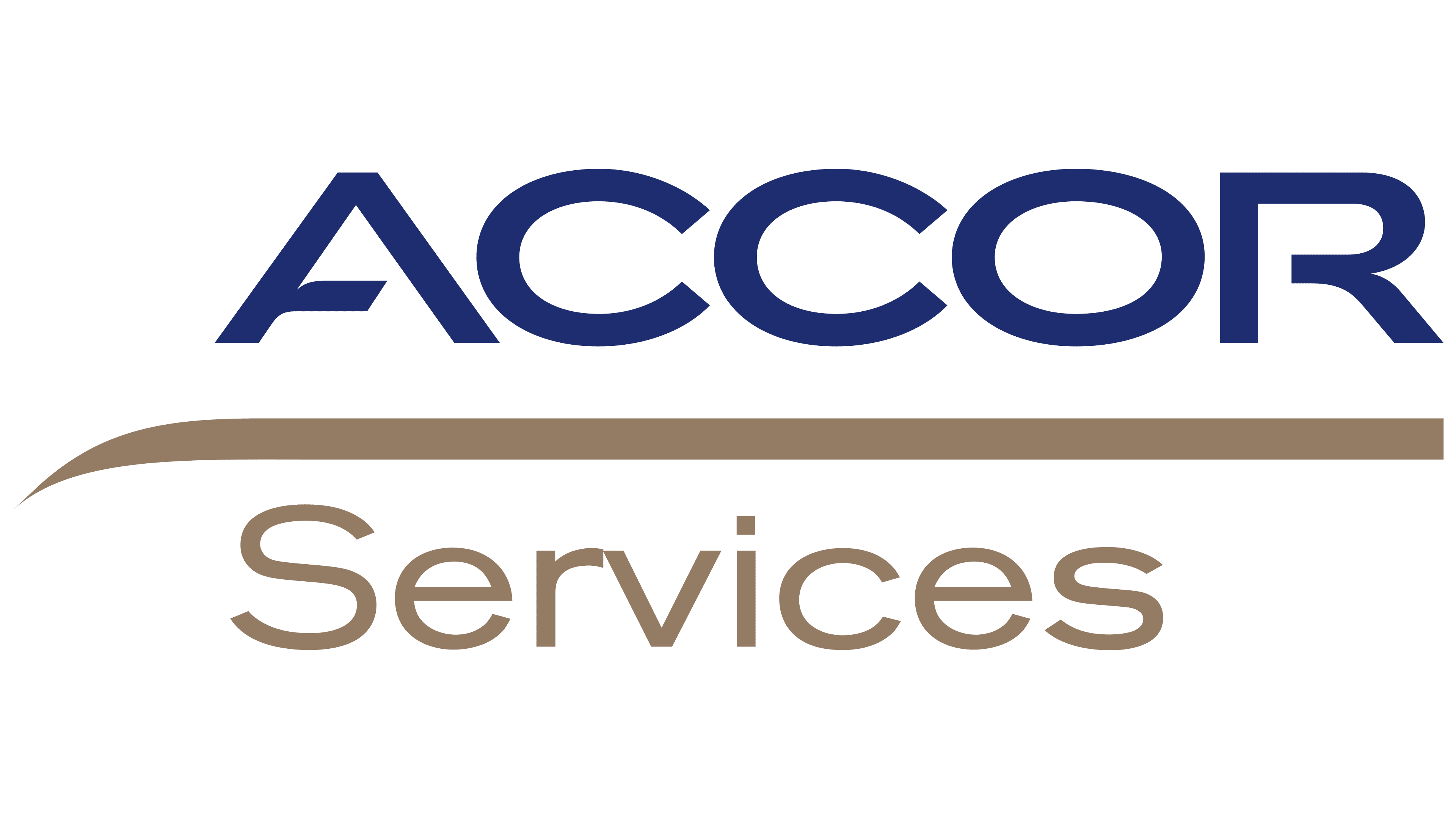
By 2006, Accor Services had updated its identity, replacing the red sphere and slanted lettering with a system more closely connected with the parent Accor group. The redesign coincided with the expansion of its corporate services. During the year, the company developed separate business areas and acquired Kadéos, PrePay Technologies, and Surf Gold in 2007.
The logo centered on the dark blue ACCOR wordmark. Uppercase sans-serif letters had geometric contours, even corners, and open forms. Their upright position gave the name a formal appearance. A long light brown line ran beneath the word. On the left, it curved to the side and ended in a point.
Services appeared below the line in the same light brown. The initial “S” was uppercase, followed by lowercase letters. The word used a light sans-serif typeface resembling Myriad or Frutiger. Thin strokes distinguished the lower line from the heavy ACCOR wordmark and established the roles of the 2 name components.
The dimensional red sphere with its white highlight and blue shadow remained part of Ticket product brands. The Accor Services corporate logo moved to a typographic composition made from the group name, a line, and Services.
2010 – 2017
The red sphere moved from the Accor Services identity into the Edenred logo and became part of the new name. The company introduced the name and visual identity of the separate public group on June 29, 2010. The new brand maintained a connection with Ticket Restaurant and other products in the Ticket family.
EDEN was formed from the opening letters of the French phrase “Entreprendre Différemment Ensemble.” The phrase had been used as the name of an internal corporate project launched in January 2010. Eden means “paradise” in 8 languages, and the company associated it with user well-being.
Red referred to the red sphere from the Ticket system and the Spanish word “red,” meaning “network.” Edenred explained it through the connections among employers, employees, citizens, business partners, and government institutions. The new name combined the internal EDEN project, the Ticket heritage, and the group’s network-based operating model.
A dark blue-purple square with rounded corners appeared on the left. Inside was a large white “E” positioned near the left edge. Broad horizontal and vertical strokes had consistent thickness, while soft terminals resembled Eurostile Rounded or DIN Rounded.
A translucent sphere transitioning from dark purple-blue to light gray-blue completed the background. A small red sphere with dimensional shading and a pink highlight appeared near the lower-right section of the “E.” The company associated the “E” with community, the sphere with international presence, and the square with social networks. The red sphere represented the group’s products and services while continuing the Ticket identity. The icon could appear independently from the full name.
The dark blue Edenred wordmark appeared to the right of the emblem. Its initial “E” was uppercase, followed by lowercase letters. The thin upright sans-serif style resembled Avenir or Calibri and differed from the heavy letter inside the square. The statement “For an easier life” appeared with the logo. Presentation materials described the brand as people-focused, friendly, optimistic, and innovative.
2017 – today
In 2017, the red sphere inherited from Ticket Restaurant became a flat, large circle crossed through the center by the Edenred name. The new identity was introduced on June 14. The update formed the public-facing part of the Fast Forward program, which involved the group’s transition to a digital model and the consolidation of hundreds of products under one corporate name.
Many products had previously retained separate names, including Ticket Restaurant. Following the rebranding, Edenred became the shared brand for the entire system, while products received unified identity guidelines. The statement “We connect, you win” communicated the idea of a digital network connecting employees, employers, and merchants.
The project was developed over approximately 1 year in partnership with the French agency Royalties. More than 200 Edenred employees from different countries participated. The launch covered 8,000 employees in 42 countries. Royalties created the logo, identity system, and brand platform.
The project received a silver TOP/COM award in the Global Design category. The internal launch and presentation of the rebranding received separate awards. The implementation scale reflected the entire group’s transition to one name and shared identity guidelines.
A flat bright red circle replaced the dark square and dimensional sphere. Eden appeared inside in white letters, while red extended beyond the circle’s right edge. The circle’s outline opened where the wordmark passed through it. Edenred associated the open form with the group’s external network of people, companies, and merchants.
Red continued the Ticket Restaurant identity and reinforced the meaning of the Spanish word “red,” or “network.” The name used a sans-serif typeface with rounded forms and consistently thick strokes. Its initial “E” was uppercase, followed by lowercase letters. The style resembled Avenir Next Rounded or Gotham Rounded.
The company linked the flowing letterforms to the shift from B2B to B2C and to increased contact between users and digital services. The compact structure worked well in mobile applications and other screen-based formats.
Edenred described the system as “simple, dependable, digital, universal, daring and connected.” In later years, the communications platform adopted the statement “Enrich connections. For good.” The logo Royalties developed remained the brand’s primary version.