


![]() Apple Pay Logo PNG
Apple Pay Logo PNG
The Apple Pay logo emphasizes that the payment system belongs to a major gadget developer. Therefore, the emblem evokes trust and reliability. Payment for the goods will be easy, and the remaining funds will be completely safe.
By 2014, mobile payments were no longer a new idea. Google Wallet was launched in 2011 and became one of the first major attempts by a technology company to move card payments onto smartphones. But the market was still cautious. Many retailers were slow to install contactless terminals, banks were not rushing into partnerships, and users often did not understand how secure phone payments could be.
Apple Pay was introduced by Tim Cook on September 9, 2014, during the iPhone 6 presentation. He described the existing card payment system as outdated, pointing to magnetic stripes, visible card numbers, and security codes that could be copied. Apple built its service around three technologies: NFC for data transfer, Secure Element for protected card storage, and Touch ID for user authentication.
The service launched in the United States on October 20, 2014, with iOS 8.1. At the start, Apple Pay worked with American Express, Bank of America, Capital One, Chase, Citi, Wells Fargo, and more than 500 additional banks. Early retail partners included McDonald’s, Subway, Whole Foods, and Walgreens. Apple also prepared an API so third-party apps could add Apple Pay.
In 2015, the service expanded to the United Kingdom, Canada, and Australia. The same year, Samsung Pay became a direct competitor, with magnetic stripe emulation that helped it work on older payment terminals. In 2016, Apple Pay launched in China following agreements with major banks. KFC, Chili’s, Starbucks, Chick-fil-A, CVS, and 7-Eleven later joined the network. By 2024, analysts estimated that Apple Pay had about 818 million users worldwide.
Meaning and History
![]()
The Apple Pay system first appeared in 2014. Preparations for its launch began a year earlier and were kept in the strictest secrecy: the banks working on the project did not even know its name or who owned it. Before embarking on its revolutionary idea, Apple acquired several startups it might need and patented several technologies related to contactless payments. Its initial partners were Visa, MasterCard, and American Express.
In September 2019, an American corporation declared magnetic stripe cards unsafe and introduced an alternative: Apple Pay. It debuted with the iPhone 6 and, until a certain point, only supported US maps. Over time, the service was expanded to other countries.
Like everything else that concerns Apple, this payment system is subject to general branding rules. Its logo, as expected, contains an icon depicting a bitten apple. The word “Pay” is written in a strict black sans-serif font on the right. Thus, the picture replaces the first word in the service name, functioning as part of a rebus. The company redesigned Apple Pay’s visual identity to meet new standards.
2014 – 2016
![]()
The first logo was unveiled at an event dedicated to the iPhone 6. Users saw nothing new: the designers recreated the iconic symbol as an apple and combined it with the word “Pay.” The apple had a familiar texture. The lower part consisted of two united egg-shaped ovals directed down the narrow side. On the left was a semicircular notch, simulating a bite site. Above hung a sheet in the form of an ellipse with pointed edges. It was tilted at a 45-degree angle and separated from the base by a space.
For the word “Pay,” the developers chose the font Myriad, a humanistic sans serif with thin strokes of the same width. The first letter was capital, and the second and third were lowercase.
2016 – today
![]()
In 2016, iOS 10 introduced a new font called San Francisco. This was the reason for the renewal of the Apple Pay logo. But no global changes followed: the designers limited themselves only to modifying the inscription. They made it clearer and more visible by increasing the letters’ boldness. In turn, the iconic symbol, a bitten apple, has been slightly reduced in size. Now he does not dominate but is on a par with the word “Pay.”
There is also a white icon in a black square. The stores use the third option: the standard emblem in a white rectangle with a black border and rounded corners.
Font and Colors
The payment system logo is built on the same principles as other distinguishing marks of Apple products. The apple depicted on the left is known from biblical stories about Adam and Eve, in which it was interpreted as a forbidden fruit plucked from the tree of knowledge. Also, an apple fell on the head of physicist Isaac Newton when he made a discovery. So it is also a symbol of enlightenment. Alchemists saw in the popular fruit the personification of the mysterious fifth element and compared its structure with the process of obtaining knowledge. And the founder of artificial intelligence, Alan Mathison Turing, was poisoned by an apple, which is also symbolic.
The word “Pay,” located to the right of the famous Apple icon, is set in a font from the San Francisco family. This typeface was part of the WatchKit framework but was spun off in 2014. Initially, it was used as the official font for the Apple Watch, and later extended to the rest of the company’s products. The letters have no serifs; all the strokes are of medium weight and approximately the same thickness. “P” is capital, “a,” and “y” is lowercase.
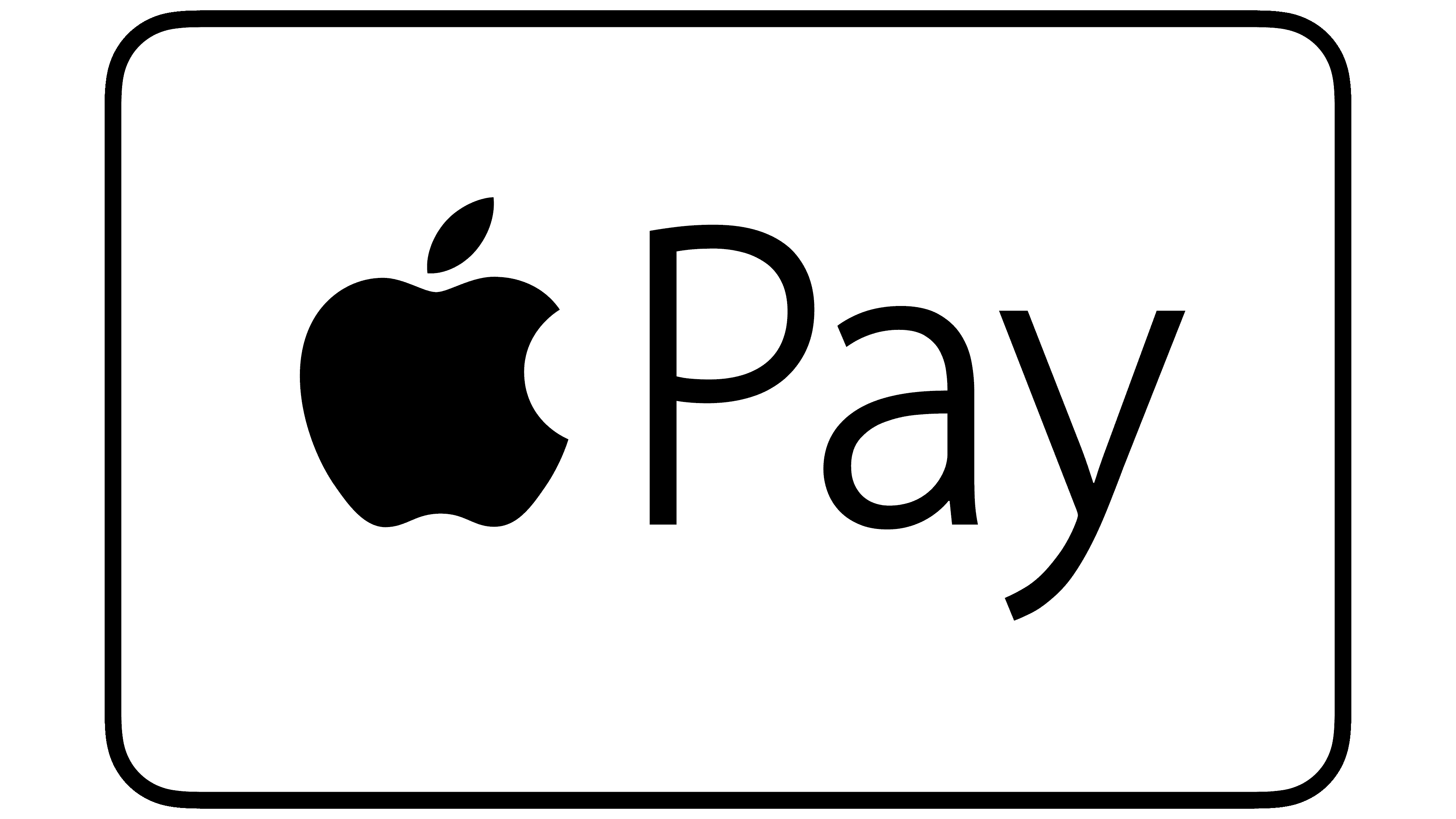
According to branding guidelines, the Apple Pay logo can only be black and white. This applies to both the inscription and the graphic symbol. Other color schemes are prohibited. The preferred background is white or any light shade.