 Bill.com Logo PNG
Financial operations for small and medium-sized businesses include paying bills, reconciling payments, and tracking transactions. Moving these processes to a digital environment reduces manual work and speeds up payments. The Bill.com logo represents a service that combines payment management, invoicing, and financial automation for companies.
Bill.com was founded in Palo Alto in 2006. Its founder, entrepreneur René Lacerte, had previously created PayCycle. Initially, under the name Cashboard, the company offered a cloud-based solution for automating payments and invoicing. This helped small businesses move away from paper checks and manual spreadsheets. In 2007, the company renamed the project Bill.com, which more accurately reflected its purpose.
In 2008, the company raised its first round of investment from Benchmark Capital. That same year, it began partnerships with accounting firms and systems such as QuickBooks and Xero. These collaborations accelerated customer growth and helped the company establish a niche among small businesses in the United States.
From 2012 to 2015, the company received backing from Bessemer Venture Partners, DCM, and Visa. During this period, it expanded functionality and strengthened bank integrations. By mid-decade, the platform was processing billions of dollars in transactions annually.
In December 2019, Bill.com went public on the New York Stock Exchange under the ticker BILL. The company raised 285 million dollars. The Bill.com customer base grew significantly.
In 2021, the company acquired Invoice2go for $625 million and Divvy for $2.5 billion. These acquisitions added expense management and virtual cards. After integrating these services, the company became a comprehensive financial platform.
In 2023, Bill.com implemented AI technologies for automatic invoice analysis and cash flow forecasting. In 2024, the company entered the mid-market corporate segment. It began competing with SAP Concur and Coupa.
Bill.com serves more than 400 thousand clients. The company processes over $100 billion in payments annually and continues to develop automation solutions for small- and medium-sized business finance.
Meaning and History
What is Bill.com?
An American cloud platform based in San Jose that automates accounting processes for small and medium-sized businesses. It combines bill management, expenses, and payments in a single digital environment. It integrates with QuickBooks, Xero, NetSuite, and Sage Intacct, and supports ACH, bank, and virtual cards, checks, and international transfers. Over 98,000 companies use the platform, and partners include JPMorgan Chase, Silicon Valley Bank, and Intuit.
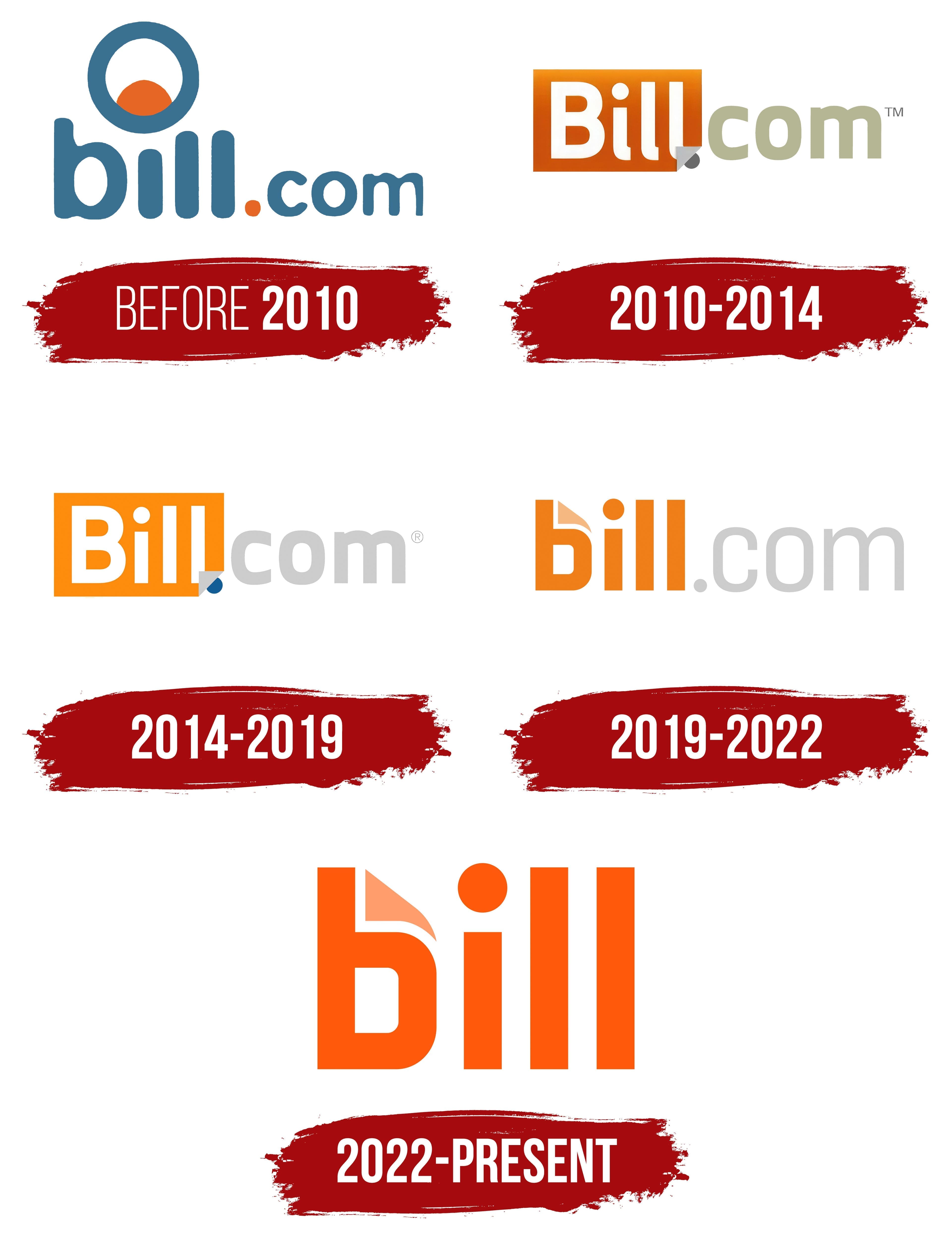
before 2010

Before adopting the Bill.com name, the company had 2 legal names. René Lacerte incorporated Cashboard, Inc. in Delaware in April 2006. He had previously created PayCycle, a payroll service. The organization became Cashview, Inc. in September 2006 and Bill.com, Inc. in December 2007. The brand launched publicly in 2008.
The Bill.com name communicated the service’s purpose through the common English word “bill.” As a noun, it refers to an invoice or request for payment. As a verb, it means issuing an invoice. René Lacerte wanted a name that covered both sides of a financial transaction. The service connected people and businesses sending invoices with recipients making payments. The “.com” ending identified the product as an online service and became part of the commercial name.
The early logo centered on the lowercase bill.com wordmark. Bill occupied most of the line, while com appeared smaller with thin strokes. This contrast emphasized “bill” and communicated the service’s purpose. The dot between the 2 parts was orange and served as a small accent within the blue-gray wordmark.
The letters had rounded forms, thick lines, and softened terminals. The wordmark used blue-gray with a light blue undertone. Bill appeared in bold, while com had a lighter weight. The sans-serif contours resembled VAG Rounded and a modified version of Comic Sans. Lowercase letters and soft shapes gave the young cloud service for small businesses an approachable image.
A circular emblem appeared above the bill, with a large blue ring around the outer edge. An orange semicircle with a curved upper boundary occupied the lower portion. White space separated the colored forms. The silhouette resembled a rising disk above the horizon or a stylized eye inside a circle. The blue ring matched the wordmark, while the orange semicircle matched the dot before com. The circular emblem served as a standalone brand symbol before 2010.
2010 – 2014

A folded lower-right corner became the Bill.com logo’s primary custom feature from 2010 to 2014. A new arrangement of the name replaced the circular emblem. Bill appeared inside a colored block, while .com moved to the right against an open background. The layout emphasized the part of the name associated with invoices and payments while retaining the domain ending within the service’s full name.
The orange block used a soft color transition. Its lower area had a rich tone that gradually became lighter toward the top. The white word Bill occupied most of the colored shape. The “B” remained uppercase, while “ill” appeared in lowercase. White lettering separated the service name from the suffix, making it an independent part of the composition.
The wordmark used a sans-serif typeface with thick, equal-width strokes. The letters had even contours and large proportions. The type resembled Helvetica Rounded and Arial Rounded. Soft terminals preserved continuity with the early version, while the overall construction became more formal.
The lowercase .com appeared to the right of the orange block in a muted gray-green shade. Its smaller size gave it a secondary role and identified the product’s online format. A dark gray dot appeared between Bill and com. The orange surface concealed its upper section, while the remaining part of the circle connected the 2 sections of the name.
The folded lower-right corner explained the dot’s placement. The block’s edge formed a gray triangular fold, with part of the dark circle visible beneath it. The effect suggested a raised layer concealing part of the dot behind the orange surface. The fold connected the colored block with .com and served as a standalone visual feature until the 2014 logo update.
2014 – 2019

By 2014, Bill.com was an established name for a service that automated accounts payable and accounts receivable. The update focused on color while retaining the existing layout. The orange block containing the white Bill name, com on the right, and the folded lower corner stayed in its established position.
A solid bright fill replaced the orange gradient. The uniform color turned the Bill block into a single, unified form. It separated it from the light area containing the rest of the name. The white letters retained their previous contours, size, and placement.
Com remained to the right beyond the edge of the orange block. Light gray replaced the gray-green color, giving the domain ending a neutral tone. The bright Bill name held the primary role. At the same time, the restrained com completed the commercial name and identified the service as an online product.
The dot between the name sections became blue. It moved closer to the lower-right corner of the orange form and connected with the folded edge. The corner resembled a raised fold with part of the blue circle visible beneath it. The detail joined the Bill block with the com ending and continued the device introduced in the 2010 version.
The logo appeared on the company’s products and corporate materials from 2014 to 2019. Bill.com established a holding structure called BDC Payments Holdings in 2018. The organization became Bill.com Holdings in June 2019, and the logo remained in place through the next brand update.
2019 – 2022

Bill.com completed its initial public offering and began trading on the New York Stock Exchange in December 2019. Shortly before its market debut, the company updated its identity to present a new image as a public company. The project communicated Bill.com’s leading role in automating business financial operations.
The orange panel gave way to the full name against an open background. All parts appeared in one horizontal line. Bill retained the orange color used throughout the 2010s. The dot and com became light gray-beige.
The name used lowercase sans-serif letters with geometric contours. Bill received heavy strokes, while .com used a thin weight. The proportions resembled Gotham, Proxima, and Nova. The letters aligned along a common baseline to create a unified horizontal wordmark.
The new layout changed the visual relationship between the name’s sections. The orange bill held the primary role, while the light .com completed the domain-based commercial name. The horizontal line worked across media with different proportions. Orange maintained continuity with the previous logo versions.
The initial “b” became the primary custom feature. A light beige triangular insert appeared in its upper section, resembling a folded page corner. The form referred to invoices and documents associated with the service. It continued the folded-corner motif from the lower-right side of the earlier orange panel by moving it inside the letter.
The rounded lower section of the “b,” combined with the angular insert, resembled a digital document or tag icon. The initial letter appeared on its own in compact formats. The full wordmark served as the primary name, while the light corner connected both versions.
The logo represented Bill.com from 2019 to 2022. The company acquired Divvy and Invoice2go in 2021, expanding its financial operations platform with new products. The 2019 version remained in use during the integration of the acquired services and the company’s development following its public offering.
2022 – today
On October 11, 2022, BILL, a shortened form commonly used by customers and employees, became the new brand name. Bill.com changed to BILL, removing the “.com” from the domain. Bill retained its connection with invoices and payments while covering the company’s expanded range of financial products.
By the time of the rebranding, the platform included bill payments, payment collection, expense management, and financial planning. The name change accompanied its transition from a SaaS service to a financial technology brand for small and midsize businesses. The shorter form united several operations under one name without tying the brand to a single product.
BILL presented the update as a company-wide program focused on business owners and the relationships among participants in payment processes. Customers had long used the shortened name in conversation, shifting the main emphasis from the internet address to BILL. The new name extended across products for payments, receivables, expense controls, and planning.
The wordmark removed .com and the gray dot. The brand name is written as BILL in uppercase, while the logo uses lowercase bill. All letters appear in rich orange. Large dimensions, heavy strokes, and tight spacing turn the word into the primary component of the composition. The logo consists of a single wordmark against an open background.
The name uses a sans-serif typeface with thick lines and rounded terminals. The letters resemble Gotham Rounded. The letters are uniform in height and compact in proportion, and removing .com shortens the wordmark. Orange continues the color direction of previous versions and appears in a richer shade within the BILL identity.
The initial “b” retains the folded section introduced in 2019. A light peach triangular insert in the upper area resembles a page corner. The rounded letter and folded shape resemble a digital document or tag icon. The sheet-of-paper image connects with electronic invoices and financial documents.
The full word bill appears in the primary logo, while the “b” is used in compact formats. BILL Operations, LLC has registered both forms as trademarks. The shortened version consists of the orange letter and light peach corner, repeating the full wordmark’s form and colors.