 Sage Logo PNG
Accounting and financial management include payroll processing, bookkeeping, and financial reporting. These processes require accurate data and regular monitoring, especially in small and medium-sized businesses. The Sage logo is associated with a company that develops software for accounting, financial management, and business processes.
Sage was founded in 1981 in Newcastle. Its founders were entrepreneurs David Goldman, Graham Wylie, and Paul Muller. The first developments were designed to automate accounting in the printing industry. From this, Sage Line 50 was created. By the mid-1980s, the company moved to selling through dealers. During this period, the company introduced software for Amstrad PCW computers. This solution increased sales volume from 30 to 300 copies per month.
In 1989, the company’s shares began trading on the London Stock Exchange. In the 1990s, the firm grew by acquiring local software development firms serving small and medium-sized businesses. These companies retained their product independence. In 1999, the company joined the FTSE 100 index.
By 2007, according to the research firm Gartner, Sage ranked third worldwide among ERP providers, behind only SAP and Oracle. In 2009, the company’s annual revenue reached £ 1.44 billion. The client base included 6.2 million organizations. In the following years, the company strengthened its position in Latin America. In 2012, Sage acquired three Brazilian companies. That same year, it launched global cloud solutions under the Sage One brand.
In 2017, Sage acquired the American company Intacct. The deal was valued at $ 850 million. This helped expand the company’s cloud ERP services. In 2021, Sage bought Brightpearl for $ 299 million. This deal strengthened the company’s position in the retail sector.
Sage’s revenue exceeded £ 1.8 billion. Cloud services income tripled over several years. The company holds a leading position in the business software market. It offers solutions in finance, human resources management, CRM, and ERP for small and medium-sized enterprises.
Meaning and History
What is Sage?
A British company from Newcastle upon Tyne, Sage ranks third globally among ERP system developers, behind only SAP and Oracle. Annual revenue exceeds £1.5 billion, and the client base includes more than 6 million businesses in 24 countries. The company began as a printing business, developed accounting automation solutions, and grew into an international software provider through acquisitions of Softline, SalesLogix, and ERP X3. Its main focus is on products for small and medium-sized businesses: accounting, CRM, HR, and the cloud platform Sage Business Cloud, which processes about £3 trillion in transactions.
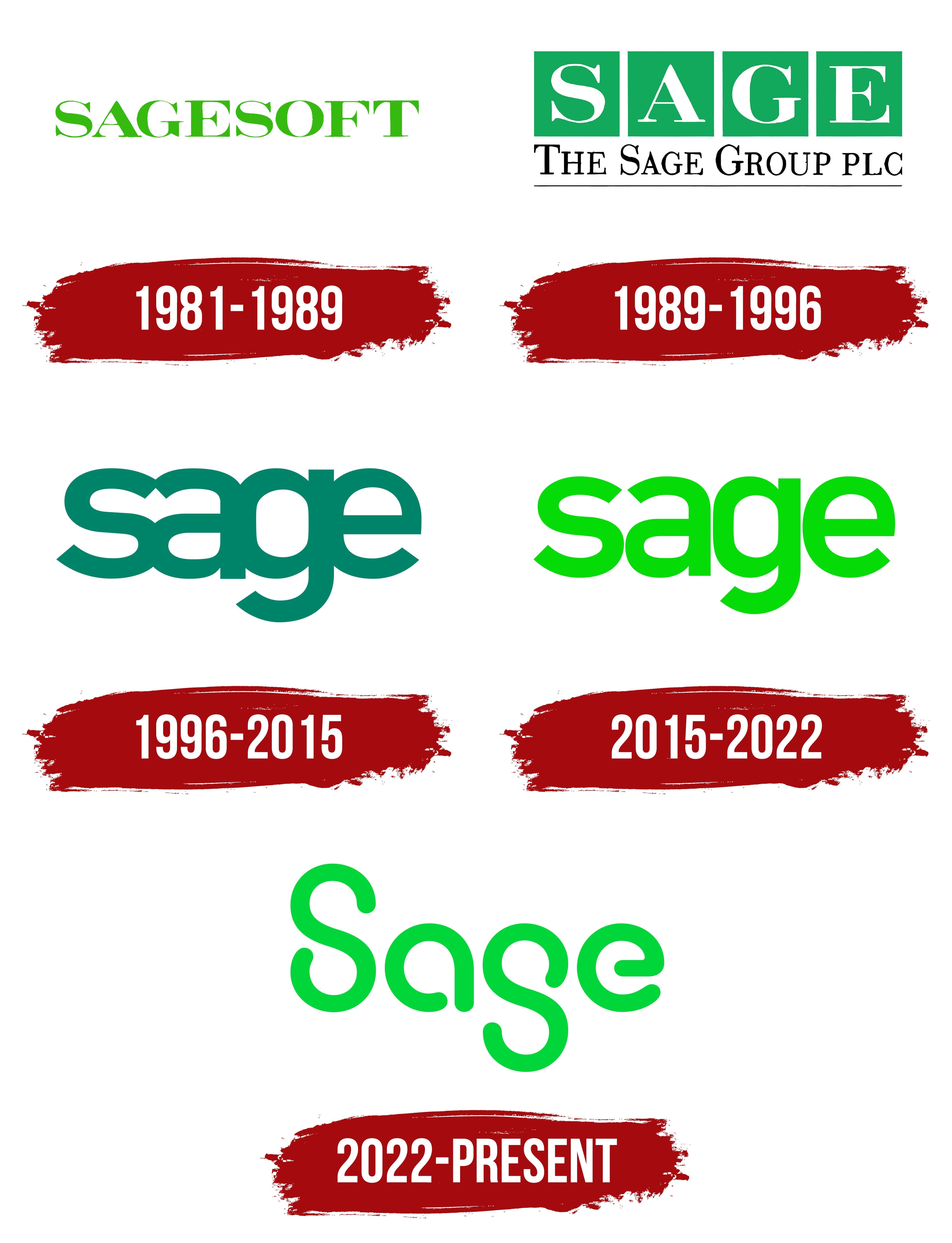
1981 – 1989
Sage’s history began with a program for the printing company Campbell Graphics. Its owner, David Goldman, wanted to automate job cost estimates and basic bookkeeping. Computer specialist Paul Muller and Newcastle University student Graham Wylie worked on the software. The opportunity to sell it to other businesses prompted the 3 partners to establish Sage in Newcastle upon Tyne in 1981.
In its early years, the company used the names Sage and SAGESOFT. The English word “sage” refers to a wise, experienced person and is also the name of an herb. The name came from a standalone word. SAGESOFT added “SOFT,” an abbreviation of “software,” to identify the company’s software development work. Sage later became part of the legal name The Sage Group plc.
From 1981 to 1989, the logo consisted of bright green “SAGESOFT” lettering. All the letters were uppercase, with tall, narrow proportions. Thick vertical strokes combined with thin horizontal and diagonal lines. Short serifs tapered slightly at their ends. The variation in stroke weight and the letterforms resembled traditional typefaces used in printed publications. The full wordmark represented both the company and its software product.
1989 – 1996
In 1989, Sage was listed on the London Stock Exchange and introduced a logo featuring its full name, The Sage Group plc. The identity reflected its status as a publicly traded group. It supplemented the Sage name’s existing association with a software product.
Four equal green squares formed a row containing white uppercase “S,” “A,” “G,” and “E” letters. The lettering retained the serif typeface from the 1980s version. A separate field for each letter divided the short word into 4 equally sized blocks.
A smaller black “The Sage Group plc” appeared below, also in a serif typeface. The initial “T,” “S,” and “G” were larger than the other letters. A thin black horizontal line completed the lower portion of the logo. Large “SAGE” lettering presented the short name, while the line beneath it gave the company’s full name.
1996 – 2015
In 1996, as Sage expanded beyond the United Kingdom, the company adopted a short lowercase “sage” logo. It removed the square fields and explanatory line. A heavy sans-serif style, similar to the branding of 1990s software products, replaced the previous serif typeface.
The wordmark used a modified version of DIN. The letters were reduced in height while retaining uniform stroke weights and rounded curves. The spacing between them was reduced, so neighboring forms almost touched. The tight arrangement united the 4 letters, while their low height gave the word elongated horizontal proportions.
The logo was rendered in dark green with a turquoise tone. Green maintained the connection to Sage’s early identity after the complete typeface change.
2015 – 2022
In 2015, Sage updated its logo to create a shared digital identity for the company and its products. The short lowercase “sage” was retained, while bright green replaced the dark turquoise shade.
A typeface derived from DIN remained the basis of the wordmark. The sans-serif letters retained their previous construction but received less compressed proportions. Compared with the 1996 version, the spaces between them increased. The name remained tightly arranged, with narrow gaps between neighboring letters.
The logo consisted entirely of the word rendered in a single color. The update covered the color, letter proportions, and spacing.
2022 – today
On April 28, 2022, Sage introduced a new brand identity as it developed digital services for small and medium-sized businesses. The company connected the update to simplifying complex operations, improving analytics, and strengthening connections between people. Wolff Olins and the studio Homebrew developed the logo, brand architecture, communication style, and shared product identity guidelines. The rollout began in the spring and continued through the end of 2022, covering services and audience communication channels.
The logo was based on the idea of Sage Flow, associated with removing obstacles from work and automating processes. CEO Steve Hare explained that the flowing letterforms express the ambition to make it easier for customers to interact with digital services. The initial “S” became uppercase, while the remaining letters stayed lowercase. The sans-serif lettering received rounded geometric forms and breaks in its contours. The “S” resembled a ribbon with free ends. An inverted version of a similar shape formed the “g.”
Jeremy Mickel worked on the Wolff Olins wordmark. His studio, MCKL, refined the lettering and carried its principles into the company’s typeface. Forest Young, Dylan Fracareta, and Zipeng Zhu led the project at Wolff Olins. Rounded corners, geometric construction, and features of monospaced typefaces connected the Sage name to the rest of the identity.
The letters retained their bright green color against black-and-white backgrounds. An animated version appeared alongside the static logo. In it, a line gradually formed the Sage name, expressing the Flow idea through the wordmark’s emergence. Seed Animation Studio created the launch videos, while VCCP London developed the international communications campaign.