


 JavaScript Logo PNG
The developers have made the JavaScript logo unique and well-recognizable. It is a makeshift shield with a bold monogram at the top, which makes it look impressive and solid. Due to differences in the shade of yellow, the badge is three-dimensional and appears convex, with a central, lowered protrusion that divides it into two identical halves.
JavaScript grew out of the early web, when pages were mostly static text and images. On December 15, 1994, Netscape Communications released Navigator 1.0. They began looking for a way to make pages react inside the browser without constant server reloads. In April 1995, Netscape hired Brendan Eich to create a scripting language, and he built the prototype in ten days.
The language was first called Mocha, then LiveScript. Its syntax was made to resemble Java because Netscape was working with Sun Microsystems. Still, its internal model drew on Scheme and Self. In December 1995, Netscape and Sun presented it as JavaScript, leveraging Java’s visibility, even though the two languages remained technically distinct.
In August 1996, Microsoft released Internet Explorer 3.0 with JScript, its own implementation of JavaScript that deliberately differed from the original. Browser behavior began to diverge, creating problems for developers. In 1996, Netscape submitted JavaScript to ECMA International, where TC39 developed the standard. In June 1997, ECMAScript 1, or ECMA-262, was published.
Browser wars slowed progress in the late 1990s and early 2000s as Internet Explorer dominated. The situation changed with Mozilla Firefox in 2004, followed by AJAX in 2005, as seen in services such as Google Maps and Gmail. In 2006, jQuery simplified DOM work across browsers. Google Chrome’s V8 engine arrived in 2008, and Node.js followed in 2009, taking JavaScript to the server. In 2015, ECMAScript 6 added major features including classes, modules, promises, let, const, template strings, and arrow functions.
Meaning and History
In September 1995, the required version was released, and by December, it had been finalized and renamed JavaScript. Of course, at first there was confusion among users and specialists because the name was almost identical to Java, but this helped popularize the new programming language. According to Eich, Netscape deliberately named it that way to quickly spread the novelty of the Internet through obvious consonance. The marketing ploy was a success. But a permanent logo for the digital product emerged later, after it was separated into an independent program.
The modern JavaScript logo emerged alongside the HTML and CSS logos, as the same company owns these programming languages. She unified their visual identity, making them almost identical in style. The only differences are in the upper inscriptions and the color scheme.
What is JavaScript?
JavaScript is a modern high-level programming language. It is developed according to the ECMAScript standard and represents one of the top 3 core technologies, along with CSS and HTML. The year of its appearance is 1995. Brendan Eich created it with support from Netscape.
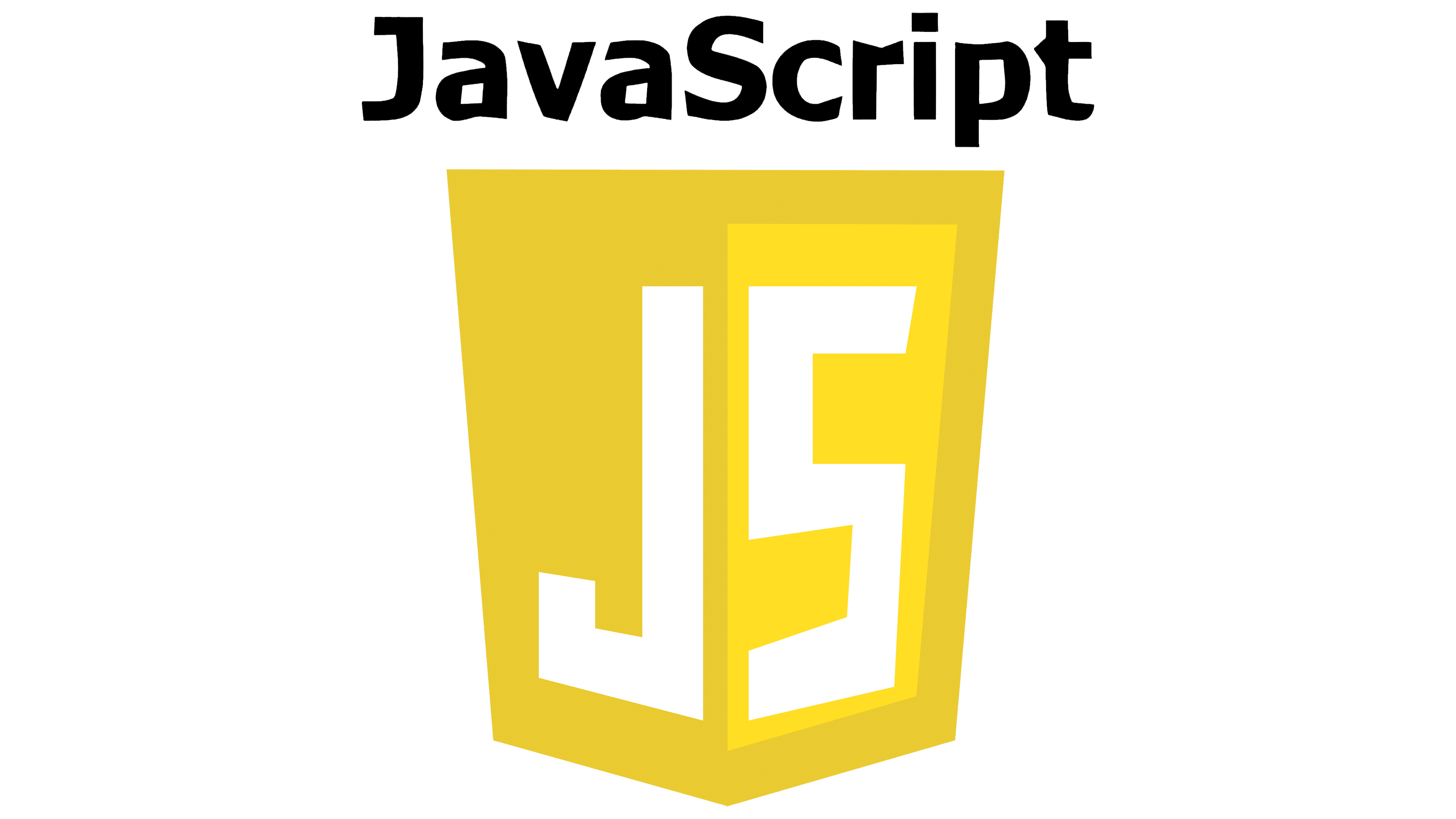
The key detail of the badge is a stylized, strict shield with straight lines and clear edges. This geometry inspires user confidence, as it indicates the program’s seriousness and careful thoughtfulness. To make the rectangle look like a shield, the designers pushed the lower part “forward” by lengthening and slightly angling it. Two shades of yellow add to the figure’s volume: the left side is darker than the right. In addition, on the right, a wide frame covers the entire perimeter.
In the middle of the logo is a block “S,” the first letter of the word “Script.” It is powerful, capital, clear, and white. To match the background composition, the artists drew it outside the box with a line protruding downward, forming a miniature angle. Large serifs also complement the symbol.
Above the shield is a black abbreviation. The inscription “JS” is written in wide, straight lines with sharp angles. Moreover, “J” resembles the letter “L” and seems to be its mirror image, and “S” resembles “Z.” Although such castling is not associated with the need for visual adaptation to different glyphs, it plays a significant role in identity. The similarity technique makes the JavaScript logo very unconventional and instantly recognizable. In addition, the replaced characters indicate the most commonly used programming language.
Font and Colors
Even though JavaScript first appeared in 1995, its official logo didn’t appear until 2011. This is due to the unification of target programs and their visual adaptation to a single style. In this case, the icon is yellow, but its shape is almost indistinguishable from HTML and CSS symbology.
All inscriptions in the logo are set in a custom typeface, specifically adapted to the program’s tasks and style. The letters are strictly proportional, business-like, even, and geometrically verified. Only the central “S” has serifs, and they are absent in the top line.
The emblem’s original palette evokes a sense of progress and dynamism while remaining pleasant and unobtrusive. Yellow in two soft shades and neutral white are harmoniously balanced by black lettering. It adds a sense of severity and seriousness to the sign.