![]() Google Gemini Logo PNGThe
Google Gemini Logo PNGThe
Google Gemini Logo embodies the idea of easy, convenient interaction with technology. The project offers tools for creating content and analyzing data, making it accessible and useful in various fields, and an important element of everyday life.
In 2023, Google introduced Gemini, a powerful multimodal AI that seamlessly understands text, images, audio, and video. Built from years of research, Gemini quickly recognized context across diverse information types. Google released Gemini in three versions: Ultra for large data centers, Pro for general versatility, and Nano, optimized for mobile devices. Soon after launch, the Pro edition enhanced the Bard chatbot, making conversations more accurate and natural.
In 2024, Google expanded Gemini’s features through its Google One AI Premium service, giving creators, researchers, and developers advanced capabilities. Bard was also rebranded to reflect Gemini’s central role, with dedicated iOS and Android mobile apps to improve accessibility. Gemini’s improved language skills enabled it to reach a global audience, especially after integrating widely used services like Gmail and Docs. It demonstrated remarkable success in solving challenging problems in science, math, and programming, often surpassing previous AI solutions. Today, Gemini continues to grow and adapt, serving users worldwide with frequent enhancements across Google’s ecosystem.
Meaning and History
![]()
What is Google Gemini?
It is a powerful artificial intelligence system with text, images, videos, code, and other data types. It is integrated into various digital products, including search, browser, and email services. It is available in several versions, from the most powerful to optimized for mobile devices. The technology helps developers, researchers, and everyday users solve complex problems, from programming and analyzing information to creating content and communicating naturally.
2023 – 2024
![]()
The logo for Google’s AI service Bard was unveiled in March 2023. Its design featured two smooth abstract shapes styled to represent a glow or glimmer of light.
The shapes avoid sharp corners or straight lines, instead having gently rounded edges to create a visually soft and approachable appearance. One shape is larger, while the smaller shape sits slightly below and offset to the side, balancing the composition. Together, these elements metaphorically resemble sparks, emphasizing the product’s innovative nature and cutting-edge technology.
The color palette uses a gradient that smoothly transitions from warm shades of orange through purple and into blue. This enhances associations with fluidity, movement, and flexibility, symbolically reflecting the AI’s continuous development and adaptability.
Overall, the design effectively conveys the concepts of user-friendly interaction and access to advanced technologies, such as artificial intelligence.
2024 – 2025
![]()
The official rebranding of Google’s artificial intelligence took place on February 8, 2024, when the company merged its Bard and Duet AI services under the new brand name Gemini. The new logo was developed by Google’s internal design team in collaboration with the branding agency Koto.
The foundation of the new logo is Product Sans, Google’s proprietary typeface known for its simple shapes and lack of serifs. The letterforms in the word “Gemini” are smooth and slightly rounded, without sharp corners or abrupt transitions. Stroke thickness is consistent, and proportions are balanced, conveying a sense of friendliness and digital clarity.
The logo’s color palette features a subtle gradient, starting with a cool blue tone on the left and transitioning to a violet-red tone on the right. This gradient conveys the brand’s dynamic character, symbolizing innovation, technological advancement, and the AI platform’s multifunctional nature. The color scheme integrates logically with Google’s overall visual identity while maintaining its distinctiveness, emphasizing the product’s AI-specific nature.

Next to the letter “i” is a four-pointed star with sharpened edges, evolving from a previously more rounded shape. The star represents a metaphor for inspiration, creativity, intellectual brilliance, problem-solving, and the fulfillment of creative ideas.
Overall, the new visual style combines historical elements from earlier logos with a contemporary approach, accurately reflecting the platform’s identity as a next-generation intellectual and communication product.
2025 – today
![]()
The new version of the Gemini logo was first spotted in early July 2025, appearing simultaneously with updated mobile app icons on Android and iOS, as well as on Google Play and Gemini’s official account on the social network X. These logo changes were part of a broader visual strategy aimed at unifying Google products under a cohesive design system, initially begun with the redesign of the Google “G” icon in May 2025, which shifted from solid block colors to a smooth gradient.
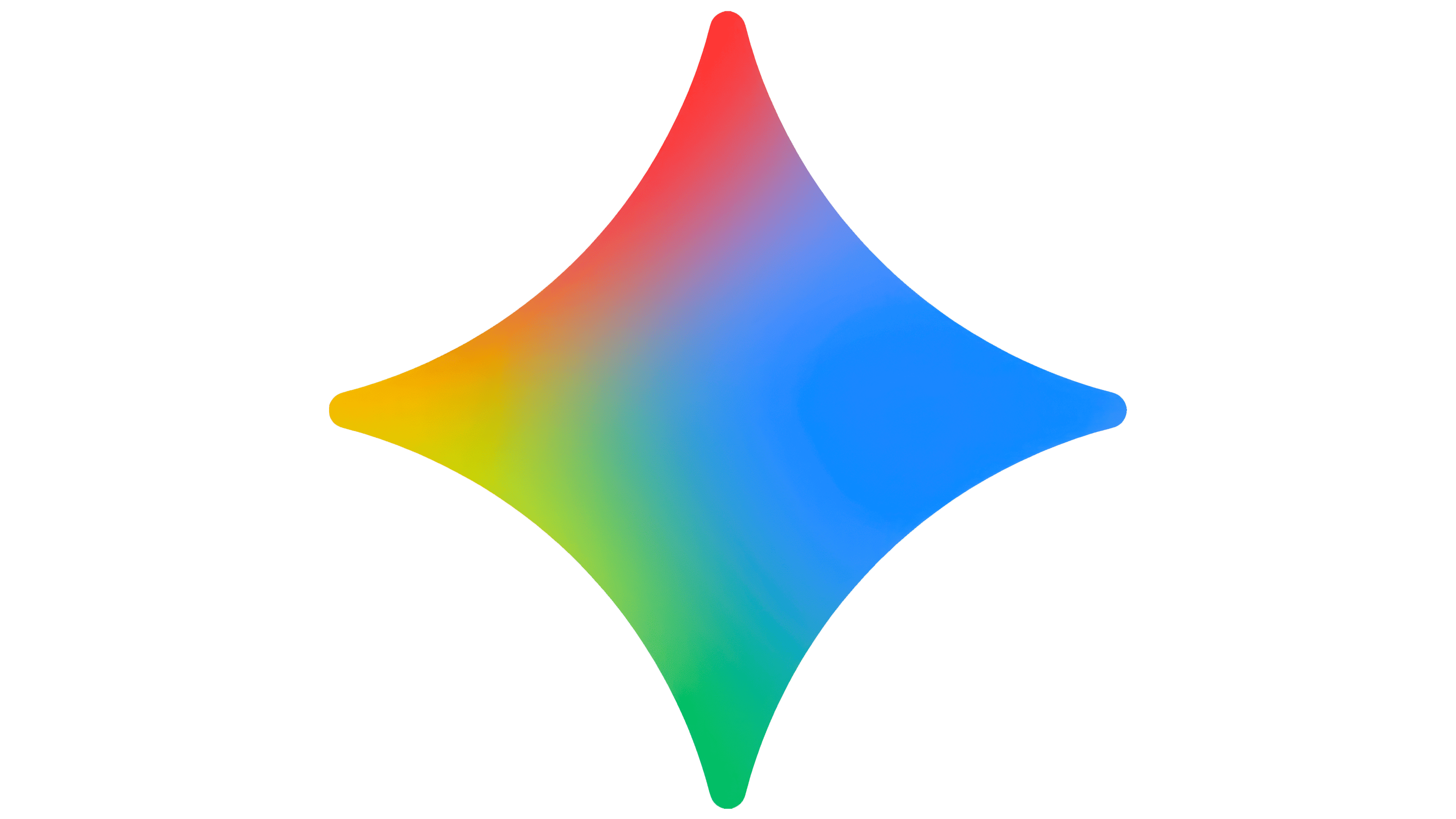
The key element of the new design was a star symbol with softly rounded edges, creating a gentler form compared to the previous, sharper version. This adjustment was made to ensure comfortable visibility even at minimal sizes, making the logo friendlier and universally adaptable across platforms and media.
The star’s color palette now features a gradient incorporating Google’s signature colors: red, yellow, green, and blue. These colors symbolically link Gemini to Google’s broader ecosystem, maintaining brand recognition and emphasizing its integration into the company’s main product lineup.
Typography for the word “Gemini” remained unchanged, still using Google’s proprietary Product Sans font, known for its geometric precision, consistent stroke width, and absence of serifs.
The star symbol serves as a metaphor for inspiration and intellectual advancement, highlighting Gemini AI’s ability to support productive interactions and enhance user creativity. Visually, the star resembles a bright burst of light, reinforcing associations with innovation and digital activity.
Gemini’s updated design has become an organic part of Google’s overall brand architecture, successfully blending historical elements with contemporary visual branding trends, while ensuring continuity across the company’s product family.