The Google Docs logo corresponds to the service’s principles of action. The developers reacted to the visual identity, so they preferred to focus on what was close to users. The result is obvious: from such an emblem, and it is immediately clear what functionality the service has and how it will be useful.
Google Docs: Brand overview
| Founded: | March 9, 2006 |
| Founder: | |
| Headquarters: | United States |
| Website: | google.com |
Meaning and History
The Google Docs marketplace was born from merging two digital products that previously existed separately. These are Writely and XL2Web. The first is from Upstartle, which Google bought in 2006. Until 2009, the newly created service was in testing. In 2010, the parent company took over DocVerse, which released an application for online collaboration of several users on Microsoft Word documents posted on the Internet.
In 2012, the Mobile Productivity Pack was included in the text service. This became possible after Google acquired the specialized Quickoffice platform. The result of this implementation and improvement of the functionality is renaming the Google Documents virtual service to the familiar Google Docs. In 2019, an advanced spell checker was introduced to the online word processing platform, thanks to machine translation technology that can detect difficult grammatical errors.
It is now a powerful tool for real-time collaborative collaboration. Complemented by other programs from the Google Drive package, it allows multiple users to open and edit documents simultaneously. Moreover, the adjustments made are immediately visible to all participants in the editing. Edits are automatically saved on the parent server and in the history of changes. You can return to them at any time. Each functional moment of service progression is reflected in the history of its visual identity and is realized in the form of a new symbolism. In total, the brand has five logos.
What is Google Docs?
Google Docs is an Internet service and mobile application for collaborative work with various documents (texts, graphics, presentations). The program is included in the free package of editors and is available for Web, Android, and iOS. The service offers several formats for saving materials and flexible settings for providing online access to them to others. The platform has been in existence since 2006.
2005 – 2007
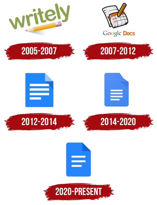
At first, the emblem looked like an amateur drawing and referred to the predecessor of Google Docs – the Writely program. The developer used a very clear image to create a trusting atmosphere: the name and a sharpened pencil, which is used to make editorial changes to typographic layouts and text materials. Its body was painted in the standard sand color, and it was located diagonally. Such a tilt gave the impression that a pencil is being touched on a white surface to leave an inscription. This was evidenced by the shadow coming from him. The text was in bold, soft letters with rounded ends.
2007 – 2012
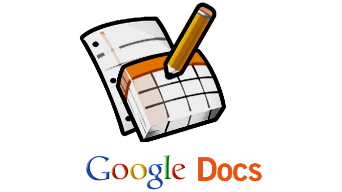
In 2007, a massive rebranding took place, as the editorial service was taken over by Google, which immediately changed its visual identity. The only thing left from the previous version is a pencil because it seemed to the designers an important element. The rest is new. So, the writing instrument was lowered end on a sheet with large cells of the same size. Beneath it was another sheet, lined for writing. Below was the name of the web service in two different fonts: the first in the style of the parent company logo, the second in orange-red grotesque.
2012 – 2014
Then a minimalist logo was approved, consisting of a single sheet. He received a blue color and had several wide white stripes: three long (top) and one short (bottom). These elements resembled a lined notebook page and graph details. The badge had three rounded corners, while the fourth had a bent shape. This was evidenced by the shadow cast by him and a slightly lighter tone of the visible part.
2014 – 2020
Having retained the logo concept (a web service associated with documents and texts), the designers made some adjustments to it. So, the stylized sheet became narrower, the white horizontal stripes were lowered down, and all corners received the maximum rounding, including the bent one.
2020 – today
The changes in the modern version of the logo are so minor that most users do not even notice them. And there were adjustments. First, the designers removed the shadow from the folded corner, and it was painted in dark blue and made sharp again. Secondly, they reduced the number of long stripes from three to two and brought them back to the middle.
Font and Colors
The Google Docs logo is constantly evolving along with the web service and the app. A concise visual identity emphasizes its convenience and simplicity: it lacks distracting details because all attention is focused on the text (particularly online documents). That is, the emblem reflects the key concept of the service.
The verbal part was present only in the early versions of the logo. The rest do not have it, as the emphasis is on graphics. Grotesque was first used for the inscriptions: bold rounded, then – printed geometric. The parent company’s name was made in the corporate style – multi-colored letters with miniature serifs. The corporate palette is not diverse and consists of a combination of white and blue of two shades.
Google Docs color codes
| Azure | Hex color: | #2684fc |
|---|---|---|
| RGB: | 38 132 252 | |
| CMYK: | 85 48 0 1 | |
| Pantone: | PMS 2727 C |
| Bright Navy Blue | Hex color: | #0066da |
|---|---|---|
| RGB: | 0 102 218 | |
| CMYK: | 100 53 0 15 | |
| Pantone: | PMS 2935 C |
