



PDHI updated its logo and overall image with Thompson & Prince. The main task was to present the brand as a player in digital health and move it beyond the image of an older technology platform built around an abbreviation.
Over 28 years, PDHI has grown into a partner for population health programs, health plans, wellness providers, and large employers. The company works with data, services, health programs, and needs for corporate clients.
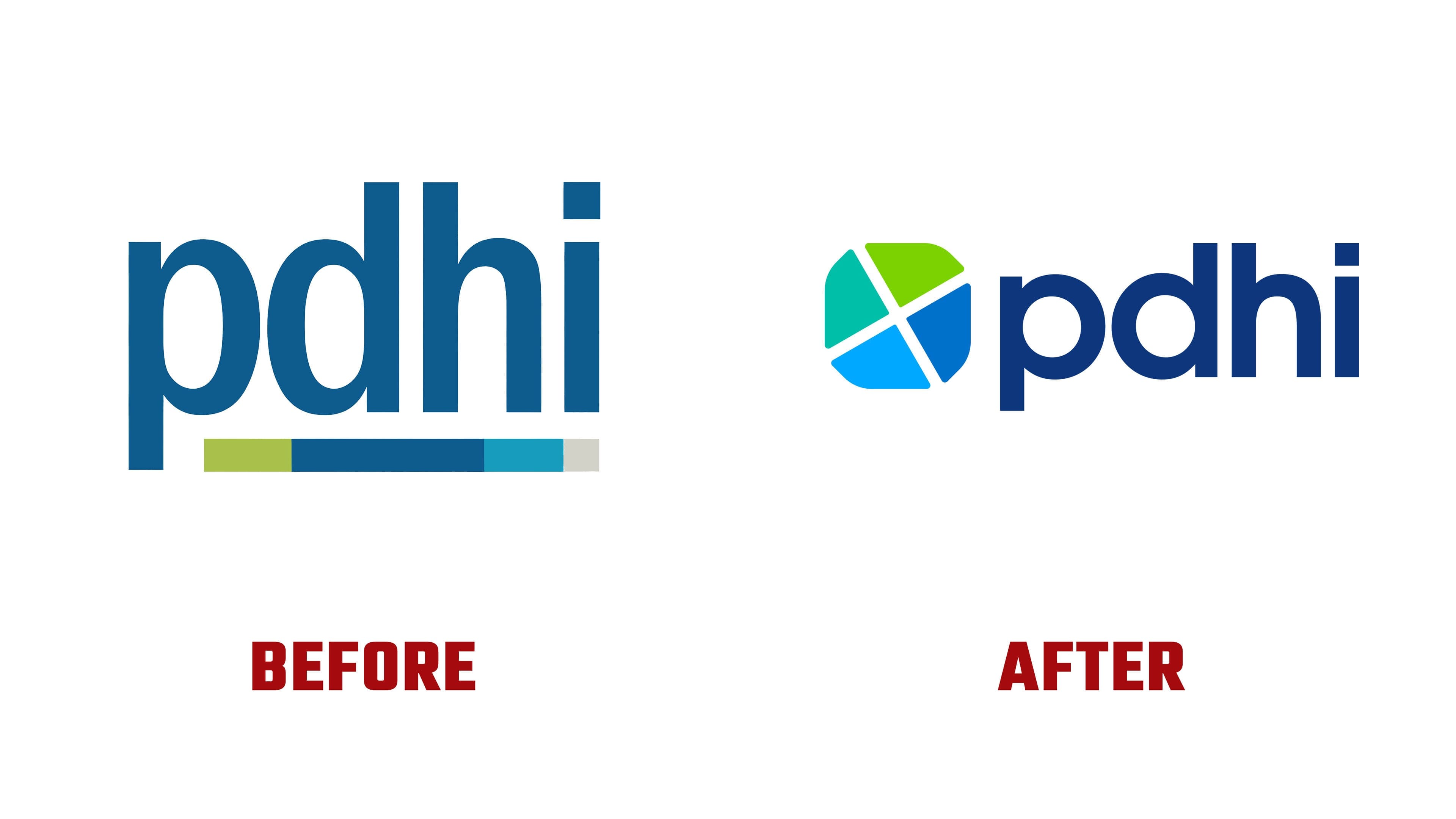
The previous mark looked restrained. The blue PDHI wordmark with a colored line beneath it created a neat but modest image. The platform’s scale came through less clearly. In the new version, the name was kept, while the symbol before the name took the lead.
The emblem is built from four colored parts. It can be read as a chart, a shield, petals, and elements of one system. For a health tech brand, the image fits the meaning. It connects data, technology, service, and people around health-related needs.

The colors became more prominent. Green, teal, and blue moved into the mark, while the colored line under the name left the system. The logo looks more unified and works better for presentations, the website, interfaces, and B2B communication.
The type remains soft and businesslike. The name is set in lowercase sans-serif letters. It maintains a practical tone and avoids a dry medical presentation. The main difference from the previous version is the inclusion of the full emblem. The brand received a mark that makes PDHI easier to distinguish among other health tech companies.

The update is tied to a new presentation built around three points: clarity, consistency, and purpose. PDHI helps simplify population health, develop wellness programs, manage incentives, biometric screenings, health coaching, managed health assessments, and NCQA compliance needs.
The foundation of the brand remains the same. PDHI emphasizes integrity, purpose-driven innovation, flexibility through collaboration, and service excellence. The logo by Thompson & Prince shifts the brand from an industry abbreviation with a colored stripe to a mark focused on system, protection, partnership, and the role of digital health in clients’ daily work.