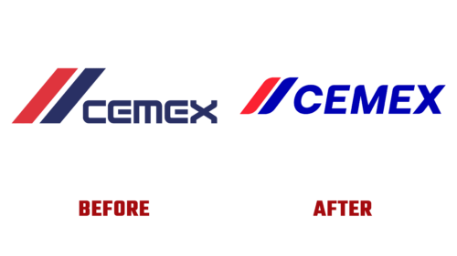
In mid-March 2023, the third-largest cement manufacturer on the planet unveiled its new emblem for the first time in thirty years. In doing so, Cemex demonstrated its global significance: helping the world achieve another milestone in sustainable living. CEO Fernando Gonzalez emphasized that they are very concerned with the reasons behind the current changes in visual identity.
- First, it is the improvement of the construction process through innovative solutions.
- Second, supporting clients in expanding the boundaries of sustainable and reliable construction.
The management noted that the company now has a modern image, dynamism, freshness, and simplicity, which is understandable to most consumers. At the same time, the emblem retains its key legacy elements. Thus, the contemporary Cemex logo consists of textual and graphic parts, which convey forward motion and strength.
These are two diagonal stripes with sharpened ends on one side. In essence, they represent stylized speed lines, adding internal energy to the symbol. Confirmation of this is the red color, combined with cobalt blue shade. Following them is the name of the cement enterprise, executed in bold letters with a slight rounding. The inscription is italic and unconnected but smooth and distinct.
Such a style is a step towards digitization, which Cemex has been striving for in recent years. It has brought a comprehensive solution for construction and industrial materials to the specialized market, implementing it in the computer sphere. As a result, the logo has acquired lightness combined with stability. Both qualities are characteristic of the products, which are accurately conveyed by the visual identity.


