


![]()
The PRINT Awards 2025 has introduced a new visual identity, moving from a structured and bold typographic style to something more refined and expressive. The update reworks the award’s name, emphasizing elegance and fluidity while keeping the familiar monochrome color scheme.
The previous logo used a heavy, geometric sans-serif typeface emphasizing structure and weight. “PRINT” stood out as the dominant element, with solid, blocky lettering reinforcing the competition’s authority in the design world. “Awards 2024” was set in an italicized, slightly distorted typeface, adding a sense of movement while keeping the overall design rigid. The black-and-white color scheme created a strong contrast, giving the logo a sharp, industrial look.
![]()
The new design takes a different approach, introducing a calligraphic script that brings a sense of artistry and craftsmanship. The typeface now features fluid strokes, delicate curves, and pointed edges, adding a touch of sophistication. Instead of past editions’ structured, heavy lettering, the new style leans into a more expressive and nuanced look.
The main title is now in an elegant, handwritten-style font with varying stroke thicknesses, creating a dynamic and organic feel. “THE 2025” appears in a clean, minimalistic sans-serif typeface, contrasting the flowing script below. The combination blends classic and modern influences, tying the competition to traditional and contemporary design trends.
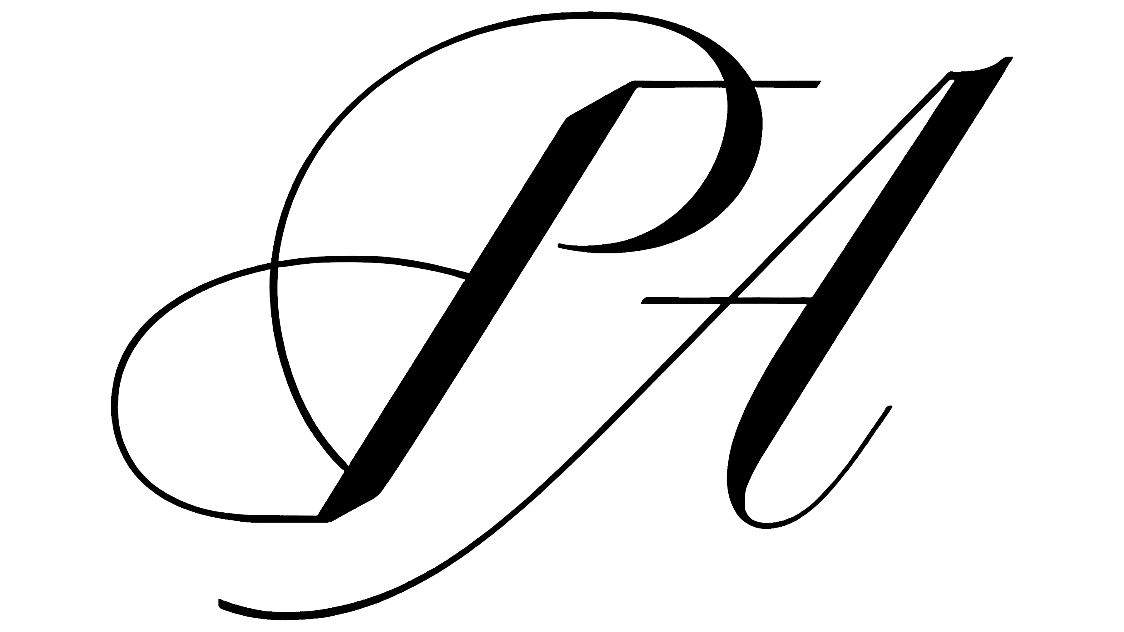
The color palette remains black and white, but the interaction between the typography and space gives it a fresh feel. The previous design relied on stark contrasts to highlight the weight of the type, while the new version uses negative space and fine details to create a more refined look. Without rigid geometric elements, the logo feels more fluid and engaging.
Beyond the logo, the overall identity system includes intricate decorative elements. The visual style incorporates three-dimensional textures, organic shapes, and ornamental details that complement the typography. These additions bring depth to the design, reinforcing the handcrafted, artistic feel.
![]()
The PRINT Awards logo’s transformation shifts its tone from bold and industrial to emphasizing artistic refinement. The balance between expressive script and understated sans-serif lettering connects tradition and modern design, ensuring a striking presence for the 2025 edition.