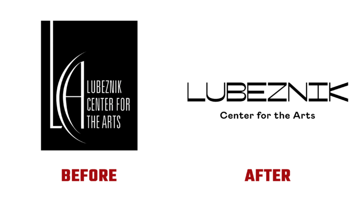
In 1978, the Lubeznik Center for the Arts was established as a contemporary arts center in Michigan City, IN. The Center aimed to create the first institution in this small town for holding art classes and exhibitions. It acquired its current name in 2003 in honor of Jack and Shirley Lubeznik, local philanthropists who donated their building for free use. Today, the brand successfully fulfills its mission of spreading world-class art, creating engaging programs, and conducting creative research that allows a community of passionate people to develop and move forward through meaningful cultural experiences. The change in strategy and the development of new cultural programs – educational and educational – was supported by Firebelly from Chicago, IL, who provided the Center with a Grant for Good to implement their plans. As part of these changes and the prospects for further action, the brand has rebranded itself, making dramatic changes to its visuals.
When creating a unique visualization that clearly and very accurately reflects the features and personality of the organization, all the changes that have taken place, the features of the future use of the logo were taken into account, which led to the decision to have the main option and several secondary ones. The main one is distinguished by its officiality, some strictness of execution. Its atmosphere is limited by the formal framework, which determines its scope – in charitable events, at art exhibitions, especially world-class ones. Additional options are designed for youth programs, classes, vibrant social events. These options have a bold performance a playful atmosphere. The use of attractive animation made it possible to revive the created personality on the entire spectrum of its display.
The original approach to self-visualization turned out to be bold enough for an organization of this level, which guaranteed its attractiveness and mandatory recognition. The use of reverse contrast, creating an original visual space with horizontal strokes, had a huge visual impact on the viewer. The use of a font with fancy letters “B,” “I,” and “K,” as well as a narrower “L” created an unforgettable impression, providing a guaranteed memorability of the logo composition. Playing with visual perception, in which horizontal strokes are perceived as thicker, only enhances this effect. The letters become even more unusual, and the center of the composition changes its tone, making it playful and the logo recognizable. The ingenious decision to use Colophon Foundry’s Mabry typeface, with its whimsical shapes, ensured emphasized the brand’s identity.


