
Canal Extremadura updated its identity with Brand in Action. The project is connected with the development of the Canal Extremadura Conecta media platform. Television, radio, OTT services, and online channels received one shared visual mark.
Canal Extremadura operates as the public broadcaster of Extremadura in Spain. The brand needed an image for a media system with different broadcast formats.
The main mark became the “EX” monogram. It replaced the previous emblem, in which the symbol and the name were separate. The new version is built into the Canal Extremadura name. It works for screens, apps, social media, broadcast use, and promotional materials.
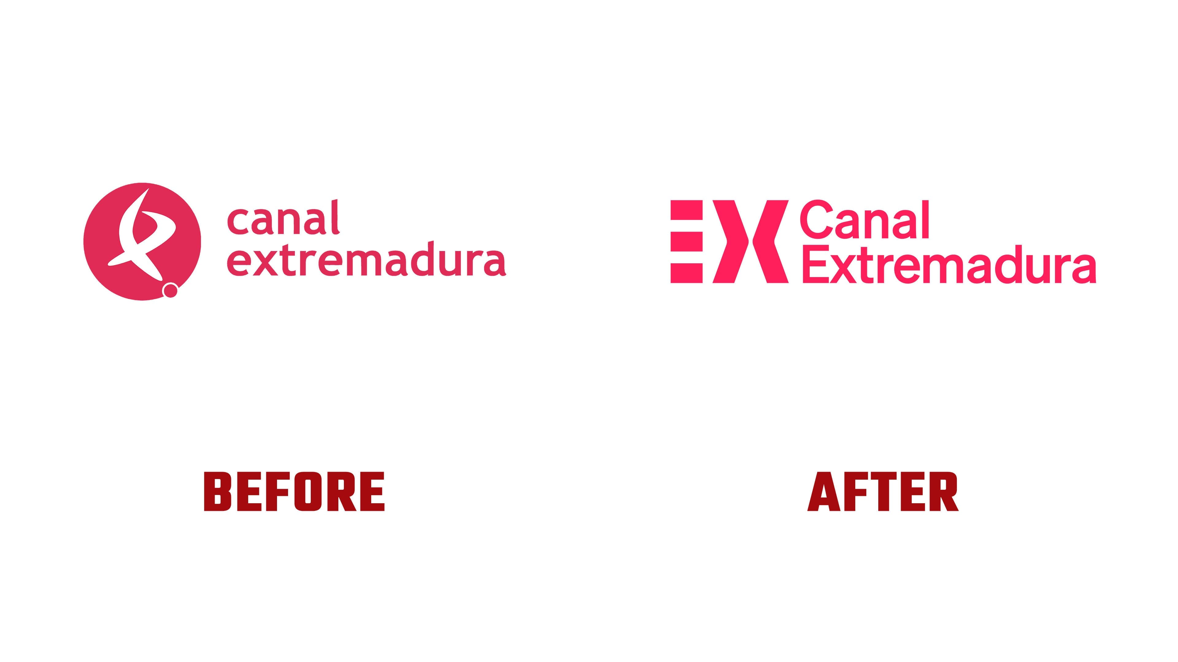
The letter “E” is built from three parallel parts. They are connected with the media group’s three areas of work: television, radio, and digital. The letter “X” looks like a point of intersection. Through it, the meeting of the region’s residents, media, and Extremadura comes through.
The previous logo evoked the identity of regional television from the early days of digital television. It had many details and several meanings in a single form. The new version became simpler. One mark, a short form, a connection to the name, and usability across different applications.

The pink color was kept. It has long been connected with Canal Extremadura. It helps the channel maintain a visual link across broadcast, the website, apps, and social media. Paired with the “EX” monogram, the color works as a fast brand marker.
The rebrand covered broadcast graphics, news, idents, the OTT platform, radio, social media, and business materials. The main result of the project is tied to the logo. “EX” brings together the various Canal Extremadura services into a single system and presents the channel as a shared point of contact for the region’s residents.