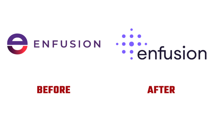
Enfusion, not just a unique, but one-of-a-kind cloud SaaS platform, has undergone a qualitative rebranding, becoming the owner of an extra-modern external design. Having as its main task the simplification of investment management, it has combined the main operations – front – middle – and back office. This aggregation was made possible through the use of a single golden dataset. With their help, all participants have the opportunity to act based on the use of the same information in real-time, regardless of their location. The platform for several years of its existence, the brand has been able to demonstrate the power of its unique technological capabilities when applied to hedge funds. The time has come for aggressive expansion into the segment of institutional investors. To move quickly and efficiently from technological innovation ideas requiring funding to a global platform that is proven and promising. All its power was transformed into an attractive visual image that reflects all the accumulated experience.
With such an important task, it was entrusted to the professional design agency “50,000feet”, which conducted in-depth marketing research, which made it possible to highlight the company’s main competitive advantages. The entire strategic program and the messaging system were built on this. They combined the platform’s main advantages, providing effective communication with various corporate audiences.
The solution to this problem was built on the definition of the brand’s verbal expression and a unique and balanced visual identification system. The new logo has an updated color palette and typography. They have provided a bold and elegant presence for the brand in the highly competitive fintech environment. In this system, the latest achievements in digital photography were applied, and modern technologies for creating design were used. Its basis was a reliable visual guide.
The developed visualization effectively demonstrated the experience and complexity of the company’s software solution, becoming an effective start for the possibility of further expansions and modernization. The site was structured to provide visitors with ease of perception and understanding of visual information based on the nomenclature of the platform and the structure of services. Creative content and an online application were developed to promote active promotion in the redesigned complex.


